| | ||
(2)
The appearance of two or more fonts in an assigned proximate book(s) by a candidate printer raises the possibility of shared printing so that the intermediate issue of his ownership of more than one font must be settled before work proceeds on the target text. In such a case, the pattern of font usage in
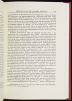
In general, two situations occur: the long-term use of two fonts or the simultaneous use of two sequential fonts during a transitional period. In either instance, the simultaneous use can lead to transformations in font composition that affect the font identification process. Such transformations are usually progressive and irreversible. Reverse transformations through decontamination seem not to have happened except through purging of foul-case italic letters.[26] Hence, a commonsense assessment of the changes necessary to transform a font from suspected early to late states usually suffices to settle the issue. The possibility of the total replacement of individual sorts should be considered in the context of the number of affected sorts. It is conceivable that a printer decided to jettison entire 'a k y ?' sorts and replace them with newly-cast type. However, at this point, there seem to be no examples of this having occurred. When the balance or proportions are observed to shift dramatically to new replenished types in a sort, remnants of the original types are inevitably present. The transformation issue is sometimes critical in establishing the sequence of fonts in a shop during one printer's tenure or in deciding whether a font passed to a new printer along with a shop. In the matter of identifying a sharing printer, a target font in a shared section can be compared to either state of a transformed candidate font. If it can be established that the font was transformed at some point, text samples in the earlier state will contain recurrent-types that can establish the identity of the font in the later state in a target text (or vice versa).
In ideal situations, the ownership of two fonts is easily demonstrated by the interwoven use of two fonts in bibliographical units that eliminate shared printing. New Simmes-S2 prints most of Eliosto STC13509 (1606), but old Simmes-S1 appears at D3-E4v. Such a pattern argues against sharing because of the mutual appearance of the two fonts in the respective halves of a gathering. Ballard took over the two fonts and used them in a similar fashion in Merry Devil STC7493 (1608). Shop lineage, in this instance, provides added evidence of ownership of the two fonts. The alternation of Kingston-Y1 and -EFc, both used simultaneously for a few years, in T. Workes STC12316 (1601)
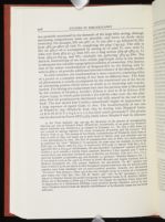
In some instances, the transformation is more extensive, consisting either of a partial or a complete mixing of two fonts in different faces. This kind of phenomenon is usually accompanied by the transitional use of the two in an alternating pattern which leaves no doubt as to ownership and transformation. The mixing of a replacement font into the previous font is illustrated by the creation of Creede-3. Creede-1 (S-face) is used to D in Selimus STC 12310a (1594), at which point Creede-2 (C2-hybrid) takes over; the two alternate, then are promiscuously distributed and fully mixed by the end of the book. The new mixed font Creede-3 immediately begins its appearances in a long sequence of signed books to 1602. The transformation of one case of Windet-S1 into Windet-S2 from 1605 by fouling with Windet-F letters (A D G H M O T a b g k w x y z) has been noted previously.[27] The process can be observed in Fawne STC17483 (1606) where Windet-F and -S2 alternate
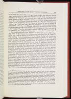
The transformations in the sequence of three fonts used by Eld 1603-1609 occur in the context of a simultaneous transitional use of Eld-Y1 to Eld-S1 and Eld-S1 to Eld-Y2 in interwoven settings during both transitions. The resulting cross-contaminations yield foul-case clusters in Eld-S1 and Eld-Y2 that aid in potential recognition of the two fonts if encountered in shared sections. Eld clearly planned ahead in acquiring new fonts, but for some reason pushed the old fonts to the brink of depletion, thereby occasioning the transformations of the new fonts. Although his compositors were quite careful, it seems that interweaving a depleted font with a new one presented an impossible distribution situation. Each of the fonts appears separately in signed books; nonetheless, Eld's ownership is clear from the use of the respective pairs of fonts in alternating patterns which eliminate the possibility of shared printing. Put into use in 1603?, Eld-Y1 was the only pica roman that appeared in books from the shop until early 1605, when Eld-S1 appeared in Survey (STC6201, 22 January 1605) with Eld's imprint and thereafter in several others (An Answer STC26002 etc.) to 1608?. The low-density S-capitals that appear in Eld-Y1 early on are possibly remnants from Simson/Read-S1; this suggests that part of Simson/Read-S1 was in the shop until replaced by Eld-Y1 in 1603? If so, it either was not used at all, or only in shared sections, although this seems unlikely because of the overall production of the shop during Read's tenure, which seems to have included but a few short ephemera and no books of noteworthy length after 1601. However, the fouling of Eld-Y1 with additional S-capitals and then with lower-case sorts begins
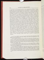
Transformations in fonts usually occur offstage. Unless the process is observed in progress, it must be inferred from the demonstrable ownership of the two fonts either in long-term or transitional simultaneous use. This is the case with the two states of Jaggard-Y1. Jaggard-Y1a appeared in at least three books before transformation: T. Anatomie STC12465.5 (1603), T. Triumphs STC18279 (1605), and T. Lamentation STC7606 (1605). At some point in 1605, Y1a was transformed into Y1b by the addition of C2-hybrid sorts. Two factors obscure the time and source of contamination. Jaggard-Y1b's first appearances in signed books occurs in 1606: Essays STC1139, and T. Badges STC889. However, Jaggard used the font earlier in his section (F-H) of Dutch Courtesan STC17475, entered 26 June 1605. The most likely source of the contaminating sorts was Jaggard-C2. However, the date of Jaggard's acquisition and first use of this font is unclear, but it seems to have been later than 1605. The date of its appearance in Westward Hoe STC6540 is confused by the contradiction between the crossed-out Stationers' Register entry of 2 March 1606 and the imprint of 1607. An alternative possibility is that, in order to extend the life of the font, Jaggard replenished Y1a with C2 sorts from the same foundry that supplied Jaggard-C2 before acquiring the latter. In any event, ownership of Y1b and Jaggard-C2 is not an issue because of Jaggard's practice of alternating these fonts within gatherings along with a third font, Jaggard-S1. Jaggard's section (A-G; Eld-Y2 in H-I2v) of Westward Hoe, for example, prints in Jaggard-Y1b except for Jaggard-C2 in D4 and F1, and Jaggard-S1 in B2v-3, C1, C2v-4v, E1-3, E4v, F1v-4v and G2v-3. The three fonts alternate in Jaggard's sections of An Apologie STC19295, shared with Eld, and Jaggard-C2 and -S1 alternate in T. Miseries STC25635 (1607).[33] The two were used at least once in alternating fashion as the emphasis fonts (T. Deade Tearme STC6496, 1608). Just why Jaggard acquired and used the three fonts is a mystery since Jaggard-Y1b was still adequate in 1606 for setting the long (B-2G) T. Badges STC889. Even so, the use of the three is confined to 1607, suggesting a transitional waiting period until Jaggard-Y2 was delivered in 1608 (Jesuites STC1824). The fonts may have been used more extensively than we know. The practice of alternating seems to have gone amuck and fouled one case of Jaggard-S1 in Sermons STC15882 (1607) where a mixture of Y1b, C2 and S1 sorts occurs in R6,7,8, S1,2v,3,4v and later. The font is largely uncontaminated in the short text in A2-A3v:15 of Ruine of Rome STC6641 (1607), but this probably is attributable to the use of the uncontaminated case. A transient phenomenon confined to 1607, the three fonts seem to occur always in alternating fashion and thereby provide a unique kind of font identification composite consisting of the pattern and the cross-contamination.
One circumstance is shared by the Islip-Y1a,b and Jaggard-Y1a,b transformations.
In general, the continuous use of a single font in two states can be demonstrated by recurrent-types in the early and late states. In some instances, a font is already contaminated in what seems to be its earliest appearance. Circumstances may indicate the plausible source of contamination. For example, Allde-Y1 appeared in 1597 (R & J Q1 STC22322; and Granados STC 16902, 1598) with a low-density wrong-face mixture in place, including S-face sorts (A1 D1 G H O T; low-riding C F1 G2 H I L M P; a d2 f1 h2 p1 u1; ligatures: ct fi2 fl2; and '?') and C2-hybrid sorts (b2 k1 g2), all of which are probably from Allde-C2 which last appeared in 1596. However, Jaggard-Y2 appears with oversized capitals (2.95-3.15mm) already in place which do not seem to come from Jaggard-S1 (A B C D G H I K M O P R S T V; see T. Pathway STC898, 1609).
The transformation issue can be clouded when the similarity exhibited by a sequence of fonts is such that transformation seems the logical explanation. The general principle that transformations are progressive usually permits settling the issue. Sorting the sequence of fonts in Purfoot's shop 1598-1607? is complicated by the fact that three same-face fonts are involved (see also later discussion of Robinson-Y1a,b). The sparse known output during the transitional periods between Purfoot-Y1, -Y2, and -Y3 forces an extension of the survey across 1601-1606 in order to locate samples of each font. The fiveyear period represents sufficient time for major transformations to have occurred. The early font, Purfoot-Y1 (last seen in 1601?) exhibits mixed Y- and
| | ||