| | ||
In his book The Textual Condition, Jerome McGann claims that John Rodker, the printer of Ezra Pound's Hugh Selwyn Mauberley (April-June 1920), possessed at least six decorated initial Ts made by the artist Edward Wadsworth.[1] According to McGann, we can deduce that Rodker possessed six Ts because his edition of T. S. Eliot's Ara Vos Prec (December 1919 — February 1920) displays six decorated initial Ts.[2] From this supposed fact, McGann goes on to argue that since Rodker possessed six Ts, and Mauberley only required six decorated initial Ts,[3] Pound deliberately chose not to use a decorated initial T on page 16 of Mauberley. McGann supplements this argument with evidence from proof sheets of the edition held in the Humanities Research Center at the University of Texas. In the margin of page 13 of these proofs, Pound wrote, "Supply of Ts ran out" and instructed Rodker to use a plain or italic capital T, because "The old printers did this when fancy capitals ran out" (cited in McGann, 158). On the basis of the Eliot edition evidence, McGann believes that Pound was incorrect in his assumption that Rodker had exhausted his supply of decorated initial Ts. Instead, McGann interprets Pound's advice to follow the style of the "old
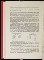
McGann's claim about the six Ts derives from a misconception of the printing process. McGann imagines all the pages of a book set in type at the same time, rather than set as a series of pages arranged in formes. These formes are then used to print sides of sheets, which are subsequently folded and cut to create the final structure of the book. As a result of printing in formes, at any one time a printer need have no more type available than is required to print a single side (though in practice it is often easier to set the type for both formes of a sheet). The table below indicates by sheet, forme, siglum, and page number the locations of the initial Ts in Rodker's editions:
| Hugh Selwyn Mauberley [5] | ||
| 8°: A — B 8 | ||
| Inner | Outer | |
| A | 5v (10) | 6v (12) |
| 6r (11) | 7r (13) | |
| 8v (16) | ||
| B | 3v (22) | |
| Ara Vos Prec | ||
| 4° A 4 B4 C — D 4 E — G4 | ||
| Inner | Outer | |
| C | 3v (22) | |
| D | 3v (30) | |
| F | 2r (43) | 3r (45) |
| 4v (48) | ||
| G | 3r (53) |
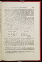
In addition to this negative evidence that Rodker never used more than two decorated initial Ts on a single side, there is also more positive evidence for the existence of two, and only two, initial Ts. One of the initials has a visible gap in the top outside rule of the border, approximately 9 mm from the right edge. This gap appears to vary in length from 1 — 3 mm, due to variation in inking (and possibly to deterioration in the metal, though the gap is present in the earliest version of Eliot's text and does not seem much larger in late copies of the Pound text). I have termed this version the "broken" T and indicated its presence in the table below as Tb. The other decorated initial T I have termed "unbroken" because all of its borders are intact. However, it can also be specifically distinguished by the presence of a small uninked circle in the widest band in the lower right quadrant, approximately 7 mm from the right edge and 4 mm from the bottom. Its presence is identified in the table below by the letter T without superscript.
| Hugh Selwyn Mauberley | ||||
| Inner | Outer | |||
| A | 5v (10) | T | 6v (12) | Tb |
| 6r (11) | Tb | 7r (13) | T | |
| 8v (16) | T | |||
| B | 3v (22) | Tb | ||
| Ara Vos Prec | ||||
| Inner | Outer | |||
| C | 3v (22) | T | ||
| D | 3v (30) | Tb | ||
| F | 2r (43) | Tb | 3r (45) | T |
| 4v (48) | Tb | |||
| G | 3r (53) | T |
So what does it matter how many Ts Rodker had? It matters quite a lot for McGann's argument about Pound's intentions. Most obviously, bibliographical analysis reveals that Pound was correct in his note about running out of Ts. More specifically, and significantly, Pound's knowledge that Rodker possessed only two Ts undermines McGann's supposition that Pound intentionally wished the italic T to appear on page 16:
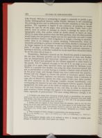
Nonetheless, McGann's research on the Mauberley proofs is instructive, for the data McGann provides can be reinterpreted to show that Rodker was an inexperienced and inaccurate typesetter: at least three of the six initial Ts Pound had planned for his volume appeared as other letters in the proofs. The T expected on page 12 was set as F, on page 13 as L, and on page 16 as some other incorrect letter not specified by McGann (157). While it is possible that Rodker was using the other decorated initials simply as placeholders to avoid having to transfer a limited stock of initial Ts at the proof stage, and though Pound may have understood this practice, Pound still felt obliged to correct the proofs as insurance against future errors.[7] That Pound's vigilance was necessary emerges from a collation of copy #27 of Mauberley against the other copies I have seen. Most notably, the blue ornament on the title-page wanders around inordinately, even overlapping the imprint in one copy (Huntington Library 354201). Equally egregiously, the lower part of the table of contents (from p. 19 to p. 28) has to be reset between the printing of #27 and #63, in order to correct the page numbers.[8] Other changes also appear to be improvements or regularizations, especially of punctuation.[9] The most telling difference, though, is an
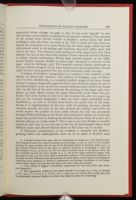
Evidence of Rodker's inexperience as a printer is not confined to his edition of Mauberley, however. The Library of Congress copy of Eliot's Ara Vos Prec, labelled #9, is a complete jumble — pages of the inner forme of sheet C appear diagonally opposite where they should be (pages 18 and 22 are interchanged, as are 19 and 23), because someone either rotated the forme 180° on the bed of the press between the printing of the inner and outer formes or, more likely, turned the paper incorrectly as the sheet was perfected. The outer forme of sheet G is also marred, but only two pages (49 and 53) are reversed diagonally.[11] Since no other copies, including those numbered 4, 10, and 11, exhibit these errors, we cannot rely on the numbering as a representation of the true order of printing. #9 must almost certainly precede #4 (one of the four printed on vellum), and while we would expect any printer to have made certain the text was accurately arranged before printing on the much more expensive vellum, we would not expect the printer then to bind up his mistakes and pass them off as part of a limited edition, in a false order.[12] This is not to say that Rodker is terribly unethical, only that he was very lax in the way he intermingled sheets from different states and allowed flawed sheets to find their way to market.
If McGann's presentation of the evidence is unsound and Rodker's printing habits are undisciplined, what are we to make of Pound's comment
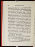
McGann would perhaps argue that later editions do not adhere as closely to the tradition of decorated book production, and so Pound must work within a different set of bibliographic codes and has to sacrifice this particular allusion. Such an argument, however, raises the question of whether the Ovid Press Mauberley does adhere to the fine art tradition. Certainly the book is printed on very reputable paper (Whatman, with four copies on Japan Vellum), but the style of Wadsworth's press icon, decorated capitals, and tailpiece is distinctly modernist, bearing little relation to the styles of previous eras.[13] The cloth binding with paper label is simple and bears little resemblance to bindings by the pre-Raphaelites or other earlier binders. So the allusion of the italic T is not reinforced by most other aspects of the bibliographic code, though Pound could no doubt have offered advice on all of these aspects had he wished to implement a deliberate program.
McGann also seems to suppose that Pound chose Rodker as his printer because of Rodker's high standards and artistry:
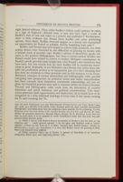
Rodker and Pound may have hoped to achieve high standards, but their artistic desires were thwarted by the difficulties of printing by formes with a limited stock of movable type. Rodker's edition of Mauberley speaks volumes to the analytic bibliographer, but what it reveals neither Rodker nor Pound would have wished to convey to readers. McGann's commentary on Pound's proofs provides some insight into what Pound's own intentions may have been, but also reveals how far short Rodker fell in translating manuscript to print. Ironically, it was McGann's own dictum that critics must consider the production process as an inseparable part of a text's meaning that first drew my attention to these questions and, in this instance, to his errors. McGann's concepts of textual materialism and bibliographic codes provide intriguing new perspectives on authorial intent and reader interpretation, but these concepts must themselves consistently acknowledge, not just exploit, the historical practices they seek to reinstate within the critical horizon. Textual and bibliographic codes result from the interaction of creative intentions and social, technical, and political considerations. This interaction generates both opportunities and limitations, all of which have to be recognized in a fully informed sociology of texts, even if that means turning the Ps and counting the Ts.
| | ||