[ILLUSTRATION]
525. NOTE THE PLAN OF ST. GALL AS A SUBJECT
OF ILLUSTRATION IN VOLUMES I AND II
AND CATALOGUE OF INSCRIPTIONS FOLLOWING
VOLUMES I AND II
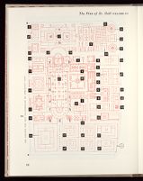
The Plan is shown in this work by two modes of illustration, tonal and line.
Tonal illustrations, shown as details of the Plan, in most cases are in color and
at the same size as the original, while line illustrations printed in black or in
red, often with overlays of the opposite color, occur in several different degrees
of reduction and represent the red line drawings of the original.
Reproduction of the Plan by line
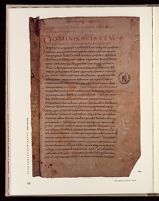
The great Plan drawn on parchment survives in a remarkably good state as a
document. In centering attention, at original size, on its prime visual feature,
it will be observed that the red line drawing by which building and landscape
features are delineated is interrupted in many parts by short breaks, rarely
exceeding one or a few millimeters, where the ink has ceased to bond to the
parchment. These imperfections posed no problem in reproduction at reduced
dimensions. However, in certain parts the course of the red line drawing,
although clearly in evidence in original dimensions, is too meager to record
photographically a satisfactory printed image of the deteriorated condition of
the drawing at reduced dimensions. Resort to correction was performed as
follows.
By good fortune, the firm of E. Löpfe-Benz of Rohrschach, when printing
their important eight-color facsimile lithographic reproduction of the Plan of
St. Gall in 1952, also printed a small over-run edition of the red key-plate for
a few specialists, and their own use. This reproduction depicted the red line
drawing of the Plan at original size stripped of all other subject matter. With a
specimen of this key worksheet in our possession, which we obtained through
the kindness of the late Hans Bessler, by careful photography, several precision
prints were made on material of high dimensional stability and receptive to
pen and ink for retouching. On one print all defective parts of the line drawing
were corrected to yield a continuous line in all parts of the Plan, alterations
being restricted only to supplying in full strength those areas where the ink
had deteriorated or ceased to bond, but where unmistakable traces of its original
course were in clear evidence. When reduced to exactly one-fourth
original size, the print happily yielded an image satisfactory for reproduction
in printing. For greater reduction than one-fourth original size, prints as
described above required line widths to be retouched two times and in a few
cases, were retouched three times line width (1/10 × s, example, ill. I.xx).
Since the printed images at reduced size serve schematically or diagrammatically,
sometimes as red base color for a black overprinting, the often ugly
implications or connotation of "alteration" vanish. When the reader seeks a
degree of authenticity in the study of the delineation of the Plan drawing he
may turn to color reproductions shown original size in Volumes I and II, or
the following Catalogue.
Tonal Illustrations in Color
The tonal illustrations in color in this work are derived from the splendid
facsimile eight-color reproduction of the Plan of St. Gall printed in 1952,[71]
which portrays the great document in a high degree of fidelity to the original
that would be difficult to surpass. The procedure of derivation is accomplished
by means of the "optical color scanner," an instrument of photo-computer
antecedents, and available commercially only recently for application in the
printing arts. At the outset the hope of the authors had been to negotiate with
the eminent Swiss firm who printed the eight-color facsimile lithographic
edition in some scheme, one perhaps by which their color film or master negatives
could be made available. On learning these no longer existed and furthermore
knowing of the current ban on photographing the original parchment
because of the deleterious effect of strong lighting used in photographic procedure,
there was no alternative except to resort to the use of the scanner and
a copy of the facsimile reproduction.
A facsimile negative (probably on blue-sensitive film) in our possession, provided
us by Dr. Duft, was invaluable for reference but proved of little use as a
technical instrument since the stained areas of the parchment printed as great
black spaces lacking in detail. In color photography screening and dexterous
technical manipulation can correct for this condition, as is evidenced on
inspection of the facsimile Plan.
THE CATALOGUE OF INSCRIPTIONS
The remarks on certain problems of reproduction for printing in line when
drastic reduction in the dimensions of the image occurs, do not apply to the
color reproductions at the same size as the original. To some extent they apply
also to color reproduction at reduced scale but except for one instance (frontispiece,
fig. 1.X, I.xxviii) that was not a problem in this work. Enlargement
does offer grave problems, particularly when the original document to be copied
(called "the copy") has been "screened." The source from which the Plan
illustrations were scanned was screened copy. Thus, in the reproductions of the
following Catalogue, a high degree of printing technology, long experience,
great expertise, and close supervision with precise dot control are involved. By
tests and experimentation the use of one black plus two colors was found to
yield an image of visual quality adequate for the purpose of this work. The
greater degree of authenticity exemplified in high fidelity facsimile printing
with explicit veracity was not economically feasible nor even appropriate in a
work concerned with planning development and architecture more than with
great arts ancillary to it.
E.B.


