University of Virginia Library

Search this document 


collapse section 
 1. 
 2. 
 3. 
  
collapse section 
 1. 
 2. 
 3. 
 4. 
 5. 
 6. 
 7. 
 8. 
 9. 
 10. 
 11. 
 12. 
 13. 
 14. 
  
collapse section 
  
  
collapse section 
 1. 
 2. 
 3. 
 4. 
 5. 
 6. 
 7. 
 8. 
  
collapse section 
  
  
collapse section 
 1. 
collapse section2. 
 01. 
 02. 
collapse section3. 
 03. 
 04. 
  
collapse section 
  
  
collapse section 
 1. 
 2. 
  
collapse section 
  
  
collapse section 
 1. 
[section 1]
 2. 
 3. 
  
collapse section 
  
  
collapse section 
  
  
collapse section 
 1. 
 2. 
 3. 
 4. 
 5. 
  
collapse section 
  
  
collapse section 
  
  
collapse section 
  
  
collapse section 


collapse section 


collapse section 


Since the 18th century collation has been a standard procedure in editing Shakespeare. At first it sought lexical differences between editions; but recently variation within the same edition has come into focus, largely through the work of the late Charlton Hinman.[1] His mechanical collator and its adaptations[2] have revolutionized collation. Instead of comparing words

198

Page 198
one at a time in two different exemplars of an edition, it compares whole pages simultaneously as visual gestalts, making obvious even minor differences between them, such as unequal inking and change of type or damage to it.

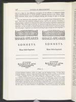
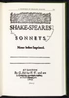
Let me illustrate the principle with an example from Shakespeares Sonnets, 1609 that has hitherto escaped notice, and in the process introduce a photographic method of collation that does not employ expensive mechanical collators. The title page of the Q1 of 1609 has long been known to have two imprints. In the account of Hyder Rollins, the authoritative Variorum editor, the title pages "represent an identical setting of type except for the imprints."[3]

illustration

199

Page 199
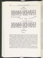
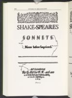
What happens when we move beyond the unaided eye and superimpose the images, however, contradicts Rollins' assessment, as the following plates will show. Before I analyze their evidence let me describe the simple process by which these images are obtained. I began with photocopies of the title pages of the two imprints generously supplied by Curator Carey S. Bliss of the Huntington. As the Library photographed them in slightly different magnification, one of the images was copied again, and this served to bring them to size. (Photocopiers rarely conserve the size of the original.) This experimental process of changing the magnification was repeated with the photocopier stocked with transparencies rather than opaque paper.[4] The resulting transparent image of the one imprint was then placed over the opaque image of the other supplied by the Library, and the two images were tested for alignment. This securing of alignment is cumbersome in mechanical collators, especially as in the present case when different parts of the page align on different axes, but hand-held images offer no such problems. Once a significant alignment had been found, the two pages were placed transparency-down on a photocopier to make an image of the superimposition. In the first illustration (Pl. 2) the alignment is of the ornament and 'SHAK' at the top of the page. The alignment in the second illustration (Pl. 3) is toward the bottom of the page (as in the colinearity of the rules).[5]

The alteration of the imprint, long known, seems to have been accompanied by something never guessed at. First there is horizontal and vertical displacement of rows of type between the two images, although identical letterpress is found in common text. The horizontal movement might, to some degree, be explained by application of different pressures in locking up the forme after the change of imprint (for collation of the surviving title pages reveals that the gross differences observed here correspond to the change of imprint). But the vertical displacement of type can be explained only by the transposing of a reglet from above to below 'SONNETS.'—or vice versa. This alteration occurs in conjunction with another, revealed by the fact that the two images of 'SHAKE-SPEARES' do not fully align with each other (see Pl. 2). This evidence can be readily understood by another manipulation of the photoimages (a procedure impossible on mechanical collators). The following plate is made as the former two except that the transparency is turned over and rotated 180° with the result that the two imprints can be

200

Page 200
illustration

201

Page 201
illustration

202

Page 202
illustration
contrasted as mirror images along some useful axis, here the base line. The images can be shifted slightly along this axis in order to align mirror images of particular types or type groups. Plate 4 shows two such different alignments.

The explanation of the misalignment is now obvious: the first and third E's in the name have been interchanged; this feature, like that of the transposing of the reglet, coincides with the change in imprint. In the Wright title the first E (that in 'SHAKE') has a slightly narrower set than the two E's in 'SPEARE' and may represent a different fount. In the Aspley title this E with the narrower body is transposed with the second E of 'SPEARES'. The difference in the bodies of these transposed types throws off the alignment of '-SPEARES' up to the final S by altering the spacing before the hyphen. Of course, there is no change in length of the whole line.

The order of these changes, which coincide with the unlocking and adjustment of the page to alter the imprint, is not to be determined by strict bibliographical evidence. It is possible that in the unlocking of the page the

203

Page 203
first and perhaps the second line of type 'SHAKE-SPEARES | SONNETS.' pied and was reassembled, in the process the two E's being interchanged and the reglets rearranged. However, since the position of the narrower-bodied E in 'SHAKE-' in the Wright state of the title produces a more pleasing typographical effect than when it is the penultimate letter in 'SPEARES' in the Aspley state, it is also possible that the change was deliberate, in which case the Wright was the later imprint. The cause can remain only a matter of opinion: it is sufficient to state the evidence and to testify to the ability of mechanical or photocollation to isolate such minute differences between texts, differences unknown a generation ago when the Variorum Sonnets was published, a model of editing in its day.

Let me now turn the techniques used here to a specific kind of problem that arises in close bibliographic scrutiny of any book—analysis of running headlines.