| 8 Why was the Brunelleschi peephole
abandoned? The psychology of perspective and Renaissance art | ||
8 Why was the Brunelleschi peephole
abandoned?
With the objects. But the spectator also moves
With lesser things, with things exteriorized
Out of rigid realists. ...
Wallace Stevens, from “An Ordinary Evening in
New Haven,” 1949 (Stevens, 1972, p. 335)
In Figure 8-1, we can see a reconstruction of Brunelleschi's
second panel,[1]
described by Manetti as follows:
He made in perspective the piazza of the palace of the Signori
of Florence, ... in such a way that the two faces are seen completely
...: so that it is a wonderful thing to see what appears.
... Here it might be said: why did he not make this picture,
being of perspective with a hole for the eye, like the little panel
from the Duomo towards Santo Giovanni? This arose because
the panel of so great a piazza needed to be so big to put in it so
many different things, that it could not, like the Santo Giovanni,
be held up to the face with one hand, nor the mirror with the
other ... He left it to the direction of the onlookers as happens
in all other paintings of all other painters, although the onlooker
may not always be discerning. (Trans. by Edgerton, 1975,
pp. 127–9)
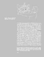
Figure 8-1. Edgerton's depiction of
Brunelleschi's second experiment
the peepshow not only because it was unwieldly[2] but, I
believe, for two deeper reasons: one is the “gimmicky”
effect of a peepshow, which transforms it into mere entertainment;
the other is the robustness of perspective,
which has as its consequence the potential for the creation
of extraordinarily powerful psychological effects.
To better understand why a peepshow smacks of gimmickry
and mere entertainment, I propose to digress here
and analyze the interesting notion of gimmick. Take prestidigitation.
Shows of legerdemain are displays of extraordinary
virtuosity, incomprehensible to the uninitiated, but
which lose much of their charm once the trick is revealed.
To be sure, it is always fascinating to look closely at an
extraordinarily able performer or artisan demonstrating his
or her skill, but a person who has learned the secret of a
magic trick cannot watch its performance and still experience
the surprise and awe induced by objects seeming to
violate the laws of nature. Similarly, to have looked into
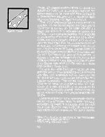
Figure 8-2. Droodle
curiosity about technique. In this respect, magic and perspective
cabinets are like the droodle[3] shown in Figure 82.
Once you have been given its title,[4] you cannot regain
your visual innocence with regard to the picture.
We say of such displays that they are merely entertaining
gimmicks. It is true that such objects occasionally prod us
into comparing our state of mind before and after our
insight into what made us experience the illusion, thus
inducing in us a metaperceptual experience, which engenders
an understanding of the workings of our mind. Nevertheless,
they are not primarily designed to do so, nor is
that their predominant effect. When illusion is the core of
an experience, as it is in magic or perspective cabinets, the
work that gives rise to the illusion becomes particularly
ephemeral because the mechanics of the illusion rather than
the work itself become the focus of the experience. In
contrast, to have been backstage at the theater or to have
visited an artist's studio very rarely diminishes the power
of the finished work of art and often leads us to reflect
upon the role of illusion in art.
The claim that works that hinge on illusion are mere
gimmicks because of the ephemerality of the experience
they afford must be reconciled with the observation that
the work of certain influential modern artists suffers from
a similar ephemerality. There are two ways to proceed:
Either we can accept the complaint of some that much
modern art is mere gimmickry, or we can analyze the
nature of the ephemerality of certain kinds of modern art
and ask what sets it apart from perspective cabinets and
the like.
It is a commonplace that modern art evolved by violating
accepted norms of “subject matter, but more importantly
composition, figure-ground relationships, color, scale, and
tactile values” (Burnham, 1973, p. 46). Jack Burnham calls
these violations formal transgressions. But there is another,
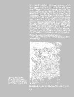
Figure 8-3. Kenneth Martin,
Chance and Order Drawing
1981. Pencil. Collection Ruth and
Andrew Forge, New Haven, Conn.
have engaged in, which Burnham calls historical transgressions.
These are violations of our conception of the indispensability
of the artist's choices and of the artist's voluntary
control over the artistic product, on the one hand, and of
the indispensability of the physical persistence of the work,
on the other. Artists have relinquished voluntary control
over the work of art in two ways: by introducing randomness
into the process of creation, and by relinquishing
key aspects of the fabrication of the work. Randomness
has entered the process of creation with the introduction
of aleatory methods of pictorial, poetic, and musical composition.[5]
An example of this in the pictorial domain is
one of Kenneth Martin's aleatory drawings (Figure 8-3).
[The following aleatory process generated Figure 8-3:
An 8-by-8 square grid was numbered from the top in horizontal rows
from left to right.
The numbers from 1 to 64 were written on small cards, which were
shuffled. Thirty-two pairs of numbers were picked at random (without
replacement, so that no number was drawn twice) in order to determine
how each of the 64 intersections in the grid would be connected to one
(and only one) other intersection. The 32 pairs were set down in 4
columns of 8.
A single line was drawn for each of the pairs in the top row: 27→60,
9→16, 63→41, and 36→53.
Pairs in all the other rows were interpreted in the same fashion, except
that sets of parallel lines were drawn, instead of the single lines drawn
for the pairs in the top row. Pairs in row 2 were taken as instructions
to draw pairs of parallel lines, pairs in row 3 were taken as instructions
to draw triplets of parallel lines, and so on.
Consider the pair 3→42, the leftmost in the second row. The first of
the two parallel lines connected intersections 3 and 42. The second line
connecting 3 and 42 lay to the right of the first (assuming the line was
oriented toward intersection 42). There is no indication of the procedure
used by Martin in this drawing to determine whether the expansion
was to be to the right or to the left: Twelve of the 28 multiple connectors
expand to the right, and the remainder expand to the left.
This drawing reflects the order in which the lines were drawn by
following a rule whereby a set of parallel lines is always interrupted by
preexisting sets of lines. For instance, the pair of lines 3→42 was drawn
before the pairs 43→33 and 37→25; therefore, the latter seem to be
occluded by the former where they happen to intersect. Thus, if each
set of lines intersected its immediate precursor (which is not the case:
We cannot tell by looking at the drawing the ordinal position of pair
31→45 in row 2), the drawing would have 32 distinct layers in depth.
Martin uses the same set of random pairs for several drawings and
paintings. For instance, the drawing Chance and Order X/6 (Martin,
1973) differs in the order of drawing the connecting lines, and in the
rule for right or left expansion.]
In addition to the incorporation of randomness into the
process of creation, some artists have attempted to undermine
the norms that define a work of art by deliberately
curtailing the physical life of the work. Thus transitoriness
has become (for some) a central characteristic of works of
art such as Jean Tinguely's Homage to New York (Figure 84),
a sculpture-machine that was supposed to self-destruct,
but didn't (because it broke). John Cage called this attitude
toward painting “art as sand painting (art for the now-moment
rather than for posterity's museum civilization)”
(1973, p. 65). He adds a footnote to “art for the now-moment”:
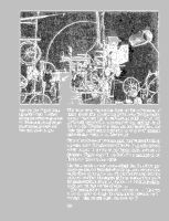
Figure 8-4. Jean Tinguely, Homage
to New York. A self-constructing
and self-destroying work of
art. Demonstration in sculpture garden
of Museum of Modern Art,
New York, March 17, 1960.
This is the very nature of the dance, of the performance, of
music, or any other art requiring performance (for this reason,
the term “sand painting” is used: there is a tendency in painting
(permanent pigments), as in poetry (printing, binding), to be
secure in the thingness of a work, and thus to overlook, and
place nearly insurmountable obstacles in the path of, instantaneous
ecstasy). (1973, p. 65, footnote 10)
Some artists have even circumvented the process of making
the work of art. Certain artists did so by using objets trouvés,
which Marcel Duchamp called Readymades, such as his
Bottlerack (Figure 8-5). In his fascinating monograph on
Duchamp, Octavio Paz writes:
The Readymades are anonymous objects that the artist's gratuitous
gesture, the mere fact of choosing them, converts into
works of art. At the same time this gesture does away with the
notion of art object. The essence of the act is contradiction; it is
the plastic equivalent of the pun. As the latter destroys meaning,
the former destroys the idea of value. ...
The Readymade is a criticism of ... manual art. ... The artist
is not the maker of things; his works are not pieces of workmanship
— they are acts. (1981, pp. 21–2, 23–4)

Other artists have developed Duchamp's implicit criticism
by creating conceptual art, in which a declared intention,
the description of a project (often not feasible), or
the performance of an act are the work of art. One example
is described by Burnham (1973, p. 150):
Using a beach near his cottage at Truro, Massachusetts, [Douglas]
Huebler decides to use the dimensions of a gallery in Los
Angeles as boundaries for six sites on the beach. Markers are
placed at six locations and Huebler makes photographs of each.
These are assembled with a map and explanation and the piece
is sent to the gallery in Los Angeles. The result on the gallery
goer's part is a sense of double transposition.
| a. The gallery in Los Angeles |
| b. The photos of the Truro beach with the gallery floor markers |
| c. The sites on Truro beach with markers the dimensions the gallery floor |
These violations of the artist's freedom of choice (e.g.,
Martin's aleatory paintings), violations of persistence (e.g.,
Tinguely's self-destroying sculpture), violations of the need
for elaborate technique (e.g., Duchamp's Readymades),
and violations of the materiality of the work (e.g., Huebler's
conceptual art), which test our very conception of
the boundaries of art, are often characterized (by the many
who find this art distasteful) as gimmicks, precisely because
of the two ways in which they are like droodles: they are
surprising when first encountered and their visual impact
is unlikely to grow on future encounters. These works
were created “not because they are 'good to see' but because
they are 'good to think' ” (Burnham, 1973, p. 46).
Indeed, one might argue that the essence of the works in
which Burnham sees historical transgressions is that they
provide an insight into art or into our conception of art;
they might be thought of as providing a meta-aesthetic experience.
These works that hinge on a single insight, however
penetrating, and that play the role of a single
characterization, however apt, in an ongoing exploration
of the scope and definition of art are likely to be branded
as gimmicks because we expect meta-aesthetic experiences
in the course of philosophical or critical discussions of art,
not in art itself.[6]
In addition to the ephemerality of the experience afforded
by perspective cabinets, there is another feature that
suggests gimmickiness, namely, the reliance on a technological
device, usually one that is relatively unfamiliar,
and the emphasis of the technological device in attracting
an audience to it. Sometimes the technology imposes unusual
conditions on the viewer or listener, such as wearing
special spectacles (for stereoscopic viewing), or earphones
(for vivid stereophonic hearing), or requires very fine adjustment
of complicated apparatus, such as an extraordinary
sound-reproduction system. At least initially, such
constraints and involvement with technology inspire complaints
about gimmickry. Photography and film have suffered
in Arnold Hauser's The Social History of Art:
The film is ... an art evolved from the spiritual foundations of
technics and, therefore, all the more in accordance with the medium
in store for it. The machine is its origin, its medium and
its most suitable subject. Films are “fabricated” and they remain
tied to an apparatus, to a machine in a narrower sense than the
products of the other arts. The machine here stands both between
the creative subject and his work and between the receptive
subject and his enjoyment of art. The motory, the mechanical,
the automatically moving, is the basic phenomenon of the film.
Running and racing, travelling and flying, escape and pursuit,
the overcoming of spatial obstacles is the cinematic theme par
excellence. ... The film is above all a “photograph” and is already
as such a technical art, with mechanical origins and aiming
at mechanical repetition,[7]
in other words, thanks to the cheapness
of its reproduction, a popular and fundamentally “democratic”
art. It is perfectly comprehensible that it suited bolshevism
with its romanticism of the machine, its fetishism of technics,
and its admiration for efficiency. Just as it is also comprehensible
that the Russians and the Americans, as the two most technically-minded
peoples, were partners and rivals in the development of
this art. (1966, pp. 197–8)
Only in recent years have photography and film been recognized
as forms of high art.[8]
Stereoscopic films are gimmicks not only because you
must wear special spectacles to perceive the illusion, but
also (and perhaps principally) because the stereoscopic films
made to date were designed as showcases for the illusion
(see Figure 8-6), replete with startling events such as objects
hurtling at you and horrible, menacing monsters emerging
from the screen to disembowel you. When such superficial
application of the illusion fades out and is gradually replaced
by an application that does not make the illusion
the core of the experience, it ceases to be considered a
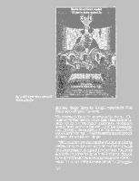
Figure 8-6. Advertisement for a 3-D
(stereoscopic) film
would come of age in this sense:
The stereoscopic film is the tomorrow of the cinema ... [because]
art “species” that survive are those whose structure accords
with the innermost organic tendencies and requirements
of both the creator and the spectator ... [and] the three-dimensional
principal in the stereoscopic film fully and consecutively
answers some inner urge ... it satisfies some inborn requirement
of human nature. (1970, pp. 129–30)
We have noted three characteristics of illusion-producing
devices that drive them out of the realm of art and evoke
in us the impression that a gimmick is involved. First, some
gimmicks are vulnerable to technical disclosure. Second,
some gimmicks demand constrained conditions of observation.
Third, gimmicks are accompanied by the suggestion
The peephole bears the latter two stamps of the gimmick:
It requires the spectator to immobilize his or her eye
at the peephole; and it is presented as a means of obtaining
a powerful illusion of depth and thus focuses the observers'
attention on the illusion rather than any other, more valuable
aspects of the work.
The second reason Brunelleschi and his contemporaries
had for abandoning the peephole method is more subtle
than the avoidance of gimmicks and perhaps more important.
After all, one should not exaggerate the difficulty
of overcoming a public's prejudiced tendency to call a new
technique a gimmick if it is put to varied and interesting
uses. The second reason is related to the robustness of
perspective. We have seen that the scene represented in a
painting does not appear to undergo distortions when a
spectator moves in front of it, and that the robustness of
perspective implies that the spectator is able to infer the
location of the center of projection of a perspective picture,
to compensate for the projective distortion that the picture
plane undergoes during the spectator's movement, and to
see the picture as it would be seen from the center of
projection. I have also hinted that the spectator experiences
his or her body to be at this inferred center of projection
and that this experience was intuitively discovered by the
Renaissance painters and exploited in pictures that were
designed so that they would never be seen from the center
of projection (a phenomenon discussed in Chapter 6).
To convey how compellingly a painting puts you at its
center of projection, we will analyze one of Mantegna's
frescoes in the Ovetari Chapel. This painting produces this
experience so effectively that it induced an eminent art
historian into error. Frederick Hartt, in his History of Italian
Renaissance Art, writes:
The lowest register of frescoes of the life of St. James begins just
above the eye level of a person of average height for the Renaissance.
The last two scenes, therefore, are planned as if Mantegna
had a stage in front of him filled with models of human
beings seeming to move downward as they recede from the eye.
Thus only the feet of the figures nearest to the picture plane
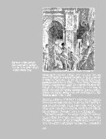
Figure 8-7. Andrea Mantegna,
Saint James Led to Execution
(1454–7). Fresco. Ovetari Chapel,
Eremitani Church, Padua.
are cut off by the lower edge of the fresco. In the St. James Led
to Execution [Figure 8-7], we look up at the nearby buildings
portrayed with sharply real effect. ... The coffering of the arched
gateway is also seen from below. But a moment's reflection will
disclose that if Mantegna had been consistent in his view, he
would have made the verticals converge as they rise, because
they are orthogonals leading to another vanishing point, high
above the scene. (1969, p. 350)
So strongly does Hartt feel that he is looking at the painting
from a low vantage point that he feels that his line of sight
must be tilted upward, which is equivalent to tilting the
image plane away from the vertical, which in turn implies
the convergence of vertical lines at a vanishing point.
But he is mistaken. A low center of projection does not
imply a tilted line of sight and image plane. To analyze
the experience provided by Mantegna's fresco, let us briefly
review the dilemma of perspective. Recall that some artists
the center of projection (as Donatello did in The Feast of
Herod, Figure 6-1). We have argued that, if the scene contains
rectangular objects, the viewer will experience the
picture as if it were viewed from the center of projection.
Mantegna placed the center of projection at eye level but
designed the picture so that the single vanishing point would
be below the bottom of the frame. In this way, a viewer
who looked at the painting would feel that the implicit
vantage point (the perceived center of projection) is at the
same height as the true vantage point. At the same time, if
a viewer's gaze was directed at right angles to the picture
plane along the implicit principal ray, the viewer would
be focusing on a point below the frame. To further emphasize
the strangeness of this projection, observe that such a picture
is hard to create by optical means: Suppose you wanted to
simulate the picture-taking process underlying this fresco
using a standard camera. The only thing you could do
would be to stage the scene on a platform somewhat above
eye level and to hold the camera at eye level, pointing
neither up nor down, “looking” at a point below the top
of the platform. Because the developed picture would cover
a vertical field more than double the field covered by Mantegna's,
it would then be necessary to crop it just above
the horizon line (see Figure 8-8).[9]
In other words, Mantegna has created a discrepancy much
more subtle than Donatello's enforced disjunction of the
viewer's vantage point from the center of projection: He
allows the viewer to stand at the center of projection and
then implies inconsistent directions for the observer's line
of sight and for the principal ray of the central projection.
The viewer's unconscious inference implies a principal ray
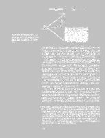
Figure 8-8. Explanation of central
projection used in Mantegna's Saint
James Led to Execution (Figure
8-7)
is looking at a wall), but the frame of the picture implies
a visual axis at an oblique angle to the image plane (in
which case the viewer is not looking at the horizon).
In Chapter 4, we discussed Leonardo's deep concern for
the correspondence between the center of projection and
the spectator's vantage point. To disregard this correspondence
— he wrote — is tantamount to producing a perspective
that would “look wrong, with every false relation
and disagreement of proportion that can be imagined in a
wretched work.” And yet, as Leo Steinberg showed in a
brilliant reexamination of the substance and form of Leonardo's
Last Supper, Leonardo most blatantly — and successfully
— violated his own rules.[10]
We first look at Pedretti's analysis of the perspective of
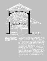
the fresco (see Figures 8-9 and 8-10). The perspective construction
of the fresco is not perfect: Different sets of orthogonals
converge at different points.[11]
The center of
gravity of the triangle defined by three points is assumed
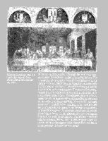
Figure 8-9. Leonardo da Vinci, The
Last Supper (1495–8). Fresco.
Church of Santa Maria delle Grazie,
Milan.
the horizon line is drawn, labeled L. O. in Figure 8-10. The
intersection of the present floor of the refectory with the
picture plane is indicated by a line labeled pavimento attuale,
and the level of the floor at Leonardo's time is marked by
a line labeled pavimento precedente. The center of projection
(which is at the height of the horizon) is 4.6 m (or 15 ft.
1 in.) above today's floor. The distance point (at the intersection
of the diagonals of the ceiling coffering, assumed
to be made up of square coffers), labeled P. D., is 10.075
m (or 33 ft. 1 in.) from the vanishing point; therefore, the
center of projection is 10.075 m, or between a quarter and
a third of the length of the refectory away from the picture
plane (Figure 8-11). At that distance, the picture's angular
dimensions are 46 by 26 degrees. (To indicate a scale of
angular measure, Pedretti has included a circle whose diameter
subtends 60 degrees when viewed from the center
of projection; it is labeled cerchio visivo.)
From Pedretti's analysis (which is very much in line with
Steinberg's), we learn that, as Frederick Hartt put it, “there
is no place in the refectory of Santa Maria delle Grazie
where the spectator can stand to make the picture 'come
right'” (1969, p. 401). The center of projection is so high
that only a person about three times as tall as the average
could see the picture from the center of projection.
But, from what I have explained in earlier chapters, a
high center of projection should pose no problem: The
robustness of perspective should take care of correcting for
distortions caused by viewing the fresco from a vantage
point that does not coincide with the center of projection.
The Last Supper does, however, pose a problem, for Leonardo
was not content to leave robust enough alone. He
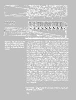
Figure 8-11. Reconstructed plan and
longitudinal elevation of room represented
in Leonardo's Last Supper,
in relation to plan and elevation of
refectory
he created a space that suggests architectural continuity
with the refectory, an illusionistic architecture along the
lines we have discussed in Chapter 3. Unfortunately, no
one has taken a photograph of the fresco from the center
of projection. To get a feel for how well the fresco meshes
with the line defined by the feet of the liernes that define
the ten bays, consider the photograph shown in Figure 812,
taken from approximately the height of the center of
projection, somewhat too far to the left of the refectory,
and about 25 m (roughly 82 ft.) too far.[12] The tops of the
tapestries represented on the right wall of the room in
which the Last Supper is taking place cry out to be aligned
with the feet of the liernes on the side wall of the refectory.
In Figure 8-13, which is a simulation of the view of the
fresco from the height of the center of projection, and
looking straight on at the vanishing point, but still somewhat
too far away, the alignment of the feet of the liernes
in the refectory with the tops of the tapestries in the fresco
is quite close.
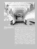
Figure 8-12. Leonardo's Last Supper.
Photograph taken from a height
of 4.5 m.
Assuming that a viewer standing at the center of projection
sees the virtual space in which the Last Supper takes
place aligned with the real space of the refectory, we have
an interesting problem. To judge from his writings, Leonardo
seems at one point to have not believed in the robustness
of perspective. As we saw in Chapter 4, he
recommended that paintings be viewed from the center of
projection or that the center of projection be “at least twenty
times as far off as the greatest width or height of the objects
represented” (Leonardo da Vinci, 1970, §544, pp. 325–6).
In his Last Supper, he created a painting that no one, under
normal circumstances, would see from the center of projection.
Had he created a virtual space that did not suggest
itself as an extension of the real space of the refectory, the
robustness of perspective would have ensured that no distortions
would be perceptible. But in addition to defining
an elevated vantage point, he designed the architectural
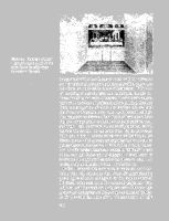
Figure 8-13. Steinberg's cardboard
model of the refectory with the line
defined by the feet of the liernes
drawn on the side walls
in a way that could produce its illusionistic effect only when
seen from the inaccessible center of projection. If this line
of reasoning is correct, then this masterpiece further enriches
the dialectical tension between the observer's station
point and the center of projection of the painting. Because
there is a suggestion of continuity between the real and
the virtual architecture (very much as in Pozzo's ceiling),
the inconsistency between them “pushes” you away from
the low vantage point to which your body confines you,
and “pulls” you up toward the center of projection, which
resolves the tension. At the same time, the inconsistency
helps you adopt a noncorrective way of looking at the
fresco, one in which the you can pay attention to the rather
jarring discrepancies between the virtual and real architecture.
In this respect, Leonardo created a “difficult” work
of art, one that forces you to engage in mental work to
overcome the obstacles Leonardo has placed in your way
to achieving an illusion of depth via perspective.
In fact, Leonardo did even more to make the work difficult.
You will remember that Pedretti's measurements
give a figure of 46 by 26 degrees for the angular extent of
the fresco when seen from the center of projection. You
will also recall that rectangular objects seen under an angle
greater than 37 degrees are likely to appear distorted (Chapter
6). Nevertheless, none of the representations of right
And yet something is wrong. The shape of the virtual room
represented in the fresco does not appear to be rectangular,
but trapezoidal. To quote Steinberg:
To one who can read a simple perspective, the suggestion that
Leonardo's space is meant to be experienced as if on a trapezoidal
plan comes as an affront — as though one didn't know how to
read. The literate eye wants to interpret the waning width of
the room as an illusion — not what is “really there.” [We omit
here an interesting footnote by Steinberg.] If the side walls seem
bent on closing in behind Christ, our educated intelligence knows
that such mere appearance must be discounted. (1973, p. 376)
Steinberg claims that this impression is caused by the failure
of certain key features in the fresco (the upper edges
of the hanging tapestries) to align with corresponding features
in the refectory when the fresco is seen by a person
standing on its floor. But even when the fresco is reproduced
so that the walls of the refectory are invisible (Figure
8-9), that is, under conditions that allow the robustness of
perspective to come into play, the impression of accelerated
convergence remains. I believe that the impression is caused
by Leonardo's unusual cropping of the upper part of the
picture. If the ceiling had been allowed to extend to its
intersection with the picture plane, I believe there would
have been no tendency to perceive the plan of the virtual
room as being trapezoidal. In the absence of such an uncropped
picture, we can make a similar point by cropping
the picture into conformity with more standard representations.
In Figure 8-14, I have cropped the sides of the
fresco. As a result, the impression of looking into a trapezoidal
space is greatly diminished. The reason for the
change is that, although none of the intersections that are
part of the perspective construction violate Perkins's laws,
the points at which the upper boundary of the picture
intersects the ceiling–wall orthogonal is (to use the terminology
introduced in Figure 6-17) a tee, and therefore
cannot represent a rectangular corner. If, as we argued in
Chapter 6, the presence of such local features affects our
perception even though their component lines are not intended
to be interpreted as belonging to one trihedral angle,
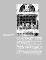
Figure 8-14. Cropped version of
Leonardo's Last Supper
being in the same plane as the ceiling. Indeed, if one crops
the bottom of the fresco, as in Figure 8-15, there is little
to suggest that the light regions on either side of the coffered
ceiling represent walls.
Was Leonardo aware of all these effects when he designed
this painting? We shall never be certain. There is
no question, as his notebook entry (quoted in Chapter 2)
shows, that he was acutely aware of the problem of distortions
caused by moving the eye away from the center
of projection, and so it is extremely unlikely that any feature
that we have discovered in this work escaped Leonardo's
notice. Steinberg asked himself this question, and
his answer serves us perfectly: “It is methodologically unsound
Figure 8-15. Cropped version of
Leonardo's Last Supper, showing
top part only
of his inventions” (1973, p. 369). There is one passage in
Leonardo's late writings (Atlantic Codex, folio 111, v–b
in the Ambrosian Library of Milan, written at least twenty
years after he painted The Last Supper), that suggests that
Leonardo may have understood the way in which perspective
can induce an experience of elevation in the
spectator:
And the figure painted when seen below from above will always
appear as though seen below from above, although the eye of the
beholder may be lower than the picture itself. (Emphasis supplied.
Quoted by Pedretti, 1978, p. 39, footnote 1)
Let us recapitulate the lengthy argument of this chapter.
We started with two general answers to the question why
the Brunelleschi peephole was abandoned, namely, that
peepholes are gimmicky and that, because of the robustness
of perspective, peepholes are not necessary to achieve a
compelling illusion of depth. In the latter part of this chapter,
we discussed two masterpieces in which perspective
was exploited to achieve effects that could not be achieved
by any other means. Mantegna used perspective to produce
a discrepancy between the direction of the spectator's gaze
(upward) and the direction implicit in the orientation of
the picture plane (horizontal). The result is a vibrantly tense
work full of foreboding. Leonardo used perspective to elevate
the viewer to an extraordinarily high center of projection,
thus achieving a feeling of spiritual elevation. At
the same time, the odd cropping of the top of the picture

the Last Supper is taking place. As a result, there is an
indefiniteness, an ambiguity, about the place, most befitting
to the locale of an event so critical to the spiritual life
of the church.
Martin Kemp (personal communication, 1982) has pointed out that this
diagram is somewhat misleading. He writes: “The worst of
the innacuracies
is that the pavement patterns were not orientated as shown.
This makes quite different sense of the perspective. The sides of the
Piazza are not aligned at right angles as shown.”
It has been suggested that Brunelleschi painted the first panel on a mirror
(leaving the upper part of the panel unpainted to reflect the sky and the
moving clouds) and that large mirrors were hard to come by in the
fifteenth century (Krautheimer, 1974).
“Droodle” is a riddle-like neologism coined by Roger Price that combines
the words “doodle” and “riddle.”
Walter Benjamin, “L'Oeuvre d'art à l'époque de sa reproduction méchanisée,”
Zeitschrift für Sozialforschung, 1936, vol. 1, p. 45. [Hauser's
footnote.]
Even the use of so minimal a technological tool as a straight edge to
produce straight lines in a painting is sometimes considered questionable.
Could it be that the series of works by Albers called Despite Straight
Lines is an ellipsis of the statement, “This is art, despite straight lines”?
This sort of “cropped perspective” is not unique: Vittore Carpaccio's
Arrival of the Ambassadors of Britain at the Court of Brittany (ca. 1495) has
its vanishing point to the left of the painting, and so the viewer feels
that he or she is standing to the left of the Alberti window through
which the scene is visible and is gazing toward that invisible vanishing
point outside the painting. Carpaccio's painting is less disorienting than
Mantegna's, possibly because our normal horizontal field of view is 37
degrees wide, whereas our normal vertical field of view is only 28
degrees high. See Chapter 7.
The remainder of this chapter is heavily influenced by Steinberg (1973,
Chapter IV). One of the most fascinating aspects of this monograph is
Steinberg's study of replicas and adaptations of Leonardo's masterpiece
by other painters. He makes an extremely strong case for presuming
that whenever a replica or adaptation deviates from its model, the feature
of the model that was not carried over is worth examining closely.
| 8 Why was the Brunelleschi peephole
abandoned? The psychology of perspective and Renaissance art | ||