| | ||

Appendix III
Comparative Analysis of Fools CD, I, and EF
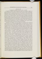
In general, same-face fonts frequently require an extensive analysis of every variant sort. The relative lack of variants and the stylistic uniformity of Y-fonts forces the comparative analysis of two Y-fonts to focus upon subtle differentiae such as the proportions of new/old letters in various sorts, and anomalous and foul-case letters. The opposite is true of S-fonts. Letters from most of the 54 variant punches and 16 miscastings (excluding misjustified low-rider capitals: b2, h3, n3,4 t2, D2, E3, F2, fl2, ff1b, ff2b, ſh2,3, ſi2, ſſ2, ſt2) frequently appear together in normal S-fonts, making necessary an analysis of all composite groups in order eventually to isolate several discriminants that appear in only one of the two texts being compared. The S-face components of White-M and Stafford-EF are easier to distinguish than normal S-fonts, since the EF-face lacks several S-face letters (see list below).
In general, the lengths of the texts affect the certainty of the results. In shared sections of 4 or more quarto gatherings, the inference that a variant is absent from one font is fairly reliable. However, in short sections of one or two gatherings, this inference must be considered tentative, especially in low-frequency sorts (see later discussion of random recurrence patterns), until verified in other texts (White-M, Witts New Dyall STC22426 [1604], d'Olive EF; Stafford-EF, Vertues Due STC20169 [1603], Genealogy STC12872 [1604], Articles of Agreement STC18455 [1607]). For example, the EF-face 'z' (width: 1.25mm) appears a few times in Whore (E2:32, F4v:10) and Gen (p. 9:27) along with Y-face 'z' (width: 1.45mm) (Whore, E2v:22, E3:6,22,23; Gen, p. 14:35) and S-face z1. Sort-pressure is quite high in Whore (compositorial preference for "cozen", "coz" forms), but very low in Fools (EF total: 6), a possible reason for the exclusive appearance of z1 in Fools (E1:33, E1v:2, F2v:3). The EF-face and Y-face 'z' could nonetheless still reside in the cases. In instances such as the exclusive moderate-level g1 in CD, I, (about 17/gathering) and low-density g2 in EF (about 6/gathering), a consistent frequency distribution vs sort-pressure in two gatherings is a fairly reliable indication of the strong probability that a variant is absent (i.e., S-g1 vs Y-g, 17/147, 13/142, no S-g2). The low-density of ligature samples in short texts such as Fools EF requires the examination of every ligature (excepting the exclusive 'ſh' variants) to isolate and classify the S-face ligatures, but even then, the sample is minimal so that the results must be considered tentative until confirmed in other texts. Furthermore, the overall condition of letters in a sort can cause difficulty. Moderate-level (CD, I, 15/gathering) S-face k1,3 can be confused with unclear samples of replenished EF-face k1,2 (EF-k1: C4v:11, D1:19 "spark"; E2:17, E2v:35, E3:2, E4v:21; oblique junction EF-k2: D1:17 "like"); only one anomalous sample (F4:28 "like") of S-k1 in EF emerged after examining all such 'k'. Similarly, an EF-b1 (F2v:30 "tables") with a heavily-inked bowl frequently looks like S-b1 (a single anomalous S-b1 occurs at F2: 29). Finally, White-M's consistent low-riding capitals (A B C F G H K L M N P R S V Y) differentiate it from Stafford-EF's correctly justified capitals (except

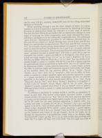
While searching through a text for clean samples of letters in a given typeface, it is wise to maintain a separate composite for sketching and noting locations of alternate-face letters for reference at a later stage of analysis. The fact that both White-M and Stafford-EF are mixed fonts emerges in early stages of analysing the S-face components; each yields alternate-face lower-case letters and ligatures in the stylistically recognisable sorts. The additional "gross features" discriminants provided by the different alternate-faces (Y-face and EF-face subset) is a mixed blessing since several Y-face and EF-face letters are unresolvable in reproductions. The Y-face and EF-face variants in 'b d', for example, require precise measurements in originals to detect differences in structure and size; the EF-face b1, d1,2, and 'h p t' are easily confused with their S-face counterparts. The ovals group illustrates the problem of "too many" potential variants in mixed fonts. The wide (1.2mm) EF-p2 and the expanded S-p1 (width: 1.3mm) are difficult to distinguish, even when juxtaposed (see single sample of S-p1, F1v:26 "ap /p/ oynt"). Similarly, the Y-p in EF (F4v:19) differs from the EF-p2 (E1:2 "su /p/ pose", E4v:33) chiefly in descender-length (1.15mm vs 1.25mm). The EF-d1,2 and S-d1,2 appear together in approximately equal proportions in Stafford-EF. The two d1 exhibit similar dimensions (width: 1.15mm, junction separation: 1.15mm, height: 3.0mm) but differ in junction angles and formation, top-serif, bowl-stroke, and height of the ascender above the top junction (EF-d1: E1:30 "doubt", E4v:30 "doubt", E1:5 "doe"; S-d1: E1:13 "poynted"). The two d2 differ in bowl-width (1.225mm vs 1.2mm), junction angles and junction separation (1.3mm vs 1.15mm), and EF-d2 is a thicker letter; nonetheless, the two are indistinguishable to the naked eye when heavily-inked (EF-d2: E1:31 "day", E3:29 "diuorced", E4v:30 "day"; S-d2: E2v:5 "dycing"). Similarly, a wrong-face 'd' in CD, I (C1:18 "related", C2:26 "dayes", D3v:18 "In /d/ eede", D4v:14 "darkest") is easily confused with Y-face 'd' (C1:29 "feared", C1v:12 "good"), differing in bowl width (1.25mm vs 1.2mm) and junction separation (1.45mm vs 1.35mm).
In addition to the S-face 'b' variants in CD, I, and EF, an anomalous 'b' occurs in each font. The shorter (2.85-2.9mm), narrower (width: 1.15mm) variant of CD, I (C1:25, C1v:22 "but", D2:12) with wide junction separation (1.45mm) can be confused with lightly-inked samples of the anomalous variant in EF which has the same junction separation, is slightly taller (2.9-3.0mm) and wider (1.175mm) (E1:28, E2:15 "business", E4:11,30), and both appear to be EF-b1, since all three exhibit a slight but noticeable right slant (about 3 deg.). Expanded EF-b2 (width: 1.3mm, junctions: 1.45mm) appears less frequently in CD, I (C2:3,19 "bound") than in EF (E1v:10, E3v:19) and can be confused with Y-face 'b' (C1:36 "breath", C1v:6 "be"[2nd], 17), although the top-junction is perpendicular rather than at an oblique angle. Unstressed EF-y (apex: 35 deg., E1:11,13,14) with usually non-printing serifs looks like Y-y2 (apex: 38 deg.) with worn serifs. The low-angle top-stroke of

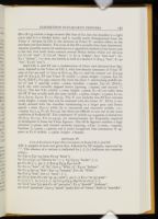
Both CD, I, and EF use a combination of S-face and alternate-face ligatures, limited to the Y-face in CD, I, with low-density remnants of Y-face 'ff' (one at C2v:30) and 'ct' (two at D1v:24, D3:11), and the unique 'oo' (C3:34) and 'th' (C2:4,7). EF uses Y-face 'ſl' (width: 1.15mm, height: 2.75mm, F3v:16, F4:28, [Eld-Y1, G1:33]), miscast ſſi2 with the short 'i' and leaning middle letter ('ſ' and 'i' spacing, x-line: 1.0mm, baseline: 1.05mm, E3v:18, [Eld-Y1, G3:8; ſſi1 with correctly aligned letters [spacing, 1.05mm] and normal 'i', G3:1]). The few Y-fi1 (width: 1.1mm, height: 2.9mm, E1:16) are taller than the EF 'f1' but usually look the same (width: 1.05mm, height: 2.75mm, E1:20, E2:4, E3:27, E4:22, F1:11, F3v:3). The 'ſi' sort includes two EF-face variants (same height: 2.7mm) that can be confused with the S-face 'ſi". EF-ſi1 is vertically stressed with the shoulder terminating in a larger pear and letters spaced 1.1mm (F4v:1) while ſi2 is unstressed and narrower (width: 1.0.-1.05mm, E4:7, 9, F1:28, F2:2,3); the three are difficult to sort out in the worn condition of Stafford-EF. The condensed 'ſſ' (width 0.9-0.95mm) is distinctive (E2:8,15, E1v:32, F1v:21,23,24), yet measurements are frequently required to distinguish it from the Y-face ligature. The EF-ſh ligature exhibits a high junction (1.5mm) and slanted ascender (spacing, x-line: [1.2mm, 1.05mm], baseline: [1.15mm, 1.15mm]) and is easily recognised. One anomalous 'fl' appears at E1:6 (width: 1.15mm, height: 2.85mm).
| | ||