| | ||
Font Analysis as a Bibliographical
Method: The Elizabethan Play-Quarto Printers and
Compositors
by
Adrian Weiss
[*]
In "Edward Allde as a Typical Trade Printer", R. B. McKerrow distinguished two classes of early printers, the printer-publishers who published books on their own as well as printing for others, and trade printers who printed almost exclusively for publishers and produced "a very large proportion of the play-quartos, the smaller volumes of verse, the prose-pamphlets . . . many of whom, it may be said, give a great deal of trouble by their casualness in the matter of imprints and dates." Perhaps McKerrow inspired the few subsequent studies of printers by commenting that "a comparatively small amount of work devoted to such minor people as these would help us very greatly in identifying the house of origin of many books which bear no printer's name"[1]; however, the inspiration was short lived as bibliographers turned increasingly to studies of specific texts based upon now-familiar methods of analysis. Nearly a half-century later, Peter Blayney reiterated the need for
In general, printer identifications in both categories of books have relied upon the recognition of ornaments and decorated upper-case initials, a form of evidence with limited reliability and value because of the common practice of lending among printers and because of the large number of books in which neither appear. A practical limitation in shorter shared books, particularly play-quartos, arises from the fact that printer's devices usually are restricted to the preliminaries and first letter of a text; later shared sections simply continue setting the text without an opportunity to insert ornamental stock.[3] In contrast, evidence from a printer's type fonts exhibits no such limitations and, together with identifiable types, can be considered de facto proof of his identity.[4] Hence, such evidence can be used to identify a printer's work in assigned and shared books, and distinguish sections of shared books or books printed by a printer with two or more fonts. Furthermore, it can provide a more accurate focus for compositorial and presswork analysis since, if two fonts appear in a book, at least two sets of type-cases were used. In turn, this fact implies the possibility of two compositors setting simultaneously or alternately and the consequent need for casting-off copy, factors that are considered crucial in influencing accuracy in the textual transmission process. Unfortunately, the subject of font analysis and its uses have received very little attention, despite its potential importance in bibliographical research.[5] It seems that so fundamental a physical fact such as the type fonts used in a book could hardly be overlooked by scholars habituated to working with vast amounts of minute details. But that, in fact, has happened in many cases where the presence of two or more fonts in a book has been overlooked and bibliographical analysis has proceeded as if the book were printed by a single printer in one font.[6] It seems fair to say that the discipline as a whole has suffered from the lack of a practical method of analysing fonts for the purposes of distinguishing sections of shared books and of identifying printers. One hopes that this present introduction to a method of font analysis and its use in bibliographical study will enable textual scholars to assess more accurately the impact of various aspects of the printing process upon early texts. Font analysis, although simple in nature, requires attention to the enormous amount of detail that characterizes a particular font. My discussion of font differentiae perhaps draws attention to more detail than is necessary, but I think that too much is the best option in this case despite the potential tedium for readers and I apologize in advance. Likewise, I believe that this introduction would be incomplete without an explanation of the logic that underlies
I
On the simplest level, font analysis distinguishes between two fonts in dissimilar faces with no greater difficulty than obtains, by analogy, in recognizing that a modern face such as Courier is different from Prestige. In general, typefaces can be distinguished upon the basis of differences in size, either apparent or real, and stylistic differences in the design of the letters. The width and height of the body of the types respectively determine the horizontal spacing between letters and the vertical spacing between lines, although measurements of the latter using the standard method are sometimes less than precise because of paper shrinkage across four centuries.[7] Width is generally classified in relative terms such as "condensed" or "narrow", "medium", "wide", and "expanded". Most letters (or sorts) of the S-face are set on a wider body than in the Y-face, especially in regard to 'a r' and the thin letters 'i j l t'. The effect of this body-size on overall appearance can be seen by comparing the spacing in combinations such as "are", "and", and "illusion". The type seems spread out in the S-face leaving more "white space" within words in a line of set type. The use of wide and expanded 'k x z', and a bold left-stem on the 'v y' adds to this effect.[8] In contrast, the thin letters of the Y-face are set on a narrower body, and, along with the medium 'k v x y z', produce an appearance of more densely packed type, with quite prominent white spaces between words, but little within words.
The general design of the S-face (see footnote 12 for the naming of these fonts as S and Y) further contributes to its squarish, open appearance. The vertical elements of the letters are thicker than the horizontal curved portions so that the former print more boldly than the latter. In technical terms, the "weight" or relative density of blackness of the parts of a letter establishes the "contrast" between thick and thin strokes, and the orientation of thick to thin defines the "stress": thus the S-face exhibits "vertical stress" or vertical "shading". The stress is not necessarily uniform in all letters, but dictated by shape. The diagonal letters (A M N S V W X Y Z v w x y z) exhibit oblique stress with thin vertical or right-leaning and bold left-leaning (relative to the baseline) strokes. In the lower-case letters, the bold inking of shoulders (a h m n) and bowls (b d p q) at the x-line makes the typeface appear higher and wider than it actually is. On the other hand, the Y-face is relatively unstressed so that all portions of a letter print with nearly equal boldness, except for the light shading that characterizes the shoulders of the tall letters, ligatures and the curved portions of several lower-case letters. The Y-face's lighter weight and contrast is obvious to the naked eye even when heavily inked. Viewed at high magnification (30X) in original books, the metal elements that form Y-face letters (i.e., the surface of the type which makes contact with the paper) seem rounded on the edges, whereas S-face letters exhibit elements with usually sharp squared edges.
An analysis of the specific differences in the structure of the letters in the two faces can clarify the relation between the stylistic design of specific letters and the overall appearance of a typeface. Font analysis is facilitated by the fact that letters can be classified in groups on the basis of shape. A major difference in design can be seen in the group consisting of the 'f' and the long-(or tall-) 'ſ' and their associated ligatures. In the S-face, the uniformly thin shoulder stroke is a rather flat arc which abruptly curves just below the h-line into the bold vertical stem. It terminates at the right with a quite small "pear". The shoulder frequently appears shaded because of the accumulation of ink along its bottom edge and around the pear; lightly inked letters and the shoulders of some ligatures reveal the actual weight of the shoulder. In many of these letters, damage has nudged the right half of the shoulder upward so that it terminates horizontally. The shoulders of the 'ſſ ff ffi' ligatures are similarly formed. Both shoulders are of equal height and the left joins the right slightly below the h-line, rather than being vertically staggered as in the Y-face. The 'ſh ſl ſt' ligatures clarify this design characteristic. A bit of the ascender of the 'h' and the 'l' in the former extend above the shoulder junction, while the 't' of the 'ſt' ligature reaches almost to the h-line before joining the shoulder. Damage frequently flattens the shoulders into a single continuous arc and nudges the right termination upward.
In contrast, the tall letters of the Y-face are shaded. The shoulder of the 'f' and tall-'ſ' commences with a graceful curve just above the cross at the x-line and thins as the stroke moves through a diagonal to the horizontal, then broadens in the downward stroke that completes the shoulder. It terminates noticeably below the h-line with a large pear. The letters in the ligatures are vertically staggered: the left 'ſ' or 'f' is a bit shorter than the right letter. The shading of the downward stroke that completes the shoulder is obvious in the ſh, ſl and ſt ligatures, where the 'h l t' are shortened to accommodate the low junction with the shoulder. The junction commonly gathers ink and accentuates the shaded structure of the shoulder. The difference between the two faces in regard to shoulder structure is quite obvious at high magnification where the actual impression of the face elements can be detected without the obfuscation caused by the inking-in of the curves and joints. The overall effect of the shoulder structure in the ligatures and tall 'ſ f' is that the horizontal space between lines in the S-face is uncluttered by the bold inking produced by the shaded, staggered shoulders that characterise the Y-face. Finally, the 'ct' ligature provides an easily detected discriminant. The "open" 'ct' ligature is typical of the S-face: the body of the 'c' is slanted left and seems improperly formed since neither end of the 'c' "closes up" with the 't' and a considerable amount of white space obtains between the two letters. In contrast, the Y-face uses an elegantly formed 'ct' ligature in which the body of the 'c' is fully formed and closes up with the cross and base of the 't'; the letters are joined by a graceful link whose orientation and size balances the 'c'.
The two faces are further differentiated in the lower-case by the formation of the shoulders, bowls and top-serifs. In the S-face, the counter, or enclosed white space, in the round (or "oval" to be precise) letters (o d q)
Lower-case letters are unstressed in the Y-face. The 'o' is formed by a round stroke of uniform thickness. The bowls of the 'b d p q' exhibit barely noticeable vertical stress because the portions of the bowl which join the vertical stroke are thinned slightly at 12 and 6 o'clock. In contrast to the distinct oblique junction angle of the S-face, Y-face bowl and shoulder junctions are nearly right angles at the x-line. In the 'b', for example, the round line to the left of the axis is bent upward toward the horizontal to join the ascender almost on the x-line at half the height of the ascender. At the bottom of the letter, the round line of the bowl touches the baseline and curves upward slightly to join with the ascender, which is thus displaced above the baseline. Evenly proportioned round letters result from this design concept, which is inverted in the 'p q': the baseline junction is nearly horizontal, while the top junction forms a slight oblique angle. The shoulder stroke of the
The two faces can be further differentiated by lower-case diagonal letters (k v w x y z) and the 'g'. The S-face diagonal letters are commonly of expanded width which is accentuated by pronounced serifs, the right-angle crossing of the diagonals in the 'x', and the long arms of the 'z'. Pronounced serifs and heavy oblique stress of the left stem creates an impression of extra width in the 'y v', although they are of medium width. The "squat" appearance of the 'k' results from the low junction of the link of the arm-leg at ¼-height on the ascender, the right angle enclosed by the arm-leg in the common variants, and the pronounced arm and leg serifs. In contrast, medium-width diagonal letters are found in the Y-face in the 'v w x y' sorts, although a condensed 'y' variant is common. The left stem of the 'y v' exhibit minimal stress and a smaller enclosed angle than in the S-face. Several 'k' variants occur, but the junction of the arm-leg link at about ⅓-height on the ascender is always higher than in the S-face 'k' and produces a more balanced proportioning. Finally, the loop of the 'g' is noticeably larger than the bowl in the S-face; the loop-stroke begins at the base line, while the link pushes the bowl to the x-line. In Eld's version of the S-face, the left edge of both bowl and loop are vertically aligned, creating a left-slant; in another common variant, the bowl and loop are centered for an erect appearance. The bowl of the 'g' in the Y-face, in contrast, is approximately the same width as the loop, and the letter is vertically aligned.
Stylistic differences are generally more obvious in the capitals, particularly with respect to several awkward, poorly proportioned letters in the S-face which contrast with the more balanced symmetry of the Y-face capitals. The gross, excessively wide and awkward 'M' of the S-face is characterised by a single left top-serif and slanted legs. The Y-face uses a symmetrical 'M' with double shoulder serifs that are integral to the 'V' stroke that connects the erect legs. The bowl stroke of round S-face capitals such as 'P B D R' begins considerably to the left of the ascender on the characteristic oblique angle and complements the accentuated shoulder- and base-serifs of other capitals, while in the Y-face, the bowl stroke is horizontal and barely overextends the ascender. The S-face uses an obtrusively large 'P' whose bowl stroke terminates far below the x-line and does not close up with the ascender; the letter clashes aesthetically with the 'B' and especially the 'R', with its aenemic bowl that terminates at the x-line and its stressed tail that extends awkwardly beyond the bowl. In the Y-face, the 'B P R' are of similar proportions. The tall rectangular 'E F' are noticeably narrow for the S-face, particularly in regard
A few hours examination of the two faces in originals or high quality facsimiles of any of the books noted in later discussion will familiarize the reader with the essentials of typeface design and structure. The considerable differences between the S-face and the Y-face render them easily distinguishable even to the novice after such an exercise. It seems a fortunate coincidence that in many cases of shared printing, versions of the two faces alternate in sections of a book. In such cases, a comparative analysis need only progress through a few groups of letters before the "gross features" illustrated above distinguish the different fonts, providing sufficient cause to suggest that further bibliographical analysis proceed upon the assumption that two printers were involved. However, that is merely the beginning step in the application of font analysis. A book printed in more than two fonts almost inevitably requires distinguishing two same-face fonts, followed by an attempt at identifying the fonts in other books for the purpose of sorting out the printers. That process is facilitated by a comprehensive font composite that graphically records the distinguishing traits of a given font.[9]
The identification process itself requires that the font in the target book be compared to extremely similar, same-face fonts in other books. Similarly, in many instances of sharing that involved more than two printers, two or more versions of the same typeface are encountered in different sections of a book. In both situations, the bibliographer then is faced with a more complex task of analysis, since distinguishing between fonts in the same face is a much more difficult proposition because the general stylistic traits are identical except for infrequent variants. Assuming that the two same-face fonts and their respective sections of the book have been successfully distinguished, an attempt to identify the printers is further complicated by the fact that, quite understandably, the preliminary candidates will be selected primarily because they used the typeface in their known work. Hence, the general kind of stylistic analysis described above must be supplemented by a more refined and detailed focus upon potential discriminants within the context of nearly identical fonts. As a general rule, discriminants can be detected in this situation
II
The refined evidence required for distinguishing same-face fonts can be divided into internal and external categories depending on whether a potential discriminant is imported from a dissimilar face, or whether it is a variation within the stylistic parameters of the face. In both categories, a discriminant is two-dimensional, and consists of the qualitative stylistic difference combined with the quantitative proportion of differing letters in a sort. External discriminants are easily detected because of the clash in the stylistic features noted in earlier discussion, and are imported into a font through processes of fouling, replenishment, and large-scale mixing of two fonts. The proportion of wrong-face letters in a sort usually indicates which process is involved: a high proportion of wrong-face letters in a given sort suggests a high probability of replenishment, and conversely, a small, or better yet, almost infinitesimal proportion suggests that fouling is responsible. Mixing introduces significant proportions of wrong-face or stylistically different letters into most sorts of a font. It is impossible to state fixed proportions or rules that apply to all fonts.
The distinction between replenishment and fouling is based upon the assumption that replenishment is responsible for the presence of abnormal (wrong-face or miscast) letters in significant quantities in a population which retains a varying proportion of normal letters in the depleted sorts. The converse is taken to indicate fouling since the overwhelming majority of letters in a sort consists of normal letters. The distinction can have serious practical implications: the former come from outside the shop and merely provide an additional discriminant in a single font; however, the latter are from within the shop, and indicate that the font belongs to a printer with two or more fonts. In turn, this permits the narrowing of the field of candidates to such printers and provides an additional criteria to guide the search for the printer of a section of a shared book. The correct candidate will use two fonts that either could produce or actually do exhibit an appropriate degree of mutual cross-contamination.[10] The replenishment process produced four categories of external wrong-face or miscast capitals, ligatures and lower-case letters. Although many miscast letters are in the correct-face and hence internal discriminants in a technical sense, in most instances they present such a striking contrast to properly formed letters that they warrant classification as external discriminants. As a general rule, potential discriminants must be checked against the same letters in other printers' fonts to verify that they are abnormal for the typeface. The on-going process of piecemeal replenishment usually will have produced quantitative differences in the proportions of replenished abnormal and original letters in same-face fonts.
Wrong-face capitals are the most easily detected external discriminants and typically are produced by replenishment of a Y-font with S-face capitals.
In some instances, proportions such as those noted in the replenishment of Purfoot-Y1 with wrong-face capitals may be deceptive. As a general rule, once the possibility of replenishment because of wrong-face capitals is entertained, the lower-case letters and ligatures must be checked to verify the correct-face and then be confirmed in another book. Nicholas Okes's S-font (1607), for example, was purchased with Guyot capitals, but the lower-case letters and ligatures are S-face except for the medium 'ſſi' and 'ffi' ligatures that somehow slipped in.[13] Similarly, the different proportions caused by fouling as opposed
In the absence of obvious stylistic differences, variations in size provide the primary clue to the presence of wrong-face capitals. The general rule about cross-checking potential wrong-face discriminants against other fonts is especially relevant here, since early pica typefaces exhibit a normal range of variation of height in the capitals and ligatures which could be mistaken as potentially significant.[14] For example, a survey at high magnification of the capitals in Eld-Y1 could lead to the false impression that large-scale replenishment in the capitals produced a varying range in height of about 0.3mm, which, if unique to Eld-Y1, would certainly be a powerful font discriminant ('K' = 2.4mm, 'G' = 2.75mm). A similar but smaller variation in
Miscast capitals and ligatures occur both as original abnormalities in a font and as products of replenishment. Antecedent to their appearance in a font is the history of the set of punches or sets of matrices from which they derived. Due to the nature of the type trade in the 16th century, a somewhat limited source of new type forced a homogeneity among fonts which sometimes levels potential discriminants from miscasting. Thus, a miscast letter is not necessarily unique to a single printer's font, since many printers were probably acquiring type from the same few founders during the period. The most obvious evidence of this consists of the small 'W', which is commonly the only version of the letter found in most pica fonts, and several miscast ligatures which are found in these fonts from the 1550's onward. However, given the number of possible combinations and proportions of normal and miscast letters across the upper- and lower-cases and ligatures, composites of same-face fonts usually reveal significant discriminants. "Miscast" is used here
The most common and useful kind of abnormality consists of the misalignment of a letter in the vertical or horizontal planes so that it either leans or is positioned improperly at the baseline. For example, a strike could be taken with the punch so misaligned vertically that no amount of justifying the strike by filing its long sides could produce a matrix with a correctly
The divergence in same-face fonts caused by acquisition and replenishment from different sources at different times is suggested by the combinations which occur. Eld's low-rider 'G' appears along with low-rider 'B C F K L M P R T', but correctly aligned 'I', in Creede-4 (Antichrist, STC7120, [2]H—M; Monsieur d'Olive STC4983 [1606], A, B(i)). Some of these letters appear in Eld-S, but are in closer alignment with normal letters, suggesting that the two original fonts were purchased from separate foundries, one of which used several misjustified replacement matrices to produce Creede-4. Eld probably replenished from this foundry, but the misjustified matrices were, by chance, more closely aligned to the matrices used by the first founder.
In addition to misalignment in the vertical and horizontal planes, the two letters forming a poorly cut ligature can be improperly oriented with respect to each other. These are especially prevalent in S-fonts, where variants occur in which one letter leans and produces a narrower gap between the letters at the baseline, or one letter is above the baseline. The skewed letters of ligatures make clear the difficulty of cutting a punch with perfectly aligned letters.[21] S-fonts seem to vary in the number of types available in their ligature sorts. Eld-S, Simmes-S, Field-S and Creede-4 almost exclusively set an 'ſſ' or 'ſſi', while Windet-S frequently resorts to alternate settings with combinations of 's', tall-ſ, 'ſi', and 'i'. However, the 'ſſi', 'ſ ſi' and 'ſſl' ligatures occur at low-frequency so that locating one in a text is difficult at times. But the miscast 'ſt' with the leaning 't' is so pervasive in S-fonts that the discriminating factor usually is the proportion between new, bold-printing (ſt2) and older-appearing ligatures (ſt1). In Sejanus, two old letters can be seen at C1:11,12 among a dozen new samples. Damage usually consists of a flattening or distortion of the curve of the shoulder of the 'ſ' and can be seen in the "new" letters at C1:3,30. In contrast, five new letters (LLL, A4v:18,30, B1:4, 10,34) are found among nine damaged in White-M, and the two are about equal in Simmes-S (Mal Q3, C2:7,8). A crisper, deeper impression in the matrix(ces) probably accounts for the difference in weight and distinctness of the two 'ſt', as must be the case with the 'ſſ' ligature. Heavy inking on the inside of the left 'ſ' seems responsible for a bold apparent variant ſſ2 with the left 'f' curving inward at the baseline (White-M, Titus, B4:12). The left shoulder often prints as an oblique straight-line. The consistent inking effect suggests a variant punch although there is no measurable difference. Some erect, normal appearing ſſ1 can be found in most S-fonts (Eld-S, Sej, D1:28; Field-S, Arte of Poesie STC20519 [1589], D4:25,26,35) along with the apparent variant (Sej, C3v:31; Arte, D4:27). A single punch doubtlessly produced all these 'ſſ' ligatures. The 'ſh' appears in S-fonts in a normal version ſh1 along with two common miscastings. In ſh2, the 'ſ' and ascender of the 'h' lean right in varying degrees, while the right stem of the 'h' is erect; the foot of the 'ſ' is above the baseline (0.15mm) while the feet of the 'h' are generally level at the baseline; the body of the type frequently seems to lean right. In ſh3, the
The letters of variant ff1 are correctly aligned (spaced 1.15mm), and the long right shoulder terminates horizontally in a small pear and extends 1.15-1.2mm beyond the right 'f'; the right shoulder of miscut variant ff2 curves into a sharp tip and extends 1.05mm beyond the ascender; the broadly curved left shoulder separates the misaligned letters 1.2-1.25mm (at 0.4mm above the x-line) which then converge to a spacing of 1.1-1.15mm at the baseline; the left 'f' is slightly higher in most. Misjustified matrices contribute low-riding miscastings of both variants (ff1: Danter-M, Coblers Prophesies STC 25781 [1594], C1:7, C4v:32; LLL, B2v:11, C2:27, C3:32. ff2: LLL, B2v:11, C2:27, C3:32) as well as correctly aligned ligatures (ff1: Sej, C3:20, C3v:4; Creede-1, Selimus STC 12310a [1594], D1:32 "off"). ff2: Sej, C1v:22; Simmes-S, R3, B3:35, D2v:31; Creede-2, Selimus, D2:32 'effeminate"). Both variants that appear in the 'fl' sort are miscut with the letters converging toward the baseline. The two are easily distinguished by height (fl1: 2.75-2.85mm, see Sej, B4:24, C4:17. fl2: 2.9-3.05mm, see R3, E3v:35, E4:6; Read-S, Cynthia's Revels, STC14733 [1601], B3v:6,14,30,35); the misalignment is less pronounced in fl1 (above x-line: 1.2mm, baseline: 1.15mm) than in fl2 (1.25mm, 1.1-1.15mm). A third variant with correctly aligned letters appears in Creede-1 and White-M although it may not belong to the S-face set of punches (fl3: 2.7-2.8mm high, 1.15-1.2mm wide; see Selimus, C4v:23 "flight", C4v:24 "flies"; LLL, G3:7). The right-leaning 'i' of miscast variant fi2 (2.85-2.9mm high) produces a width of 1.2mm at the upslanting cross and 1.05 mm at the baseline; the 'i' often appears to ride high and the ligature frequently leans right (Danter-M, Coblers, C3:5; White-M, LLL, A4:2, Fools, D1v:20).
An 'ſt' with right-leaning 't' (ſt1) is common in Y-fonts, although the lean is not so pronounced as in the S-face ligature since the portion of the 't' below the cross is closer to the vertical. Short-Y contains a large proportion of the ligature in which the deviation is so slight that the 't' appears erect (R3, H2:26,29,33), although the shoulder over-extends the 't' so that the top-half of the 't' leans right (ſt1b). Eld-Y1 includes a small proportion of this version (Mal Q2, C4:20,21, C4v:7). A second version in which both letters lean right and the 't' rides high (ſt2) is also common to Y-fonts, appearing in low proportion in Short-Y (R3, H2:13,37) and Eld-Y1, but in the majority in Braddock-Y1 (MND Q1, D3:1,15,27,31); the latter was replenished with a significant number of S-face 'ſt' which is quite obvious because of size (MND Q1, D3v:6,21, F3v:28,29). The 'ſt' sort in Braddock-Y2 is split evenly between the leaning 't' (ſt2) (Antichrist STC7120, [1]B3v:1,11,18) and partially erect
Although samples of most lower-case letters are available in large quantities in a text, their value as discriminants is somewhat undercut by their size and penchant for sustaining damage and distortion through extended usage. Generally, wrong-face upper-case letters are obvious to the naked eye because of stylistic differences, but identifying miscast and wrong-size lowercase pica letters is difficult if not impossible except at high magnification, since the measurable differences often amount to less than 0.1mm. Inking effects easily obscure this magnitude of variation, especially when new types ink more boldly. Read-S provides examples of replenishment with obvious Y-face letters in several sorts. Graceful Y-face 'a' variants distinguished by the shoulder, which extends to the left of the bowl, appear in varying proportions, accounting on some pages for about 30% of the total (Revels, B3v), and in lower proportions on others such as I2, where six (I2:4,20,23,24,26,31) are found among 72 older S-face 'a', reflecting the random recurrence of low-level replenished letters in page-length textual units. The Y-face 'k' variants and squat S-face k2 (junction height: 0.75mm) appear in roughly equal proportions, as on B3v where the ratio is 5:6, and both are in good condition, suggesting proximate replenishment without concern for stylistic integrity. Some pages show a few older S-face k1 (junction height: 0.65mm) (E1v:9,14) with worn serifs. The ratio of Y- and S-face 'p' is about 1:2 (C2v, 6:11). The fact that wrong-face letters occur in just a few lower-case sorts is a useful discriminant between Read-S and mixed fonts such as Danter-M and White-M, which exhibit variants in most sorts. The frequent skewing of type also is a pivotal factor in lessening the value of lower-case letters as discriminants and increases the need to cross-check against other fonts in order to establish whether a given letter is actually abnormal. A survey of many pages of Revels such as B3v, for example, reveals that a vertical shifting of type during the locking-up of the forme skewed many lines and as a result moved many types above and below the distorted baseline. Judgments about specific types are thus rendered difficult. In many instances, examination of such letters at high magnification in originals reveals that they actually are positioned correctly on the baseline, and the illusion of horizontal displacement is caused by inking effects. Read-S was replenished with miscast and oversized letters in several sorts. The 't' sort is about equally distributed between normal, worn
In general, discriminants consisting of miscast and wrong-size lower-case letters are limited to a few sorts in pica fonts, partly because of the limited sources of new types, and certainly because of the difficulty of detecting abnormal letters with any certainty. High-frequency letters such as 'c e l r s' seem useless as discriminants because of the absence of inherent distinguishing features. The cross of the S-face 'e', for example, appears to rotate through a range of about 8 degrees above and below the horizontal, suggesting a potential discriminant. However, the simultaneous appearances of 'e' with varying degrees of rotation in fonts such as Creede-1 and Creede-2 (Selimus STC 12310a) indicates a misstrike, misjustification, matrix-wobble during casting, or common damage.[23] Variations in inking, paper-stretch, and wear frequently obscure the stylistic differences in actual variants and abnormal letters and can be resolved only at high magnification in originals. For example, S-fonts commonly have three variants in the 'n' and 'u' sorts which differ in newness, height, width and weight (boldness). The height of vertical letter elements, particularly serifed ascenders and stems, varies according to the amount of wear and the kind of damage a letter has experienced so that dimensions must be expressed as a range of values (as in the following examples). Variant u1 (1.05mm wide, 1.7-1.8mm high) and the tall u2 (1.1mm wide, 1.9-2.0mm high) frequently appear identical because of these factors. The u2 at Revels B3v:22 inked lightly just to the edge of the top-serifs with no excess ink to blot upward as the wetted paper stretched around the top-serif during impression; in contrast, the short u1 at B3v:23 ("would") inked heavily and exhibits the stretch effect. Both types exhibit the common distortion caused by beating the type during lock-up: the left serif is depressed into the type because of the absence of support and the stem is bent inward slightly (see u2, Fools, F1:16, vs new u2, E2v:17) while the right serif is pushed upward rather than depressed because of the support provided to the malletblow by the left stem. As a result, the top of the letter slants upward, with left-stem heights of 1.7mm (u1) and 1.8mm (u2) and right-stem heights of 1.8mm (u1) and 1.95mm (u2). The printed images of the two 'u' variants (B3v:22,23) are nearly identical in height (1.85/1.9mm vs 1.8/1.95mm) and indistinguishable with the naked eye. Variant u3, which is exclusive in Eld-S
The 'w' especially is prone to creating an illusion of extra height and low positioning, since the paper stretches along the pointed apexes and down into the type-shoulder during impression. About 30% of Read's 'w' sort is oversized (height: 1.9mm) and usually rides low (w2) (Revels, C2v:14,15,17), although a far greater portion merely seems oversized. The same is true of White-M, Creede-3 and other fonts in which the w2 variant occurs. A condensed "tight" 'w' (width: 1.55mm) (Revels, B1v:16, B3v:26, C1:18,32, I3:26) that prints with distinct apexes and lacks a center serif is difficult to decipher and illustrates one kind of problem associated with pica lower-case letters. Since no equivalent variant appears in contemporary S-fonts, the likely conclusion is that it should be dismissed as undefinable. However, it is a genuine variant that appears in an S-font used by Henry Bynneman some thirty years earlier (The Enimie of Idlenesse STC11476 [1568], prefatory letter, [unsigned verso]: 8,10,12,13,22). By 1579, the condensed 'w' had been replaced by the normal S-face letter. However, it remains in John Allde's S-font as late as 1580 (A Warning for the Wise STC5259, C4:4 etc.). The newer majority w2 in White-M always rides low (LLL, A2:13) and appears along with an alternate-face 'w' (A2:23) as well as low-frequency remnants of the Guyot short second-stem 'w' (A2:14, A3:10). Creede-3 uses a distinctive w3 (introduced via Creede-2) in which the outer stems print finely and seem to bow outward, with serifs inside the stems (R&J Q2, A4v:2,13); it appears oversized in some instances (A4v:16 "swoong"). This w3 occurs in White-M and Stafford-EF as well as in S-fonts and is integral to the EF-face. In contrast, Eld-S and Windet-S lack the 'w' variants found in the above fonts. Overall, the comparison of these letters in several S-fonts is necessary to distinguish miscast letters from normal letters whose appearance is modified by inking and impression.
It seems that useful miscastings are even more limited in Y-fonts. Two variants of 't' were introduced into Eld-Y1, including a leaning low-rider t2 (Essayes STC18041, Yy1v:3 "it" "their"; Antichrist STC7120, [2]A2v:2,3,4) and an erect t1 which positions correctly (Yy1v:9 "wittily"). By mid-1604, the proportion of the leaning version diminished (Mal Q1, B4v:14 "witty" and B4v:16 "vnutterable", where it is juxtaposed to quite normal letters) with
Finally, rather high concentrations of wrong-face and wrong-size punctuation (especially in Y-fonts) present a confusing situation. The distinction between replenishment and fouling is academic here since all printers had complementary fonts as a source of foul-case punctuation marks in black letter, italic, and larger faces. However, the appearance of several sizes of comma in Braddock-Y1 and Short-Y suggests deliberate replenishment, at least in regard to the size normally found in 96mm fonts; the 108mm variants are so grossly oversized as to suggest fouling. Commas are especially difficult to work with due to paper stretch and the effects produced by medial vs terminal justification. As a result, the 96mm and 108mm commas frequently cannot be reliably distinguished from each other, although they are usually distinguishable from heavily-inked normal commas.[24]
III
Despite the overall uniformity of a typeface, stylistic variations in some minor aspects of the design of a letter, the width of a letter, and serif formation occurred which provide a category of internal discriminants for distinguishing same-face fonts. These divide into two groups, depending upon whether the stylistic variation is obvious to the naked eye, or whether examination and measurement at high magnification is necessary for discrimination.[25] The latter is generally true of Y-face variants and S-face 'k' variants. In instances such as the S-face 'n' and 'u' noted earlier, a difference can be sensed because of the heavy inking of these letters, but both widths randomly appear bold, or as in the case of the 't', the actual horizontal positioning is confused by heavy inking of the underside of the foot. When the 'n u' appear amidst other wrongface bold variants as in Danter-M and Creede-3, the difficulty of sorting them out with the naked eye is aggravated.[26]
In the S-face, the vertical and oblique stress along with accentuated serifs render the diagonal letters 'x y z' especially susceptible to illusions. Variations in inking and damage to the stems and serifs of the two 'y' variants often suggest stylistic differences, but the variants are identical except that the right diagonal of "tiny" y2 ("Le Be" specimens 12, 13) is shorter (2.55mm vs 2.7mm). Both exhibit an enclosed angle of 45 degrees, a heavily stressed left
Other useful obvious S-face variants occur in the 'b f g h i k' sorts. Two apparent 'b' variants (bold: b2) probably can be credited to a difference in the depth of impression in the matrices which supplied them, since both exhibit the same acute enclosed angle of the bowl-top junction with the ascender and length of oblique fineline (0.7mm), and the same bowl-width (1.3mm) and separation between bowl-junctions on the ascender (1.3mm). The junction-angle of taller (3.1mm vs 2.9mm), wider (1.35mm) variant b3 is roughly the same, but the oblique fineline is longer (0.9mm) and the bowl junctions are separated by 1.45mm; the bottom of the bowl joins the ascender almost horizontally at the baseline, whereas it curves upward to form the junction in b1-2 (d'Olive, E1v:11 "best" vs "be"; Whore, D3:2 "ru b1 b3 ers"). Both d1-d2 are tall letters (2.9-3.05mm high) with a marked left counter and acute bowl-junction angles but differ in the separation of junctions on the ascender (d1: 1.15mm; d2: 1.25mm); the bowl-stroke of the narrower d1 (1.15-1.175mm) forms an inverted pear-shaped counter that often seems awkward; in d2, the stroke thickens as the bowl widens toward the baseline (top: 1.15mm vs 1.2mm). In both, the ascender broadens to a slanted termination sans top-serif (d1: LLL, A3v:10,11,13,14; Whore, A3v:5 "dinner", C3v:15 "heard", d2: LLL, A3v:33 "made", B4:14 "helde"; Whore, A2v:2 "behold", 9 "ashamde"). The thicker d2 almost invariably prints bold; oppositely inked d1-2 are usually indistinguishable (see LLL, B4:21 "d2 i d1"). New clean-printing samples of the tall (2.9-2.95mm) f1 variant exhibit a slightly stressed ascender which thins as it curves smoothly high above the cross (0.9mm) into the shoulder that broadens and terminates horizontally in a small pear (Sel, D1:15, D2: 4,5). The right half of the base-serif frequently bends downward in good letters (LLL, A2v:15, A3:9; R3 A4:4), a result either of damage or a misstrike.
Unlike the S-face, the Y-face exhibits considerable susceptibility to damage
Given the susceptibility of the 'y' to damage, a wide range of appearances occurs, but just two punches supplied the 'y' sort. Variant y1 exhibits a wider apex angle (42 deg.) than y2 (38 deg.) The lightly stressed left diagonal accentuates its apparent width. The right diagonal is slightly longer than in y2 (2.7mm vs 2.65mm) and terminates at the bottom with a round ball, while the termination of y2 is oval and offset to the left of the diagonal. Flat top-serifs extend 0.25mm on both sides of the diagonals of y1; the outside of the left top-serif frequently is bent upward, and both serifs experience damage and wear which reduces the outside portion (y1: Essays, Yy1v:15 "your" [2]; MND, B1v:14 "euery"; Poetaster STC14781 [1602], B2:7 "day", 8; LLL, A3v:9 "say", 11 "day"). The top-serifs of y2 slant downward and extend 0.3mm on the insides of the diagonals; in new samples, the left top-serif has a very slight nub outside the diagonal which is quickly eradicated (y2: Essays, Yy1v:11 "by"; MND, B1v:12 "choyce", 13 "boyes"; Poetaster, B2:12 "thy", 13 "my"; LLL, A2v:2, A3:7 "whyle"). Both variants appear together in most Y-fonts, although y2 seems exclusive in Short-Y. Miscasting seems responsible for apparent variants of both in which the letter is rotated counter-clockwise on the apex. Damage to y2 produces an inward-bowing right diagonal both above and below the baseline.
The variety of appearances in the 'k', unlike most other sorts, actually indicates a large number of variant letters, all uniform in style with minor but consistent differences in structure and dimensions. Vulnerability to normal bending damage is limited to the area of the letter below the link which connects the arm-leg to the ascender. While other portions of the letter have relatively broad foundations on the type-body, the counter enclosed by the leg, link, and foot of the ascender eliminated internal support so that a "knee" bend frequently occurs in the leg, and the foot bends inward. Neither element ever bends outward. In contrast, bending damage is rare in the fineline arm which seems most vulnerable; the exposed arm-serif, however, normally experiences wear, bending, and blunting, often being reduced to a dot in old letters and sometimes bent in-line with the arm.
Three different size ranges occur. The height of the correct-size 'k' ranges from 2.75-2.85mm, depending upon the condition of triangular top-serif, which is rounded, blunted, or worn off in older letters. Anomalous undersized variants probably were cut for smaller faces (about 70mm bare 20-line height) and in most cases ride slightly high and usually lean slightly right. The sophistication required of a punchcutter in controlling a letter's printed appearance while working within nearly identical size parameters is evident in as much as these smaller 'k' always seem "tiny" despite the fact that the junction
At the opposite end of the scale, 2.95mm 'k' variants with correspondingly high (0.95-1.05mm) junctions appear in Y-fonts. The Braddock-Y1 tall (2.95mm) variant k7 is a scaled-up version of normal elegant k1 differentiated by a higher junction (0.95-1.0mm), longer link (0.55mm), shorter (0.55mm) high-angle (48 deg.) arm, and long leg (1.0mm) which extends beyond the arm (0.9mm vs 1.0mm). The letter as often rides low and leans right (MND, C4v:8 "makes", D2:11 "talke") as not (D1:16 "quake", D2:1 "looke") and appears in Read-S (Revels, I3v:3 "thinke" etc.). The apex of the triangular top-serif of the tall variants is commonly sheared or blunted and prints with a flat top. The intermediate stage of the process is evident in the letter at MND C4v:24 ("skill"), where blunting has flattened the apex of the triangle and pushed the apex metal into a small spur (0.1mm) on the right of the ascender. This peculiar form of damage is uncommon in other 'k' variants where the apex of the top-serif is usually rounded by wear. The effect of newness on apparent size is obvious when new "elegant" k1 are visually compared without magnification to the tall variant k7. A new k1 in Braddock-Y2 is directly beneath a 'p' (Poetaster, D4v:7/8), a setting which totally eliminates paper-stretch effects and permits an accurate measurement of the height of 2.8mm. Other samples measure up to 2.9mm (B2:3 "workes", B3v:4 "broken"). A folio prose setting such as Essays STC18041 apparently reduces overall paper-stretch since the new k1 in Eld-Y1 measures 2.75-2.8mm (Yy1v:19 "speake", 27 "talke" etc.). Furthermore, the new ascender element in both Braddock-Y2 and Eld-Y1 is wide with distinct edges not yet rounded by beating during lock-up. The same is true of other new Y-face 'k' variants noted in the Appendix.
A few simple variants appear in Y-fonts. Short's i3, l2, and t2 are cast on a narrow body and are left-justified so that the crammed spacing is obvious in
IV
The process of mixing produced a class of unique fonts characterized by significant proportions of letters in two or more typefaces across both cases. The simplest form occurred within a shop when the printer mixed together the cases containing two fonts to produce a third. The rationale behind this kind of mixing is obscure; however, the fact that at least a few sorts in mixed fonts contain only letters of one face suggests a cost-efficient approach to salvaging the investment in the original font which, inevitably, would have been replenished in many sorts during previous use. By melting down only the scrapheap of discarded types and perhaps the severely depleted sorts toward a new font, a possibly significant cost-savings on the metal required for the new font could be realized, the investment in the salvaged sorts would continue to produce, and the addition of the new font would eliminate the need to replenish in the near future. A reluctance on the part of some printers to acquire new fonts is suggested by what we know in this respect. One extant record of font management reveals what seems to be an enormous amount of discarded type (40%) on the scrapheap awaiting melt-down.[29] Given the amount of type needed to initially fill two sets of cases, it would be possible to make-do with a quite depleted font by setting from both sets of cases at once rather than alternating from them or by transferring all type into a single set of cases.[30] However, this cost-savings rationale is purely speculative, and there seems to be no consistency among printers. Thomas Creede progressed through four fonts in 16 years (1593-1609); significantly, mixed font Creede-3 endured for half this period (1595-1603), suggesting perhaps that mixing enhanced the longevity of the font. Creede-4 served from 1603-1609, slightly less. Eld-Y1 was replaced by Eld-S after about 2½ years, and Eld-S by Eld-Y2 in less than two years.[31] Then again, Simmes-S was in use from the beginning of Simmes' career in 1595 to about 1606,[32] a remarkable but unfortunate fact since it should have been scrapped long before.
The in-shop kind of mixing is illustrated by the creation of Creede-3 by the mixing of Creede-1 and new Creede-2. The significance of W. Craig Ferguson's
These three examples provide insight into one kind of mixing that in all probability occurred at the type foundries which supplied mixed versions of these fonts to Creede, Okes, Islip, Allde, Stafford and other printers. For whatever reason, the founder(s) combined partial sets of matrices from two sets of seminal punches (S-face and alternate-face) to produce Creede-2. Significantly, the S-face erect g2 is integral to Creede-2. The slightly smaller bowl and vertical counter of this variant absolutely indicate a duplicate punch rather than a misaligned or a misjustified strike from the normal S-face left-leaning g1 punch. The presence of both variants in clean S-fonts is further evidence of duplicate punches in the seminal set.[34]
Once Creede-2 and Creede-3 are compared with other mixed fonts, the most intriguing aspect of font history emerges: how and where in the type production and distribution processes particular combinations of dissimilar-face letters became mixed in groups, creating mixed fonts with extraordinary similarities and yet striking differences in composition. The differences probably can be explained by analogy with Creede-3 where replenishment after
The fact that mixed fonts are composed of the S-face and at least three other typefaces underscores the difficulty of sorting them out relative to their sources in identifiable seminal sets of punches. Except for a few instances of replacement or duplicate punches, it seems clear that the composition of seminal sets of punches endured unmodified. Hence, the stability of certain combinations of alternate-face letters suggests an ongoing process at various foundries of mixing strikes or matrices from several sets of punches. Strictly speaking, "typeface" denotes a stylistically uniform set of seminal punches and thus must be re-defined to include such stable combinations of letters as seen in Creede-2, Stafford-EF or Windet-F, where the "C2-face", "EF-face" or "F-face" label denotes a hybrid set of matrices that supplied two or more printers with a particular combination of stylistically heterogeneous letters from alternate typefaces. Ultimately, it may be impossible to relate a particular subset of alternate-face letters to a distinct set of punches and define the seminal "typeface" in a traditional sense. One problem is the difficulty of locating a specimen in which the subset appears along with the remaining letters from the seminal set of punches. A composite, as a whole, defines not only the stylistic traits of individual letters, but also the combination of letters which comprise the typeface; the design of a particular letter is clarified by juxtaposition with other letters (i.e., the cross-strokes of the 'e f t' provide reference points for judging the height of shoulder-ascender junctions). The certainty that a given letter belongs to a typeface grows in proportion to the number of letters in which the design and reference points coincide. The work of sorting out mixed fonts lies in the future and should shed valuable light on
V
The process of font analysis aims at detecting discriminants which differentiate two or more fonts. Since White-M and Stafford-EF combine extensive S-face bases with an alternate-face (Y-face, EF-face subset), they contain far more discriminants than typical same-face fonts, a situation which, in combination with their worn condition and the poor printing quality in Fools, makes them ideal for illustrating the problems encountered in the typical search process which employs reproductions for the initial stage of comparative analysis. Font analysis, as a method, benefits from a comparison of perceived stylistic variants in a font with similar variants in other fonts in order to establish that they are genuine and historically demonstrable rather than transient effects of wear, damage, inking and printing. Ideally, variants could be verified by reference to an extant founder's specimen of a typeface so that any transformations in composition could be easily detected.[36] In practice, the appearance of a typeface in other books usually is the only kind of specimen available for comparative analysis, although these can reflect a different state of the typeface occasioned by practical circumstances.[37] Although neither White-M nor Stafford-EF correspond to any extant specimen, a preliminary examination of the two fonts in Fools CD, I, and EF reveals capitals, lowercase letters, and ligatures that obviously combine an S-font with smaller alternate-faces quite similar to the Y-face, suggesting that specimens of the two faces in other books (or other sections of the book) be used as a reference point during analysis. Similarly, Guyot-style letters ('G', short second-stem 'w', 'g k p q z fi') call for reference to the Guyot pica specimen in Low Countries (Fig. 203, p. 268) or books by Henry Bynneman or George Bishop. Previous study of fonts in other books can also suggest reference specimens; in this instance, similar fonts had been noted in Whore EF (Simmes as primary printer, others unidentified), Monsieur d'Olive EF (Creede, sharing unnoted), The Seven Deadly Sins (STC6522, 1606, Edward Allde), Every Man in his Humour (STC 14766, 1601, Simon Stafford) and Lymbo-Mastix (STC19295, 1607, George Eld).
The analytical process progresses through three stages that vary in scope and precision: (1) an initial seriatim survey of the book for discriminants consisting of obvious wrong-face and stylistically variant letters and punctuation; (2) a more complete and precise survey of each possible section of a book aimed at detecting subtle stylistic variants and devising font composite(s); and (3) a comparison of variants in the two fonts to isolate both stylistic and quantitative discriminants. The analysis must proceed in an orderly fashion from gathering to gathering, first focusing upon the capitals, then ligatures, punctuation and lower-case groups. The seriatim order is essential because the divisions of labor in shared books follow no logical pattern; moreover,
First Stage
Capitals. Uniform Y-face capitals appear in Eld's section (AB, GH, K) except for a few foul-case S-face capitals. The presence of both S-face and alternate-face capitals in C-F, I, approximates the pattern of extensive replenishment in Purfoot-Y, and at first glance suggests a single font. The single major discriminant occurs in the oversized (height: 2.9mm, 96mm letter), awkward, right-leaning 'W' in EF, but its cogency is undercut by four appearances (F1:16, F4:12,32, F4v:20) of the normal 'W' found in CD, I, which raises the possibility of two sets of cross-contaminated cases rather than two independent fonts. Similarly, the few alternate-face symmetrical 'M' cut across the possible CD, I, and EF boundaries (C3v:18, E1v:19, E4:21, E4v:14, I2:32). However, two anomalies are limited to CD, I: three appearances of a Guyot 'G' (C2v:14, D2v:21, I3:18) and the 76mm 'Y' in D and I (D2:34, D4v:15,16,17, I1:21, I2v:25, I3v:2), which could be interpreted as transient fouling (see later discussion) of one of two cases. Alternate-face letters 'E K R V Z' are lacking in CD, I, and 'O S V Z' do not appear in EF, but these omissions must be viewed cautiously as supplemental evidence, since non-appearance does not prove non-existence. Both S-face and alternate 'I T' occur in roughly equal proportions throughout. In general, the evidence of capitals clearly indicates
Punctuation. Fouling with italic query and black letter colon, query and period can be dismissed as insignificant, since these occur throughout the text; similarly, S-face query occurs throughout C-F, I. Eld's section uses the Y-face query consistently. An obvious discriminant occurs in the exclusive appearances of Y-face query in CD, I, and the large Guyot query in EF.
Ligatures. Uniform Y-face ligatures occur in Eld's section. The evidence is ambiguous in C-F, I, since S-face and alternate-face variants occur in the ligatures. The S-face ligatures are obvious, but given the printing quality of Fools, it is improbable that the double variants (excluding S-face) in several ligatures would be detected at this stage, since examination in an original is necessary.
Lower-case. Again, Eld's section uniformly uses Y-face letters fouled by about a dozen S-face letters. The evidence is ambiguous with respect to further subdividing C-F, I, since most obvious variants seem to appear throughout. Except for some S-face g1 (CD, I) and g2 (EF), differentiating other variants requires examination in an original, including the bold variants of 'b d f h', condensed and wider variants of 'k p u v x y', the oversized 't,' the squarish w4 and the bowed outer-stems w3, the Y-face (CD, I) and Guyot (EF) 'g', and S-face k1 (CD, I) and poorly-printing or damaged EF-face k1-k2 (EF). Overall, the lower-case evidence as seen in a reproduction could easily suggest a single font in C-F, I.
Second and Third Stages
The first stage of analysis, in short, clearly indicates a distinct Y-font in Eld's section, but yields ambiguous evidence as to whether one or two fonts appear in C-F, I. The few major differences seen in CD, I, and EF suggest that the second stage of analysis proceed with an awareness of a possible division at the D4v-E1 boundary. The comparison at high magnification of numerous samples of each letter within the sequence of gatherings focuses upon stylistic structure and minute variations in size in order to complete the font composites and isolate variants. In this instance, the analysis of E1 yields new variants not seen in CD, suggesting that a second font composite be devised. The division of labor in Fools, with I separated from CD by EF, automatically requires moving to the third stage of analysis which consists of a comparison of the font in I with the refined evidence accumulated in the two composites. In other cases, the font composite from a section of one book usually is compared with a font in another book. The third stage of analysis of Fools focuses on the lower-case and ligatures. A summary of the results is given in the Appendix.
Overall, the comparative analysis of CD, I, and EF confirmes their separate identity and the assignment of their respective sections to two sharing
VI
Relatively few same-face fonts exhibit the plethora of discriminants seen in mixed fonts such as White-M and Stafford-EF. Generally, font analysis must resort to the kind of tedious search that is necessary for detecting low-frequency foul-case letters. Foul-case pica roman letters constitute a category of discriminants between same-face fonts and are, quite simply, distinguished from the normal letters by the wrong-face and size differentiae discussed earlier. It can be generally assumed that the source of such letters is another pica roman font previously or currently used in the shop; hence, fouling of an S-font by Y-face letters usually implies the possibility of a two-font shop, although this inference must be verified by a survey of books by the printer. However, anomalies occur where the source of a foul-case pica roman letter cannot be explained in this manner; for example, Simmes-S contains a very few Y-face letters although he never used a Y-font. These include Y-face 'k' (Mal Q1, F4v:30; Q2, F1v:33), 'M' (Q2, G3:24; Q3, C1:29, G4:26) and 'P' (Q3, G4:11); further appearances, if any, have been overlooked.[41] Similarly, Felix Kingston's Y-font contains a few Guyot 'G' (The Works STC12312 [1599], C3v:34, C4:1, C5v:11, D2:17 etc.), and White-M uses the unique 'th' and 'ch' ligatures. The value of these letters as discriminants depends upon their rarity (either in a quantitative or stylistic sense) or longevity in the context of other same-face fonts. Windet-S is fouled with the short second-stem 'w' and B-face 'a', both fairly rare variants which also appear in White-M and Danter-M but not as a result of fouling. Both Eld-S and Windet-S show a few wrong-face medium 'z' which do not correspond in either instance to a second font in their shops and do not appear in the other S-fonts discussed here. Letters from the small capitals and shorter roman fonts (68mm, 76mm) constitute another common class of foul-case roman letters. In addition, the damaged 'ſſ' ligature distributed into the 'ſl' ligature sort and foul-case punctuation provide two kinds of valuable discriminants. It seems that compositors were little concerned with stylistic integrity in the latter area, and promiscuously set punctuation from wrong-size roman, italic and black letter sorts when shortages developed in the roman text-font. Hence, quite a few combinations resulted from mixtures of: S- and Y-face roman, black letter, and short and tall italic variants of the query and exclamation point; large Guyot query; S- and Y-face, black letter and italic (two degrees of lean) colon and semicolon; black letter period; and three useful sizes of comma. As a general rule, it seems logical to assume that foul-case italic and black letter punctuation marks are by definition a result of fouling rather than replenishment.
The complementary italic font in a shop was a major contributor of foul-case letters in the strict sense (i.e., an italic letter set in a roman text), but as a practical matter, the concept should be extended to include the use of italic for emphasis in italicised titles and names, speech prefixes and
As noted earlier, the distinction between fouling and replenishment is quantitative, with the former implying a second font in a shop. The distinction is also important as regards the function of foul-case evidence in font identification, and beyond that, in the analysis of compositors, method of setting and distribution, standing type and sequence of printing, since the two processes have a different effect upon the manner in which variant letters reappear. A wrong-face population created by replenishment in significant proportions remains stable throughout the lifetime of the font, since it results from a deliberate choice to introduce wrong-face letters, and unless the standards about font integrity were reversed, the letters would not be purged.
However, the obstacles presented by the nature of foul-case evidence can be circumvented by a method of analysis based upon two concepts that render foul-case types valuable despite their non-specific identities both in font identification and more specific applications related to compositorial and presswork analysis. First, the critical distinction between transient and resident fouling must be recognized in dealing with this kind of evidence. Transient fouling, which endures for a few gatherings but not beyond a text, is of little value in font identification, but can be useful in presswork analysis, since it signifies compositorial behavior in response to conditions such as shortages in a sort. Consequently, short-term transient fouling can provide strong circumstantial evidence of the sequence of printing. The fact that only A-C of MND Q1 are fouled with black letter colons suggests that the book was printed sequentially beginning with A, and not B-H then A, as has been suggested.[46] In contrast, resident fouling endures across several texts (and frequently
Second, an understanding of the manner in which fouling occurs is essential to the interpretation of foul-case evidence. The non-identity of recurrent foul-case letters is compensated for by the fact that resident fouling of a font almost inevitably occurs in two or more sorts and thus produces a cluster of fouled sorts that reappears in sequences of gatherings or texts. Treating a font's foul-case letters as a "cluster" is simply an application of the statistical concept of a randomly selected sample population that is to be measured against a predefined distribution of variables in order to determine the probabilities that the sample conforms. In this instance, the variables consist of the cluster of foul-case letters in the populations of the affected sorts as a whole. A comparison of the total populations of affected sorts in two fonts reveals the order of statistical probability that the fonts are the same or not. Since resident fouling usually exhibits a fairly consistent cluster of affected sorts, it is possible to rely upon a quantification consisting of the density of the members of the cluster in a sample population whose limits are set in response to criteria suggested by the text or texts under examination. The quantification need not be overly rigorous when attempting to distinguish two same-face fonts. Each font can be treated as a whole without respect to the distinction between two sets of cases. Hence, a definition of a cluster in units of member density per gathering is entirely adequate; in practice, the cluster compositions alone will frequently distinguish two same-face fonts without reference to member density. Hence, a simple application of this approach sans statistical analysis can show that the cluster remained consistently fouled through the sample texts, thereby providing strong circumstantial evidence of the identity of a font.
The random recurrence patterns exhibited by low-density fouling are determined by the dynamic relationships among at least four factors: the continuous process of fouling and purging as affected (1) by the ease of purging and (2) by compositorial skills and intention; (3) the variation in the demand upon fouled sorts by sections of a text or by different texts; and (4) the distribution of foul-case letters deeper into sort compartments or into a different case, thereby delaying later reappearances.[47] Although the first two factors seem too obvious to belabor, the standard method of interpreting foul-case evidence in compositorial analysis suggests the need for a closer examination of the interaction of the two as they affect the permanence of fouling in a font. First, the ease with which fouling types could be detected during distribution seems important. The fact that compositors distributed on the basis of a visual recognition of each type seems well established since Charlton Hinman first made the point, and is confirmed by the pervasiveness of one kind of fouling in roman pica fonts. The damaged 'ſſ' ligature which lacked the right shoulder approximated the appearance of the 'ſl' ligature and was commonly distributed into that sort. These damaged ligatures are obvious in proof because the right letter retains the spur which distinguishes it from a straight-edge 'l', but the spur would be virtually invisible during distribution. Due to the damage, it is possible to establish many of these foul-case ligatures as separate types, such as three in Windet-S (Sophonisba, B2:34, D2:1, F4:37) and others as recurrent types, as in Windet-S (Fawne Q1, E1:29, I2v:19), Eld-Y1 (Fools, A4v:14, H4v:2), Braddock-Y1 and Short-Y (noted above). Eld-Y1 presents an interesting instance (unless my eyes deceive me) of visual confusion during distribution: ſſ4 first appears in the 'ſl' sort (Mal Q1, C2:33, E3v:7) and then the 'ſt' sort (Mal Q3, H3:20). On the other hand, foul-case italic capitals, for example, would be obvious on the stone and easily purged, but their permanence varies among fonts. Four appearances of italic 'S' occur in Simmes's section of The Malcontent Q1 (F2v:23, F3: 10,24, H4v:1), but none in the same sections of text in Q2, nor in Simmes's section of Q3 (B-G). Obviously, textual demands on the 'S' sort were exactly the same in Q1, Q2, and F of Q3; hence the non-reappearance of italic 'S' fouling suggests routine purging of the sort at the natural break-point between editions. Similarly, the five variants of the query (S-face, Y-face, italic, black letter, large Guyot), the S-face and italic exclamation point, and the black letter colon and period could probably be recognised during distribution and purged, but on the whole they seem to remain resident once introduced into most fonts. But unless a compositor distributed against proofs, which seems extremely unlikely, the clash presented by oversized capitals such as the S-face 'G S E' in a Y-font (usually quite noticeable in proof) and by less obvious smaller capitals such as Y-face 'G S' in an S-font (fairly difficult to detect in proof) would go unnoticed during distribution and remain resident in a font. Thus the smaller Y-face 'S A T' which recur in Eld-S in sequential gatherings of Sejanus also are found in later texts, even when a prose text, such as The Romish Spider (STC5704, new STC5693.7 [1606]), requires relatively few capitals per gathering.[48] Windet-F 'A D G H M O T' fouling in
Not surprisingly, the compositor is the second factor responsible for the difference between resident and transient fouling. Compositors seem to vary considerably in their purging skills and attitudes. Although the intention and skill of a compositor cannot be taken as the sole factor influencing the permanence of fouling in a font, the contrasting treatment of transient vs resident fouling reveals the importance of compositorial intention.[50] That is implicit in the frequent instances where foul-case letters in previously fouled sorts are tolerated while new foul-case letters are purged. It seems that the newly fouled area of text or the kind of newly introduced foul-case letters are fresh in mind and a deliberate decision made to purge. Heavy textual pressure on the query sort in R3 K4 produced fouling with the black letter query, followed by a complete purging. The previous pages of K required six italic, four Y-face and one black letter queries, but in K4 the one italic and four Y-face queries were supplemented with 13 black letter queries. However, the ratio of black letter to Y-face and italic queries remains in LM at the previous levels, suggesting that the K4 foul-case marks were immediately purged, but the resident black letter queries earlier in the gathering left undisturbed. Since this compositor could purge 13 marks from K4, he obviously could recognize and purge the remaining black letter queries if he intended to. Furthermore, the density of black letter query fouling in Short-Y changes radically across three texts, confirming the purging ability of Short's compositors. In 3H6 (1595), black letter query appears in proportions similar to that seen in 1H4 (1598) and English Secretary (1599).[51] The persistence of resident fouling with italic capitals in many fonts suggests a decision to tolerate certain foul-case letters while purging others. Italic 'T' fouling in Short-Y varies in a manner similar to the black letter query, appearing at moderate density in 3H6 (1-5 per 8 pages or gathering) and H of R3. One compositor then fouled his halves of I(16 'T'), K(11) and L(10) extensively with italic 'T'. Both cases were incompletely purged, so that no foul-case 'T' appears in 1H4 until I3v(1), K2v(2) and K3(1), and once in Secretary (1599) (Ll4v:29). Sort-pressure is an unlikely explanation for these appearances.[52] The types were probably buried in the sort compartment when the 'T' was purged as part of the replenishment of the sort after R3 with S-face 'T' in about equal proportions, a factor that
The varying dynamics of the continuous process of fouling-purging due to differing textual demands upon vulnerable sorts, ease of purging, and compositorial intention are exemplified in Creede-4, where heavy italic fouling with 'I' and moderate fouling with 'S T' were tolerated as resident while other italic letters were routinely introduced and then incompletely purged. In an early book, the text was fouled extensively with italic 'A swash-A' (26) and 'Guyot A' (1) in Creede's section of Antichrist STC7120 (1603, [2]H-M, see [2]H2v,3,4v,6v,8,8v), and was then purged, since it does not reappear in later gatherings or books. The resident cluster begins to develop in I (two C), then in K with 'G' (23), 'swash-G' (2), 'I' (23), and 'P' (2); the 'I' remains in L (9), 'swash-P' emerges (1) and 'P' (6) increases; only the 'P' reappears in M (10). Compositorial intention explains the localization of fouling, since sort-pressure remains constant ("God", "Priest") throughout. By Honest Whore CD (1604), the cluster is in the font. High-frequency 'I' appears 46 times in C alone, while 'S T' occur at moderate levels in C(9, 5) and D(7, 7). The cluster is completed by low-density italic 'C F G swash-G P W' and Y-face 'M'
The importance of the compositor as a key variable cannot be overestimated, judging from the relation between Windet-S and Windet-F. The alternation of Windet-F with the two cases of Windet-S in Fawne Q2 provides confirmation of proper distribution of substituted roman capitals. One compositor set text from the Windet-F cases and from one of two Windet-S cases (Windet-S2) distinguished by fouling with Windet-F. "Dulcinea" required extensive substitutions of roman 'D' in the Windet-S2 sections of G through E of Q2.[56] For whatever reason, the compositor substituted from both the Windet-S2 and Windet-F cases. Hence, the route for possible mis-distribution
In general, compositorial intention must be considered a pivotal factor in determining the permanence of fouling in a font. However, the process of purging foul-case letters was subject to a deliberate choice on the part of the compositor, but that decision was not inevitable, since foul-case letters were routinely tolerated and produced resident clusters. Moreover, the effectiveness of the process was limited by the class of letters that were involved. It seems clear that deliberate large-scale fouling of a small section of text created favorable mnemonic conditions for immediate purging if the compositor so desired, although even obvious foul-case letters presented some difficulties in this situation. If a highly skilled compositor was intent upon purging foul-case letters, the kind of letters made a significant difference: purging some classes of letters was well-nigh impossible, regardless of skill or intention. Hence, the relation between the ease of purging, and compositorial skill and intention, has serious implications in font analysis and identification. Fouled lower-case letters can be trusted implicitly as font discriminants, roman capitals slightly less, and italic capitals only if they can be established as resident in the roman font over a sequence of texts.
Given the difficulties of purging even obvious letters, resident foul-case roman types thus tend to reappear fairly consistently over a period of time, either in a given sort or two, or in clusters if several sorts are fouled, a fact which enhances their value as font discriminants as well as evidence of presswork despite the inherent ambiguity of their specific identities. This is also true of wrong-face letters introduced through very low-level replenishment. As will be noted below, replenished wrong-face letters can occur in such low
This random behavior of low-density fouling can present a problem in font identification if the target font is compared to a similar font in only one or two other books. Members of a cluster, or the cluster itself, can skip gatherings and entire texts and thus create a presumption that a different font is in the other book. The recurrence of the S-face 'g k x' cluster in Eld-Y1 illustrates how the principle of randomness translates into non-reappearance of foul-case letters even though they are probably in the font. S-face 'k' first occurs in Mal Q2 (1 appearance), then in Whore (3), Q3 (1), Fools (4), and Eastward Hoe! Q1 STC4971 (4); S-face 'g' first occurs in Mal Q1 (2), not in Q2, then in the later books in increasing numbers as fouling progresses toward the end of the lifetime of Eld-Y1; S-face expanded 'x' occurs first in Mal Q3 (2), skips Fools, then recurs in Eastward (3). Although the 'k' reappears consistently across the sequence of texts, the sporadic absence of the 'g x' portion of the resident cluster could suggest that the fonts are not the same. The problem is amplified within the gatherings of a single text because non-reappearance seems much more frequent, especially with clusters of 2-3 letters. In Whore, for example, the 'k' skips H-K, the 'g' appears in all four (G-K), and the 'x' does not appear.[58] The 'w' of the Windet-F 'k w' cluster in Windet-S1 likewise skips F and I(standing) in both editions of Fawne.[59] Randomness is especially noticeable in regard to the capitals. Textual demands upon upper-case sorts vary considerably, even in play-texts, a fact which can lead to the non-recurrence of a fouling capital even though it is probably in the font. Eld-Y1 is fouled early on with S-face capitals 'D E G H K O P S' that recur fairly consistently in most texts from 1603 onward except for the 'E K P'. S-face 'K' first appears in Antichrist STC7120 (1603) ([2]B5:5) in a text with low demand upon the sort, is not seen in Mal Q1-2, but then emerges in later texts (Whore, G2:7; skips Mal Q3; Fools, B2:27; Eastward Q1, B1v:28, B2:28, E1v:28, F3v:37, I1v:8). The 'E P' are similar. The 'E' appears in Mal Q1 (B1v:14, standing E1:30), skips Q2, then appears in Whore (I1v:33), Mal Q3 (H1v:16), Fools (G3v:6) and Eastward (B4v:27, C2:24, I1v:13); the 'P' appears in Mal Q1 (B2v:16, standing D2:3), skips Q2, Whore, and Q3, then
Despite the probability that members of a low-density cluster will fail to reappear consistently as a whole, the odds are just as good that they will. Small capitals and low-density remnants of original capitals in fonts replenished with wrong-face capitals usually reappear, perhaps because the sorts were only partially replenished. The recurrence of normal 'W' and symmetrical 'M' of Fools EF in Whore EF and Courtesan EF illustrates the manner in which randomness influences both the numerical density of recurrences and their location within units of text, a tidy two gatherings in this instance. The normal 'W' skips E of Fools to appear four times in F (F1:16, F4:13,32, F4v:20); of the three in E of Whore, E3:21 and E4v:31 are distributed (E3v:24 left standing); a normal 'W' then is reset in Courtesan at E3:33; the 'W' at F4:24 is left standing. The appearances of the symmetrical 'M' are limited to three in E of Fools (E1v:19, E4:21, E4v:14), but four appearances occur in each gathering in Whore (E1v:18, E3:23,26, E3v:32, F1:20, F1v:12,21, F4:33); two in distributed E(o) do not recur in Courtesan. Even though the 'M' at F1:20 was distributed along with the rest of the page, Courtesan sets another symmetrical 'M' in exactly the same location—what are the odds on this happening?
In short, the behavior of low-density foul-case letters must be approached in terms of a probable range of recurrence rather than in a simple numerical term, and the even probability of random non-recurrence must be borne in mind. In the instance of Eld-Y1, for example, the cluster members consisting of S-face 'D G H O S', Guyot 'S', and black letter query represent stable components of the resident population of their respective sorts. The principle of randomness indicates that, in theory, each or all may skip gatherings. But across several texts, they produce appearances per gathering consisting of usually 1-2 'D', 1-3 'G', 1-2 'H', 1-3 'O', 2-4 S-face 'S', 2-5 Guyot 'S', and about half of the time 1-3 black letter query. Even though individual letters in the cluster do skip gatherings, they all usually appear in texts of three or more gatherings. The same kind of behavior based on the probable range of recurrence can be noted in low-density clusters in Short-Y, Purfoot-Y, Windet-S1 and -S2, Danter-M, and Braddock-Y1.
The principle that the recurrence of low-density fouling is independent of pressure on a sort is implicit in the preceding examples, particularly in regard to reset portions of Whore and Mal Q1-2 ('S'), where sort-pressure is identical to that exerted in the original setting. However, the minute number of foul-case types noted in these examples obscures the randomness of recurrence in short units of text, such as the page or a gathering or two, that is characteristic of independence from sort-pressure. That randomness is more obvious in the recurrence of foul-case and replenished wrong-face letters that occur in higher proportions than low-density foul-case letters. Again, proportions must be viewed in terms of a range into which numbers are distributed. In general, fouling and replenishment of less than roughly 8-10% exhibits a randomness similar to low-density fouling in an experiential context, that is, the wrong-face letters are missing much of the time and it is necessary to search for them. A transition region occurs roughly between levels of 10-20%. As the proportion of a wrong-face letter moves upward through the region, recurrence exhibits an increasingly direct correlation between sort-pressure and frequency of appearance until the wrong-face letter behaves as a dependent variable. For example, Simmes-S was replenished with a Y-face 'g' and condensed 'p' but in different proportions. The random behavior of moderate fouling and low-level replenishment can be seen in recurrence of the Y-face 'g' across four texts. Hamlet Q1 (1603), Mal Q1-2 H, and Mal Q3 A-E are unrelated texts, while FG of Mal Q1-2-3 are essentially identical (give or take a few lines in Q3). The number of appearances of Y-face 'g' vary
Nonetheless, subsequent fouling or replenishment can shift the proportions of wrong-face letters in a sort and possibly cause confusion in comparing two fonts. For example, a moderate-level replenishment of Simmes-S with S-face 'p' after Hamlet Q1 would have this effect. In such a situation, Knowledge of compositorial fouling-purging habits as observed in other texts can support a hypothesis that progressive fouling is responsible for a shift in the number or the proportions of cluster members, as seen earlier in Creede-4. This kind of shift occurs in the progressive fouling of Windet-F with S-face 'w' between Spectres and Fawne. CD of Spectres exhibit ratios (S-face/normal 'w') of 11/187 and 10/213; the ratios in Fawne Q1 G(o) and reset portions of F (1, 2v-3, 3v-4) are 13/151 and 11/141.[62] The fouling behavior of the Windet compositor(s) in Fawne Q1-2 G, reset portions of Q2, and Sophonisba D, E4, F2, and G2v-3 leaves progressive fouling of Windet-F as the only plausible explanation for the increased level of foul-case 'w'. In another instance, progressive fouling in Eld-Y1 after Mal Q1-2 expanded the resident cluster with S-face 'A C L Y' that recur as usual in later texts. The additional letters first appear in Whore ('C': G4v:23; 'L': I1:38, I3:20; 'Y': I4v:15), then Mal Q3 ('A': H4v:12, I2v:39; 'C': H2:22; 'L': I1:14; 'Y': I2:4), and Eastward ('A': E2:12, F3v:16; 'C': C2v:22, F2v:37; 'L': E1:14, F2v:17). Finally, 'R' first appears in Eastward (A2:27, C2v:27, E1:36, F2v:22) toward the end of Eld-Y1's lifetime. Situations like this definitely require a survey of earlier texts to define the initial resident cluster and its rate of recurrence. Overall, the frequency of appearance of the original cluster is fairly consistent until Whore, when an increase can be noted along with the expansion of the cluster. That the two shifts occur together suggests progressive fouling of one font rather than two separate fonts. Eld's compositors were quite careful about fouling, setting texts in both Eld-S and Eld-Y1, and alternating the two fonts in Eastward Hoe! Q1-3, without producing anything more than low-density fouling in a few sorts, and successfully purging most of the foul-case letters from Eld-S after Sejanus. The shift in Eld-Y1 in Whore probably is attributable to the depleted condition of the font rather than compositorial habit. A different kind of shift occurs when large-scale replenishment modifies cluster composition. The resident cluster in Short-Y includes moderate levels of italic 'T' in 3H6 and R3, but the replenishment with S-face 'T' and purging of italic 'T' has a dramatic impact on the cluster. Similarly, introduction of the 'oo' ligature in Short-Y after 3H6 adds an obvious (although not wrong-face) letter to the font that is useful as a cluster member. Short-Y looks quite different as a result. A similar effect occurs in Simmes-S through normal attrition of wrong-face letters introduced by replenishment. The few Y-face 'M' in the 1604 Simmes-S (noted earlier) are remnants of low-level replenishment (4-7 appearances per gathering) around 1597 (see R3, A-G).
Finally, the relatively large number of recurrent identifiable S-face capitals in the Braddock-Y1 cluster from January, 1598, to October, 1600, reveals
VII
To summarise, although this kind of evidence requires a tedious searching of sample texts, the section of a font composite which indicates the kind and proportion of replenished abnormal letters and resident foul-case letters and punctuation is a potent tool for distinguishing same-face fonts. Mutually exclusive clusters of these letters usually provide adequate evidence of the identities of such fonts.[65] Fortunately, much of this evidence can be found in high quality reproductions since it consists of obvious classes of letters and marks. However, it must be approached with an awareness of the manner in which the ease of purging and compositorial intention is affected by the class of letter. Otherwise, confusion can result about the distinction between transient and resident fouling. Thus the interpretation of obvious foul-case italic capitals and punctuation, black letter punctuation, and small capitals
As implied in the preceding discussion, the recurrence patterns exhibited by resident clusters suggests an obvious relevance of this kind of evidence to compositorial and presswork analysis, but the subject as a whole is beyond the scope of this paper, needs further investigation, and will be addressed later. However, the implications of recurrent patterns of resident fouling should be briefly noted in regard to the common practice of inferring the method and order of setting, and distribution points, from type shortages and substitutions. The simple fact that resident wrong-face types tend to recur in clusters argues against viewing them as repetitive acts of fouling unless the history of the font shows that these appearances result from transient fouling during the setting of the particular text in question. Given the varying demands of a text upon the variety of sorts in a wrong-face cluster, the odds against recurrent shortages that require the same limited set of substitutions in a sequence of gatherings must be astronomical. For example, this is tantamount to claiming that the text of Mal Q1 required substitutions of the S-face 'G O D' part of the resident cluster first on B3, then again on D1. Unless the distinction between transient and resident fouling and the principle of randomness is borne in mind, the locations of appearances of foul-case letters can be tortured into supporting any plausible explanation of the order of
Appendix I
Y-face 'k' Variants
The various dimensions noted for the 'k' are measured as follows. Width is taken between points dead-center in the particular elements of the letter: (1) link: ascender to arm junction; (2) arm-leg alignment: ascender to arm-serif junction and to the dead-center of the leg at the base-serif junction. Length: (1) arm: point at the arm-link junction to the junction at the bottom of the arm-serif; (2) leg: right apex of the enclosed arm-leg angle to the center of the base-serif on the right edge of the leg, adjusted for damage to the base-serif. Height: top edge of the ascender top-serif to the bottom edge of the base-serif, measured on new undamaged letters (otherwise adjusted for damage to the serifs). Arm-angle: measured in degrees above horizontal as established by a perpendicular through the ascender.
The normal 'k' sort includes several variants differentiated by subtle structural differences that cannot be attributed to the usual distorting factors. The reason for the plethora of 'k' variants is that the Y-face is doubtlessly French in origin and consequently lacked the 'k', hence the need for 'k' punches to complete sets of matrices probably supplied from France. The puzzling fact is that the Y-face 'k' is not even a close stylistic cousin of the more awkward, broader, high-angle arm (72-84 deg.) 'k' variants cut by the Dutch and German punchcutters. Paradoxically, it has more in common with italic 'k'. The major stylistic trait of "elegant" k1, for example, is the staggered vertical alignment of arm-leg, where the leg extends beyond the arm (0.95mm vs 0.85mm), a standard italic 'k' trait that is complemented by the high-angle arm (48 degrees) topped by a right offset, wide (0.65mm) crescent serif that reaches upward like an outstretched hand. The right half of the leg-serif usually points downward like the extended foot of a ballerina. Like a Granjon italic 'k', k1 is a flowing lively letter, totally unlike the ponderous static Dutch and German 'k'.
The remaining 'k' variants illustrate the difficulty of cutting such a complex letter and maintaining balanced proportions among the various elements. The arm-leg of "bent-arm" variant k2 align vertically (0.9mm), and the serif usually extends on both sides of the leg. The structure of the high-angle (48-52 deg.) arm is evident only at high magnification: it bends to form perpendicular junctions with both the short link (0.45mm) and the centered bullet serif which frequently inks underside only and prints as a crescent. New samples of "defective serif" k3 show a full-printing, centered bullet arm-serif and full leg-serif; a shallow strike is probably responsible for the defective arm-serif which usually prints only the rear underside, if at all, as if
Several low-angle (42 degree arm) variants are common. "Oblique-junction" k4 is unique in that the arm-leg link (0.5mm) forms an oblique rather the usual perpendicular junction with the ascender while the link-leg junction is nearly perpendicular; the low-angle arm is topped by a large (0.75mm) level slab serif offset right, frequently bent up on the right to approximate a thin crescent, or worn down in old letters to a much shorter length. The arm-leg align vertically (0.9mm); the right portion of the leg-serif is frequently missing. The "long-leg" k5 variant is formed with a high ascender junction (0.95-1.05mm) and a short link (0.4mm) in order to accommodate the long leg (0.95-1.0mm vs a normal 0.85-0.9mm). The low-angle arm is shorter than usual (0.5mm vs 0.65mm) and topped by a medium crescent. The ascender base-serif is quite thick, making measurements of the junction height difficult. Later White-M (Fools, CD, I) has a 'k' (k5b) with a similar appearance due to the high link junction (0.95mm) and short arm (0.55mm) but the link is longer (0.55mm) and the leg shorter (0.9mm) than in k5 (Fools, C1v:11 "winke", C3:25 "booke", 36 "Marke", D1:31 "kind", D2:12 "make", I1v:18 "drinke"). In "long-arm" variant k6, the quite long low angle arm (0.75-0.85mm vs 0.55-0.65mm) extends slightly beyond the leg (0.95mm vs 0.85-0.9mm), despite a short link (0.4mm). New letters exhibit a wide (0.7mm), level slab serif which, ironically, usually is worn down and prints as a dot. The letter's appearance is dominated by the arm which hangs in space somewhat like a fishing pole. "Defective-serif" k3 often approximate the appearance of k6 because of printing characteristics, but measurements easily settle the issue if no k6 is nearby for visual comparison (R3, I4:34, M2v:17; Fools, E1:9,33; Essays STC18041, Yy1v:5 "knots").
Samples of Y-face 'k' Variants
Eld-Y1. New K1: Essays STC18041, Yy1v:27 "talke", 37 "bookes" "speaking"; old k1: Fools, B2v:24,25, G2v:38, H4:16; k2: B2v:24,25, H4:27; k3: Essays, Yy1v:5 "knots", Fools, B3v:20; k4: Essays, Yy1:2 "shrinketh", Fools, B3v:12, B4v:19, H3:22; k5: B4:19, G3:7, H2:33; k6: not seen.
Short-Y. New k1: Sinner's Conversion STC22702 [1594], A3v:20, A4v:13 "forsake", B3v:5; old k1: R3, I2:5 & 8 "clocke", 10 & 11 "strike", 12 "Jacke"; k2: not seen; k3: I3v:4-8 etc; k4: not seen; k5 I1v:4 "kill"; k6: not seen.
Braddock-Y1. Old k1: MND, B2v:27, B3:5, C2v:25 "snake", C3:9 "backe", D2:21; k2: D1v:25 "speake"; k3: D1v:28; k4: C2v:22, D3:19; k5: B3:30, C3:33, C4:17; k6: not seen.
Braddock-Y2. New k1: Poetaster, B2:3 "workes", B3v:4 "broken", D4v: 7,8; k2: Antichrist, [1]B1v:20, C1v:34; k3: B2v:11,19; k4: Poetaster, B1v:4 "trickt", B4v:30 "shrunke", Antichrist, [1]B3v:26 "speake", C1:9, C1v:6; k5: Poetaster, B3v:11; k6: Antichrist, [1]C1v:28, F3:20, T2v:20.
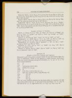
White-M. Old k1: Fools, D4:24, I1v:3, I2:24; k2: C1:27, D4:11, LLL, A3: 23, C3:24; k3: A3:34, B2v:24, C2v:13,14, F1v:21; k4: Fools, I2v:14; k5: C3:5, D4:17; k6: not seen.
Read-S. Old k1: Revels, B3v:12, D4v:3, I3v:11,20, K2v:3; k2: I3v:25 "like-wise"; k3: seen, not noted; k4: I3v:20; k6: D3:8,11.
Stafford-EF. Old k1: Fools, E4:20, F1:22, F3:20,25; k2: E1:11 "Booke", E3:6, E4:29; k3: E1:17, 33, F1:6; k4: E2v:3, 22 "sake", F1v:3, F3:26; k5: E2v:4 "like", E3:27, E3v:9[text]; new k6: Essays STC5775, O1:11 (0.9mm arm); k6: F1:15, F3:29 (0.8mm arm).
Samples of Y-face 'a' Variants
Eld-Y1. a1: Essays, Yy1v:17 "and", 33 "what"; a2: Yy1v:12 "a Dogge"; a3: Yy1v:13 "ayre", 17 "speake"; a4: Yy4v:17 "what", 33 "strange", 35 "make", Fools, H2v:18 "and".
Short-Y. a1: R3 H1v:33 "face" "scars"; a2: I1v:12 "and", 13 "saie".
Braddock-Y1. a1: MND, B3v:21 "of a", 29 "call"; a2: B1v:10 "and", 24 "again"; a3: B1v:32 "al", 34 "what"; a4: B1v:8 "painted", C3:11 "a".
Braddock-Y2. a1: Poetaster, B4v:6 "speakest", 7 "all"; a2: B2:11 "and"; a3: B3v:9 "faces"; a4: B2v:23 "Alas".
White-M. a1: LLL, A2v:14 "was", 15 "make"; a2: A3:4 "all", B4v:20 "fayre"; a4: A3v:37 "have".
Read-S. a1: Revels, D4v:13 "after", I3v:12 "saide"; a2: K3:13 "and"; a3: E1:13 "pleasures", K2v:10 "and".
Appendix II
Heights of Fell Pica Capitals and Ligatures
Measured at 30X from points 0.025mm inside the top and bottom edges of a type, in millimeters. Width of the ligatures is taken between dead-centers of the two vertical elements and given in brackets, i.e., "[1.15]", or "[1, 1]" for three vertical elements.
- 2.4: X
- 2.45 I
- 2.5: A E F H K L M N V W Z
- 2.55: D P R Y T; ct [1.75]
- 2.625: O
- 2.65 C G; ſh [1, 1], ſt [1], ſſi [1.05, 1.1]
- 2.7: Q S; ſl [1.15], fl [1.1], ff1 [1, 0.95], ffl [0.95, 1.0]
- 2.75: f1 [1.15]
- 2.8: ſi [1.1]
- 2.85: ff [1.1]
- 2.9 ſſ [1.15]
Appendix III
Comparative Analysis of Fools CD, I, and EF
In general, same-face fonts frequently require an extensive analysis of every variant sort. The relative lack of variants and the stylistic uniformity of Y-fonts forces the comparative analysis of two Y-fonts to focus upon subtle differentiae such as the proportions of new/old letters in various sorts, and anomalous and foul-case letters. The opposite is true of S-fonts. Letters from most of the 54 variant punches and 16 miscastings (excluding misjustified low-rider capitals: b2, h3, n3,4 t2, D2, E3, F2, fl2, ff1b, ff2b, ſh2,3, ſi2, ſſ2, ſt2) frequently appear together in normal S-fonts, making necessary an analysis of all composite groups in order eventually to isolate several discriminants that appear in only one of the two texts being compared. The S-face components of White-M and Stafford-EF are easier to distinguish than normal S-fonts, since the EF-face lacks several S-face letters (see list below).
In general, the lengths of the texts affect the certainty of the results. In shared sections of 4 or more quarto gatherings, the inference that a variant is absent from one font is fairly reliable. However, in short sections of one or two gatherings, this inference must be considered tentative, especially in low-frequency sorts (see later discussion of random recurrence patterns), until verified in other texts (White-M, Witts New Dyall STC22426 [1604], d'Olive EF; Stafford-EF, Vertues Due STC20169 [1603], Genealogy STC12872 [1604], Articles of Agreement STC18455 [1607]). For example, the EF-face 'z' (width: 1.25mm) appears a few times in Whore (E2:32, F4v:10) and Gen (p. 9:27) along with Y-face 'z' (width: 1.45mm) (Whore, E2v:22, E3:6,22,23; Gen, p. 14:35) and S-face z1. Sort-pressure is quite high in Whore (compositorial preference for "cozen", "coz" forms), but very low in Fools (EF total: 6), a possible reason for the exclusive appearance of z1 in Fools (E1:33, E1v:2, F2v:3). The EF-face and Y-face 'z' could nonetheless still reside in the cases. In instances such as the exclusive moderate-level g1 in CD, I, (about 17/gathering) and low-density g2 in EF (about 6/gathering), a consistent frequency distribution vs sort-pressure in two gatherings is a fairly reliable indication of the strong probability that a variant is absent (i.e., S-g1 vs Y-g, 17/147, 13/142, no S-g2). The low-density of ligature samples in short texts such as Fools EF requires the examination of every ligature (excepting the exclusive 'ſh' variants) to isolate and classify the S-face ligatures, but even then, the sample is minimal so that the results must be considered tentative until confirmed in other texts. Furthermore, the overall condition of letters in a sort can cause difficulty. Moderate-level (CD, I, 15/gathering) S-face k1,3 can be confused with unclear samples of replenished EF-face k1,2 (EF-k1: C4v:11, D1:19 "spark"; E2:17, E2v:35, E3:2, E4v:21; oblique junction EF-k2: D1:17 "like"); only one anomalous sample (F4:28 "like") of S-k1 in EF emerged after examining all such 'k'. Similarly, an EF-b1 (F2v:30 "tables") with a heavily-inked bowl frequently looks like S-b1 (a single anomalous S-b1 occurs at F2: 29). Finally, White-M's consistent low-riding capitals (A B C F G H K L M N P R S V Y) differentiate it from Stafford-EF's correctly justified capitals (except
While searching through a text for clean samples of letters in a given typeface, it is wise to maintain a separate composite for sketching and noting locations of alternate-face letters for reference at a later stage of analysis. The fact that both White-M and Stafford-EF are mixed fonts emerges in early stages of analysing the S-face components; each yields alternate-face lower-case letters and ligatures in the stylistically recognisable sorts. The additional "gross features" discriminants provided by the different alternate-faces (Y-face and EF-face subset) is a mixed blessing since several Y-face and EF-face letters are unresolvable in reproductions. The Y-face and EF-face variants in 'b d', for example, require precise measurements in originals to detect differences in structure and size; the EF-face b1, d1,2, and 'h p t' are easily confused with their S-face counterparts. The ovals group illustrates the problem of "too many" potential variants in mixed fonts. The wide (1.2mm) EF-p2 and the expanded S-p1 (width: 1.3mm) are difficult to distinguish, even when juxtaposed (see single sample of S-p1, F1v:26 "ap /p/ oynt"). Similarly, the Y-p in EF (F4v:19) differs from the EF-p2 (E1:2 "su /p/ pose", E4v:33) chiefly in descender-length (1.15mm vs 1.25mm). The EF-d1,2 and S-d1,2 appear together in approximately equal proportions in Stafford-EF. The two d1 exhibit similar dimensions (width: 1.15mm, junction separation: 1.15mm, height: 3.0mm) but differ in junction angles and formation, top-serif, bowl-stroke, and height of the ascender above the top junction (EF-d1: E1:30 "doubt", E4v:30 "doubt", E1:5 "doe"; S-d1: E1:13 "poynted"). The two d2 differ in bowl-width (1.225mm vs 1.2mm), junction angles and junction separation (1.3mm vs 1.15mm), and EF-d2 is a thicker letter; nonetheless, the two are indistinguishable to the naked eye when heavily-inked (EF-d2: E1:31 "day", E3:29 "diuorced", E4v:30 "day"; S-d2: E2v:5 "dycing"). Similarly, a wrong-face 'd' in CD, I (C1:18 "related", C2:26 "dayes", D3v:18 "In /d/ eede", D4v:14 "darkest") is easily confused with Y-face 'd' (C1:29 "feared", C1v:12 "good"), differing in bowl width (1.25mm vs 1.2mm) and junction separation (1.45mm vs 1.35mm).
In addition to the S-face 'b' variants in CD, I, and EF, an anomalous 'b' occurs in each font. The shorter (2.85-2.9mm), narrower (width: 1.15mm) variant of CD, I (C1:25, C1v:22 "but", D2:12) with wide junction separation (1.45mm) can be confused with lightly-inked samples of the anomalous variant in EF which has the same junction separation, is slightly taller (2.9-3.0mm) and wider (1.175mm) (E1:28, E2:15 "business", E4:11,30), and both appear to be EF-b1, since all three exhibit a slight but noticeable right slant (about 3 deg.). Expanded EF-b2 (width: 1.3mm, junctions: 1.45mm) appears less frequently in CD, I (C2:3,19 "bound") than in EF (E1v:10, E3v:19) and can be confused with Y-face 'b' (C1:36 "breath", C1v:6 "be"[2nd], 17), although the top-junction is perpendicular rather than at an oblique angle. Unstressed EF-y (apex: 35 deg., E1:11,13,14) with usually non-printing serifs looks like Y-y2 (apex: 38 deg.) with worn serifs. The low-angle top-stroke of
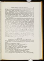
Both CD, I, and EF use a combination of S-face and alternate-face ligatures, limited to the Y-face in CD, I, with low-density remnants of Y-face 'ff' (one at C2v:30) and 'ct' (two at D1v:24, D3:11), and the unique 'oo' (C3:34) and 'th' (C2:4,7). EF uses Y-face 'ſl' (width: 1.15mm, height: 2.75mm, F3v:16, F4:28, [Eld-Y1, G1:33]), miscast ſſi2 with the short 'i' and leaning middle letter ('ſ' and 'i' spacing, x-line: 1.0mm, baseline: 1.05mm, E3v:18, [Eld-Y1, G3:8; ſſi1 with correctly aligned letters [spacing, 1.05mm] and normal 'i', G3:1]). The few Y-fi1 (width: 1.1mm, height: 2.9mm, E1:16) are taller than the EF 'f1' but usually look the same (width: 1.05mm, height: 2.75mm, E1:20, E2:4, E3:27, E4:22, F1:11, F3v:3). The 'ſi' sort includes two EF-face variants (same height: 2.7mm) that can be confused with the S-face 'ſi". EF-ſi1 is vertically stressed with the shoulder terminating in a larger pear and letters spaced 1.1mm (F4v:1) while ſi2 is unstressed and narrower (width: 1.0.-1.05mm, E4:7, 9, F1:28, F2:2,3); the three are difficult to sort out in the worn condition of Stafford-EF. The condensed 'ſſ' (width 0.9-0.95mm) is distinctive (E2:8,15, E1v:32, F1v:21,23,24), yet measurements are frequently required to distinguish it from the Y-face ligature. The EF-ſh ligature exhibits a high junction (1.5mm) and slanted ascender (spacing, x-line: [1.2mm, 1.05mm], baseline: [1.15mm, 1.15mm]) and is easily recognised. One anomalous 'fl' appears at E1:6 (width: 1.15mm, height: 2.85mm).
Appendix IV
List of Exclusive S-face Discriminants in Fools CD, I, and EF
(CD, I, samples of each sort given first, followed by EF samples, separated by ";". The absence of a variant is indicated by [-]. [+] indicates too common to list.)
- b1: C3v:2, C4v:19; [one, F2:29 "brest"].
- b2: C1:2, C4v:19 "blowne be"; [-]. b3: C3:25 "booke"; [-].
- g1: C1:18; [-]. g2: [-]; E2v:9, E4:9, E4v:10,18.
- h1: C1:12 "how", 18 "he"; E2v:3 "Whic /h", E4:22 "fathers".
- h2: C1:4, I3v:25 "this"; E2v:14 "heauen", F1v:16, "With".
- h3: C1v:9 "him", I2v:11 "have"; [-].
- p1: C1:7; [one, F1v:26 "ap /p/ oynt"]. p2: [-]; E1:2 "su /p/ pose".
- t1: [+]; [-]. t2: [+]; [-]. t3: C1:9, C3:3, D4v:6, I2:16,17; [-].
- u1: C1:6 "you" [2], new C1:16 "perceiue"; E1:5 "should" "jealousy".
- u2: C1:6 "preserue", C2v:3 "much" [2nd]; E2v:16 "euery", bold 17 "musicke".
- u3: [-]; [-]. u4: C1:2 "doubt", 12 "Nature"; [-].
- w1: C1:15 "Newes, 26 "would"; E1:9. w2:C1:22 "how"; [F4v:31?].
- w3: C1:17, 22 "t'was", C1v:11; E1:4,6. w4: [-]; E4:19, F1:7,9.
- z1: [-]; E1:32, E1v:2, F2v:3. z2: D2v:7,8; [-].
- D1: [-]; E1v:23, E2:32. D2: C4v:14; [-].
- S1: [-]; F2v:33. S2: I1v:7; [-].
- ff1: C4v:25; [-]. ff1b: C1:33; [-].
- ff2: I1:33, I3:7; F1:20, F3:22, F4:33. ff2b: C4v:12, D2v:6, D3:12; [-].
- fl1: I2v:7, I3:21; F2:21. fl2: C3v:5, D2:25; E1:34, F3v:11. fl3: I3:26; [-].
- ſh1: C1v:17, C3:25; [-]. ſh2: C1v:20; [-]. ſh3: C2v:12, C3:18, D3:28; [-].
- ſl1: D2:9; F1:11. ſl2: D4:17, I1v:8; [-].
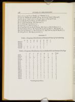
Appendix V
| A | B | C | D | E | F | G | H | I | |
| Hamlet | 3 | 4 | 6 | 8 | 8 | 5 | 4 | 5 | |
| Mal Q1 | 2 | 4 | 1 | ||||||
| Mal Q2 | 1 | 7 | 1 | ||||||
| Mal Q3 | 1 | 5 | 1 | 2 | 4 | 5 | 2 | ||
| Sup Q1 | 4 | 7 | 2 | 10 | 4 | 5 | 4 |
| 1 | 1v | 2 | 2v | 3 | 3v | 4 | 4v | Total | |
| AF-E | 1 | 2 | 1 | 3 | 0 | 1 | 3 | 1 | 12 |
| HW-E | 3 | 0 | 0 | 1 | 0 | 2 | 2 | 1 | 9 |
| CC-E | 2 | 0[*] | 0[*] | 2 | 1 | 2[*] | 2[*] | 0 | 9 |
| Ham-E | 2 | 1 | 1 | 1 | 0 | 0 | 1 | 2 | 8 |
| Q1-F | 0 | 1 | 0 | 0 | 0 | 0 | 0 | 1 | 2 |
| Q2-F | 0 | 0 | 0 | 1 | 0 | 0 | 0 | 0 | 1 |
| Q3-F | 1 | 0 | 0 | 1 | 0 | 1 | 1 | 1 | 5 |
| Q1-G | 0 | 0 | 0 | 2 | 0 | 1 | 0 | 1 | 4 |
| Q2-G | 0 | 0 | 3 | 3 | 0 | 1 | 0 | 0 | 7 |
| Q3-G | 0 | 0 | 0 | 0 | 0 | 1 | 0 | 1 | 2 |
| Sup-A | - | - | 1 | 0 | 2 | 1 | 0 | 0 | 4 |
| Sup-B | 0 | 2 | 1 | 2 | 1 | 0 | 0 | 1 | 7 |
| Sup-C | 1 | 0 | 0 | 1 | 0 | 0 | 0 | 0 | 2 |
| Sup-D | 2 | 0 | 2 | 2 | 0 | 1 | 1 | 2 | 10 |
| Sup-E | 1 | 1 | 1 | 0 | 0 | 0 | 1 | 0 | 4 |
| Sup-F | 0 | 0 | 1 | 1 | 1 | 0 | 2 | 0 | 5 |
| Sup-G | 1 | 1 | 2 | - | - | - | - | - | 4 |
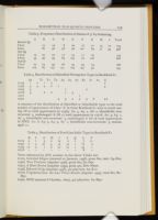
| A | B | C | D | E | F | G | H | I | Total | |
| Hamlet Q1 | ||||||||||
| Y-face | 15 | 19 | 8 | 20 | 17 | 21 | 14 | 10 | 124 | |
| S-face | 82 | 92 | 58 | 56 | 101 | 84 | 71 | 54 | 598 | |
| Mal Q3 | ||||||||||
| Y-face | 15 | 25 | 22 | 17 | 23 | 11 | 20 | 133 | ||
| S-Face | 44 | 99 | 95 | 85 | 105 | 72 | 106 | 606 | ||
| Sup Q1 | ||||||||||
| Y-face | 25 | 24 | 33 | 26 | 33 | 34 | 13 | 188 | ||
| S-face | 105 | 85 | 137 | 151 | 129 | 134 | 53 | 794 |
| A2 | T1 | T2 | T3 | A3 | A4 | A7 | R1 | S1 | A1 | Ii | ||||||||||
| 21225 | 1 | 2 | 1 | 2 | 2 | |||||||||||||||
| 17483 | 5 | 4 | 4 | 2 | 1 | 4 | ||||||||||||||
| 12322 | 5 | 1 | 2 | |||||||||||||||||
| 12718 | 3 | 2 | 2 | 1 | 3 | |||||||||||||||
| 12312 | 1 | |||||||||||||||||||
| 22302 | 3 | 3 | 2 | 2 | 3 | 6 | 2+ |
A summary of the distribution of identified or identifiable types vs the total number of appearances of S-face 'A' in three Braddock-Y1 texts is worth noting. Of 20 total appearances in 17483: A2: 5, A5: 2, A6: 2, identifiable nonrecurrent: 3, undamaged: 8. Of 17 total appearances in 12718: A2: 3, A4: 1, A7: 4, identifiable non-recurrent: 3, undamaged: 6. Of 28 total appearances in MND: A1: 6, A3: 3, A4: 3, A7: 1, identifiable non-recurrent: 3, undamaged: 11.
| B | C | G | H | I | L | Q | S | T | |
| 21225 | 3 | 1 | 3 | 0 | 13 | 0 | 1 | 7 | 11 |
| 12322 | 0 | 3 | 27 | 5 | 14 | 13 | 1 | 17 | 0 |
| 17483 | 10 | 0 | 1 | 0 | 21 | 10 | 1 | 24 | 1 |
| 12718 | - | - | - | - | - | - | - | 6 | - |
- 21225, Celestial Elegies (entered 22 January, 1598), prose 8to, text: A3-D1r.
- 12322, Two Treatises (imprint 1598), prose 8to, B1-O7r.
- 12312, A Short Forme (imprint 1599), prose 4to, Dd1-Nn2v.
- 17438, Edward II Q2 (imprint 1598), 4to play-text, A2-K1v.
- 12718, Virgidemarium: the Last Three Bookes (imprint 1599), verse 8to, B1-H5v.
- 22302, MND (entered 8 October, 1600), 4to play-text, A2-H4v.
Notes
The research for this paper was in part supported by travel grants from the General Research Fund, Regents of South Dakota, and a generous grant from the National Endowment for the Humanities, Division of College Teachers, for which I also am indebted to Fredson Bowers, Peter Blayney and Donald H. Reiman for their supporting recommendations. This paper would not have been possible without this support. I also thank Fredson Bowers for suggesting the approach of the paper and encouraging and guiding its progress, and Peter Blayney for commenting and sharing his vast knowledge of the subject.
"Edward Allde as a Typical Trade Printer", The Library, 4th ser., 10 (1929), 121-162. A. E. M. Kirkwood, "Richard Field, Printer, 1589-1624", The Library, 4th ser., 12 (1931), 1-39. Harry R. Hoppe, "John Wolfe, Printer and Publisher, 1579-1601", The Library, 4th ser., 14 (1933), 241-288. These studies concentrate on printer's devices almost entirely with only passing reference to type fonts (see note 5 below). Edwin Eliott Willoughby, A Printer of Shakespeare [William Jaggard] (London, 1934). W. Craig Ferguson, Valentine Simmes, Printer to Shakespeare et al. (University Press of Virginia, 1968) was the first to describe and use a printer's type fonts in identifying his work in sections of shared books. Dennis Woodfield, Surreptitious Printing in England, 1550-1640 (Bibliographical Society of America, 1973). C. L. Oastler included quite unsatisfactory specimens of John Day's type fonts in John Day, the Elizabethan Printer (Oxford Bibliographical Society, 1975) with identifications of punchcutters where possible, pp. 40-43. Akihiro Yamada, Thomas Creede, Printer to Shakespeare and his Contemporaries (Shinsu University, 1981) catalogued appearances of ornamental stock. Clifford Chalmers Huffman, Elizabethan Impressions: John Wolfe and his Press (AMS Press, 1988). See also Peter H. M. Blayney, note 10 below.
"The Prevalence of Shared Printing in the Early Seventeenth Century", Papers of the Bibliographical Society of America, 67 (1973), 437-442.
This limitation does not necessarily apply to longer books, especially prose texts with chapter and section divisions which invite the insertion of ornaments and initials. Several of the quarto and folio prose texts referenced later begin sections with ornamental stock as a matter of course.
This is not a new idea. There are about a half-dozen extant early records of legal proceedings involving the identification of the printers of pirated or seditious books by their type fonts. For some examples, see Talbot Baines Reed, A History of the Old English Letter Founders (London, 1887), pp. 123-133.
McKerrow overlooked the potential of font analysis and defined what seems to have become a prevalent attitude: "Of Allde's types [type fonts] there is little to say. . . . So far at least I have observed, there is nothing in the types used to distinguish Allde's work from that of a dozen other printers" (p. 147) (Allde actually used four easily distinguished pica roman fonts between 1590-1605). Some years later, Fredson Bowers noted the potential value of the description of fonts in a book, Principles of Bibliographical Description (Princeton University Press, 1949), p. 127, and later commented (p. 305): "The font of the type used in the text, whether roman, italic, or gothic, is given; when possible, this type should be identified by reference to books on printing types, but for books of this period precise identification is usually difficult." See my comment on this problem, note 36 below. One purpose of this paper is to lay a foundation for future work leading to the "precise identification" of fonts by reference to Elizabethan books and printers' fonts.
This comment applies to every study of a book printed in two or more fonts that I have seen. The consequent analyses of compositors and presswork inevitably are incorrect with respect to the assignment of compositors, running titles, skeletons, number of presses, sequence of setting and printing and other aspects of printing. For example, W. W. Greg distinguished three sections in The Honest Whore on the basis of type fonts, but missed the EF and G-K division, correctly noting it in the second edition by reference to running titles, "'The Honest Whore' or 'The Converted Courtesan'", The Library, 4th ser., 15 (1935), 54-60, repeated by Fredson Bowers (see note 40 below); and G. Blakemore Evans, "Textual Introduction", All Fools, ed. G. Blakemore Evans, in The Plays of George Chapman: The Comedies, gen. ed. Allan Holiday (University of Chicago Press, 1970), 227-232. Evans attributed three compositors to Eld although two belong to the sharing printers. Even though W. W. Greg had specifically noted that a different font appears in one section, Evans begged off: "I cannot see any significant difference, but Greg's eye was sharp and trained and I hesitate to disagree with his years of experience on such a matter" (p. 229). Likewise Akihiro Yamada ignored the issue and attributed four compositors to Eld in "A Bibliographical Study of George Chapman's All Fools (1605)", The Shakespeare Society of Japan, 3 (1964), 73-99. Both concluded that All Fools was printed on one press,
Two forms of measurement indicate the size of an early typeface: (1) the "20-line" measurement in millimeters is the distance from a point in one line to the corresponding point in the twenty-first line of type above or below set without leading (a thin strip of lead placed between lines in later centuries), the line from which the measurement starts being included in the count; (2) the "bare" measurement in millimeters is the distance from the top of an ascender to the bottom of a descender in a single line (i.e., top of the 'h' to the bottom of the 'y' in "thy") multiplied by 20. The complementary measurements are necessitated by the fact a given typeface could be cast on taller bodies than that for which it was designed.
The technical terminology for the various elements of letter-forms has never been standardized to any degree of unanimity. Philip Gaskell, "A Nomenclature for the Letter-forms of Roman Type", The Library, 5th ser., 29 (1974), pp. 42-51, is the most comprehensive attempt with a glossary of terms and a complete roman alphabet with the term for each element of each letter. Gaskell differs in some respects from the nomenclature traditionally used in historical typography. The physical space occupied by a line of type is defined by four imaginary lines: (1) letters sit on the "baseline"; (2) the "x-line" (Gaskell: "mean line") defines the shoulder height ("x-height") of lower-case letters (m, n, b etc.); (3) the "h-line" ("ascender line") defines the height reached by ascender above the x-line; (4) the "descender line" defines the lowest level reached by letters which protrude below the baseline (g p q y). In regard to other terms, I prefer the traditional "pear" to his "bulbous terminal". "Cross-stroke" (or "cross") seems descriptive of the horizontal strokes in 'A E F T'; the "arm" and "leg" (or "tail") of the 'k' seems preferable to an "upper diagonal" which is topped by an "upper diagonal serif" and a "lower diagonal" terminated by a "lower diagonal serif"; the lower part of the 'g' has always been a "loop", and calling it a "tail" seems inappropriate because it does not look like the "tail" of a 'y' or 'R' or 'Q'; it seems inconsistent to gloss "ascender" as "the extended stem of b, d, f, h, k, l, tall-s" and then use "stem" exclusively to refer to all vertical elements of both short and tall letters, especially when the latter are traditionally "ascenders".
A font composite is compiled by sketching the stylistic features seen in a font's several groups of letters, punctuation and fouled sorts. The value of the font composite arises from the fact that it defines a font in terms of sets of specific distinguishing features. The diagonal letters form one set, the ligatures another and so on. When comparing two fonts, the sets provide an efficient method for quantitatively estimating the chances that the two are the same. See my discussion in "Reproductions as a Source", pp. 251-255.
Reference will be made in the following discussion to typeface specimens of the period. The major sources of reproductions of extant founders' specimens are found in a few ground-breaking facsimiles collections specifically intended as a basis of historical study of early types and punchcutters. (1) J. Dreyfus & others eds., Type Specimen Facsimiles, Vol. I, Nos. 1-15 (London, 1963). The anonymous Folger c.1565 specimen sheet attributed
The height of a typeface, as measured from the top of the ascenders to the bottom of the descenders, defined the shortest body that could carry the face. However, a given typeface could be cast on a taller body; the Claude Garamond "cicero" (i.e., pica) punches in the Plantin collection, for example, produced fonts with heights ranging from 80-84mm (see Type Spec. Facs. Vol. II, "Le Be" note 13, p. 14). Similarly, new punches were cut with shortened ascenders and descenders and the typeface cast on a smaller body than originally intended (see Type Spec. Facs. Vol. II, "Folio c.1585" specimens 38 and 45). In one extraordinary instance, a typeface with a bare measurement of 80mm was cast on a body with a 20-line measurement of 67mm without modification of ascenders and descenders (see Type Spec. Facs. Vol. II, "Folio c.1585", specimen 57, and note 57, p. 10). Vervliet does not explain how the type body was modified to make possible the setting of the specimen and other texts. The body of every sort had to have been kerned to allow for the overlapping of ascender and descender lines.
In the remaining discussion, I will label specific typefaces, variants and subsets by the printer who used them in combination with an initial that was chosen according to an imperfectly defined convention. The "-Y" was selected arbitrarily for Eld's Y-font as first studied in The Malcontent, then the "-Y" was used to designate the same typeface in other
See reproduction, Texts of 'King Lear' (p. 455), and Blayney's attribution (p. 500) of the font to Francois Guyot by reference to the anonymous c.1565 Folger specimen (in Low Countries, R27, Fig. 203; Type Spec. Facs. Vol. I, No. 1) and the specimen of Henry Bynneman's Guyot font in Isaac, Fig. 6.
Generally, high quality reproductions are useful for discriminating gross features such as the height difference of S-face vs Y-face capitals and stylistic differences (i.e., diagonal group) between two typefaces, provided the images of the letters are distinct and clear. This preliminary stage of analysis is frequently adequate for concluding that two fonts are not the same. However, precise measurements at high magnification such as are referenced in the following discussion should not be attempted in reproductions. The dimensions cited in the present study were taken in originals at The Huntington Library as follows: width is measured from points dead-center in the letter elements as established by the faint trace of the elements in the ink-blot; height is measured at points 0.025mm from the edges of elements. Angular measurements are taken with a specially designed and produced micro-protractor. Consult a graphics design/production shop with a PMT machine for reducing the camera-ready protractor to a radius of about 0.25-inch on celluloid or other suitable material.
The specimens in this monumental work are an extremely valuable resource for bibliographers desiring to become familiar with actual type appearance at high magnification (20X-30X). The edges of the letters are quite distinct; the only drawback is that modern printing technology has eliminated most of the distorting effects produced by early methods of hand-inking with the balls: originals have to be examined to appreciate the impact of that variable. Such crisp inking is rarely encountered in early books, a fact which renders them quite a bit more interesting in typographical study. Since frequent reference will be made to variations in size as a means of distinguishing variants, a tabulation of the Fell pica typeface (see Appendix II) will provide a useful overview of the accuracy that can be expected of a master punchcutter like Garamond while filing steel
Bibliographers tend to think of type in terms of the two-dimensional image on the printed page. Several references provide discussions, drawings and photos of the various tools and stages of the type production process which are helpful background for the following discussion. Absolutely outstanding photos of punches and matrices appear in Stanley Morison's The 'Fell' Types, particularly plates 14, 15, 17 and 18, and decorated initials in plate 19, with a detailed glossary of technical terms, pp. 256-259. See also Low Countries for a drawing of the type-casting mold and discussion (pp. 10-11); and Harry Carter, A View of Early Typography (Oxford, 1969), Figs. 2, 3 and 5 for drawing and photographs of a mold, newly cast types, and type-caster at work.
A perceptive former graduate student, Mary S. Radigan-Hunter, responded to this possibility: "Of course: the punchcutter had a bad day, missed a few strikes and crushed his left thumb, so naturally he wouldn't be able to hold the punch perfectly perpendicular, would he?" Fournier explains: "It sometimes happens that the matrix has been struck more deeply on one side than the other, the punch not having been continuously held quite upright in relation to it. . . . Striking the matrix needs a steady and practised hand; which has given rise to a saying that 'A matrix well-struck is half-justified'." (Manuel de Typographique, p. 90).
See Fournier's explanation of correcting height-to-paper, Manuel de Typographique, p. 90. The depth of impression obtained during the striking of the matrix was a "judgment call" as Fournier notes that the punch "is beaten in with a hammer as perpendicularly as possible until it has gone in as much as a twelfth of an inch or thereabouts [my emphasis]" (p. 83). See Blayney's explanation of matrix-wobble during casting, Texts, pp. 179-180.
Morison defines the justification of a matrix: "reducing it by filing to a true rectangular shape such that, when fitted to a mould, it will produce type with a level face and of standard height for a character that is optically satisfactory for uprightness, alignment, and distance from adjoining characters," The 'Fell' Types, p. 257. When the metal of the matrix was displaced during impact by the punch, the shape of the rough matrix blank was distorted by the vectorial dispersion of the impact force. In simple terms, the sides of the matrix bulged around and beneath the impression of the letter. This can be seen in the clear photo of an unjustified matrix in A View of Early Typography, Fig. 6 (between pp. 8-9). Fournier's explanation of the arduous process of striking a matrix reveals the latitude for errors in judgment and provides a possible insight into why certain letters exhibit sharp-edged elements while others seem rounded or blunted: ". . . with a gentle hammer-blow a shallow impression is made [in the blank]. If the letter is observed to slope either to right or to left, the punch is turned round a little and a second impression is made on the first, and after this a third, the punch being carefully got into the right position. So the place for the strike is gradually found. When at last the punch is shown by the preliminary trials to be in its proper position, it is beaten in with a hammer . . . ." (p. 83). Justification involved correcting the kinds of misalignments referred to in my discussion of miscast letters: "The matrix has to be reduced at the sides until it is of the right width . . . in the case of a letter which ought to be upright but leans a little to right or left through having been struck awry, the matrix must be corrected by being filed down on the side away from which the letter leans. In this example . . . where the h leans to the right, the letter must be corrected by having some of the left-hand side of the matrix towards the top filed away" (p. 93). Low-riding letters are corrected: "the distance between the end of the matrix and the head of the strike [i.e., top of the letter] is too great, and some of it [i.e., end of matrix] must be taken off"; high-riding letters are corrected: "the face of the strike is too short. This is cured by a few hammer-blows upon that end of the matrix to lengthen the copper," thereby lowering the letter on the matrix (p. 93).
For example, the fine S2 that seems to lean right (as if the rectangle enclosing the letter were rotated slightly clockwise) and to sit low on the baseline appears in significant proportions in White-M (LLL, A3:16,21, A3v:2,21,36), and in Creede-3 (R&J, A4v:26, B2v:29, B3v:19, C1:32, C3:13,31) amidst normal erect-appearing letters, most of which exhibit some form of distorting damage. A very low portion of Eld's 'S' sort seems to lean although
Some comment by Paul Beaujon shocks the industrial-age mind into an awareness of the accomplishment of these craftsmen: "As Garamont himself wrote that he had cut punches and cast type since the end of his earliest childhood, it is possible to credit the unsupported statement of Lottin that he was practising in 1510, though our earliest firsthand news of him comes some thirty years later. It takes fifteen years, say the punch-cutters, to learn to cut a twelve-point g [i.e., large pica]: the smaller sizes are cut by men who have had more practice," "The 'Garamond' Types", pp. 132-133.
Normal ſh1: Eld-S, Sej, B1v:21; Simmes-S, Mal Q3, B4:13; Creede-3, R&J Q2, A4v:1, 23; White-M, LLL, A4:13, I1v:21. ſh2: Eld-S, Sej, C3:5; Simmes-S, Mal Q3, A4:13; White-M, LLL, A2:10,15; Field-S, Arte, D4:34; Creede-4, d'Olive, A2v:33; Windet-S, Fawne Q1, E2:18. ſh3: Creede-4, d'Olive, A4:30; Windet-S, Fawne Q1-2, I2:5.
In contrast, the cross of the 'e' in early pre-Garamond romans, which the B-face subset in Danter-M resembles (see below), exhibited a upward slant of as much as 24 degrees or so, obviously an intentional stylistic feature. Similarly, the cross of the Le Be 'e' consistently slants upward, while Henry Denham's (An Apology STC6077 [1566]) slants downward; these variant 'e' definitely derive from two punches, while the S-face 'e' from a single punch.
Commas are difficult to work with, given their physical shape and size. Another problem is created by medial vs terminal justification which affects the spacing between a comma and the preceeding letter. See Blayney's discussion, Texts, pp. 179-180.
Generally, "obvious to the naked eye" means that the presence of a possible variant can be sensed; however, some form of magnification is always useful in confirming the variant, such as a 3-inch high-quality magnifying glass. Bear in mind that improper orientation of the glass or the viewing angle distorts the viewed image. The AGFA LUPE 8X viewer, a quite useful magnification device designed for examining slides and contact prints, is pocket-portable, inexpensive and can be purchased at most photo shops. The precise resolution that is required for the kind of measurements indicated by the term "high magnification" simply cannot be achieved with "a powerful magnifying glass and a fine scale [ruler]" as one typographer suggested. In the typical steel or plastic ruler calibrated in millimeters, the tick marks are 0.2mm or wider; what's worse, the scale becomes more inaccurate as the lenght increases. Most simple high magnification devices, such as the Radio Shack or the shirt-pocket varieties, invert the image, decrease light about 75%, and distort the image. I use a Wolfe 8x30 Field Microscope with lens extender, an internal scale graduated in 0.05mm, and negligible-light-loss non-inverting optics. Since it took about two years to locate a source for this instrument, I pass along the information: Catalogue #591305, Carolina Biological Supply Company, Burlington, NC 27215 (about $125 or higher, depending upon the dollar-yen exchange rate).
A comment by Harry Carter, one of the great scholars of early typography, is worth noting in this context: "Some of the types [typefaces] . . . can be reduced to three or four very diverse elements, more of them than I thought at first. These conjunctions and confusions are material for another, more technical discourse, of interest to people who underrate the difficulty of identifying types [typefaces] by looking at them . . .", "Types of Christopher Plantin", p. 171.
I have discussed the inherent deficiencies of reproductions for typographical study in "Reproductions as a Source", see esp. pp. 238-239 regarding some of the factors that distort the image of a type; other problems of textual transmission that undermine the
A mandatory exercise for the new typographer consists of recognising the effects of the reproduction process on the transmitted image of a letter by comparing the Fell 'a' with the "CICERO DE GARAMOND" screened facsimile (p. 124; also in Type Spec.
Blayney's statistics and discussion of the approximate size of Okes's pica font is most informative. See Texts, pp. 145-148.
It is interesting to note the use of Eld-Y1 and Eld-S in the former's final appearance in Eastward Hoe! Q3 F3v. The compositor first drew an 'H' and two 'ſſ' ligatures from Eld-Y1 on F3, then switched to Eld-Y1 on F3v. Eld-Y1 apparently was so depleted that substitutions were required with S-face 'k fi ct ſi ſſ A C E M P S'.
W. Craig Ferguson notes that Simmes acquired a new font in 1606 which prints all of Eliosto Libidinoso STC13509 except for D3-E4v, the final appearance of the long-lived Simmes-S. He printed only four books in the new font before he "was officially replaced as a printer" in March, 1607. See Valentine Simmes, Printer to Drayton, Shakespeare et al., pp. 9, 40-41.
Stanley Morison indicates that the set of Fell pica punches, for example, includes later replacement punches in the 'C J N R U W g' sorts: "Their presence in a uniform set of matrices suggests that a strike from Garamond's punches with these additions or replacements was justified in Holland in the seventeenth century" (The 'Fell' Types, p. 133); the english (96mm) roman matrices were supplemented by punches cut at Oxford c.1688 to produce duplicate matrices in 25 sorts (pp. 144-145). See also Type Spec. Facs. II, "Index 1567", note 26, p. 4.
The letters are reminiscent of pre-Garamond early romans, especially in the bold
Modern typography benefits from the fact that a Caslon, Garamond or Times Roman letter is easily identified by reference to standard specimens. However, the current state of the history of early typography is a serious obstacle to historical font analysis since only a few early pica roman specimens are known that can be definitely attributed to identifiable punchcutters. The problem of extant specimens in font analysis merits further comment. The most frustrating aspect of working with Elizabethan and Jacobean books is that the published specimens do not match with the typefaces in these books, with few exceptions like Henry Bynneman's Francois Guyot pica font. In general, typographers have long resorted to comparatives such as "very similar to" or "a close copy of" in recognition of the fact that similarities in design, but not precise correspondences, can be detected between specimens and fonts in books. A. F. Johnson deals directly with this practice in "The Supply of Types". I believe that the old, frequently invoked, axiom "the same type can look quite different in the hands of different printers" can be rejected out of hand. The bare measurement of a typeface and individual letter sizes are constant physical facts: precise measurements of letters of a typeface simply do not vary significantly from one book to another or one printer to another. This is obvious from thousands of such measurements: a Y-face 'm' is always narrower than the S-face letter, and always by an amount that hardly varies. Similarly, referring to differences as "a later development in" an identified typeface is legitimate only if it can be shown that the seminal set of punches, or an intermediate set of matrices, is identical except for the differences. Ignoring these basic physical facts leads to nebulous references to typefaces which are a hindrance to font analysis and the bibliographical description of the typefaces in a book. Frank Isaac, for example, notes of the "extremely popular" pica roman: "most of the quarto plays are printed in this size. They were modelled on the 'Cicero de Garamond' of the Berner sheet which is also found in Plantin's Index," "Elizabethan Roman and Italic Types", p. 89. Isaac groups these typefaces according to the styles of 'g' and 'w' and makes a few supplemental distinctions in surveying the varieties of the two letters used by some 18 printers (e.g., "A w with a short second stem . . . was used in this group by Bishop in 84[mm], Bynneman in 86, Day in 82, Orwin in 82, Purfoot in 82 . . .", p. 90). Isaac's listing lacks references to sample books and dates, a real problem. For example, Purfoot indeed used this 'w' at least from 1570 (The Hateful Hypocrisy STC10951) in an F-font that by 1579 (The Forest of Fancie STC4271) had become mixed with an S-font. Determining when Purfoot-Y was introduced needs further investigation, but it does not use the Guyot 'w' and appears in Fawne with Windet-F which does, an occasion for confusion. Beyond that, pica roman fonts simply cannot be grouped according to a few variants. The confusion caused by such a simplistic rationale is apparent when the six pica roman specimens are examined. Henry Bynneman's font (Fig. 6) derives exactly from the Francois Guyot punches that produced the Guyot specimen of the anonymous Folger folio sheet (Type Spec. Facs. I, No. 1; Low Countries, Fig. 203, p. 268), except that Bynneman's font is cast on an 82mm rather than a 78mm body; the bare measurements of the two match (72mm). Richard Field's and Valentine Simmes's S-fonts (Figs. 8, 9) are stylistically distinct in all respects from Garamond's pica romans. Similarly, John Windet's pica (Windet-F) (Fig. 12) represents a different design concept and scale (the x-line is closer to the h-line) and is closer to faces cut by Ameet Tavernier (see Low Countries, Fig. 206, p. 267). Thomas Orwin's is a mixed font (Fig. 10) with assorted S-face letters; John [Henry?] Denham's font (Fig. 11) combines letters from "Le Be" specimens 12,13 with others probably cut in the Netherlands, but this font needs further study. [I append this brief reference to W. Craig Ferguson's Pica Roman Type in Elizabethan England (Scolar Press, 1989), which arrived too close to press-time to permit detailed comment on what seem to be fundamental problems in approach and documentation. Too many conflicts between this paper and Pica Roman Type occur to permit specific discussion; hence a general statement must suffice. Although my identifications of fonts and printers have been
The combinations of typefaces noted in regard to mixed fonts suggests many hypothetical explanations for the minor variations in same-face fonts. For example, the fonts were purchased at different times from one founder who had replaced certain matrices in the meantime; or from two founders who were supplying type cast in hybrid sets of matrices that differed in but a few sorts; or one of the two printers was forced by circumstances to replenish the ligatures from a founder who supplied only S-face pica type. The Plantin and Le Be inventories of punches and matrices suggest another possibility. Plantin had at least four sets of pica roman matrices from two sets of punches, one by Claude Garamond; the Le Be inventory listed eight sets of pica roman matrices (see Type Spec. Facs. II, "Le Be", notes on specimens 10, 12, 13, 19, p. 14). Secondly, although it illustrates an 18th-century foundry, a woodcut of William Caslon's casting shop shows casting stalls and casters at work along two walls of the room (see fold-out illustration at the front of Talbot Baines Reed, A History of Old English Letter Foundries [London, 1887]). Taken together, these suggest a fundamental economic rationale that could explain the mixing of typefaces either piecemeal or more extensively. A temporary heavy demand for pica roman types could be met by assigning several casters to the task using available sets of pica roman matrices; or, by assigning two casters to high-frequency sorts (a e p etc.) using duplicate matrices not necessarily in the same typeface. I must admit these explanations are purely speculative although attractive.
The following examples are based upon my own oftentimes regrettable experiences. Trips to rare books collections inevitably place a premium on time that, at least in my case, often invites short-cuts in methodology that cause later problems.
The search process will be discussed in a later paper. Relevant details about this case are as follows. While previously identifying Eld-Y1 in G-K of Whore, I had noted that EF used the large awkward 'W', the Guyot '?' and several other potential discriminants. The completed Fools EF composite demanded a follow-up analysis of EF of Whore and the second edition, The Converted Courtesan. Some Fools EF discriminants emerged in sections of Limbo-Mastix during a survey of other books by Eld, but it is not the same font. Fools EF discriminants were later encountered in books by Simon Stafford and Edward Allde, leading to the former's identification. I had noted some traits of d'Olive EF while analysing Creede-4 in A, B(i), and these suggested the comparison to Fools CD, I.
See Fredson Bowers, "The first quarto of 1604 was set up in three sections comprising sheets A-B, C-D, E-K. . . . This final section of the play, E-K, appears to have been machined on two presses, one of which printed sheets E, F, H; and the other, sheets G, I, K" (p. 4) and other discussion of the compositors, running titles and skeletons in the two editions, "Textual Introduction", The Dramatic Works of Thomas Dekker Vol. II (Cambridge, 1955), pp. 3-14. I might note that identifying running titles is a difficult proposition simply because they are set in same-face letters. As I note in "Reproductions as a Source", most of the letters in typical running titles are unidentifiable because of the lack of specific damage (see pp. 242-244); hence, without specific evidence to the contrary, concluding that the same running titles move through a book is based upon an assumption of regularity in compositorial procedures at one press or in one printing shop. Shared printing is inherently irregular in this sense since a minimum of two compositors, two presses, two skeletons and casting-off of copy is required. The confirmation of printing in one shop by a font analysis must, therefore, precede running-title analysis. In the event that two fonts are found together within a single gathering (as in Eastward, Fawne E-I, and d'Olive B), a survey of the printer's work is an additional prerequisite in order to confirm the possibility of simultaneous printing in a two-press shop. (Aside from d'Olive, I am unaware of any instance of two printers' fonts appearing together within a gathering.) Otherwise a dangerous trap ensues when the running titles in sections of a shared book are set in same-face fonts without distinguishing peculiarities such as a distinctive damaged letter
Locating low-density foul-case letters such as these is especially tedious. I usually do a minimum of three searches of a text (or texts). One cardinal rule is to note the location when the letter is first detected, since a repeated search is no guarantee that it will be found again. It is worth noting again that non-appearance does not mean that the letter is not in the font.
The complementary black letter font was a major source of foul-case punctuation, but I know of no resident fouling with letters from this typeface except for punctuation marks. However, infrequent instances of textual fouling with the black letter 'ye' occur (Antichrist STC7120 [1603], [2]H3v:32; The Woeful Cry of Rome STC1833, B2:3, B2v:14; Regiment STC1827 [1606], I1:18; W. Craig Ferguson noted 'ye' fouling in Creede-3 also, "Creede's Pica Roman", p. 152). This 'ye' fouling should be viewed as transient fouling resulting from the compositor's justification habit in prose texts, and not as resident in the roman cases. A rather unique kind of textual fouling with a large pre-Garamond roman font occurs in Isle of Gulls (STC6412, 1606), where the left-third or so of F4v:31-39 are set in this oversized Venetian(?) type. Fouling with 'C' occurs elsewhere throughout this section (EF) (F4v:13 etc.). The discovery of this unique font in a signed book would automatically identify the printer, given its rarity in Elizabethan printing.
The three styles of italic capitals in use during the period provided obvious discriminants. In the most common, stems and ascenders of the capitals are straight and terminate in serifs (as if a roman face were titled to the right); this style appears in the pica italic faces cut by Robert Granjon (see The 'Fell' Types, p. 139) and Ameet Tavernier (Low Countries, Figs. 233-234, p. 305). Granjon also cut a second style of italic capitals characterized by extended "swash" strokes. The left stem of the 'A M' is a long, graceful curve; the bowl-stroke of the 'B D P R' begins with a swash, the 'G' terminates in a descender swash, the tail of the 'K Q R' terminates in a swash below the baseline, the diagonal stroke of the 'N' incorporates both the shoulder and base swash, and the 'E' is like a reversed numeral "3". Both styles are mixed in Eld's, Braddock's, Purfoot's, Short's and other italic fonts. Read's (and Eld's early) font included a variant 'A M' in which the swash terminated in a curl, fairly common variants. Francois Guyot cut a third style of capitals (see Low Countries, Fig. 231, p. 301) in which the bowl-stroke of the 'B D R P' begins almost vertically at the x-line to the left of the ascender, the left top-serif of the 'M' hooks over, and the swash diagonal of the 'N' extends below the baseline. The Guyot style was less common than the Granjon.
G. K. Hunter noted of Mal Q1: "One of the problems of printing The Malcontent seems to have been the very large number of italic Ms required for the names, and this put the printer to all kinds of shifts. But at the beginning of sheet F, and incessantly thereafter we find a new kind of italic capital M [Guyot], which we must assume to have been in one compositor's box but not in the other's. That this M was in Sims's possession is shown by its use in QC [Q3] of The Malcontent and in that part of The Honest Whore printed by Sims," "Introduction: The Text", The Revels Plays: 'The Malcontent' (1975), p. xxxii. Simmes's section (F-H) of Q1 also uses the Guyot 'P' in large numbers, and both Granjon styles of 'B M P'. Eld's section (B-E) uses the straight-stem Granjon and the curl-swash variants of 'A M', swash 'B D P', and what appears to be a few Ameet Tavernier 'M' (B3v:34, C1:29, C4v:8, D3:32, E2:19, E3:32). The Guyot 'M P', and the curl-swash 'A M' and Tavernier 'M', are exclusive to the two sections of the book (and Simmes's and Eld's sections of Whore as well). Given the number of 'M' and roman substitutions, the situation suggests two separate printers' fonts rather than two cases, and calls for a survey of a few other books by Simmes to determine whether the letters found exclusively in Eld's sections were ever used by Simmes. Unfortunately, Hunter seems not to have been aware of W. Craig Ferguson's Valentine Simmes, Printer to Shakespeare (1968).
I must note the possibility that the replacement of a large portion of the italic font could be responsible for the shift in these sorts. The italic of Q3 prints much more
See Robert K. Turner, Jr., "Printing Methods and Textual Problems in A Midsummer Night's Dream Q1", Studies in Bibliography, 15 (1962), 33-55. The major portion of the study aimed at establishing the setting and distribution sequence by correlating 115 reappearances of identified types with evidence from substitutions. Turner's use of a reproduction for the typographical identifications produced an error rate of 44% which, in combination with my identification of 47 additional appearances of damaged types, discounts his conclusions about the setting and distribution of the text and his interpretation of substitutions; see my discussion of Turner's distributions (pp. 240-242) and the Table of Identifications (pp. 266-268), "Reproductions as a Source".
The distribution of foul-case letters deeper into sort boxes or into a different case, or the setting of a text from alternating cases, one of which is not used after a certain point, can only be surmised from the behavior of foul-case letters which, in any event, is random. Although it can be assumed that types in a sort emerge in a "last distributed, first to be reset" pattern, the pattern is merely probable, since a certain randomness is introduced by the order in which pages of a forme are distributed: the last page to be set is not necessarily distributed first. The genuine exhaustion of a sort prior to substitutions would seem to pull all normal letters from a sort box, but in order to establish a real number, the point in the text at which setting from the sort began would have to be established, and that is possible only through an exhaustive identified-types survey to accurately pinpoint distributions. Hence, this discussion of the behavior of foul-case letters ignores the possible effects on recurrence behavior by setting from two cases and by distributions. Nonetheless, distribution factors seem responsible for recurrence in many instances. For example, the damaged 'ſſ' in the 'ſl' sort appears eight times (A2:9,12[text], A5:11, A6:15, A7v:22, B1:20, B4:11, B4v:11, C1:10) in 3H6 but not later in this book in either the 'ſſ' or 'ſl' sorts; seven times in R3 (H3v:28, I4:35, I4v:29, K2:27, L4:4, M1v:21, M3:27); none in 1H4; then six in Secretary (F3v:20, I1:25, L3:13, T3:36, Ff3v:8, Gg3v:10). The damaged ligatures were purged and newly damaged ones wrongly distributed in the sequence of texts except for the one which reappears (R3, L4:4, M3:27; Sec, F3v:20). It is worth noting that the right shoulder of the foul-case 'ſſ' at Sec I1:25 is not sheared away, but merely bent downward rather severely. This alteration of its appearance was sufficient to occasion incorrect distribution into the 'ſl' sort.
Recurrences of Y-face capitals across three gatherings in the verse text of Sejanus: 'S': B3:38, B3v(5), C1v:16,24, C2v:24, C3:10, D1:16, D1v:9,11, D3:2, D3v:2,3; 'T': B2:4,16,20, C3v:14, D3v:28, D4:20,21,30; 'A': B4:31, C2v:24, C4v:17,22, D3v:33, D4:18. Despite the extremely low demand on the sorts in the prose text of Spider, it was sufficient to produce the following appearances in the first gathering of Eld's section: 'S': H1:13[text], H1v:4; 'A': H2:30, H4:29; 'T': H4:20. In addition, new fouling occurs with Y-face capitals in 'F' (H4v:13) and 'G' (H3:4); 'C' also appears later (I1:3). Incidentally, the mixture of S- and Y-face 'I' occurs in both texts.
See Sejanus: 'g': B1:32, B1v:6, B2v:9; 'k': B2v:18; 'p': B3v:37. In Spider, the prose text requires a greater number of lower-case letters, but this does not seem to increase the appearance rate of low-density fouled letters: 'g' appears at H1:6[text], H2:28, 'p' at H2:28, but 'k' is lacking until I1:25, I1v:23.
I think it fair to observe that consistent performance in the purging of fouled speech prefixes, emphasis names and stage directions (roman capitals with italic lower-case) exhibits no real significance with respect to compositorial skill: the roman capitals preceding 2-10 italic lower-case letters present a minimal challenge, if any. The capitals are almost invariably distributed back into the roman pica cases as numerous compositorial analyses have shown. However, the practice of automatically interpreting roman substitutions (capitals) in speech prefixes irrespective of the italic font's history merits comment. The possibility of fouling the italic cases with roman capitals calls for caution in invariably assuming that substitutions are transient fouling. The S-face 'S' substitutions in Creede's printing of Henry V Q1 (1600) may represent an exception. The ratio of S-face 'S' to italic 'S' is: D:
The density is fairly consistent throughout 3H6 which was printed in eights. Dividing into units of eight pages (equivalent to a quarto in fours) gives the following numbers of black letter queries: 0, 11, 9, 14, 5, 8, 6, 9. The numbers in 1H4 are: 0, 4, 8, 14, 16, 1, 9, 7, 8, 6. In Short's section of R3 (H-M3v): 2, 1, 15, 2, 1. The Y-face and italic query numbers are omitted to emphasize the variation that occurs in R3, although the pressure on the '?' sort in the three texts is not significantly different. What remains, I believe, is a reflection of compositorial intention either to purge or to tolerate obvious foul-case letters. Since both cases were used to set R3, Short-Y as a whole was imperfectly purged of the black letter query prior to setting.
See MacD. P. Jackson, "Two Shakespeare Quartos: Richard III (1597) and i Henry IV (1598)", Studies in Bibliography, 35 (1982), 173-190. Jackson did not consider the possible connection between foul-case evidence and the cases from which each compositor set his respective section of the text.
Foul-case italic T1 occurs in 3H6 (D5:19, E6v:3?) and R3 (I1:24, L4v:9), but not in the two later texts, suggesting a purging of the text of R3, but not the cases. The 'T' in 3H6 and Secretary do not correspond to any seen in R3 with one probable exception (R3, L4:26, M2:33; Sec, Ll4v:29).
The former may simply skip Fawne in the manner characteristic of low-density fouling. However, the high density of the 'I T' fouling precludes the possibility that it could skip gatherings or texts. Furthermore, both cases were fouled since the 'I T' appear in both formes and halves of each gathering A-E. Deliberate purging of large-scale fouling is clearly indicated. The 'I' in Fawne Q1 C2v(5) and D2v(5) is probably fresh transient fouling. DC was entered 26 June, 1605, and Spider on 4 February, 1606, about six weeks prior to Fawne. Appearances of Purfoot-Y1 italic cluster members: 'B': DC, C3v:16, D1v:11; Fawne Q1, C4:21. 'C': DC, D3:24, E4:13, E4v:12; Spider, C4:4; Fawne Q1, C1v:13, Q1-2, D2:10, D3:36. 'G': DC, D2v:14, E1:16; Spider, B3:37, B4v:34, C2v:9, E3v:20, F2v:17. 'L': DC, A2v:9, B3:21, 25, C1:29, C2:18,20, C3v:15,17, D1v:38,39, D4:12,34; Spider, G1:5, G2: 31, G4v:22; Fawne Q1-2, D2v:34. 'S': DC, B2:24, B3:3, B4:3, C1:28, C1v:1; Spider, C4v:20, D3v:31; Fawne Q1-2, D2:30.
Appearances of common low-density cluster members in Whore: 'C': D1:5, D1v:37; 'F': D4v:25; 'G': C1v:5, D1v:31; 'swash-G': C3v:13, C4v:7; 'P': D2:23; 'W': D2:32,33; Y-face 'M': D4v:31. Appearances in d'Olive: 'C': B3v:28,30, B4:2,26; 'F': B1v:30, B2:35; 'G': A4v:29, B4:17; 'swash-G': B2:15,27, B3v:15, B4:5; 'P': A2v:6, B1v:17, B4:21[2]; 'W': A4v:22; Y-face 'M': A3v:22. Incidentally, Windet-F prints Ee1-Ff4r of Regiment STC1827.
Windet-S2 sections: G1:1-8, G1v, G2, G3:1-28 except most of 17-18, G3v, G4, G4v; F1v, F2, F3; E1, E2v, [E3?], E4v.
The Fawne was entered 12 March, 1606, five days before Sophonisba, but this does not definitely indicate the order in which the two were printed. In any event, the resident roman fouling is the same in both and was not purged between books.
S-face k1: Mal Q2, C3v:24; Q3, I1v:14; Whore, G1:19, G2:18, G4:23, Iv4:8; Fools, A4:14[text], B3:29, G3v:37, K1:7; Eastward, B1v:15, B2:28, C2:4, H2v:11, H2v:35. S-face g1: Mal Q1, B2:16, C4v:28; standing type Mal Q1-2, D4v:16, E4v:11; Q3, H2:24, H2v:10, H3:24, H4:26, I1:34, I2:22, I2v:4,8, I3v:27; Whore, G1:8, G2:18, H1:5, H1v:30, H2:33, I2:6,30, I4v:7, K1:32; Fools, H1:5, H2:28; Eastward, D4v:37, E1:14, E2:5, F3:27, H3v:17,29, H4:33. Expanded S-face x2: Mal Q3, H1:8, I3:29; Eastward, E1:4, F3:20, H4:20.
Errors and omissions in the list of the 'k w' appearances noted in "Reproductions as a Source" (note 39, p. 264) are corrected as follows. Windet-F 'k': Q1, E3:8; type k2: Q1, F4v:30, H3:4, Q2, E3v:14, H3:14; both Q1-2: H1v:17, H3v:27, H4:17, I1v:29, I2:23, I3:6. Windet-F 'w': Q1, E2v:8,36; Q2, E3v:11, E4:15; both Q1-2, H1v:17, H3v:27.
The recurrence of the S-face A1 in MND Q1 has been noted earlier. The number of appearances (28) of S-face 'A' indicates that replenishment introduced this letter along with the S-face 'H S' (with a few 'Q R V') and 'ſt' to form the S-face cluster in Braddock-Y1. See also later discussion and the Braddock-Y1 Tables in the Appendix.
This 'W' also appears regularly in 3H6 (B6v:12,32, C3:15, C5:24, D1:30, D2v:26, E2v:12) but does not seem to occur in 1H4 or Secretary.
The damage is of the kind that a compositor or corrector could not ignore. It is not clear whether Antony Hammond meant to imply a general principle about compositorial behavior in noting that "such types are likely to be noticed by the compositor or proofreader, and discarded rather than distributed," "The White Devil in Nicholas Okes's Shop", Studies in Bibliography, 39 (1986), p. 160. To be on the safe side, it seems wise to take his statement as true of Okes's workmen; it does not apply to every shop.
Implicit throughout this discussion is the categorical necessity of the survey as a prerequisite to compositorial and presswork analysis. Unless this principle is clearly understood, the potential for error is limited only by the inferential ingenuity of the scholar who misunderstands or ignores font evidence. For example, an extraordinary sequence of inferences in Akihiro Yamada's "Q1-3 of The Malcontent, and the Compositors" leads to the rhetorical question: "But was it in fact practical to use only one copy [printer's copy] when two compositors were working at different shops, as must be the case with Q3 according to the implication [actually an unqualified conclusion] of Ferguson's statement that the type used in H-I of Q3 is one 'which Simmes is not known to have used'. Or should it be believed, in order to settle this question . . . that this particular type was in fact in Simmes's possession?" (note 14, p. 130). The implicit answer is absolutely wrong. The "tail" of compositorial and presswork analysis, however ingenious and cogent, simply cannot "wag the dog" of a survey of nearly all the books (in the original) by a printer. Ferguson's survey indeed proved that Simmes did not use this type. The extreme improbability that he nonetheless possessed it is disproved by my survey of Eld-Y1 which yielded about 450 appearances of 85 identified types from The Malcontent in a dozen other books by Eld. Such simple facts as are yielded by the survey can, in effect, "trash" studies of printing which overlook font evidence. (I was tempted by insatiable curiosity to tabulate the number of pages "trashed" by the font evidence noted herein, but the thought of adding even one more statistic tipped the scale to pity, leading doubtlessly to a much-deserved mutual sigh of relief).
A few of the previous isolated examples can be combined to illustrate the point. Given the fact that both Purfoot-Y1 and Eld-Y1 are used in two-font play-texts 1605-1606 by John Marston (Fawne, Eastward Hoe! etc.), a comparison of the two same-face fonts would be the logical first step in determining whether either printer appears in both books. A-D of Fawne exhibit high-level replenishment of upper-case sorts with S-face letters, a foul-case cluster of italic 'B C L S', both erect and leaning italic query (D4:5), colon and exclamation point (A4v:17), while the Y1-font sections of Eastward show a low-density (foul-case) cluster of S-face 'D E G H K M O P S T g k p x!?', black letter and leaning italic'?', and damaged 'ſſ' ligature in the 'ſl' sort. Or, Windet-S in E-I of Fawne could be compared to Eld-S, since Windet printed Sophonisba, another Marston book. In this instance, the fouling is in contrasting typefaces: Eld-S is fouled by Y-face 'g k y', while Windet-S is fouled by Windet-F 'a k w x y' and 'ſt' ligature as well as italic capitals. One final qualification is necessary in concluding this discussion of the random behavior of wrong-face letters. The fonts have been treated as a whole while ignoring the probability that two sets of cases fed the texts included in the examples. It seems likely that the use of statistical methods for analysing the frequency distributions by pages will distinguish the cases from which texts were set, given clusters of appropriate dimensions. However, more work is needed in this area.
Although the group of fonts considered in this discussion represents but a small
| | ||