| | ||
Benjamin Franklin's Philadelphia Type
by
C. William Miller
SOME SEVENTY-TWO YEARS AGO C. R. HILDEBURN, at work on his compilation of Colonial Pennsylvania imprints, saw clearly that if a scholar were to identify the mass of unsigned presswork issuing from the shop of Benjamin Franklin, he must first study the distinctive type which Franklin and his fellow craftsmen used. The state of printing in the Middle Colonies made the conditions for such a study unusually favorable. In the early and middle decades of the eighteenth century there were seldom more than a half-dozen important printers at work in this whole cluster of Middle Provinces. The individual printer's array of type sizes was limited, his fonts usually quite different from those of his competitors, and his use of the same letter consistent over long years because type then was particularly hard to come by and costly and difficult to replace.
Studying Franklin bibliography was not, however, Hildeburn's prime concern; he was engaged in a pioneering venture of far wider scope and in the end attempted to identify all the unsigned Pennsylvania presswork from that of William Bradford's lone press in 1685 to that issued by the numerous printers of the Post-Revolutionary Era.[1] His contribution to Franklin studies was nevertheless the first major one, and both Charles Evans in the first four volumes of his American Bibliography (1903-04) and W. J. Campbell in his Short-title Checklist of Franklin Imprints (1918) have accepted as authoritative Hildeburn's ascriptions of unsigned items to Franklin.
In a project so ambitious as that undertaken by Hildeburn, inaccuracies are almost inevitable, and recent research has shown them to be serious enough in Franklin bibliography alone to force a restudy of that material. Hildeburn, understandably, missed both signed and
Hildeburn's most significant contribution to Franklin then, perhaps, is his demonstrating the fruitfulness of his approach through a knowledge of type, and for the student intent on studying anew the whole of Franklin's printing and publishing activities, as I am, the goal is clearly to move in the direction which Hildeburn has indicated and hope to avoid his errors.
The type which Franklin owned falls into three divisions: (1) the variety of letter which he used at the Passy press during his sojourn in France from 1776 to 1785 and later brought back to America and sold in part to the New York printer Francis Childs; (2) the arrays of fonts with which Franklin stocked the houses of his numerous printing partners at work in colonies other than Pennsylvania, within the Province of Pennsylvania but not in Philadelphia, or within Philadelphia but printing in German rather than English; and (3) the large body of type which Franklin used in his original printing house established in Philadelphia in the spring of 1728 and relinquished in January of 1766 to David Hall, the reliable Scotsman whom he had taken into partnership eighteen years before in 1748.
This present paper deals exclusively with the type last mentioned — that with which Franklin started his career and that used later in the same shop by Franklin and Hall trading as partners. The objectives of the study are principally historical and descriptive. Mr. Lawrence C. Wroth has succeeded admirably in indicating generally where the colonial American printer acquired his type, how much he bought, what sometimes it cost, and how he used it.[3] This paper will offer the fuller information on these points to be gleaned from an intensive
The resources for carrying on this Franklin investigation, despite my evident inability to find conclusive answers for all the important questions, are extraordinary — richer certainly than those for any other colonial American printer practising his craft in the middle decades of the eighteenth century — and perhaps because of their odd variety merit a comment at the outset. The single most important material is, of course, the large amount of extant printed matter issuing from Franklin's shop: the weekly issues of his newspaper, The Pennsylvania Gazette, and the more than 500 preserved Franklin imprints. Next in significance are the revealing observations in the Autobiography and scattered comments among the thousands of published Franklin letters, especially those in the Strahan-Hall-Franklin correspondences. The important new material, much of it previously unstudied, is the David Hall manuscripts — a series of letter books covering the entire period of the Franklin-Hall partnership, business papers of Hall and of Franklin and Hall recently rediscovered, and a few important new Franklin-Hall letters not known before to exist. Related to these, and ideally suited for this study are the papers of James Parker, Franklin's former printing partner in New York City, commissioned as the agent of Franklin during his stay in London, to reach an equitable settlement with Hall upon termination of the Franklin-Hall partnership. The key document is an itemized list of the firm's complete type holdings in January of 1766, by size, weight, state of wear, and estimated monetary value.
In the fall of 1724 Franklin took ship for London where he would be "on the Spot . . . to chuse the Types & see that everything was good of the kind"[4] for the little printing house which Governor Keith of Pennsylvania had urged him to set up in Philadelphia and declared himself willing to underwrite. Within days after his arrival Franklin came to understand the nature of the governor's promises, that they
Franklin's stay in London, according to the Autobiography, lasted about eighteenth months, from December 24, 1724, to July 23, 1726. Almost immediately upon arrival he secured employment at the large printing house of Samuel Palmer in Bartholomew Close, first as a pressman, and later as a compositor. After staying there about a year, he joined the even larger house of John Watts near Lincoln Inn Fields, where he continued working until his return to America. The associations with both great printing establishments, one may infer, left their considerable mark on Franklin and contributed much to a developing interest in type founding and design.
Located near Palmer's in Bartholomew Close was the type foundry of Thomas James, at that time the most important firm of its kind in England. Franklin states that he "had seen type cast at James's in London" (Memoris, p. 136) and observed the craft sufficiently to be able later while working for Keimer to contrive moulds, crude makeshift puncheons, and matrices suitable to supply Keimer's wanted sorts. At both Palmer's and Watts' Franklin would also have heard of William Caslon, whose new type faces were in time to make obsolete the James' large stock of earlier English and Dutch fonts. Palmer and Watts each had recognized Caslon's genius, and commended him on his early letter cutting, and encouraged him to consider type-founding as a career, Palmer repudiating his stand later when some of his business associates made clear to him that Caslon's success as a founder might ruin their trade.[5] Hence, a dozen years before Franklin was to buy his first Caslon fonts, he must have had pointed out to him, or have seen for himself, the remarkable promise of this new letter designer.
Franklin left London late in the summer of 1726 thinking that he was done with the craft of printing forever; he had accepted the offer of a clerkship in the Philadelphia store of Mr. Denham, a Quaker merchant, and entertained high prospects of eventually establishing a business of his own in the West Indies. The death of Denham in the spring of 1727 having dissipated Franklin's hopes, he returned reluctantly to the employ of the printer Samuel Keimer as the foreman of his shop. There he met Hugh Meredith, earned the esteem of Hugh's father, and having been offered financial backing by the elder Meredith
Here then is Franklin's first order of type. He has left us no other record of the transaction or hints about the assortment of fonts requested — only the task of trying to reconstruct the inventory and find answers to a series of questions. An analysis of the type used in his early imprints makes clear that he had commissioned quantities of but six fonts. Three he planned to use regularly as text letter: the English, pica, and long primer; two others — the double pica and the French canon — for both limited text-letter and titling; one, the two line pica, exclusively for titling.[6] In addition he included the usual supply of quotations and a generous quantity of flowers to match the three sizes of his text type; these he used to contrive an ingenious array of factotums and page decorations, a marked feature of his typography throughout his printing career. Foreseeing the likelihood of printing almanacs years before he conceived the idea of writing and publishing his own Poor Richards, he ordered an extra quantity of long primer figures and the necessary planet sorts.
In what amounts and at what cost he purchased this type one can make only a close guess. Twenty-five years later, on October 27, 1753, Franklin wrote Strahan in London asking him to order from Caslon a quantity of type for "a small printing office . . . at New Haven," to be shipped by the first boat in the spring.[7] The itemized list except for the 100 lbs. of great primer and the 50 lbs. of two line English parallels so nearly the inventory of fonts found in Franklin's early printing that I offer it as a probable duplication of his first order.
- 300 lbs. long primer, with figures and signs sufficient for an almanac
- 300 lbs. pica
- 100 lbs. great primer
- 300 lbs. English
- 30 lbs. two line capitals and ffowers for different fonts
- 20 lbs. quotations
- 60 lbs. double pica
- 50 lbs. two line English
- 40 lbs. two line great primer[8]
Without the great primer and the two line English the order in aggregate weighs 1050 lbs., about one-fourth the weight of the type owned by the firm of Franklin and Hall in 1766.[9] This 1050 lbs. of type purchased in 1728 would have cost Franklin and Meredith at least one-half of their available £200 in currency (Wroth, op. cit., pp. 65-68).
In this 1753 order one has no difficulty in identifying Caslon as the founder responsible for casting the fonts; with Franklin's initial order, on the other hand, one wonders whether or not he designated founder and face, particularly for the distinctive pica and English fonts which are identical except in size. Franklin's recent sojourn in London would have afforded him opportunity to decide upon the text letter he preferred, but his disillusioning experience with Governor Keith and his departure from London thinking that he was done with the printing craft forever might well have made such a hypothetical selection seem pointless. His pica and English fonts are slightly larger than those of his competitors Andrew Bradford and Samuel Keimer, and, I think, considerably more pleasing to the eye; this impression of greater attractiveness results in part, however, from Franklin's superior presswork and consistently cleaner case. On one occasion, at least (Memoirs, p. 160), Franklin stated that the type which he used in The Pennsylvania Gazette was "better" than that which Keimer had employed earlier in the same publication. Quite possibly Franklin made the claim because he had personally selected the fonts or relied on a knowing craftsman in London to select them for him and knew them to be superior to Keimer's; on the other hand, he may simply have been fortunate in the fonts which the Philadelphia merchant had secured for him. The fact that Franklin reordered quantities of the identical six fonts in 1731 in order to stock the printing house of his partner Thomas Whitmarsh located in Charleston, South Carolina, suggests certainly that Franklin had a marked preference for the type he was then using in his own shop.
In 1728 there were in England at most five foundries from which Franklin might have ordered his letter: in Oxford, the Andrews foundry, and in London, the foundries of Grover, Mitchell, James, and an anonymous founder for whom there exist no specific dates of operation.[10] The only recorded extant specimen book for any of these is that one published together with the sale catalogue of the James
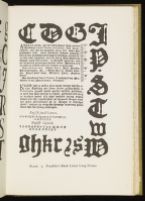
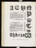
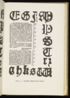
These fonts acquired in 1728 at the outset of his career Franklin used steadily for the next ten years. He did, however, secure in the fall of 1734[15] a small quantity of black letter long primer which he employed sporadically until 1742. For Franklin the new font served two special uses: one was to mark the holy days in the text of his Poor Richards; the other was to set the Gazette advertisements written in the German language, since Franklin never used in his own shop or in that of Franklin and Hall any German scriptorial letter. Black letter was by no means a novel type in Philadelphia printing. Andrew Bradford had small quantities of two black letter sizes — a two line English and a long primer — from the start of his career in 1713, and he and William Bradford, Jr., his nephew after him used the identical font of long primer for advertisements in German in their newspapers. Franklin's original font, readily distinguishable from that of the
By 1738 Franklin's printing business had increased enormously. He launched his newspaper in October of 1729. As early as 1730 he had won from Bradford the position of official printer for the Pennsylvania General Assembly. In the late fall of 1732 he began publishing the first of his Poor Richard Almanacks, which soon became so popular that he was eventually printing annual editions of nearly 10,000 copies. By 1734 he was serving as public printer for both New Jersey and Delaware, the second known before 1776 as the counties of New-castle, Kent, and Sussex. His election as Clerk of the Pennsylvania General Assembly in 1736 put him in a position to obtain commissions for even more government printing than he had enjoyed before. This increased volume obliged him to consider some long range plans for acquiring additional fonts and for replacing his present text letter which after ten years had become somewhat rubbed.
The earliest in a series of purchases of new fonts of text letter appear together in the Gazette on May 4, 1738. The issue is a memorable one, for it marks Franklin's first use of Caslon type, and possibly the earliest use of Caslon in Colonial American printing. His first two new fonts were pica and small pica, the second remarkable for its acute shortage of p and u sorts which obliged Franklin's compositors to substitute inverted d's and n's consistently until February of 1739. From this point in Franklin's career, the spring of 1738, until the termination of his partnership with Hall on January 21, 1766, Franklin, with one exception purchased Caslon text type exclusively for use in his Philadelphia house. The single exception, an obviously non-Caslon font of bourgeois with swash italic capital A's and N's and a gawky oversized roman capital W, makes only two appearances in Franklin's recorded printing: one, the slight Catalogue of Choice and Valuable Books offered for sale in the spring of 1744, and, two, portions of the text of Nos. 922-926 of the Gazette, running from August 14, to September 11, 1746. How this font came into his hands and when
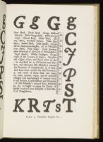
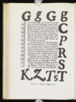
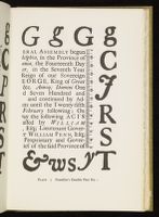
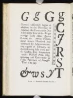
Franklin's first font of Caslon long primer came into use in the Gazette on May 3, 1739, the issue of the previous week, April 26, 1739, revealing his earliest display of Caslon flowers. By July 17, 1740, he had acquired his first Caslon brevier, and probably his first Caslon English, although it makes no appearance in the Gazette until September 18, 1740. At this time, or within a year, Franklin added fonts of Caslon great primer and paragon, a smaller quantity of Caslon double pica, and an assortment of Caslon titling letter — two line long primer, two line pica, and French canon. His two line double pica and five line pica, acquired about the same time, are for some unexplainable reason non-Caslon. Apparently the final purchase in this series was a small quantity of Caslon black letter brevier used first in the Gazette on September 2, 1742. Parker, in compiling his inventory of the type owned by the partners in 1766, fixed the weight of all the black letter — both long primer and brevier — together with "figures, planets, space rules" at a mere 53 lbs. (J. C. Oswald, loc. cit.).
This extensive purchase of Caslon type over a four-year period, 1738-1742, was the last Franklin was to make for his own shop before turning it over to his partner, David Hall, in January of 1748. The documents covering these transactions with Caslon, like those for Franklin's dealings earlier with the James foundry, are missing. The reconstruction is based, therefore, entirely on the evidence of the appearance of the type in Franklin's signed printing, particularly in the dated weekly issues of the Gazette, which for each new font from brevier to English furnished the basis for assigning the approximate time of purchase and earliest occurrence in Franklin's presswork.
Without the records dealing with these type purchases it is impossible to determine how much Franklin paid for his new fonts, how exacting he was in designating a particular letter when Caslon offered for sale a choice of fonts within a given size, and whether or not Franklin dealt directly with the Caslon foundry. If one may form an opinion based on Franklin's later purchases, the likelihood is that Franklin dealt indirectly with the Caslon foundry and merely designated the size of type which he desired to buy. Certainly after 1743, the year in which Franklin initiated his correspondence with Strahan, it is clear that while Franklin dwelt in America he ordered his additional Caslon fonts through Strahan and relied on his judgment in selecting the most suitable letter.[19]
Parker's itemized inventory of the type owned by Franklin and Hall in 1766 does make it possible, however, to state with some certainty in what quantity Franklin purchased several of these first Caslon fonts. Parker lists the following:
- 436 lbs. Long Primer, well worn
- 318 lbs. Small Pica, almost worn out
- 421 lbs. Pica, Old, and much batter'd
- 334 lbs. Old English, fit for little more than old metal
- 223 lbs. Great Primer, well worn
- 158 lbs. Double Pica, pretty good
- 91 lbs. Double English Do.[20]
All of these, which represent but a portion of Parker's total inventory, I have associated with Franklin's original purchase of Caslon type only because I have found no clear evidence either in the printed matter or in the extant manuscripts to indicate that Franklin bought later additional quantities of these fonts. The one exception is a later font of Caslon English, but Parker clearly distinguishes it from the older one: "502 lbs. Newer English, nearly half worn" (J. C. Oswald, loc. cit.). This newer Caslon English, acquired in order that Hall might undertake a large piece of government printing in folio, had appeared first in the printing of the laws of the General Assembly for April 5, 1756, while the older Caslon English seems last to have been employed in the printing of the laws for February 3, 1756. Parker's noting the existence of the two English fonts in 1766 makes clear that though Hall had acquired a fresh font of English some ten years before, he had not seen fit to scrap his worn one.
Thus it is possible to explain how Franklin and Hall kept possession of their original font of Caslon English for a period of twenty-six years. They used it for sixteen years, and once it had worn out, merely kept it in storage for the next ten. But what of the other original Caslon fonts which they retained for an equally long period and kept in use? Part of the explanation certainly is that Franklin and Hall were loath to lay out any more money on type than they needed to. They expected their business to yield a substantial income, and to achieve this objective in troubled times with an unstable economy was no simple task. Moreover, Hall was a frugal man who tended to make do with what materials he possessed so long as they were tolerable. But a more important part of the explanation is the kind of printing they were engaged in and the demands that that printing made on their various sizes of type. From 1728 to 1738 Franklin regularly used English,
When Franklin turned over his shop on January 21, 1748, to his new partner, he put into Hall's hands a stock of all-Caslon text type from eight to ten years old. The purchasing of any additional fonts was to be Franklin's responsibility,[21] though by stipulation in the articles of agreement the two men were to share jointly in the expense.[22] The font first in need of replacement was, quite predictably, the brevier, which with ten years of hard wear in the Gazette had become markedly worn; it lingered in the standing type of a few advertisements until December 19, 1752, more than two years after the new Caslon brevier had been pressed into service on September 27, 1750.[23] Franklin placed
Also in the fall of 1755 both Franklin[24] and Hall were in correspondence with Strahan about a new small-body font. Hall wanted "500 weight" of a font, "Body of Brevier with long primer face & if not with a Long primer Face, with one betwixt a long primer and Brevier" (HLB I, August 28, 1755). Caslon having cast the letter during the winter, Strahan in early March shipped "The Fount of Brevier . . . on Board Captain Reeve, who was ready to sail when an Embargo was clapt on all our Shipping for Six Weeks" (HLB I, March 13, 1756). The type arrived finally in time to be used in the Gazette on June 24, 1756. Franklin writing to Strahan from New York on July 2, remarked that "the brevier fount . . . came to hand in good order and pleases Mr. Hall and me very much."[25] In a reply to Hall written in September Strahan noted that "the new Letter in your Newspaper . . . looks very well" (HLB I, September 11, 1756). Then the storm broke. Hall discovered that he had received not a large face-small body font, but all bourgeois, and shortly thereafter Franklin discovered further that Caslon had billed him for a font of brevier at 2/6 per pound rather than for a font of bourgeois, which should have cost a half shilling less. Franklin felt put upon. He had paid £58/17/6 for the font, had been overcharged £11/15/6, and immediately wrote Strahan somewhat sharply requesting that he see Caslon about a refund, which we may infer was forthcoming since Franklin made no later reference to the matter.[26] An analysis of the bill reveals, incidentally, that the precise weight of the letter was 471 lbs.
When Hall next had occasion to ask his partner to buy some new letter, Franklin was residing in London, having arrived there in July of 1757. When Hall's request reached him in the spring of 1758, he went directly to the foundry to place the order. Caslon cast the font — 192 lbs. of bourgeois — over the summer, and Franklin arranged for it to be shipped in September. The shipping was delayed, however, so that the type did not reach Philadelphia until the following spring.[27]
What Hall wanted was not bourgeois but brevier. "The old Letter is shockingly bad," he wrote Franklin on March 5, 1760, "and I don't care to use the Bourgois [in the Gazette advertisement], for the Reason
By July of 1761, a little more than a year after Franklin had sent over the last font of Caslon brevier, Hall was urging him to order a like quantity of the same letter to be shipped at once. The Gazette advertisements were becoming so bulky that he was obliged "to distribute the standing ones in order to set up the new" (HLB II, July 20, 1761). Franklin allowed the request to go unheeded so involved had he become by this time in the responsibilities of his work as provincial agent. Eventually Hall understood that Franklin could no longer be expected to perform even these occasional chores for the firm, and on November 21, 1764, Hall asked Strahan to secure for him 500 lbs. of Caslon brevier, despite the fact that at that moment Franklin was again on the high seas bound for London, after returning to America
When the partnership terminated in January of 1766, Hall took over the shop and shortly thereafter joined in a new business agreement with a former employee, William Sellers. Their type save for the newly acquired font of brevier consisted of the stock previously owned by Franklin and Hall. In quantity and variation of size the letter was extensive, but as Parker explained to Franklin, ". . . indeed the whole is worn much, except the Double Pica and newest English, tho' neither of them are new."[32] Within six months Hall had begun ordering replacements for the old fonts, starting with the long primer and titling type (HLB III, June 7, 1766). Only one of Franklin's 1728 type acquisitions, the James' French canon, remained in use throughout the 38 years of Franklin's association with the Philadelphia printing house, and passed into the possession of Hall and Sellers. I found it used only once, and this in a line of long standing type. Within the year it had disappeared.
This then is the history of the fonts of type which Franklin employed in his Philadelphia shop from 1728 to 1766, and the necessary preliminary to the consideration of one final question: With what certainty is it now possible to identify as Franklin's a piece of printing, unsigned or issued as the work of another, which falls within the 38 years of his active printing career and which is by some fashion connected with Pennsylvania, New Jersey, or Delaware? The answer is best divided into two parts. During the greater portion of Franklin's career as the master of his own shop, from the spring of 1728 to the late summer of 1743, I believe it possible to identify positively on the evidence of the type just about any piece of unsigned Franklin printing. In 1728 Franklin had but two competitors in Philadelphia. The less significant was his old employer, Samuel Keimer, whose meager holdings of text type consisted of two fonts of English and one each of pica and long primer, all of them readily distinguishable from Franklin's. Keimer sold his shop to David Harry in 1729 and went to Barbados where Harry joined him in 1730, "taking the printing house with him" (Memoirs, p. 174). Franklin's more formidable competitor was, of course, Andrew Bradford, whose type holdings exceeded Franklin's but differed from them in every font. One, therefore, can distinguish
The second part of the answer involves complications. It covers the period of 1743 to 1766, the last few years of Franklin's sole proprietorship and the whole of his partnership with Hall. In 1742 Franklin completed his series of purchases of all-Caslon fonts; by 1743 he had disposed of the last of his original James letter except for the seldom seen French canon, which persisted until 1766. It is this array of new Caslon letter acquired by Franklin that at one and the same time presents the surest basis for identifying his later unsigned presswork, and the gravest obstacle. The chief complicating factor is Andrew Bradford's nephew, William Bradford, Jr., who opened his Philadelphia shop about July 1, 1742, and had acquired by early September 1743, a font of Caslon English, by December 1745, a font of Caslon pica, and by December 1746, a font of Caslon long primer. He did possess from the outset, however, non-Caslon fonts of English and long primer, and an assortment of non-Caslon titling letter. Further, he used printer's ornaments only rarely, none of them cast by Caslon. Had he continued systemically to purchase additional Caslon type, the problem of differentiating his printing from Franklin's on the basis of the letter alone would have proved all but insolvable. Fortunately for this study he did not. His two later fonts of bourgeois are non-Caslon, and he seems never to have owned a font of brevier.
Further, when William's uncle, Andrew Bradford died, he stipulated in his will that the nephew was to receive at the death of Cornelia Bradford — she died in 1755 — all of his "Printing Press Letter . . . if he shall behave himself handsomely towards her."[33] According to Isaiah Thomas, Cornelia had been responsible for disrupting an earlier partnership between Andrew and his nephew;[34] therefore William's chances of acquiring his uncle's fonts before 1755, if at all, would seem remote. But the letter in William's publications tells another story. By 1746 William was using Andrew's newest font of English, and by 1752 he appears to have gained possession of much of the remainder of Andrew's stock of type. Since Franklin and later Hall used only Caslon fonts and William Bradford, Jr., both Caslon and non-Caslon type,
Other than Franklin and the Bradfords, who were printing almost entirely in the English language, and Christopher Sauer, who was printing more in German than in English, Philadelphia in the 1740's had only a trio of struggling minor German printers — Joseph Crell and two Franklin partners, Gotthard Armbruster and Johan Boehm — all employing non-Caslon fonts or German scriptorial letter. In the large cities to the north, however, the important printers were all equipping their houses with Caslon. In New York City Franklin established a silent partnership with James Parker, the successor to the retiring William Bradford, Sr., and fitted the new shop with a complete stock of Caslon type by 1743. In Boston by the mid-forties Rogers and Fowle, Kneeland and Green, Gookin, and Henchman had all acquired Caslon fonts.
In the 1750's two of the three new printers in English to set up shop in Philadelphia were men trained by Franklin, James Chattin and William Dunlap, the latter a Franklin partner in Lancaster before moving to Philadelphia. The third newcomer was Andrew Steuart. Chattin, active from 1752 to 1758, first in Lancaster and later in Philadelphia, possessed in addition to his Caslon English, long primer, and brevier, an assortment of distinctive non-Caslon fonts, which makes it relatively simple to distinguish much of his printing from Franklin and Hall's. Dunlap and Steuart, on the other hand, both starting their careers in 1758, reveal almost from the outset all-Caslon letter. Further-more, by 1754 James Parker had set up a printing house in Wood-bridge, New Jersey, employing Caslon type entirely, and by 1761, James Adams, a Franklin-trained printer, had begun using Caslon in his new shop located in Wilmington, Delaware.
The two new Philadelphia printers in the early sixties were Peter Miller and Henry Miller, craftsmen whose houses were stocked with both German scriptorial and English roman and italic letter. The chief difference between the two is that Henry Miller, a former Franklin journeyman, employed for his publications in English all-Caslon text and titling type while Peter used largely non-Caslon fonts.
This increasingly widespread use of Caslon by the printers both in Philadelphia and in the neighboring provinces makes it most difficult after 1753 to identify by means of the letter alone an unsigned Franklin
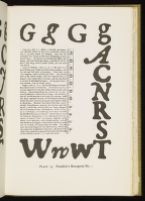
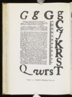
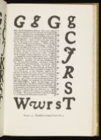
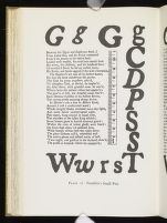
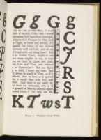
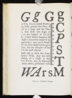
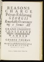
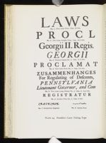
There remains finally the need to discuss the pattern of the accompanying series of plates and of the digest of known fact concerning each font exhibited, for these plates and their related commentary constitute the basic evidence by which future bibliographers may test the validity of the conclusions presented in the earlier sections of this paper and carry on independent research in eighteenth-century American printing among the Middle Colonies.
There are in all twenty-four plates, seven showing a variety of fonts widely used by Franklin's competitors during the years when Franklin was sole master of his establishment, fifteen reproducing the text fonts used by Franklin or by Franklin and Hall, and two offering selected samples of the Franklin titling type plus his very limited holdings of English scriptorial and pica Greek letter.
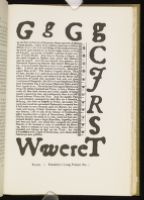
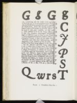
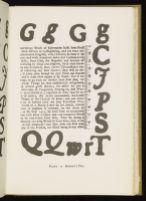
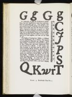
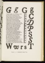
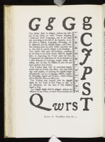
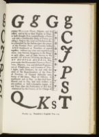
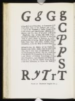
In each plate exhibiting a text font it was my intention to achieve two objectives: (1) to reproduce at actual size a twenty-one line segment of the font with representative samplings of both the roman and italic letter, and (2) to present considerably enlarged a key selection of characters designed to assist the scholar in identifying a particular type. The first objective has not been fully realized in every plate, but since the fonts owned by Franklin and his Philadelphia competitors often differ markedly, the samples pictured should offer the scholar a reasonably workable basis for positive identification.
Several obstacles stood in the way of achieving the first objective. The limited size of the plate prohibited the inclusion of a twenty-one line segment of the larger fonts, the double pica and paragon. Also it was not always possible to find among extant copies of Franklin's imprints set in smaller fonts twenty-one line segments combining representative settings of both the roman and italic letter, or where such examples were found, uneven impression in the original printing or defects such as extreme warping, faded inking, and tears, stains, or distorting repairs made satisfactory photographic reproduction unfeasible. Among the black letter fonts, it was difficult or on occasion impossible to find extended passages from which to choose a suitable example. With each segment of type in mass, regardless of size, I have appended a millimeter rule so that the scholar may test for himself the degree of accuracy with which the letter has been reproduced at life size and make compensations where the enlargement varies a millimeter or two.
The second objective, that of reproducing much enlarged and truly characteristic a series of letters useful in identifying a specific font, was likewise a task beset with difficulties. Any enlargements as great as those offered on the plates will of necessity involve a certain amount of distortion, the smaller the characters as those reproduced from the fonts of brevier and bourgeois, the greater the distortion.
Furthermore, those letters recurring frequently in a font designed for setting copy written in English may be cast from a series of matrices, rather than from a single one, and therefore may differ slightly in tilt depending on how the puncheon was held when the matrix was struck; hence, despite my careful scanning of many occurrences of the same letter before selecting what was considered a truly characteristic example, it is possible that I may have reproduced only one typical casting where several are present in a given font. Another complication in selection arose from the fact that it was not possible consistently to present reproductions of letters in settings which exhibited the font fresh from the foundry. And even where this was possible, the user of the plates must be wary of what changes in appearance may occur in individual characters after years of use when the sharpness of line is blunted, the terminals distorted, and tails, ears, finials, and beaks damaged.
Two other points need brief words of explanation. First, key letters have been presented greatly enlarged in order that one may perceive more easily the distinctive design of the characters: the curvature of bowls, contour of arms, and variation in terminals. The letters in enlargement are not to be considered an accurate basis for judging the relative size of one character to another. Use rather the sampling of the font in mass as the basis for making that judgment. Second, the characters enlarged include many more capitals than lower case letters. The reasons for such a selection are that: (1) in the Franklin period it was compositorial practice to capitalize all important nouns; hence capitals abound in the texts under consideration; (2) many of the capitals exhibit distinctive variations, especially in arms, stems, beaks, finials, and spurs; and (3) these characteristics may be the more readily discerned in the larger capitals than in the lower-case letters.
In the enlarged reproduction of characters in the black letter fonts, of which Franklin and the Bradfords had clearly limited supplies and which they employed most frequently in setting advertisements in their newspapers, hastily printed on inferior grades of native paper, I had the greatest difficulty in discovering wholly satisfactory examples; since, however, almost every character in Franklin's long primer font differs
The commentary accompanying each plate includes approximately the same kind of information. The first entry gives the name of the printer or printers using the font; the eighteenth-century name for the font; its twenty-line measurement in millimeters except for that of the titling type where the height of the capital is given; and the terminal dates of use of a particular font by one or more printers.
The second entry, "Key Letters," offered for all but the Caslon fonts, includes descriptions of individual characters useful in identifying the font quickly. The aim usually has been to designate characters which make it possible for the scholar at a glance to distinguish the Franklin letter from the same letter in fonts used by his contemporaries.
The third entry, "Comment," includes information concerning the years during which the font was regularly in use and in some instances the transference of a font from one printing house to another. This entry often includes also in a second paragraph the names of printers other than Franklin using a like font during the same years.
The final entry, "Occurrences," lists a sampling of imprints wherein the particular font has been used. A number preceded by "C" refers to the entry of the work in W. J. Campbell's A Short-Title Checklist of all known Franklin Imprints; a number preceded by "E" refers to the entry in C. Evans' American Bibliography; and a number preceded by "H" refers to the entry in C. R. Hildeburn's A Century of Printing: the Issues of the Press of Pennsylvania, 1685-1784.
- FRANKLIN Long Primer No. 1 67 mm. 1728-1743
- Key Letters: (Roman) the lower case r with blunt ear, the letter when set between e's or i's falling appreciably short of the mean-line; (Italic) the lower case w characterized by the sweeping downward curving of its head.
- Comment: This font Franklin used from the spring of 1728 until May 3, 1739, when he acquired his Caslon long primer. Thereafter the non-Caslon letter appears sporadically in Franklin printing until its discard late in 1743; it continues in use, however, in the standing type of the Poor Richard Almanacks until 1747.
- Type identical with Franklin's long primer No. 1 occurs from January 8, 1732 until March
10, 1733, in The South-Carolina Gazette, printed by Thomas Whitmarsh,
Franklin's partner in Charleston; on March 17, 1733,
198the roman letter with its distinctive lower case r is replaced by another roman font, but the italic like Franklin's persists in the printing of Whitmarsh and his successors, Louis and Peter Timothy, until March 9, 1747.
- Occurrences: 1728: C1, E3104. 1730: C16, E3252. 1732: C46, E3503. 1733: C49, E3710; C59, E3625. 1734: C66, H479. 1735: C71, E3783; C87, E3901; C90, E3905. 1736: C98, E3986. 1742: C237b, E5033. 1728-1739: Pa. Gazette, passim. 1733-1747: Poor Richard Almanacks.
PLATE No. 1
- FRANKLIN Pica No. 1 84 mm. 1728-1738
- Key Letters: (Roman) the capital G with sheared serif on upper arm and lower armed spur, the capital S with upper armed barbed serif; (Italic) the capital G with lower armed spur, the distinctive swash capital J and P, the lower case w with center loop and head with sheared inverted terminal.
- Comment: Franklin used this font from the spring of 1728 until May 4, 1738, after which date the earlier font disappears. See comment for Franklin's English No. 1.
- Type identical with Franklin's pica No. 1 occurs from January, 1732 until March 9, 1747, in The South-Carolina Gazette.
- Occurrences: 1728: C1, E3104. 1731: C25, E3388. 1732: C35, E3500. 1735: C88, E3902. 1736: C98, H536. 1737: C106-107, E4138-39. 1729-1738: Pa. Gazette, passim.
PLATE No. 2
- KEIMER — HARRY Pica 83 mm. 1725-1730
- Key Letters: (Roman) the lower case w with the two inner stems joining only at apex; (Italic) the lower case w with head terminals linking apex and stems.
- Comment: This is Samuel Keimer's lone pica font acquired in 1725, and turned over to his successor, David Harry, who used it in Philadelphia from 1729 to 1730, before taking it with him to Barbados.
- Occurences: KEIMER — 1728: E3051; E3905. 1728-1729: Pa. Gazette, Nos. 1-39. HARRY — 1730: E3323, E3350.
PLATE No. 13
- BRADFORDS Pica No. 3 82 mm. 1736-1757
- Key Letters: (Roman) lower case g with medium bowl, vertical ear, and thinning lower arc of biased loop; (Italic) the lower case w with unlooped inner stems and pointed biased lower apices.
- Comment: This pica, the third used by Andrew Bradford since he had begun printing in 1713, appeared first in the American Weekly Mercury on December 9, 1736. Cornelia Bradford, Andrew's widow, used the font from 1742-1746. It passed to William Bradford, Jr. in the early 1750's.
- Occurrences: A. BRADFORD — 1737: E4142. 1738: E4246. 1740: E4499, E4537. 1736-1746: Am. Weekly Mercury, passim. C. BRADFORD — 1743: E8005. W. BRADFORD, JR. — 1751: E6658. 1753: E6952, E6968, E7063, E7112. 1754: E7152. 1757: E8005.
PLATE No. 14
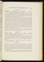
- FRANKLIN English No. 1 95 mm. 1728-1742
- Key Letters: See descriptions under Franklin's Pica No. 1.
- Comment: The face of this English font is the same as that of Franklin's Pica No. 1. Franklin used this font from the spring of 1728 until late in 1742. He acquired his first font of Caslon English probably in the summer of 1740; it first appears in the Gazette on September 18, 1740. He used his old and new fonts concurrently from 1740 to 1742.
- Type identical with Franklin's English No. 1 occurs from January, 1732 to March 9, 1747, in The South-Carolina Gazette. The same type badly rubbed occurs in E6954 dated 1753 with the Newport imprint of Franklin's nephew James. The pica of this font — Franklin's Pica No. 1 — also markedly worn occurs in an unsigned 1757 broadside announcing a Rhode Island lottery. I have not yet made an extensive examination of the Franklin Newport imprints, but the occurrence of these worn fonts in Rhode Island printing suggests the possibility that some years after B. Franklin had purchased his new Caslon English and pica he may have sent his earlier non-Caslon fonts to Newport where in 1738 his brother's widow took over the shop until her son James could be educated and trained to the printing business in Philadelphia by his uncle.
- Occurrence: 1733: C49, E3710; C50, E3711. 1735: C84, E3884. 1736: C99, E4061. 1738: C126, E4327. 1741: C187, E5033. 1742: C237b, E5033. 1743: C283, E5272. 1729-1740: Pa. Gazette, passim.
PLATE No. 15
- KEIMER - HARRY English No. 2 92 mm. 1726-1730
- Key Letters: (Roman) the capital C with its stubby rounded finials; (Italic) the lower case g extending above the mean-line.
- Comment: This is Keimer's second font of English, not the first "small, wornout font of English" which Franklin found in the shop when he applied to Keimer for a job in October, 1723. Keimer turned over the font to David Harry, who used it in 1729-1730 before taking it with him to Barbados.
- Occurrences: KEIMER — 1728: E3051. 1728-1729: Pa. Gazette, Nos. 1-39 passim. HARRY — 1730: E3323.
PLATE No. 16
- FRANKLIN Double Pica No. 1 Cap. 5 mm. 1728-1741
- Key Letters: (Roman) capital C with barbed beaks, the small bowl of the lower case g, the lower case v with the apex frequently above the base-line, and lower case y extending above the mean-line; (Italic) swash capital J, heavy stemmed with markedly rounded foot and head terminals, backward tilt of bar in capital H and of head serif on capital L, rounded terminal on head of lower case w.
-
Comment: This font acquired in the spring of 1728 Franklin used
often as text type for broadsides and for section headings in printing the Provincial
200laws as well as for titling type. Once he had acquired his large assortment of Caslon titling type in 1741 and his Caslon fonts of great primer and paragon, his use of double pica in either non-Caslon or Caslon became negligible.
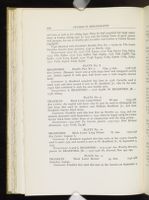
- Type identical with Franklin's Double Pica No. 1 occurs in The South-Carolina Gazette from January, 1732 to March, 1747.
- Occurrences: 1729: C7. 1730: C16, E3252. 1733: C49, E3710; C59, E3625. 1734: C62, E3822. 1735: C77, E3862; C90, E3905. 1736: C98, E3986; C99, E4061. 1738: C123, E4298. 1740: C148, E4524; C163, E4600; C183, E4651. 1741: C200, E4722; C209, E4792.
PLATE No. 17
- BRADFORDS Double Pica No. 2 Cap. 5 mm. 1728-1758
- Key Letters: (Roman) lower case g with large bowl and elongated curved ear; (Italic) capital G with spur, and lower case w with lengthy sheared head.
- Comment: A. Bradford acquired this font in 1728, Cornelia used it until 1746, and then turned it over to W. Bradford, Jr., who by the early 1750's had combined it with his own double pica.
- Occurrences: A. BRADFORD — 1728: E3086. W. BRADFORD, JR. — 1758: E8205
PLATE No. 18
- FRANKLIN Black Letter Long Primer 66 mm. 1734-1766
- Key Letters: the capital and lower case S's may be used to distinguish this font from that used by Andrew and William Bradford, Jr., and from Franklin's brevier black letter.
- Comment: Franklin used this font first on October 31, 1734, and consistently thereafter until September 2, 1742, when he began using his Caslon brevier black letter either alone or in conjunction with the long primer.
- Occurrences: 1734-1766: Pa. Gazette, passim. 1735-1747: Poor Richard Almanacks. 1737: C106, E4138.
PLATE No. 19
- BRADFORDS Black Letter Long Primer 67 mm. 1723-1748
- Key Letter: Capital S.
- Comment: A. Bradford acquired this font early in the 1720's, Cornelia used it until 1746, and turned it over to W. Bradford, Jr., by September 3, 1747.
- Occurrences: A and C. BRADFORD — 1723-1746: Am. Weekly Mercury, passim. W. BRADFORD, JR. — 1747-1748: Pa. Journal, Nos. 250, 290.
PLATE No. 10
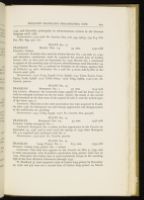
- FRANKLIN Black Letter Brevier 54 mm. 1742-1766
- Foundry: Caslon.
-
Comment: Franklin first used this font in the Gazette on September 2,
2011742, and thereafter principally in advertisements written in the German language until 1766.
- Occurrences: 1742-1766: Pa. Gazette, Nos. 716, 743, 756-57, 773, 814, 818, 820, 880, 899, 972, etc.
PLATE No. 11
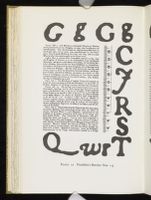
- FRANKLIN Brevier Nos. 1-3 54 mm. 1740-1766
- Foundry: Caslon.
- Comment: Franklin first used his Caslon Brevier No. 1 on July 17, 1740, and thereafter consistenly until he acquired his second font of Caslon brevier (No. 2), first used on September 27, 1750. Brevier No. 1 continued to appear in the standing type of Gazette advertisements until December 19, 1752. Caslon Brevier No. 3, ordered by Franklin in all roman, appears first on February 19, 1761; thereafter No. 2 and No. 3 occur side-by-side in the Gazette until 1766.
- Occurrences: 1740: C145, E4506; C177, E4636. 1741: C200, E4722; C207. E4704; C228, E4856. 1757: C608, E8041. 1764: C695, E9669. 1740-1766: Pa. Gazette, passim.
PLATE No. 12
- FRANKLIN Bourgeois No. 1 57 mm. 1744-1746
- Key Letters: (Roman) the unusually large capital W and the lower case w with its enlarged terminal on the far stem; (Italic) the swash A, the curved head terminal on the first stem of the capital M and N, and the arched apex of the lower case w.
- Comment: This font is the only non-Caslon text type acquired by Franklin after 1738. Its infrequent use and abrupt appearance and disappearance in the mid-forties are puzzling.
- Occurrences: 1744: C289, E5396. 1746: Pa. Gazette, Nos. 922-926.
PLATE No. 13
- FRANKLIN Bourgeois Nos. 2-3 57 mm. 1756-1766
- Foundry: Caslon bourgeois No. 1
- Comment: Bourgeois No. 2 makes its first appearance in the Gazette on September 24, 1756, and is used until the spring of 1759 when Bourgeois No. 3 is acquired and combined with No. 2.
- Occurrences: 1756-1766: Pa. Gazette, passim.
PLATE No. 14
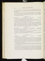
- FRANKLIN Long Primer No. 2 67.5 mm. 1739-1766
- Foundry: Caslon long primer No. 1 roman
- Comment: This font first appears in the Gazette on May 3, 1739, and is used concurrently with Franklin's non-Caslon long primer until late in 1743. Thereafter the Caslon font is used exclusively except in the standing type of the Poor Richard Almanacks through 1747.
- W. Bradford, Jr. had acquired a font of Caslon long primer by December 23, 1746, and put
into use a second font of Caslon long primer on March
20211, 1756, in the Pa. Journal. Chattin by 1753, Dunlap and Steuart by 1758, and Henry Miller by 1761 were all using fonts of Caslon long primer in Philadelphia.
- Occurrences: 1739: C138, E4453. 1740: C163, E4600; C170, E4613; C175, E4633; C182-83, E4650-51. 1741: C200, E4722; C209, E4792; C228, E4856. 1742: C237, E5033. 1748: C381, E6238; C385, E6165. 1749: C412, E6300; C417, E6320; C431, E6412.
PLATE No. 15
- FRANKLIN Small Pica 74 mm. 1738-1766
- Foundry: Caslon small pica roman and italic No. 2
- Comment: Franklin first used this font in the Gazette on May 4, 1738. From that date until February 1, 1739, he substituted inverted lower case roman d's and n's for the missing p and u sorts.
- Occurrences: 1739: C132, E4419. 1740: C145, E4506; C153, E4564; C165, E4604; C177, E4636; C183, E4651. 1741: C187, E4675; C191, H695; C197, E4714; C207, H719; C215a, E4820; C216, E4824; C228, E4856. 1742: C233, E5082; C236, E4896; C238, E4930; C244, E4987; C260, H799. 1747: C363, E6013. 1748: C380, E6135. 1749: C428, E6282. 1750: C447, E6555.
PLATE No. 16
- BRADFORDS Small Pica 72 mm. 1733-1746
- Key Letters: (Roman) lower case g with small bowl and vertical ear; (Italic) swash capital B, D, and P.
- Comment: A. Bradford first used this font on December 22, 1733. W. Bradford, Jr. appears never to have used this letter.
- Occurrences: A and C. BRADFORD — 1733-1746: Am. Weekly Mercury, passim.
PLATE No. 17
- PRANKLIN Pica No. 2 84.5 mm. 1738-1766
- Foundry: Caslon pica roman No. 1
- Comment: Pica No. 2 first appeared in the Gazette on May 4, 1738, and was used thereafter until 1766. Twenty-eight years is an exceedingly long period for the steady though light use of one font, and it is quite possible that Franklin may have acquired an additional quantity of Caslon pica in the interval, but I have found no evidence either in the correspondence or printing to support the point.
- W. Bradford, Jr. began using his font of Caslon pica by June 6, 1745. Andrew Steuart, William Dunlap, and Henry Miller were all using theirs early in the 1760's.
-
Occurrences: 1740: C144, E4501; C157;
C163, E4600; C170, E4613; C189; C190, E4782. 1741: C228, E4930. 1742: C233a-b, E5082; C235, E4889; C237a, E5033; C246, E5013; C258-59,
E5104-05. 1744: C290, E5361; C310, E5509; 1745:
C312, E5532. 1746: C334, E5853. 1748: C378,
E6120; C397-98, E6239-40; C400, E6247. 1749: C411, E6297; C435, E6348.
1751: C472, E6754; C478,
203E6754; C490, E6859. 1753: C508, E6987. 1754: C528, E7318. 1756: C583, E7815. 1757: C591, E7840; C593-94, E7916-17.
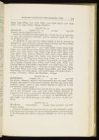
PLATE No. 18
- FRANKLIN English Nos. 2-3 92 mm. 1740-1766
- Foundry: Caslon English roman No. 1
- Comment: Franklin first used English No. 2 in the Gazette on September 18, 1740, and consistently thereafter until he acquired English No. 3 for use in April of 1756.
- W. Bradford, Jr. first used his Caslon English in the Pa. Journal on September 8, 1743. Chattin by 1756 and Steuart, Dunlap, and Henry Miller by 1761 were likewise employing Caslon English.
- Occurrences: English No. 2 — 1742: C236, E4896; C237b, E5033; C238, E4930. 1743: C264, E5124; C275, E5253; C277, E5263; C282, E5216; C283, E5272. 1744: C287, E5472; C294, E5390; C299, E5442; C308, E5415. 1746: C325, E5671; C327; C330-32, E5844-46; C336, E5772; C347, E5885. 1747: C350, E6042; C356, E5949; C361, E5989. 1748: C377-78, E6119-20; C399, E6243; C401-02, E6168-69; C403, E6214; C405, E6269. 1749: C406-07, E6394-95; C408, E6395; C411, E6297; C417,E6320; C435, E6348. 1750: C455, E6617. 1751: C458-59, E6745-46; C474, E6658; C478, E6783; C480, E6748. 1752: C483-84, E6906-07; C486, E6835; C499, E6908. 1755: C538, E7354. 1756 (Feb. 3): C560, E7750. English No. 3 — 1756 (Apr. 5): C561, E7751; C565, E7635. 1758: C620, E8146. 1759: C634, E8338; C640, E8486. 1760: C646, E8578; C648, E8633. 1762: C673, E9314. 1766: C728, E10355. 1766 (Feb.): HALL — E10442. 1766 (Sept.): HALL and SELLERS — E10443.
PLATE No. 19
- BRADFORDS English No. 3 93 mm. 1742-1758
- Key Letters: (Roman) capital G with pronounced spur and upper barbed terminal, and capital C with sheared terminals, the lower one almost fully bracketed (Italic) capital G with marked tapering of upper arc of arm and distinctive swash capital P.
- Comment: Andrew Bradford first used this font in June, 1742, Cornelia used it from December, 1742, until 1746, when William Bradford, Jr. acquired it and used it concurrently with his Caslon English until 1758.
- Occurrences: A. BRADFORD — 1742: E5031. W. BRADFORD, JR. — 1746: E5883. 1748: E6166, E6244-45. 1752: E6940. 1753: E7112, E7136. 1758: E8205.
PLATE No. 120
- FRANKLIN Great Primer 117 mm. (Cap. 3.75 mm.) 1741-1766
- Foundry: Caslon
- Comment: Franklin first used this font in 1741. He employed it, much as he did his font of paragon, for use in setting broadsides, section-headings in the Provincial laws, and an occasional pamphlet as well as for titling type.
- Occurrences: 1741: C222, E4836, 1742: C237a, E5033; C257, E5106. 1744: C290, E5361; C303, E5473. 1745: C314, E5553. 1746: C336, E5772; C342, E5847. 1749: C429, E6397; C430, E6396. 1755: C554, E7569. 1756: C577, H1497.
PLATE No. 121
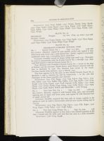
- FRANKLIN Paragon 130 mm. (Cap. 4.5 mm.) 1742-1766
- Foundry: Caslon
- Occurrences: 1742: C237a, E5033. 1744: C290, E5361. 1745: C314, E5553. 1746: C342, E5847. 1749: C429, E6397; C430, E6396.
PLATE No. 122
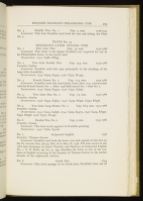
- No. 1 French Canon No. 1 Cap. 11.5 mm. 1728-1766
- Key Letters: (Roman) capital R with double curved tail, capital E with tilted lower arm, lower case e with slanted bar; (Italic) capital G noticeably condensed, lower case e extending above mean-line.
- Comment: Franklin owned no larger titling type until 1741. Thereafter he used it concurrently with his French Canon No. 2 through 1747. After 1748 Hall mixed it with his French Canon No. 2.
- Type identical with Franklin's French Canon No. 1 occurs in the shop of Keimer and his successor, David Harry, until Harry's removal with the font to Barbados in 1730. The identical font occurs in the South-Carolina Gazette from January, 1732 to March, 1747.
- This font appears to be the same as that labeled French Canon No. 3-Berthelet 2 and 3, matrices 85 and 69 respectively — in the 1782 Sale Catalogue of the James punches and matrices.
- Occurrences: 1730: C18, E3340. 1733: C49, E3710; C55, E3711. 1734: C62, E3822. 1735: C77, E3862; C84, E3884. 1736: C99, E4061. 1738: C123, E4298. 1739: C129. E4409. 1740: C148, E4524a; C183, E4651. 1741: C209, E4792. 1742: C237a, E5033; C245, E5034. 1743: C283, E5272. 1744: C303, E5473. 1746: C326, H4622. HALL and SELLERS — 1766: E10443.
- No. 2 Two Line Pica No. 1 Cap. 7.5 mm. 1728-1743
- Key Letters: (Roman) capital G with barbed beak, spur, and noticeably tapering arcs of upper and lower arms, and capital R with flattened foot of single curved tail.
- Comment: Franklin acquired this font only in roman capitals in the spring of 1728; he used it concurrently with his new Caslon titling type in 1742-43.
- Occurrences: 1733: C49, E3710; C55, E3711. 1735: C87, E3901. 1740: C144, E4501; C183, E4651. 1742: C238, E4651.
- No. 3 Two Line Long Primer No. 1 Cap. 6.5 mm. 1738
- Comment: Franklin appears to have had a very limited quantity of this font. I found only the italic used and that but once in a folio broadside.
- Occurrence: 1738: C123, E4298.
- No. 4 Double Pica No. 1 Cap. 5 mm. 1728-1741
- Comment: This font Franklin used both for text and titling. See Plate No. 7.
PLATE No. 123
FRANKLIN'S EARLIER TITLING TYPE
- No. 1 Five Line Pica Cap. 19 mm. 1752-1766
- Comment: This letter is the largest Franklin ever acquired for use in his Philadelphia house. It was rarely used.
- Occurrence: 1752: C486, E6835.
- No. 2 Two Line Double Pica Cap. 13.5 mm. 1742-1766
- Foundry: Caslon
- Comment: Franklin used this type principally in the headings of his large folio broadsides.
- Occurrences: 1744: C303, E5473. 1756: C577, H1497.
- No. 3 French Canon No. 2 Cap. 11.5 mm. 1742-1766
- Comment: Franklin used this non-Caslon letter after 1741 concurrently with his French Canon No. 1. After 1748 Hall mixed No. 1 with No. 2.
- Occurrences: 1744: C303, E5473. 1746: C342, E5847.
- No. 4 Two Line Pica No. 2 Cap. 7.5 mm. 1742-1766
- Foundry: Caslon
- Occurrences: 1746: C342, E5847. 1749: C429, E6397; C430, E6396.
- No. 5 Two Line Long Primer No. 2 Cap. 6-6.5 mm. 1741-1766
- Foundry: Caslon
- Occurrences: 1741: C222, E4836. 1744: C303, E5473. 1749: C429, E6397; C430, E6396. 1756: C577, H1497.
- No. 6 Double Pica No. 2 Cap. 5 mm. 1742-1766
- Foundry: Caslon
- Comment: This font rarely appears in Franklin printing.
- Occurrence: 1742: C260, E5106.
- No. 7 Scriptorial English 1738
- Foundry: Thomas Grover
- Comment: Franklin used both the lower case and capitals of this font in the Pa. Gazette Nos. 481-90, Feb. 28 to May 18, 1738. The font occurs in the 1782 Sale Catalogue of James' Punches and Matrices as Scriptorial English No. 1. T. B. Reed, op. cit., p. 199, identifies the letter as one of the two fonts of English occurring in the foundry of Thomas Grover in the earlier decades of the eighteenth century.
- No. 8 Greek Pica 1744
-
Comment: This brief passage set in Greek pica, Franklin's lone
use of
206Greek letter, occurs in a footnote for James Logan's translation of Cicero's Cato Major, 1744: C290, E5361. Andrew Bradford in 1738 (E4246) and William Bradford, Jr. in 1753 (E7112) revealed in their printing a considerably larger quantity of Greek pica. William by 1750 had acquired even a small quantity of Hebrew type (E6515).
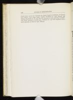
PLATE No. 124
FRANKLIN'S LATER TITLING TYPE
Notes
A Century of Printing: the Issues of the Press of Pennsylvania, 1685 — 1784 (1885-1886), 2 vols.
C. W. Miller, "Franklin's Type: Its Study Past and Present," Proceedings of the American Philosophical Society, XC (1955), 418-432.
Benjamin Franklin's Memoris, Parallel Text Edition, ed. Max Farrand (1949), p. 86. Cited hereafter as Memoirs.
See Philip Gaskell, "Type Sizes in the Eighteenth Century," Studies in Bibliography, V (1953), 147-151.
Talbot B. Reed, A History of the Old English Letter Foundries, ed. A. F. Johnson (1952), pp. 200-228.
A Catalogue and Specimen of the . . . Printing Type-Foundery of . . . Mr. John James . . . Improved by . . . Edward Rowe Mores . . . which will be Sold by Auction . . . Wednesday, 5th June, 1782 . . . .
Charles Enschedé, Fonderies de Caractères et leur Matériel dans les Pays-Bas du XVe au XIXe Siècle (Haarlem, 1908), pp. 74-76.
American Philosophical Society Library Mss., David Hall Letter Book, 1764-1772, November 21, 1764. Cited hereafter as HLB III.
American Philosophical Society Library Mss., David Hall Letter Book, 1750-1759, July 13, 1750. Cited hereafter as HLB I.
American Philosophical Society Library Mss., David Hall Letter Book, 1759-1764, March 5, 1760. Cited hereafter as HLB II.
| | ||