| | ||
Correlated Type Sizes and Names for
the Fifteenth Through Twentieth Century
by
John Richardson Jr.
[*]
Bibliographical theorists such as Fredson Bowers and G. Thomas Tanselle have noted that bibliographers record the vertical measurement for twenty lines of unleaded type as part of their analytical descriptions of printed books.[1] In addition, Bowers has advised recording the appropriate point size as well as the common name for the printing types found in books.
Regrettably, however, bibliographers do not usually have the actual type in hand as do printers; rather they must deal with the printed image—the type face as it appears on the page. Nor do they always have specimen sheets or other primary sources at hand to consult regarding the common names. Furthermore, some previous efforts to reconcile this situation have been flawed in their mathematical calculations and as a result have misled unsuspecting researchers.
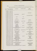
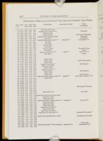
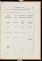
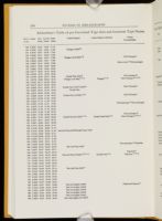
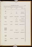
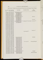
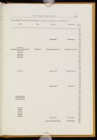
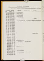
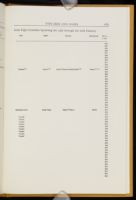
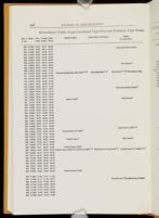
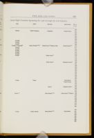
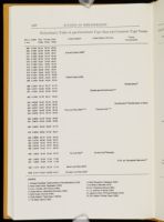
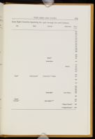
This article seeks to alleviate those problems by providing a reliable comparative study of the sizes and names of type. Specifically, it attempts (1) to furnish extensive millimeter measurements for twenty lines of type, (2) to calculate accurately the equivalent measurements in inches and in pica as well as fournier and didot points, and (3) to correlate the common type names for seven countries over six centuries.
Background and Sources
At the turn of the century, Robert Proctor first employed a measure of twenty-lines of type to avoid the difficulty of the apparent size. McKerrow preferred ten-line measurements but A. W. Pollard resisted this change. Ten-line measurements make sense; they would save some time counting lines and the division by ten would be easier. John Tarr, in his 1946/47 Library article "The Measurement of Type" (5th ser. 1: 248-249) offered a useful table of 49 to 220 millimeters with the corresponding values in inches, pica points, and old bodies. Unfortunately, his sixty-one calculations, either by
In 1949, Bowers codified the work of the preceding bibliographers, thereby encouraging successive generations to use the twenty-line measurement. Nevertheless, one cannot easily convert from the measurement of the printed image to the exact specification of point size. Interested bibliographers have still needed to consult a variety of sources. For the first time, this article draws together the work of many different bibliographers, including the following.
Fifteenth Century
Charles Enschedé, Typefoundries in the Netherlands from the Fifteenth to the Nineteenth Century. Translated by Harry Carter. Edited by Lotte Hellinga. Haarlem: Stichting Museum Enschedé, 1978. The common names for English, Dutch, French, and German typesizes are entered on the correlated table using the inch measurements from his convenient "Table of Body-Sizes" (pp. 455-456).
Sixteenth Century
Harry Carter, A View of Early Typography Up to About 1600 (Oxford: Clarendon Press, 1969). A chart entitled "Old Names for [Twelve] Bodies of Type in English, French, German, and Dutch and Typical Values for Twenty Lines in Millimetres" appears on page 127 and shows the actual body and face of type alongside the common names. These names are entered into the correlated table using the millimeter measurements.
H. D. L. Vervliet, Sixteenth-Century Printing Types (Amsterdam: Menno Hertzberger, 1968). The author conveniently summarizes his work in a table on page 16 labelled "Synopsis of the [20 different] Names for the Sizes of Type, Used in This Book." Unfortunately, he miscalculates the didot points in at least five of the largest sizes of type. In three instances he rounds up his pica point sizes (83, 52, and 15.5) rather than down. Nevertheless, he provides English names for several typesizes and these are entered into the correlated table based on his twenty line millimeter measurements.
Seventeenth Century
Joseph Moxon, Mechanick Exercises on the Whole Art of Printing, edited by Herbert Davis and Harry Carter. 2nd ed. (London: Oxford University Press, 1962). Regrettably, the reproduction of his "Prove" is not an exact size facsimile so that measurements cannot be taken directly from it. On page 21, however, Moxon provides a table of ten common names and their equivalent measurement for one foot. The editors' note suggests that "names were given loosely to bodies varying very much in size. . . ." Nevertheless, these ten names have been added to the correlated table by dividing Moxon's figures into twelve to obtain the fractions of an inch.
Eighteenth Century
Harry Carter, Fournier on Typefounding; the Text of the Manuel Typographique (1764-1766) (London: Soncino Books, 1930). On page xxxv ff, a "Table of Body-Sizes" lists the English old body and Fournier name along with the equivalent in English inches and pica points. The names are entered in the correlated table using Carter's highly accurate English inch equivalents.
Philip Gaskell, "Type Sizes in the Eighteenth Century," Studies in Bibliography 5 (1952-53): 147-151. On page 151, Gaskell records sixteen text types by name along with the body size in pica points (column B) and a twenty-line measurement in column C. Common names are entered into the table using his measurements in column C.
Talbot B. Reed, A History of the Old English Letter Foundries (London: E. Stock, 1887); rev. ed. by A. F. Johnson (Folkestone: Dawsons, 1974). Drawing upon various "specimen-books of the eighteenth century" Reed presents a table on page 32 giving eighteen different names of type from England, France, Germany, Holland, Italy, and Spain along with the respective pica point size. Derivations of these names are treated on pp. 35-40 of his history.
Allan Stevenson, Catalogue of the Botanical Books in the Collection of Rachel McMasters Miller Hunt, Vol. 2, Part 1: Introduction to Printed Books, 1701-1800 (Pittsburgh: Hunt Botanical Library, 1961). To create his "Common Type Sizes in the Eighteenth Century" on p. ccxxviii, Stevenson relies on many different sources. His ten-line millimeter measurements have been doubled and the eight English common names entered into the correlated table directly. Then, for six other countries, including Sweden,[2] he provides the modern pica points and the common names for nine more type sizes. Again, these names have been entered into the table based on the stated Pica point equivalent.
Nineteenth Century
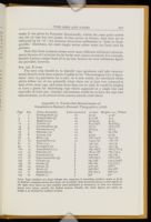
Giambattista Bodoni, Manuale Tipografico, 2 vol. (Parma: Presso la Vedova, 1818). Bodoni's work provides twenty-two "Serie di Caratteri Latini" or common Italian names for type sizes on pages 1-144 of volume one. Twenty-line millimeter measurements have been taken directly from the original and the names entered into the table. Although several other works, such as De Vinne, base their information on Bodoni, he seems to have worked "only to please himself"[3] and must be approached with caution. See Appendix A for an indication of some of the problems encountered measuring his types.
Charles H. Timperley, The Printer's Manual (London: H. Johnson, 1838; reprint ed., English Bibliographical Sources, No. 7. London: Gregg Press, 1965). Comparable names for nineteen different sizes are provided for England, France, Germany, and Holland on page 56. A second table gives the number of lines to a foot for eighteen different bodies; these have been divided into twelve inches to provide the decimal equivalent, and the common names have been added to the correlated table.
Twentieth Century
Theodore Low De Vinne, The Practice of Typography: A Treatise on the Processes of Type-making, the Point System, the Names, Sizes, Styles, and Prices of Plain Printing Types, 2nd ed. (New York: Century Company, 1902). His Plain Printing Types contains the common names for twenty-seven American and English types. Their respective point equivalency size is found on page 54, followed by the names of another twenty-seven French and German types and their Corps (i.e., didot) size. Finally, he draws upon Bodoni's Manuale Tipografico (1818) for the Italian names which are accompanied by the equivalent Spanish and Dutch names on page 56. In addition, the "Relation of Different Bodies of Type to each other and to standard linear measures [i.e., in inches, feet, and square feet] by the Bruce System of Geometrical Progression" appears on page 148. The discussion of common names appears in Plain Printing Types on pages 62-68. Common names are entered into the correlated table using De Vinne's pica and didot point equivalents.
Lucien A. Legros and John C. Grant, Typographical Printing-Surfaces; The Technology and Mechanism of Their Production (London: Longmans, Green, and Company, 1916) provides a handy "Table 6—Comparative Table giving the names of [23 different] English and foreign type and their dimensional relationships in Fournier, Didot, and standard points, in inches, and in millimetres." The pica-to-inches and the didot-to-inches columns are quite accurate, matching the correlated table almost exactly even to the third or fourth place.
Daniel B. Updike, Printing Types: Their History, Forms, and Use, A Study in Survivals. 3rd ed., 2 vol. (Cambridge: Harvard University Press, 1962). On page 27, Updike presents a table labelled "Names of Sizes of Type in Various Countries." Covering eighteen pica point sizes, ranging from 4.5 to 48-point, he lists the equivalent names in England, France, Germany, the Netherlands, Italy, and Spain. The common names are entered into the correlated table using the pica point measurements.
Method of Calculation
The measurements generated for columns two through four presented in the following tables are derived from the millimeter column. To calculate the inches for the second column, the millimeters were multiplied by .03937 and divided by twenty. A pica point is equal to 1/72 of inch or .013888 inch. The figures were calculated by multiplying by millimeters by 2.83482 and dividing by twenty. The Fournier point is equal to .013728 of an English inch while the didot point is equal to .0148 of an inch; millimeters were multiplied by 2.6601 and divided by twenty. A consistently high degree of mathematical accuracy for the calculations has been assured by using "1-2-3," Release 2.01 from the Lotus Development Corporation. To check these calculations, note that 508 millimeters per twenty lines equals 1.0000 inches or 72.00 pica points.
Use of the Tables
Bibliographers may approach the following tables in either of two ways: (1) from their twenty-line measurements which may range from fifteen
With Millimeter Measurements
Bibliographers in the former case will be undertaking original measurements directly from books and should heed the following advice. Twenty-line measurements should only be based on lines set solid. Unfortunately, it is not always possible to know whether there is leading between the lines. A convenient test for the presence of leading is to measure the interline spacing between a descender in the top line and an ascender in the next line down. A measurement between .5 and 1.0 millimeter usually suggests that the text is set solid.
Comparisons with other work may be complicated by the fact that bibliographers have not taken their measurements in a consistent manner. Some variation occurs because of ink squash—perhaps as much as one millimeter on the top and bottom of the sample. Thus, the use of a 6-10X power glass is recommended to determine the border of the type impression (Barker Interview). Additional variation can enter when one measures paper that is cockled or that has stretched or shrunk. In measurements taken for the Catalogue of Books Printed in the XVth Century Now in the British Museum (1908), for instance, A. W. Pollard notes up to a two per cent deviation ("Introduction," p. xx). Likewise, Philip Gaskell reports that "Paper shrinkage, which was more pronounced across the chain-lines than along them, generally reduced its dimensions by about 1 per cent, and occasionally by as much as 2½ per cent" (New Introduction to Bibliography [1972; repr. with corr. 1974], p. 13). These differences can be minimized by taking measurements on several different leaves.[4]
More importantly, Proctor measured "from the top of the short letters in line 1 to the bottom of the short letters in line 20, no account being taken of the tails on the longer letters."[5] As a consequence, his calculations are off by a fraction of an inch, as are measurements from the top of an ascender (e.g., h or l) in the first line to the bottom of a descender (e.g., g or y) in the twentieth line. The most accurate way is to begin any place in line one and measure to the same spot in line twenty-one. Any twenty-line measurement can be checked by measuring the type-page height and multiplying this figure by twenty and then dividing the product by the number of lines. This result should closely approximate the twenty-line measurement, although because the text type page measurement is usually taken to be the height from the text's highest ascender to its lowest descender, the result of the formula will not be precisely accurate.
With the Bruce System
Second, the measurement in inches will help bibliographers examining more recent books, especially American ones. Calculations in inches have been carried to four places to the right of the decimal point. Such precise















With Point Systems
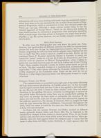
In other cases the bibliographer may only know the point size. Note, however, that typefoundries in different countries use different measurement systems for body sizes of type. In Anglo-American countries, the Pica Point System, originating in 1878, has been widely adopted since England led the way in 1898.[6] One Pica point is equal to .013888 of an inch. Earlier on the continent Simon P. Fournier (generally known as Fournier le jeune) advanced his "point" system in 1737 (see his Tables des Proportions qu'il faut observer entre les caracteres or Manuel Typographique, 1764); Updike reprints the 1742 table between pages 28 and 29 in volume one of his Printing Types. Many consider Fournier's system, in which a point equals .013728 of an inch, "the first successful attempt at a mathematical systematization of type-bodies."[7] The other system advocated by Françoise Ambroise Didot is widely employed on the Continent today. Based on the pied du roi—12 French or 12.7892 Anglo-American inches—one Didot point is equal to .01483 of an inch.
Common Names and Dates
The common names are provided in the right part of the tables following the type measurement information. As Updike points out, "at first the name was descriptive of both body and face. Later it was applied to the body only" (p. 25). Because this table is based on other scholars' work, there are minor variations in the spelling. Of course, variation in orthography is natural in the period before dictionaries when there was no standardized spelling. In any event, no attempt has been made to rationalize this situation. If two names are used for the same size of type, then that information appears in the table in a special way. For instance in Germany, Petit or Jungfer are both used for type measuring fifty-six millimeters. Consistently throughout the table, when two names are used for the same size, then these are divided by a slash, with one exception.
In France the two systems, Fournier and Didot, resulted in different names, primarily because Didot took Cicéro (like Pica in England) as the standard but changed it from twelve to eleven points. Thus, in the French column only, the slash shows from which system the name derives. More specifically, when the slash appears before the common name it means that the name is taken from the Didot system. Similarly, if a slash appears after the
Note that these common names cover many different millimeter measurements because of variations in the books each source examined. For example, Spanish Lectura ranges from 78 to 90 mm. Sources for each millimeter figure are provided, however.
For the Future
The next step should be to identify type specimens and take measurements directly from these sources. Updike in his "Chronological List of Specimens" cites 124 specimens for a start. As it now stands, the correlated tables which follow are of use primarily when there are at least two consecutive lines of the same type, and when those lines are set solid. It would be helpful to have a guide for identifying type which appeared in a single line and especially in lead ones. Another convenience would be to have the type face measurements, as do several of the sources already cited above.
| Page | Seq. | Name, Examples | Lines measured | 20 lines | Height x 20 / # lines |
| 1 | 1 | Parmigianina (3) | 20 | 52/52 | 51.36 |
| 4 | 2 | Nompariglia (3) | 20 | 57.5/58 | 57.5 |
| 7 | 3 | Mignona (5) | 20 | 57.25/57 | 57.25 |
| 12 | 4 | Testino (7) | 10 | 64.2/65.8 | 63.6/65.3 |
| 19 | 5 | Garamoncino (9) | 10 | 72/72 | 70.6/71.8 |
| 28 | 6 | Garamone (10) | 10 | 78/77.5 | 76/77 |
| 38 | 7 | Filosofia (10) | 10 | 86/ | 85.7/86 |
| 48 | 8 | Lettura (10) | 10 | 92/91 | 91/92 |
| 58 | 9 | Silvio (13) | 10 | 106/105.8 | 105/106 |
| 71 | 10 | Soprasilvio (10) | 10 | 119.5/120 | 118/118 |
| 81 | 11 | Testo (14) | 5 | 132/132 | 132/131 |
| 95 | 12 | Parangone (7) | 5 | 144/144 | 142/144 |
| 102 | 13 | Ascendonica (11) | 5 | 164/163.6 | 162.5/161.3 |
| 113 | 14 | Palestina (7) | 5 | 182.5/176 | 184/174.4 |
| 120 | 15 | Canoncino (7) | 5 | 203/200 | 197/197 |
| 127 | 16 | Sopracanoncino (3) | 5 | 228/226.6 | 226.6/228 |
| 130 | 17 | Canone (3) | 5 | 237/238 | 233.3/233.6 |
| 133 | 18 | Corale (3) | 5 | 282/281 | 274/275.7 |
| 136 | 19 | Ducale (3) | 5 | 316/316 | 306.6/ |
| 139 | 20 | Reale (2) | 5 | 338/380! | 364/368 |
| 141 | 21 | Imperiale (1) | 4 | 405/407.5 | 396/440 |
| 143 | 22 | Papale (1) | 4 | 540 | 540 |
Notes
For generously sharing what they know, the author must thank Nicolas Barker, the British Library; John Bidwell, William Andrews Clark Memorial Library; Nancy B. Richardson, HBO & Company; Diana M. Thomas, UCLA GSLIS; Thomas Tanselle, John Simon Guggenheim Memorial Foundation; and David L. Vander Meulen, University of Virginia. The author also wishes to thank Linda Kincheloe, Getty Conservation Institute, for assisting with the formatting of the tables.
Fredson Bowers, Principles of Bibliographical Description (Princeton: Princeton University Press, (1949; repr. 1962, 1986), pp. 300-306, 444-446; G. Thomas Tanselle, "The Identification of Type Faces in Bibliographical Description," Papers of the Bibliographical Society of America 60 (1966): 185-202.
Readers may wish to note the following five Swedish type sizes which have not been added to the table due to printing limitations: Borgis (63 mm for 20 lines), Korpus (71), Cicero (85), Tertia (113), and Text (141).
G. Thomas Tanselle, "Tolerances in Bibliographical Description," The Library, 5th series, 23 (1968): 1-12. Nicolas Barker estimates a 3% variation due to paper stretch and most severe for measurements more than 100 millimeters (Interview).
Robert Proctor, An Index to the Early Printed Books in the British Museum (London: British Museum, (1898-1906; repr. 1960), vol. 1, p. 13.
| | ||