| | ||
Appendix I
Y-face 'k' Variants
The various dimensions noted for the 'k' are measured as follows. Width is taken between points dead-center in the particular elements of the letter: (1) link: ascender to arm junction; (2) arm-leg alignment: ascender to arm-serif junction and to the dead-center of the leg at the base-serif junction. Length: (1) arm: point at the arm-link junction to the junction at the bottom of the arm-serif; (2) leg: right apex of the enclosed arm-leg angle to the center of the base-serif on the right edge of the leg, adjusted for damage to the base-serif. Height: top edge of the ascender top-serif to the bottom edge of the base-serif, measured on new undamaged letters (otherwise adjusted for damage to the serifs). Arm-angle: measured in degrees above horizontal as established by a perpendicular through the ascender.
The normal 'k' sort includes several variants differentiated by subtle structural differences that cannot be attributed to the usual distorting factors. The reason for the plethora of 'k' variants is that the Y-face is doubtlessly French in origin and consequently lacked the 'k', hence the need for 'k' punches to complete sets of matrices probably supplied from France. The puzzling fact is that the Y-face 'k' is not even a close stylistic cousin of the more awkward, broader, high-angle arm (72-84 deg.) 'k' variants cut by the Dutch and German punchcutters. Paradoxically, it has more in common with italic 'k'. The major stylistic trait of "elegant" k1, for example, is the staggered vertical alignment of arm-leg, where the leg extends beyond the arm (0.95mm vs 0.85mm), a standard italic 'k' trait that is complemented by the high-angle arm (48 degrees) topped by a right offset, wide (0.65mm) crescent serif that reaches upward like an outstretched hand. The right half of the leg-serif usually points downward like the extended foot of a ballerina. Like a Granjon italic 'k', k1 is a flowing lively letter, totally unlike the ponderous static Dutch and German 'k'.
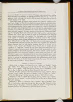
The remaining 'k' variants illustrate the difficulty of cutting such a complex letter and maintaining balanced proportions among the various elements. The arm-leg of "bent-arm" variant k2 align vertically (0.9mm), and the serif usually extends on both sides of the leg. The structure of the high-angle (48-52 deg.) arm is evident only at high magnification: it bends to form perpendicular junctions with both the short link (0.45mm) and the centered bullet serif which frequently inks underside only and prints as a crescent. New samples of "defective serif" k3 show a full-printing, centered bullet arm-serif and full leg-serif; a shallow strike is probably responsible for the defective arm-serif which usually prints only the rear underside, if at all, as if

Several low-angle (42 degree arm) variants are common. "Oblique-junction" k4 is unique in that the arm-leg link (0.5mm) forms an oblique rather the usual perpendicular junction with the ascender while the link-leg junction is nearly perpendicular; the low-angle arm is topped by a large (0.75mm) level slab serif offset right, frequently bent up on the right to approximate a thin crescent, or worn down in old letters to a much shorter length. The arm-leg align vertically (0.9mm); the right portion of the leg-serif is frequently missing. The "long-leg" k5 variant is formed with a high ascender junction (0.95-1.05mm) and a short link (0.4mm) in order to accommodate the long leg (0.95-1.0mm vs a normal 0.85-0.9mm). The low-angle arm is shorter than usual (0.5mm vs 0.65mm) and topped by a medium crescent. The ascender base-serif is quite thick, making measurements of the junction height difficult. Later White-M (Fools, CD, I) has a 'k' (k5b) with a similar appearance due to the high link junction (0.95mm) and short arm (0.55mm) but the link is longer (0.55mm) and the leg shorter (0.9mm) than in k5 (Fools, C1v:11 "winke", C3:25 "booke", 36 "Marke", D1:31 "kind", D2:12 "make", I1v:18 "drinke"). In "long-arm" variant k6, the quite long low angle arm (0.75-0.85mm vs 0.55-0.65mm) extends slightly beyond the leg (0.95mm vs 0.85-0.9mm), despite a short link (0.4mm). New letters exhibit a wide (0.7mm), level slab serif which, ironically, usually is worn down and prints as a dot. The letter's appearance is dominated by the arm which hangs in space somewhat like a fishing pole. "Defective-serif" k3 often approximate the appearance of k6 because of printing characteristics, but measurements easily settle the issue if no k6 is nearby for visual comparison (R3, I4:34, M2v:17; Fools, E1:9,33; Essays STC18041, Yy1v:5 "knots").
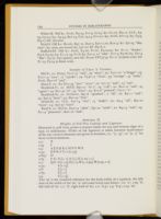
Samples of Y-face 'k' Variants
Eld-Y1. New K1: Essays STC18041, Yy1v:27 "talke", 37 "bookes" "speaking"; old k1: Fools, B2v:24,25, G2v:38, H4:16; k2: B2v:24,25, H4:27; k3: Essays, Yy1v:5 "knots", Fools, B3v:20; k4: Essays, Yy1:2 "shrinketh", Fools, B3v:12, B4v:19, H3:22; k5: B4:19, G3:7, H2:33; k6: not seen.
Short-Y. New k1: Sinner's Conversion STC22702 [1594], A3v:20, A4v:13 "forsake", B3v:5; old k1: R3, I2:5 & 8 "clocke", 10 & 11 "strike", 12 "Jacke"; k2: not seen; k3: I3v:4-8 etc; k4: not seen; k5 I1v:4 "kill"; k6: not seen.
Braddock-Y1. Old k1: MND, B2v:27, B3:5, C2v:25 "snake", C3:9 "backe", D2:21; k2: D1v:25 "speake"; k3: D1v:28; k4: C2v:22, D3:19; k5: B3:30, C3:33, C4:17; k6: not seen.
Braddock-Y2. New k1: Poetaster, B2:3 "workes", B3v:4 "broken", D4v: 7,8; k2: Antichrist, [1]B1v:20, C1v:34; k3: B2v:11,19; k4: Poetaster, B1v:4 "trickt", B4v:30 "shrunke", Antichrist, [1]B3v:26 "speake", C1:9, C1v:6; k5: Poetaster, B3v:11; k6: Antichrist, [1]C1v:28, F3:20, T2v:20.

White-M. Old k1: Fools, D4:24, I1v:3, I2:24; k2: C1:27, D4:11, LLL, A3: 23, C3:24; k3: A3:34, B2v:24, C2v:13,14, F1v:21; k4: Fools, I2v:14; k5: C3:5, D4:17; k6: not seen.
Read-S. Old k1: Revels, B3v:12, D4v:3, I3v:11,20, K2v:3; k2: I3v:25 "like-wise"; k3: seen, not noted; k4: I3v:20; k6: D3:8,11.
Stafford-EF. Old k1: Fools, E4:20, F1:22, F3:20,25; k2: E1:11 "Booke", E3:6, E4:29; k3: E1:17, 33, F1:6; k4: E2v:3, 22 "sake", F1v:3, F3:26; k5: E2v:4 "like", E3:27, E3v:9[text]; new k6: Essays STC5775, O1:11 (0.9mm arm); k6: F1:15, F3:29 (0.8mm arm).
Samples of Y-face 'a' Variants
Eld-Y1. a1: Essays, Yy1v:17 "and", 33 "what"; a2: Yy1v:12 "a Dogge"; a3: Yy1v:13 "ayre", 17 "speake"; a4: Yy4v:17 "what", 33 "strange", 35 "make", Fools, H2v:18 "and".
Short-Y. a1: R3 H1v:33 "face" "scars"; a2: I1v:12 "and", 13 "saie".
Braddock-Y1. a1: MND, B3v:21 "of a", 29 "call"; a2: B1v:10 "and", 24 "again"; a3: B1v:32 "al", 34 "what"; a4: B1v:8 "painted", C3:11 "a".
Braddock-Y2. a1: Poetaster, B4v:6 "speakest", 7 "all"; a2: B2:11 "and"; a3: B3v:9 "faces"; a4: B2v:23 "Alas".
White-M. a1: LLL, A2v:14 "was", 15 "make"; a2: A3:4 "all", B4v:20 "fayre"; a4: A3v:37 "have".
Read-S. a1: Revels, D4v:13 "after", I3v:12 "saide"; a2: K3:13 "and"; a3: E1:13 "pleasures", K2v:10 "and".
| | ||