| | ||
Thomas Creede's Pica Roman
by
W. Craig Ferguson
Founts of type are much more distinctive than has been assumed, and provide a field for detailed study. Hitherto, attention has concentrated on broken types, which are ephemeral, or on punches and matrices, which are of limited use in identifying an individual printer. I decided to undertake a pilot project, and have chosen to look at pica roman types used in England between 1590 and 1610. I am working alphabetically through the sixty or seventy printers involved, and as Creede presents an interesting case, I thought a preliminary report on this printer's types might be in order. At this stage I am working from the microfilms available in University Microfilms' STC series and Xerox copies of selected pages provided by the Huntington Library. My findings will need confirmation later from the books themselves.
Thomas Creede began printing in 1593. At that time he used a fount of pica roman type[1] which had definite characteristics often found together. Isaac noted one characteristic of this fount, the letter 'g' with the loop larger than the bowl.[2] This is only one characteristic of this particular fount, and others are perhaps more distinctive. The 'k' of this fount has a rather squat appearance, the two arms of the letter more or less forming a square; much more common in this period are shorter arms at sharper angles, forming a narrow vertical rectangle. In modern terms, an expanded letter rather than a condensed. With the expanded 'k', logically, is an expanded 'x' in which the two strokes meet at about 90°, and an expanded 'z', which is also squarish in appearance. The counter in the 'o' is slanted decidedly to the left. The serif at the base of the descender of the 'p' is to
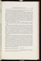
One of the most interesting letters is the 'i'. There is a mixture found in this fount, as the dots over the letter are found either directly above the body of the letter or slightly to the left of it. Mixtures of this sort are distinctive, and will become increasingly useful as we shall see, but I feel that the 'dot left' letter deserves some comment. This position is unusual. Most early romans placed the dot either directly above the letter or to the right. The preference in most continental founts was to the right, and so far the earliest example I have found of a 'dot left' is in Chiromance by Joan de Indagine, printed by Jean de Tournes in Lyons, 1549.[3] The earliest illustration of an English use I have encountered is in a book printed by the assigns of John Wayland in 1557.[4]
This, the first pica roman Creede used, I designate fount # 1. He used it in two books printed in 1593, and in all seven books assigned by Morrison to 1594.[5]
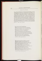
However, during the printing of The first part of the Tragicall raigne of Selimus (STC 12310a), which I assume was late in the year, a second fount was introduced and a most interesting transformation took place. Sheets A and B were printed from fount # 1, as were the outer formes of sheets C to E. With the exception of part of C4, the inner formes of sheets C and D were printed from a second fount. Fount # 2 is characterized by a narrow, or condensed, 'k', a 'centre dot' 'i', an 'o' with the counter being either vertical or slanted to the right, a 'p' with a small counter and the serif at the base of the descender to the left of the stem, and some 'w' which seems a trifle large for the fount. Again, it does not give the appearance of being fresh.
Both founts are relatively pure up to sheet E, but at this point Creede proceeded to mix the two founts indiscriminately, presumably by distributing the type to the wrong cases; by sheet G the two founts are indistinguishable from one another. Happily, for purposes of identification, this 'new' fount, designated fount # 3, is most distinctive, and was used by Creede in all the books I have seen printed by him in pica roman from 1595 until 1603. Fount # 3 is characterized, then, by a mixture of 'i' dotted left or centre, the two forms of 'k', three forms of 'o': the counter being slanted either way or vertical, the 'p' with the serif on the descender being either to the left or to the right, the former having small counters, an occasional heavy 'u', and some 'w' which seems a bit deep for the fount. The letter 'g' remains constant, the loop being larger than the bowl, and both 'x' and 'z' remain in the expanded form only.
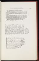

There were one or two changes as the years went by. In 1598 we find the supply of 'g' has been supplemented by several pieces with small loops. Another rather odd addition was the introduction of at least three pieces of black letter 'ye' to the fount. This occurs very infrequently, but is observed in later founts as well. Perhaps Creede simply borrowed from his black letter fount when the occasion arose.
This fount was replaced in 1603 by fount # 4. This fount was characterized by expanded 'k', 'x', and 'z', a centre dot 'i', an 'o' with the counter leaning to the left, and an unusually condensed 'u'. This letter is most noticeable when contrasted with the normal 'n': usually the two letters are the same set. The serif on the 'p' is both to the right and left of the stem, and the 'g' again has a large loop. The fount does not appear to have been of the best quality.
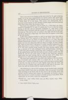
A fifth fount appeared briefly in 1606 in one book I have been able to see, Thomas Bell's The regiment of the Church (STC 1827), where it was used to print the last two sheets. It replaced fount # 4 in 1609. The most obvious characteristic of fount # 5 is the 'w', which has a short second stem which runs into the third stem half-way down its length. As Isaac remarks, this "closes up the letter"[6] and gives it a rather squashed appearance, especially when seen in context. Fount # 5 contains a centre dot 'i', a mixture of 'o' with most counters being vertical, but some slanting slightly either way, a mixture of 'k' with condensed forms predominating, a mixture of 'g' with most pieces having a small loop, and a condensed 'x' and 'z'. Many of the capital letters used with this fount are just a shade smaller than they should be, and do not reach quite as high as the lower-case ascenders. Again there was some mixing, and in 1613 one book (STC 16830) has a mixture of 'w', with some pieces having stems of equal length.
The sixth fount appeared in 1613, and is the clearest, if the least distinctive, of Creede's pica romans. The 'i' is centre dot, 'k', 'x', and 'z' are narrow, the 'o' counter is basically vertical, with some pieces leaning slightly to the left, the loop of the 'g' is only slightly larger than the bowl. The serif on the 'p' is usually crisp, and extends to both sides of the stem. This fount was used by Creede until he ceased production in 1617.
The following is a list of STC numbers of the Creede books containing pica roman which I have seen on microfilm. They are grouped chronologically according to the fount used. At the end is a list of books which were printed entirely without pica roman; the remainder of Creede's output I have not seen yet. I count as unseen a sizeable group of microfilms which, regrettably, do not have a scale for comparison.
- FOUNT #1. 1593: 12263, 12270; 1594: 52, 6817, 12310a, 12751, 16679, 21009, 26099
- FOUNT #2. 1594: 12310a
- FOUNT #3. 1594: 12310a; 1595: 1343, 14057, 18375, 20002, 25782; 1596: 5060, 12246, 15321, 15322, 15340, 15379, 19974, 24709, 24803; 1597: 798, 3705, 7087, 11573, 12716, Pt. 1, 18096, 23093; 1598: 1804, 5382, 11754, 12308, 13072, 16680, 22315; 1599: 3706, 4207, 4667, 5450a, 6151, 12233, 17154, 18870, 19538, 19964, 22323; 1600: 15026, 17188, 21081, 22289, 25144; 1602: 6036, 12415, 16681, 22290, 24727
- FOUNT #4. 1603: 5385, 11935; 1604: 13510, 21853; 1605: 1825, 1833, 6203, 18995, 22333, 24421; 1606: 1827; 1607: 15380, 23135; 1608: 24497; 1609: 19162
- FOUNT #5. 1606: 1827; 1609: 6624, 12032, 13393, 13399, 14087, 23654; 1610: 18053; 1611: 5392, 7115, 22381; 1612: 7494, 15426; 1613: 1976, 4613, 10538, 16830, 19792
- FOUNT #6. 1613: 7433; 1614: 10539, 11841, 22062, 24394; 1615: 3529, 19789, 22871; 1616: 4578, 11523
- ENTIRELY WITHOUT PICA ROMAN: 1593: 22540; 1595: 3795, 3796, 17162, 19855, 21088, 21528, 22535, 23077; 1597: 4664, 11279, 14633; 1598: 11275, 17085; 1599: 23690; 1600: 6991, 18974; 1601: 7243; 1602: 86, 16630; 1603: 14410, 17153, 21497; 1607: 4663, 14426
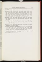
The reproduction of fount #2 on page 146 has been slightly strengthened to bring out dots over the i's.
Notes
I use this term in preference to '82 roman' as there is slight variation in measurement from fount to fount. However, twenty lines of pica measure about 82mm., or six lines to the inch, or twelve point. I hope to record consistent variations from this measure when they arise.
| | ||
