| | ||
The Bibliographical Description of
Patterns
by
G. Thomas
Tanselle
The basic technical problem of bibliographical description arises from the difficulty of expressing the visual in verbal terms. Parts of a description like the collation and contents paragraphs, which are condensed statements of sequential arrangement, can be handled easily enough in words or formulas; but the title-page transcription and the paragraphs on binding, paper, and typography present the same challenge that one meets in the attempt to frame an exact (not impressionistic) description of any physical object, whether it be a tree or a sculpture. Books are not exempt from the human urge to decorate empty spaces, and the descriptive bibliographer is faced with a wide array of patterns and designs (as in binding cloths and endpapers) which he must somehow record in a fashion precise enough to serve as an identification.
Among the decorative elements of a book, patterns and illustrations can be usefully distinguished. A pattern results when a figure (or combination of figures) is repeated (either exactly or approximately) at regular (or irregular) intervals or in a systematic arrangement; if a figure (or combination of figures) appears only once, the result is an illustration. While illustrations are frequently representational and patterns abstract, these qualities do not serve to distinguish the two, since a representational figure can be repeated as the motif in a pattern and an abstract figure can be used by itself as a single decoration. Repetition — whether precisely detailed or suggestively vague — of a basic unit is the essential feature of a pattern, and it provides a means for classifying the pattern. Although the number of possible patterns is infinite, individual patterns bear structural relationships to one another and can be grouped into a limited number of families. Whenever such a framework can be established as a standard of reference, verbal descriptions can become both more concise and more exact. Illustrations, by their nature, are less readily amenable to identification on the basis of a structural classification (though they can be
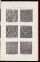
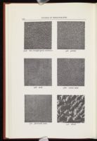
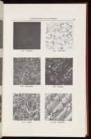
There are three ways in which patterns can be recorded in a bibliography — in pictures, in words, or in a combination of the two. The first is the most straightforward and explicit method and at the same time the most objectionable — and not simply on the grounds of expense. To rely exclusively on photographs of patterns is to abandon description in favor of reproduction. The task of a description is to provide a verbal identification which can be quoted in contexts where pictures are inappropriate. Pictures may of course be useful supplements to a description, but they are not substitutes for any part of it. The opposite extreme, of describing patterns exclusively in words, can be successful and precise only if an adequate vocabulary has evolved. In heraldry, for example, the technique of blazoning utilizes a special vocabulary and syntax which make the resulting descriptions both concise and unambiguous. The bibliographer has no such established terminology to draw on in describing patterns, except perhaps in the case of marbled papers. As a result, bibliographical descriptions of patterns must use some kind of combination of words and pictures. That is, the description itself will contain only words (preferably a standardized wording which will convey the same meaning to a large number of readers), but part of that verbal description will be a reference to a readily accessible illustration; in this way any reader who cannot visualize the pattern from the verbal description clearly enough for his purposes can look up the illustration which serves as a standard of reference.
The two essentials, then, in the bibliographical description of patterns are a standard terminology and a visual standard of reference. In a few areas, bibliographers already have such references at their disposal — R. B. McKerrow and F. S. Ferguson's Title-page Borders Used in England and Scotland, 1485-1640 (1932) is a good example — but for the most part no accepted standards exist. Enough research has taken place in certain areas, however, that it would not be premature to attempt to codify a standard of reference for those areas, particularly if it is set up in an expandable fashion, so that additions can be made in the future without affecting the basic classification. Patterns in books generally appear in one of three media: in binding cloths, both
I. Binding Cloths
Before the introduction of edition binding in the 1820's, the binding of a book generally had no connection with the publisher and was not part of the book as it was issued to the public. The description of such bindings, executed individually for owners of books, is thus outside the scope of the descriptive bibliographer's task and constitutes a separate field of investigation.[1] The only exceptions are the temporary coverings in which books were sometimes issued to serve as a protection until the books could be properly bound;[2] these covers usually consisted of plain boards with printed paper labels, and they offer little difficulty for the descriptive bibliographer. From the 1820's on, however, most books have been issued in bindings or casings by their publishers, and these coverings must be described in bibliographical descriptions. The most common material for publishers' bindings has been cloth, and the history of publishers' cloth has been traced by several bibliographers — notably Michael Sadleir, John Carter, and Joseph W. Rogers.[3]
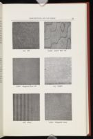
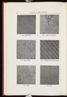
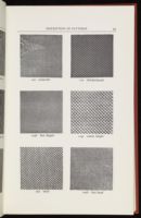
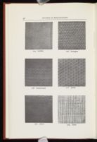
The historical investigation of publishers' cloth, while it provides a perspective for viewing specific cloths, does not in itself furnish the framework for classifying them. Sadleir's book of 1930 took the first step by including four photographs of cloths, showing their distinctive textures or "grains"; Carter's of 1932 (which displayed twelve photographs) discussed the problem in "A Note on Terminology" (pp. xvxviii) and worked out the equivalences between Sadleir's descriptive terms and the letter designations used by the Winterbottom Book Cloth Co. Ltd., the chief manufacturer of book cloth; and Rogers's 1941 essay furnished illustrations of eleven cloths, labeled with the Sadleir-Carter terms (Plates 30-40). It was not until 1951, however, that a collection of photographs of cloth grains was published which could serve as a comprehensive standard of reference. In that year Michael Sadleir included, at the end of the first volume of his XIX Century Fiction, illustrations of twenty-four cloth grains, labeled with descriptive names such as "sand grain," "hexagon grain," and "dotted-line-ribbed." Although the photographs were based on the Sadleir collection, that collection was extensive, and the photographs could be taken to represent most of the grains in common use in the nineteenth century;[4] but the photographs were not arranged in terms of any overall system of classification, and their physical location in a large two-volume reference work, which could not always be at hand when a bibliographer needed to identify a cloth, limited their influence as a standard.[5] Four years later, in 1955, appeared a second large collection of photographs. Jacob Blanck, at the beginning of the first volume of his Bibliography of American Literature,[6] provided illustrations of
Both systems have had a beneficial effect to the extent that they have called attention to the necessity of photographic samples as standards for verbal descriptions. At the same time, the two systems have dramatized the essential split between the two kinds of verbal descriptions: those which employ ordinary words and convey a meaning to every reader, and those which use technical symbols and convey a meaning only to those who have been introduced to the symbols. Both are based on photographs, but the selections are different, and neither suggests a systematic classification. Here the matter rested until 1967, when Martha Hartzog worked out, for the first time, an outline which shows relationships among types of cloth grains.[8] What was needed, as she recognized, was "an overall organizing principle which is consistent and logical, involving a symbol system which is concise and meaningful" (p. 115). She set up seven basic categories of grains, using terms largely derived from Sadleir — Morocco, Pebbly, Beaded, Geometric, Rippled, Striped, Woven — and designated the initial letter of each category as its symbol. Distinct patterns falling within these groups were then numbered — "Sandy," for example, as the second style in the "Pebbly" category, was "P2." Varieties of patterns could be indicated by modifying adjectives, so that "Coarse sandy" became "coarse P2." In Miss Hartzog's words, the system indicates "differences of degree by an adjective and quality by a separate variant number" (p. 118). Although she did not provide photographs, her chart indicated the correspondences between her terms and the illustrations of Sadleir, Blanck, and Carter.[9]
The Hartzog system is important as the first attempt to provide "a coherent organizational framework within which all cloth bindings can be fitted" (p. 118), and the nature of the system is a revealing indication of the kinds of problems involved. The choice of the seven main divisions, for example, is not self-evident. Since "Geometric" is an inclusive term which subsumes many patterns of geometric regularity, perhaps "Beaded" would more properly be classified as a variety of "Geometric" than as a separate division parallel to it. On the other hand, if the main divisions are to have more specific headings like "Rippled" and "Striped," then perhaps some of the varieties of "Geometric" — like "bead & line" or "herringbone" — deserve to be elevated to the status of generic divisions. The difficulty in formulating a classification of patterns is that there is no natural spectrum on which to base it. In the study of color, one begins with the concept of a spectrum or a solid representing the range of all possible color, and each of the infinite varieties of color has its unalterable place in the scheme. But cloth patterns are artistic, not natural, products, and no natural continuum encompasses them. Is "Striped" a development of "Rippled"? Is "Woven" closer to "Striped" than it is to "Pebbly"? One could construct an argument for various kinds of relationships, but each would be subjective and none would be definitive.[10]
The symbols employed in the Hartzog system further reveal this problem, for such symbols as "P2" and "G7" combine two principles of notation. The letters are intended to be mnemonic — "P" for "Pebbly" and "G" for "Geometric" — and not to show relationships, for alphabetical order cannot be expected to coincide with structural evolution. The numbers, on the other hand, have no mnemonic value but imply a fixed order within each lettered division; yet there is no reason that the patterns must be arranged in this order. Thus the numbers are merely arbitrary index figures, while the letters are suggestive; and the modifying adjectives — as in "coarse P2" — carry the symbols farther in the direction of rational content.[11] Another comparison with the field of color terminology may be helpful. In the ISCC-NBS Centroid
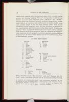
The outline and illustrations offered below as a standard for the classification and nomenclature of binding-cloth grains are therefore derived from the Hartzog system, but with a number of modifications based on the rationale just presented. In the first place, it is imperative that the divisions in a classification in outline form be not only parallel but mutually exclusive. The seven divisions in the Hartzog system do not fulfill this condition, for such terms as "Pebbly" and "Beaded" are too precise to be parallel to inclusive terms like "Geometric" and "Woven"; neither are they mutually exclusive, for "bead & line," included under "Geometric" (G7), could have been placed under "Beaded," since "pebble & line" is listed under "Pebbly" (P5). The first mutually exclusive division which suggests itself is one which distinguishes those patterns that are regular from those that are irregular: regular patterns reproduce themselves precisely, while irregular ones repeat themselves only in general effect but not in exact detail. Regular patterns, in turn, may be divided into those which are lineal in their symmetry and those which are radial; both "Rippled" and "Striped," among the Hartzog terms, are lineal, while both "Beaded" and "Geometric" are radial. Irregular patterns divide themselves into
- 100 Lineal
- 2 Rib
- 4 Ripple
- 6 Wave
- 8 Dotted-line
- 10 Dot-and-line
- 12 Dot-and-ribbon
- 14 Beaded-line
- 16 Weave
- 18 Net
- 20 Crisscross
- 22 Checkerboard
- 24 Diaper
CLOTH PATTERNS
REGULAR
- 200 Radial
- 2 Bead
- 4 Bubble
- 6 Hexagon
- 8 Honeycomb
- 10 Pansy
- 300 Fibrous
- 2 Calico
- 4 Linen
- 6 Cord
IRREGULAR
- 400 Coriaceous
- 2 Morocco
- 4 Straight-grain morocco
- 6 Pebble
- 8 Sand
- 10 Patterned sand
- 12 Whorl
- (a) (regular)
- b fine
- c coarse
- d moiré
- e diagonal
- f moiré diagonal
Modifiers
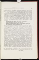
It should be understood that these numbers and letters are only reference figures and not substitutes for pattern names. They have no significance in themselves, but they serve two functions: they provide index figures for referring to photographs; and they make possible a meaningful arrangement of photographs, in which related patterns are grouped together. In a bibliographical description, both the name of the cloth pattern and its reference figure should always be given (followed by a designation of the color of the cloth), as in these examples:
coarse diaper-cloth (124c), very dark red (17)
diagonal dot-and-line-cloth (110ae), strong yellowish green (131)
fine pebble-cloth (406b), grayish blue (186)
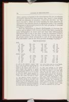
Since the illustrations in Blanck's Bibliography of American Literature and in Sadleir's XIX Century Fiction have been consulted by many bibliographers in recent years and since some bibliographical descriptions refer to one or the other, it may be convenient to have a table of equivalences. The list below records the reference figure in the present system which corresponds to each of the photographs in BAL and Sadleir (and in the three previous showings of grains):[16]
| A | 306 | CM | 408c | LG | 404b | T | 102 |
| AA | 102bd | EC | 122 | LI | 402 | TB | 118 |
| AR | 306c | FL | 108 | P | 406 | TR | 106 |
| B | 304 | H | 124b | PD | 112ae | TZ | 106ae |
| BD | 202 | HC | 206 | PR | 412 | V | 302 |
| BF | 202b | HT | 110 | RH | 210 | YR | 304c |
| C | 408 | L | 404 | S | 102be | Z | 208 |
| i | 402b | vii | 102be | xiii | 106ae | xix | 118 |
| ii | 402 | viii | 102bd | xiv | 104 | xx | 116 |
| iii | 124b | ix | 202 | xv | 108c | xxi | 406 |
| iv | 124c | x | 202b | xvi | 108 | xxii | 208 |
| v | 408 | xi | 106 | xvii | 110 | xxiii | 210 |
| vi | 410 | xii | 204 | xviii | 120 | xxiv | 206 |
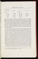
| IVa | 402 | IVb | 406 | IVc | 102 | IVd | 202 |
| a | 302 | g | 106be |
| b | 402b | h | 106 |
| c | 102bf | i | 202 |
| d | 124 | j | 114ce |
| e | 406 | k | 408 |
| f | 102 | l | 110 |
| 30 | 402 | 36 | 404 |
| 31 | 102af | 37 | 202 |
| 32 | 124c | 38 | 106 |
| 33 | 406 | 39 | 408 |
| 34 | 102 | 40 | 110 |
| 35 | 102b |
How exact the match between a cloth and a photograph should be is part of the general question of tolerances[17] and must necessarily vary with different circumstances. The dividing lines between "fine," "regular," and "coarse" — like those between "condensed" and "expanded" in regard to type faces — are not precise, and the decision to call a cloth "coarse" rather than "regular," when it falls between the illustrations of the two, will sometimes be subjective. Whether or not this imprecision takes on practical importance depends on the degree of accuracy required in a particular instance. If two states of the binding of a given book are too similar to be distinguished by means of a standard set of photographs, the bibliographer may find it necessary to include in his bibliography special illustrations of the two varieties. The standard provides a frame of reference but cannot eliminate entirely the need for individual photographs; in most cases, however, such fine distinctions in the specification of cloth grains are not necessary. Only the bibliographer who has examined a great number of copies of a book is in a position to decide the degree of precision desirable in any instance.
Since various levels of accuracy and detail are appropriate in different situations, it is helpful to think in terms of a standard series of
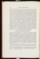
or a variety of fine bead-cloth (cf. 202b)
Once the specification of the cloth grain on one of these levels is completed, there remains the problem of describing the pattern or
As an example of a complete binding (or casing) description, the
II. Decorated Papers
Paper, decorated by various processes, was used in connection with bookbinding long before the introduction of publishers' casings, and it remains today an important resource for the designers of bindings. In both hand- and machine-bound volumes, endpapers are often decorated in one fashion or another, and the boards forming the front and back covers are frequently adorned with decorated papers (in conjunction with cloth or leather spines, and sometimes corners as well).[20] Despite the widespread use of decorated paper as a binding material, little historical study of it has been made, and virtually no discussion treats it from the viewpoint of the descriptive bibliographer; the literature of the subject, though extensive, concentrates more on the methods of producing the patterns than on the history of the art. One exception is Rosamond B. Loring's classic Decorated Book Papers (1942, 1952),[21]
What the bibliographer requires, in this area as in any other involving patterns, is a system of classification and a standardized terminology. Since the characteristics of patterns are determined, to a large extent, by the methods used to produce the patterns, the most meaningful basic scheme for classifying decorated papers groups them according to the processes of production. The conventional system, as it emerges from the work of Loring and other writers,[22] has four divisions into which the majority of decorated papers fall:
Printed
Embossed
Paste
Classifying a paper under one of these headings does not yet provide the reader of a bibliography with a very precise idea of the pattern, and most bibliographers will move to a third level of detail, which involves describing the main features of the particular pattern. A standard set of photographs would of course be helpful for this purpose, if one could be produced; but the last three divisions listed above — "Printed," "Embossed," and "Paste" — offer the same difficulties as those presented by the patterns stamped into cloth for the casings of particular books. So many variations are possible in these categories that no chart could be devised which would do more than illustrate characteristic specimens; it could not, in other words, be used as a standard for matching and identification. Under such circumstances, the most efficient and exact method is to frame in words a simple description of the prominent features of the pattern and then provide a reference to an accompanying plate in which the particular pattern is illustrated. Indication of the principal colors is also a necessary part of the verbal description, as in these examples:
printed paper, with medium olive brown (Centroid 95) birds and scrollwork on a deep green (142) background (see Plate 00)
embossed paper, with silver flowers on a dark blue (183) background (see Plate 00)
paste paper, grayish reddish orange (39), with horses and trees stamped alternately (see Plate 00)
paste-pattern paper, photolithographically printed in grayish reddish orange (39), with lozenges stamped on a brushed background (see Plate 00)
Standardization of terminology, beyond the names of the basic kinds of paper and the colors, is not possible in this situation; what can be achieved is standardization of approach.
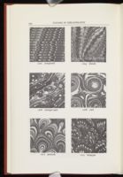
The remaining category, "Marbled," can be handled somewhat differently. Because of the nature of the marbling process, the number of types of pattern is more restricted; every specimen, though unique, corresponds in its general outlines to one of a relatively small number
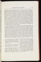
The outline below is an attempt to extract from the literature of marbling a meaningful and comprehensive scheme of classification. All marbled patterns fall into one of two categories, according to whether or not the colors are drawn after they are dropped onto the solution. If they are not touched, the resulting patterns (here called "Whisked") consist of irregular spots separated by veins and resemble real marble; if the colors are manipulated by a stylus, comb, or other utensil, the resulting patterns (here called "Combed") contain more regular lines, swirls, or loops and generally do not suggest actual marble. Traditional names for the individual patterns have emerged over the years (marbling dates from the sixteenth century); even though some of these names are not in themselves descriptive, they have become so well
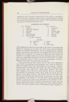
- 1100 Whisked
- 2 German
- 4 Hair-Vein (Italian)
- 6 Stormont
- 8 Gloster
- 10 Shell (French)
- 12 Smooth Body
- (1112d = Spanish)
- 1200 Combed
- 2 Nonpareil
- 4 Dutch
- 6 Antique Spot
- 8 Curl (Snail)
- 10 Peacock
- 12 Bouquet
- Modifiers
- (a) (regular)
- b fine
- c coarse
- d moiré
- g drag
- h moiré drag
MARBLED PATTERNS
Given the nature of these names, one can learn their significance most readily by studying the photographs, but it may be helpful to point out verbally some of the characteristics of the patterns. "German" consists simply of small spots and, unlike the other whisked patterns, does not have veins. "Hair-Vein" (often called "Italian"), has, as the name suggests, a fine network of thin hair-like veins. In "Stormont" the presence of turpentine creates many small dots which give the pattern a lacy effect; "Gloster" also has fine dots on the body color, but its veins are thick and multi-colored, in contrast to the thin veins of "Stormont." The "Shell," or "French Shell," pattern displays light shell-like rings on the body color, produced by the addition of olive oil. If a pattern has veins of medium thickness and a body color not mottled with dots or rings, it may be given the name "Smooth Body," as here. The most common variety of this pattern, called "Spanish," is
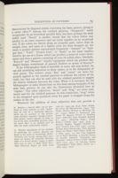
If the bibliographer finds it desirable to move one step farther, he can add modifying adjectives to these names, as in the designation of cloth grains. The relative terms "fine" and "coarse" are more frequently applied to the combed patterns to indicate the nature of the comb, but they can also be used with the whisked patterns to suggest the relative distances between the veins. When it is necessary for the bibliographer to make distinctions on this basis among examples of the same basic pattern, he can take the illustrations presented here as "regular." The other adjectives, "moiré" and "drag," are more commonly used for the whisked patterns. In this connection, "drag" refers to the elongated spots produced when the paper is dragged along the surface of the size.
Whenever the addition of these adjectives does not provide a
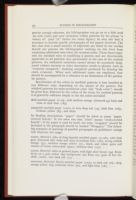
Specification of the colors in marbled patterns is best handled in two different ways, depending on the nature of the pattern. For whisked patterns the most prominent color (the "body color") should be given first, followed by the colors of the veins; for combed patterns it is generally sufficient simply to list the colors included:
shell marbled paper (1110), with medium orange (Centroid 53) body and veins of dark blue (183)
nonpareil marbled paper (1202), in very deep red (14), dark blue (183), brilliant yellow (83), and white
In binding descriptions, "paper" should be taken to mean "papercovered boards," in the same way that "cloth" means "cloth-covered boards"; if the paper is used by itself, the term "wrappers" should be included or the paragraph should be headed "Wrappers." The following examples of openings of possible paragraphs on publishers' casings will illustrate the usage:
casing. Material: sides of drag Spanish marbled paper (1112h), with dark gray (Centroid 266) body and veins of medium blue (182), strong reddish orange (35), medium orange yellow (71), black, and white; spine and corners of coarse calico-cloth (302c), brilliant blue (177) . . . .
casing. Material: sides of printed paper, with light olive brown (94) fleursde-lys on a pale yellow (89) background (see Plate 00); spine of fine ribcloth (102b), very dark red (17) . . . .
wrappers. Material: Dutch marbled paper (1204), in dark red (16), deep orange yellow (69), yellowish white (92), and light blue (181) . . . .
Decorated papers can thus be dealt with in the same fashion as publishers' cloth, by making reference to standard illustrations for a limited number of basic patterns and to special photographs for the numerous other patterns which may arise.
III. Letterpress Sheets
Patterns may also appear in the sheets of a book, on the same pages as letterpress. The most common location for such decoration is the title page, where there may be a border or a design separating the major elements of the page; but patterns occur frequently in other places, such as the beginnings and endings of chapters or principal divisions. They may be reproduced by means of wood-blocks, typographical ornaments, or various other processes.[28] The nature of these patterns, therefore, is not similar to that of cloth grains or marbled papers, with their relatively small number of standard designs; obviously, from the point of view of the difficulty of classification, patterns in letterpress sheets are analogous to those of cloth ornamentation or of printed, embossed, or paste papers. A publisher can use a different border on every title page if he chooses, and no limited selection of illustrations of these borders could do more than offer characteristic examples; it could not serve as a guide to the identification and description of any given border. Generally, then, verbal descriptions of patterns in letterpress sheets must be keyed to specific illustrations of individual patterns.
There are exceptions, however. Whereas binding cloths and decorated papers are of interest to the descriptive bibliographer chiefly in the period since the advent of publishers' bindings, when the output of books has been enormous, the patterns in letterpress sheets are the descriptive bibliographer's concern in all books since the beginning of printing. For the earlier periods, when the number of books was smaller, the supply of types and woodcuts more restricted, and the technology less advanced, the task of cataloguing all the patterns in particular categories, though not an easy one, is at least feasible. As a result, a few excellent reference works of this kind exist, particularly those issued by the Bibliographical Society in its series of "Illustrated Monographs" and "Facsimiles and Illustrations." R. B. McKerrow and F. S. Ferguson's Title-page Borders Used in England and Scotland,
Woodcut illustrations are frequently not "patterns" in the sense employed here, but some patterns are woodcuts, and any reference book which comprehensively catalogues the woodcuts of a period should be consulted in connection with the identification of patterns; for early English books, the chief work is Edward Hodnett's English Woodcuts, 1480-1535 (1935). Publishers' devices constitute a similar category: not patterns themselves, they can form the basis of patterns and are repeated from one book to another. Verbal descriptions of devices in early English books should be keyed to R. B. McKerrow's Printers' & Publishers' Devices in England & Scotland, 1485-1640 (1913).[30] While it is possible to survey all the borders, woodcuts, and devices used in particular countries during the first two or three centuries of printing and produce catalogues for precise identification, it is clearly impossible to attain such comprehensiveness for later periods, when the output of the press reached staggering proportions.
A workable approach for later periods is to organize the study of patterns by publisher. The task of recording the borders and other patterns (and devices) used by a particular publisher, even a prolific one of the nineteenth or twentieth century, is manageable; indeed, it should be a regular part of any full-scale study of a publishing house. Publishing histories could then become the standard reference works
Greater standardization in the specification of patterns in descriptive bibliographies is desirable in order to make verbal descriptions more precise. After all, any rendering in words of visual characteristics depends for its meaning on conventions, and the more detailed the conventions the more exact the verbal reference can be. Standardization should not, however, be carried to the point where it restricts rather than facilitates; and the infinite variety of possible patterns in books raises this problem in an acute form. In the case of certain patterns — cloth grains and marbled designs — a comprehensive standard and generic scheme of classification can be devised without becoming so involved or cumbersome as to defeat the purpose; and other patterns which by their nature must be illustrated specifically rather than generically can still be covered comprehensively for certain periods without becoming unmanageable. But in some cases the attempt to bring together all patterns falling within a given category (such as all stamped patterns on nineteenth-century publishers' casings) might not be worth the effort, if the result was so unwieldy that reference to it was more time-consuming and less meaningful than reference to a limited set of illustrations provided for the specific purposes of one bibliography.
Whenever a comprehensive standard set of photographs is possible, it is to be preferred to separate photographs in individual bibliographies, for two reasons: since terms become precise to the extent that everyone uses them to refer to the same things, widespread reference to a single set of photographs serves to encourage this precision;
Sources of Photographs
In order not to multiply unnecessarily the number of individual photographs of grains and patterns in print, the photographs presented here have been selected from those previously published (and therefore already used by a number of people). The following seventeen are reprinted, by kind permission of Yale University Press, from Jacob Blanck's Bibliography of American Literature (1955- ): 102, 110, 112ae, 118, 122, 202, 202b, 302, 304, 304c, 306, 306c, 402, 404, 404b, 408c, 412. From Michael Sadleir's XIX Century Fiction (1951), by kind permission of the University of California Press, come the following nineteen: 102bd, 102be, 104, 106, 106ae, 108, 108c, 116, 120, 124b, 124c, 204, 206, 208, 210, 402b, 406, 408, 410. Those reprinted from Bernard C. Middleton's A History of English Craft Bookbinding Technique (1963), by kind permission of Mr. Middleton and Hafner Publishing Company, Ltd., are as follows: 1102, 1106, 1108, 1204. From Josef Halfer's The Progress of the Marbling Art (1893) are taken 1202, 1210, and 1212; and from James B. Nicholson's A Manual of the Art of Bookbinding (1856) come 1104, 1110, 1112ad, 1206, and 1208.







Notes
The standard treatment of binding description, upon which the present discussion is based, is Fredson Bowers's Principles of Bibliographical Description (1949), pp. 376-78, 446-50.
Some canvas bindings were used in this transition period (from about 1770 until the early 1800's) and are discussed by Douglas Leighton in "Canvas and Book-cloth: An Essay on Beginnings," Library, 5th ser., III (1948-49), 39-49. This period is also treated in Charles M. Adams, "Illustrated Publishers' Bindings," BNYPL, XLI (1937), 607-11 (cf. Davidson Cook, "Illustrations on Bindings," TLS, 17 April 1937, p. 296, and the letter from John Carter, 12 June 1937, p. 452). A survey of the binding terms used in catalogues in this period is R. A. Peddie's "Publishers' Bindings, 1762-1850: A List of Terms," Library World, XLVI (1943-44), 20-21. For background, see also Graham Pollard, "Changes in the Style of Bookbinding, 1550-1830," Library, 5th ser., XI (1956), 71-94; and Ellic Howe "London Bookbinders: Masters and Men, 1780-1840," Library, 5th ser., I (1946-47), 28-38.
Sadleir, The Evolution of Publishers' Binding Styles, 1770-1900 (1930); Carter, Binding Variants in English Publishing, 1820-1900 (1932), and Publisher's Cloth: An Outline History of Publisher's Binding in England, 1820-1900 (1935) — also published in Publishers' Weekly, CXXVII (1935), 807-09, 901-04, 1006-08, 1085-87, 1167-69; Rogers, "The Industrialization of American Bookbinding," Gutenberg Jahrbuch 1938, pp. 243-52, and "The Rise of American Edition Binding," in Bookbinding in America, ed. Hellmut Lehmann-Haupt (1941, 1967), pp. 129-85. In 1931-32 a series of letters in Publishers' Circular discussed the origins of publishers' cloth, following an article by A. Whitaker Ridler, "The Earliest Cloth Binding," Publishers' Circular, CXXXV (1931), 763-64; the letters, from John Carter, Joseph Pennell, Douglas Leighton, R. A. Peddie, and others, appeared in CXXXV (1931), 781; CXXXVI (1932), 12-13, 28-29. 47, 66. A more recent specialized essay is Sybille Pantazzi, "Four Designers of English Publishers' Bindings, 1850-1880, and Their Signatures," PBSA, LV (1961), 88-99. See also George A. Stephen, Machine Book-sewing, with Remarks on Publishers' Binding (1908); Douglas Leighton, Modern Bookbinding: A Survey and a Prospect (1935); The Andrus Bindery: A History of the Shop, 1831-1838, ed. Newton C. Brainard (1940); Edith Diehl, Bookbinding: Its Background and Technique (1946), I, 40-42, 70-78; and Lionel S. Darley, Bookbinding Then and Now: A Survey of the First Hundred and Seventy-Eight Years of James Burn & Company (1959). A standard account of the present technology of edition binding is in Victor Strauss's The Printing Industry (1967), pp. 617-716.
Rogers shows that "English book cloth was the standard article in use in America throughout the century" (p. 163).
Sadleir's photographs were reprinted in the Book Collector two years later "in order that they may reach the widest possible public and so encourage the use in catalogues and bibliographies of a potentially standard vocabulary." See "The Nomenclature of Nineteenth-Century Cloth Grains," Book Collector, II (1953), 54-58.
For a list showing the equivalences between Sadleir and Blanck, see my note on "The Specification of Binding Cloth," Library, 5th ser., XXI (1966), 246-47.
An example of a thorough and complex scheme of classification in this area is Law Voge and F. R. Blaylock, "Tentative Expanded Classification of Bookbinding Techniques," Share Your Knowledge Review, XX (May 1939), 12-21. This outline, intended as a subject guide for a card index of current literature, is not appropriate for the present purpose but does illustrate some of the complications involved in attempting to construct a comprehensive classification in this field.
Since there are only five adjectives employed in the Hartzog system ("fine," "smooth," "coarse," "diagonal," "reverse"), they could easily be abbreviated with small letters to render the symbols more concise — thus "coarse P2" could become "P2c."
Logically, the thousands-digit should be employed to make the primary distinction between "Regular" and "Irregular" patterns; but in order to keep the figures more conveniently manageable, the two major divisions under "Regular" and the two under "Irregular" are assigned to four consecutive hundreds.
This parallel system of referring to colors by the names and reference numbers established in the ISCC-NBS dictionary (1955) and color charts (1965) is described in my "A System of Color Indentification for Bibliographical Description," SB, XX (1967), 203-34.
Just as the adjective "regular" need not be used for patterns representing the norm, so the letter "a" need not be attached to the number when there is no other modfier. But whenever a regular grain is moiré or diagonal, the "a" should be inserted before "d," "e," or "f'" in order to keep the regular grains grouped together. Thus "102" would be followed by "102ad" and "102ae" and then by "102b."
The adjective "reverse" (included in the Hartzog system) is not listed here among the basic adjectives which are assigned letters in the classification because it seems superfluous to provide photographs of reversed patterns. Sometimes binders do use cloth with the reverse side out, however, and in these cases the verbal description can include the word "reversed."
The 1953 printing of the Sadleir photographs in the Book Collector (II, 54-58) shows the grains in the same order (and with the same names) as in XIX Century Fiction but without the accompanying roman numerals. The "ribbon-embossed" cloths depicted by Sadleir (Plate IVb, 1931), Carter (Photograph e), and Rogers (Plate 33) are here classed as "pebble-cloth" because the background corresponds to pebble-cloth; the embossed ribbon pattern is the kind of ornamentation which — as explained below — must be taken up separately for each book.
For a general statement on this subject, see my "Tolerances in Bibliographical Description," Library, 5th ser., XXIII (1968), 1-12.
This concept was suggested by Kenneth L. Kelly's system of levels for specifying colors in "A Universal Color Language," Color Engineering, III (March-April 1965), 2-7; its application to descriptive bibliography is more fully discussed in the essay on "Tolerances" cited above.
Pictures blocked into or pasted onto the binding cloth are a different matter, of course, since they are not "designs" or "patterns" as those terms are used here. A bibliographer may choose, for various reasons, to reproduce such pictures; but their inclusion in a bibliography is less important than the inclusion of patterns, for patterns often recur on other books (whether by the same author or other authors) issued by the same publisher. Reproducing these patterns thus enhances the value of the bibliography as a contribution to the history of the book trade and will ultimately facilitate the comprehensive study of publishing practices in a given period.
See Hellmut Lehmann-Haupt, "The Use of Paper as a Cover Material," in Bookbinding in America (1941, 1967), pp. 211-18 (cf. pp. 269-72).
The second edition of the book (1952), edited by Philip Hofer, contains an essay by Dard Hunter on "Rosamond Loring's Place in the Study and Making of Decorated Papers," pp. xxvii-xxxii. Another comprehensive work is Albert Haemmerle and Olga Hirsch, Buntpapier: Herkommen, Geschichte, Techniken, Beziehungen zur Kunst (1961), which includes an extensive bibliography (pp. 183-95). Other historical studies are Bertrand Guégan, "History and Manufacture of End-Papers" (trans. Katherine Knight), Publishers' Weekly, CXVI (1929), 1755-57, 1759; Edith Diehl, Bookbinding: Its Background and Technique (1946), I, 182-89; and Charles M. Adams, "Some Notes on the Art of Marbling Paper in the Seventeenth Century," BNYPL, LI (1947), 411-22.
See, for example, Enid Marx, "Pattern Papers," Penrose Annual, XLIV (1950), 51-53; and Olga Hirsch, "Decorated Papers," Penrose Annual, LI (1957), 48-53. For further samples, see A Specimen Book of Pattern Papers, Designed for and in Use at the Curwen Press (1928).
The marbling process can be applied to cloth as well as paper, and marbled cloth has occasionally been used as a binding material; see Bernard C. Middleton, A Manual of the Art of Bookbinding Technique (1963).
See Dard Hunter, "A Bibliography of Marbled Paper," Paper Trade Journal, LXXII (28 April 1921), 52, 54, 56, 58.
C. W. Woolnough, The Whole Art of Marbling (1853, 1881); Josef Halfer, The Progress of the Marbling Art (1884; trans. Herman Dieck, 1893). Other prominent treatments of marbling, with a number of samples, are M. Fichtenberg's Nouveau Manuel Complet du Fabricant de Papiers de Fantasie (1852); James B. Nicholson's A Manual of the Art of Bookbinding (1856), pp. 82-130, 246-56; and Rosamond B. Loring's Marbled Papers (1933). A more recent display of marbling patterns is the frontispiece to Bernard C. Middleton's A History of English Craft Bookbinding Technique (1963). Verbal descriptions of the standard patterns are given in E. J. Labarre's Dictionary and Encyclopaedia of Paper and Paper-Making (1952), pp. 155-58. The best places to examine samples, of course, are in such outstanding collections as that of Olga Hirsch (British Museum) — see Printing Historical Society Newsletter, No. 12, Feb. 1969.
Because a watered effect can be produced on other patterns as well, "moiré" must be used as a modifying adjective which can be attached to any pattern name; therefore "Spanish," though a prominent pattern, cannot logically be listed as one of the basic unmodified patterns, since the moiré effect is an essential part of what the name traditionally implies.
Detailed descriptions of the methods of producing the various patterns are found in the books by Woolnough, Halfer, Nicholson, and Loring. Among other treatments are Sydney M. Cockerell, Marbling Paper as a School Subject (1934); J. Halliday's essay in How to Make Hand Decorated Patterned Papers for Book Craft (2nd ed., 1934), pp. 36-42; Franz Weisse, Die Kunst des Marmorierens (1940); Tim Thrift, Modern Methods in Marbling Paper (1945); Morris S. Kantrowitz and Ernest W. Spencer, Process of Marbling Paper (GPO-PIA Joint Research Bulletin B-1, 1947); "Marbling Magic," Inland Printer, CXXII (Jan. 1949) 48-49; G. Bernard Hughes, "English Marbled Papers," Country Life, CXII (1952), 2100-01; William Bond Wheelwright, "How Marbled Papers Are Made," Paper Maker, XXII, no. 2 (Sept. 1953), 1-5; and "The Neglected Art of Paper Marbling: A Detailed Survey of Current American Techniques and Materials," British Printer, LXVII (March-April 1955), 36-41. Cf. Kiyofusa Narita, "Suminagashi," Paper Maker, XXIV, no. 1 (Feb. 1955), 27-31.
Engraved title pages, though produced separately and not part of the sheets, are also covered by this discussion. For terminology to employ in describing typographical ornaments, Franz Sales Meyer's A Handbook of Ornament (trans. Hugh Stannus, 1894) is sometimes helpful.
| | ||
