| | ||
I. Binding Cloths
Before the introduction of edition binding in the 1820's, the binding of a book generally had no connection with the publisher and was not part of the book as it was issued to the public. The description of such bindings, executed individually for owners of books, is thus outside the scope of the descriptive bibliographer's task and constitutes a separate field of investigation.[1] The only exceptions are the temporary coverings in which books were sometimes issued to serve as a protection until the books could be properly bound;[2] these covers usually consisted of plain boards with printed paper labels, and they offer little difficulty for the descriptive bibliographer. From the 1820's on, however, most books have been issued in bindings or casings by their publishers, and these coverings must be described in bibliographical descriptions. The most common material for publishers' bindings has been cloth, and the history of publishers' cloth has been traced by several bibliographers — notably Michael Sadleir, John Carter, and Joseph W. Rogers.[3]
The historical investigation of publishers' cloth, while it provides a perspective for viewing specific cloths, does not in itself furnish the framework for classifying them. Sadleir's book of 1930 took the first step by including four photographs of cloths, showing their distinctive textures or "grains"; Carter's of 1932 (which displayed twelve photographs) discussed the problem in "A Note on Terminology" (pp. xvxviii) and worked out the equivalences between Sadleir's descriptive terms and the letter designations used by the Winterbottom Book Cloth Co. Ltd., the chief manufacturer of book cloth; and Rogers's 1941 essay furnished illustrations of eleven cloths, labeled with the Sadleir-Carter terms (Plates 30-40). It was not until 1951, however, that a collection of photographs of cloth grains was published which could serve as a comprehensive standard of reference. In that year Michael Sadleir included, at the end of the first volume of his XIX Century Fiction, illustrations of twenty-four cloth grains, labeled with descriptive names such as "sand grain," "hexagon grain," and "dotted-line-ribbed." Although the photographs were based on the Sadleir collection, that collection was extensive, and the photographs could be taken to represent most of the grains in common use in the nineteenth century;[4] but the photographs were not arranged in terms of any overall system of classification, and their physical location in a large two-volume reference work, which could not always be at hand when a bibliographer needed to identify a cloth, limited their influence as a standard.[5] Four years later, in 1955, appeared a second large collection of photographs. Jacob Blanck, at the beginning of the first volume of his Bibliography of American Literature,[6] provided illustrations of
Both systems have had a beneficial effect to the extent that they have called attention to the necessity of photographic samples as standards for verbal descriptions. At the same time, the two systems have dramatized the essential split between the two kinds of verbal descriptions: those which employ ordinary words and convey a meaning to every reader, and those which use technical symbols and convey a meaning only to those who have been introduced to the symbols. Both are based on photographs, but the selections are different, and neither suggests a systematic classification. Here the matter rested until 1967, when Martha Hartzog worked out, for the first time, an outline which shows relationships among types of cloth grains.[8] What was needed, as she recognized, was "an overall organizing principle which is consistent and logical, involving a symbol system which is concise and meaningful" (p. 115). She set up seven basic categories of grains, using terms largely derived from Sadleir — Morocco, Pebbly, Beaded, Geometric, Rippled, Striped, Woven — and designated the initial letter of each category as its symbol. Distinct patterns falling within these groups were then numbered — "Sandy," for example, as the second style in the "Pebbly" category, was "P2." Varieties of patterns could be indicated by modifying adjectives, so that "Coarse sandy" became "coarse P2." In Miss Hartzog's words, the system indicates "differences of degree by an adjective and quality by a separate variant number" (p. 118). Although she did not provide photographs, her chart indicated the correspondences between her terms and the illustrations of Sadleir, Blanck, and Carter.[9]
The Hartzog system is important as the first attempt to provide "a coherent organizational framework within which all cloth bindings can be fitted" (p. 118), and the nature of the system is a revealing indication of the kinds of problems involved. The choice of the seven main divisions, for example, is not self-evident. Since "Geometric" is an inclusive term which subsumes many patterns of geometric regularity, perhaps "Beaded" would more properly be classified as a variety of "Geometric" than as a separate division parallel to it. On the other hand, if the main divisions are to have more specific headings like "Rippled" and "Striped," then perhaps some of the varieties of "Geometric" — like "bead & line" or "herringbone" — deserve to be elevated to the status of generic divisions. The difficulty in formulating a classification of patterns is that there is no natural spectrum on which to base it. In the study of color, one begins with the concept of a spectrum or a solid representing the range of all possible color, and each of the infinite varieties of color has its unalterable place in the scheme. But cloth patterns are artistic, not natural, products, and no natural continuum encompasses them. Is "Striped" a development of "Rippled"? Is "Woven" closer to "Striped" than it is to "Pebbly"? One could construct an argument for various kinds of relationships, but each would be subjective and none would be definitive.[10]
The symbols employed in the Hartzog system further reveal this problem, for such symbols as "P2" and "G7" combine two principles of notation. The letters are intended to be mnemonic — "P" for "Pebbly" and "G" for "Geometric" — and not to show relationships, for alphabetical order cannot be expected to coincide with structural evolution. The numbers, on the other hand, have no mnemonic value but imply a fixed order within each lettered division; yet there is no reason that the patterns must be arranged in this order. Thus the numbers are merely arbitrary index figures, while the letters are suggestive; and the modifying adjectives — as in "coarse P2" — carry the symbols farther in the direction of rational content.[11] Another comparison with the field of color terminology may be helpful. In the ISCC-NBS Centroid
The outline and illustrations offered below as a standard for the classification and nomenclature of binding-cloth grains are therefore derived from the Hartzog system, but with a number of modifications based on the rationale just presented. In the first place, it is imperative that the divisions in a classification in outline form be not only parallel but mutually exclusive. The seven divisions in the Hartzog system do not fulfill this condition, for such terms as "Pebbly" and "Beaded" are too precise to be parallel to inclusive terms like "Geometric" and "Woven"; neither are they mutually exclusive, for "bead & line," included under "Geometric" (G7), could have been placed under "Beaded," since "pebble & line" is listed under "Pebbly" (P5). The first mutually exclusive division which suggests itself is one which distinguishes those patterns that are regular from those that are irregular: regular patterns reproduce themselves precisely, while irregular ones repeat themselves only in general effect but not in exact detail. Regular patterns, in turn, may be divided into those which are lineal in their symmetry and those which are radial; both "Rippled" and "Striped," among the Hartzog terms, are lineal, while both "Beaded" and "Geometric" are radial. Irregular patterns divide themselves into
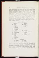
- 100 Lineal
- 2 Rib
- 4 Ripple
- 6 Wave
- 8 Dotted-line
- 10 Dot-and-line
- 12 Dot-and-ribbon
- 14 Beaded-line
- 16 Weave
- 18 Net
- 20 Crisscross
- 22 Checkerboard
- 24 Diaper
CLOTH PATTERNS
REGULAR
- 200 Radial
- 2 Bead
- 4 Bubble
- 6 Hexagon
- 8 Honeycomb
- 10 Pansy
- 300 Fibrous
- 2 Calico
- 4 Linen
- 6 Cord
IRREGULAR
- 400 Coriaceous
- 2 Morocco
- 4 Straight-grain morocco
- 6 Pebble
- 8 Sand
- 10 Patterned sand
- 12 Whorl
- (a) (regular)
- b fine
- c coarse
- d moiré
- e diagonal
- f moiré diagonal
Modifiers
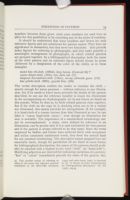
It should be understood that these numbers and letters are only reference figures and not substitutes for pattern names. They have no significance in themselves, but they serve two functions: they provide index figures for referring to photographs; and they make possible a meaningful arrangement of photographs, in which related patterns are grouped together. In a bibliographical description, both the name of the cloth pattern and its reference figure should always be given (followed by a designation of the color of the cloth), as in these examples:
coarse diaper-cloth (124c), very dark red (17)
diagonal dot-and-line-cloth (110ae), strong yellowish green (131)
fine pebble-cloth (406b), grayish blue (186)
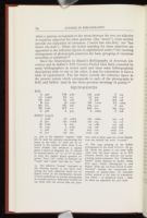
Since the illustrations in Blanck's Bibliography of American Literature and in Sadleir's XIX Century Fiction have been consulted by many bibliographers in recent years and since some bibliographical descriptions refer to one or the other, it may be convenient to have a table of equivalences. The list below records the reference figure in the present system which corresponds to each of the photographs in BAL and Sadleir (and in the three previous showings of grains):[16]
| A | 306 | CM | 408c | LG | 404b | T | 102 |
| AA | 102bd | EC | 122 | LI | 402 | TB | 118 |
| AR | 306c | FL | 108 | P | 406 | TR | 106 |
| B | 304 | H | 124b | PD | 112ae | TZ | 106ae |
| BD | 202 | HC | 206 | PR | 412 | V | 302 |
| BF | 202b | HT | 110 | RH | 210 | YR | 304c |
| C | 408 | L | 404 | S | 102be | Z | 208 |
| i | 402b | vii | 102be | xiii | 106ae | xix | 118 |
| ii | 402 | viii | 102bd | xiv | 104 | xx | 116 |
| iii | 124b | ix | 202 | xv | 108c | xxi | 406 |
| iv | 124c | x | 202b | xvi | 108 | xxii | 208 |
| v | 408 | xi | 106 | xvii | 110 | xxiii | 210 |
| vi | 410 | xii | 204 | xviii | 120 | xxiv | 206 |
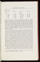
| IVa | 402 | IVb | 406 | IVc | 102 | IVd | 202 |
| a | 302 | g | 106be |
| b | 402b | h | 106 |
| c | 102bf | i | 202 |
| d | 124 | j | 114ce |
| e | 406 | k | 408 |
| f | 102 | l | 110 |
| 30 | 402 | 36 | 404 |
| 31 | 102af | 37 | 202 |
| 32 | 124c | 38 | 106 |
| 33 | 406 | 39 | 408 |
| 34 | 102 | 40 | 110 |
| 35 | 102b |
How exact the match between a cloth and a photograph should be is part of the general question of tolerances[17] and must necessarily vary with different circumstances. The dividing lines between "fine," "regular," and "coarse" — like those between "condensed" and "expanded" in regard to type faces — are not precise, and the decision to call a cloth "coarse" rather than "regular," when it falls between the illustrations of the two, will sometimes be subjective. Whether or not this imprecision takes on practical importance depends on the degree of accuracy required in a particular instance. If two states of the binding of a given book are too similar to be distinguished by means of a standard set of photographs, the bibliographer may find it necessary to include in his bibliography special illustrations of the two varieties. The standard provides a frame of reference but cannot eliminate entirely the need for individual photographs; in most cases, however, such fine distinctions in the specification of cloth grains are not necessary. Only the bibliographer who has examined a great number of copies of a book is in a position to decide the degree of precision desirable in any instance.
Since various levels of accuracy and detail are appropriate in different situations, it is helpful to think in terms of a standard series of
or a variety of fine bead-cloth (cf. 202b)
Once the specification of the cloth grain on one of these levels is completed, there remains the problem of describing the pattern or
As an example of a complete binding (or casing) description, the
| | ||