| | ||
The Lay of the Case
by
Philip Gaskell
Introductory
The lay of the case for the Latin alphabet — that is, the conventional order in which sorts of roman, italic or gothic type are arranged in the boxes of the type-case, and the organization of the cases themselves — is found today in two main forms. One form, which may be called the single lay, is associated with the German-speaking countries and Scandinavia; the other, which we may call the divided lay, is associated with the English-speaking countries, and with France and the Low Countries.
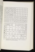
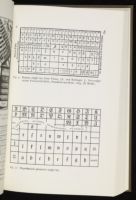
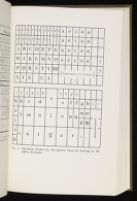
The single lay, as used for instance in Germany and Switzerland, employs one large case for a fount of type, with proportions of about 1:1.6 giving it a somewhat square appearance. The capital letters are arranged in rows of equal-sized boxes along the top of the case, and the small letters are in boxes of various sizes beneath them (Fig. 1).
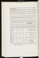
The divided lay in its original form is fast disappearing, although examples may still be seen in old-fashioned printing houses in France, England and elsewhere. Here there are two similar cases to a fount, each of them being smaller and more oblong (with proportions of about 1:2) than the single-lay case. Capital letters are in the 'upper case' boxes, which are all of a size, and the small letters are in the variously sized boxes of the 'lower case' (Fig. 2). Nowadays, however, type in cases (where metal type is still in use) is needed only for correction, and the twin cases of the divided lay are normally amalgamated into one double or job case; the Anglo-American version of the double case is the same shape and size as each of the cases of the divided pair, but squeezes the whole of the lower-case pattern into two-thirds of its width, and half of the upper-case pattern into the remaining third (Fig. 3).
It is apparent from early evidence that both the single lay and the divided lay derive from parent forms which were established by the
The single lay
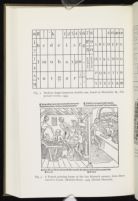
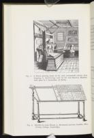
The earliest evidence, illustrations of printing houses, suggests that the single lay preceded the divided lay. The first illustration of all, which shows a French printing-house at the end of the fifteenth century, is unambiguous in its representation of the compositor's case: it is a single case, not a pair, and it is more square than oblong[1] (Fig. 4). Since French printers were using the divided lay by the early eighteenth century, not the single lay, the implication of this picture is that the single lay is the earlier. The illustrations of the sixteenth century, poor as they mostly are, tend to confirm this suggestion: all appear to represent single cases, not pairs.[2] The best of them, Froschauer's cut of 1548,[3] certainly shows a single case, but this does not tell us as much as the French illustration, since Froschauer printed in German-speaking Zürich, where the single lay remained in use. One other pointer to the priority of the single lay (although admittedly a slight one) is that Plantin in his Dialogues of 1567 referred to 'la casse' in the singular, not the plural,[4] and (as will be shown later) the divided lay subsequently became standard both in the Low Countries in general and at the Plantinian printing house in particular.
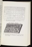
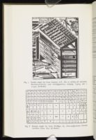
The single lay was first shown in detail in Georg Wolffger's New-auffgesetztes Format-büchlein, published at Graz in 1672.[5] Wolffger actually illustrated two single lays, one for gothic and the other for roman type. The gothic lay (Fig. 5) is closely paralleled by two more single lays for gothic type shown in the Leipzig manual of J. F. Gessner, published in 1740 (Figs. 6, 7).[6] In each of these lays the boxes are arranged in four groups, and Gessner's plates show that the groups were divided by structural bars thicker than the ordinary divisions between the boxes. The top group consists of three or four rows of boxes running the full width of the case, and containing the capital letters, figures, suspensions, etc. Then in the centre are three rows of four large boxes (one of them subdivided) for the more frequently-used small letters of the alphabet (a d e i m n o t u r v w) and for spaces. The other two groups of boxes, on either side of the centre group, contained the remaining small letters, with ligatures and punctuation marks outside them and quads in the lower right-hand corner. The total number of boxes is 109 in Wolffger's lay, and 102 and 108 respectively in Gessner's two lays. One of Gessner's plates also gives the dimensions of his case: it measured 47½ by 29½ in. (1.210 by 0.750 m.).[7]
Wolffger's lay for roman type was essentially similar to the gothic lay, but it needed a larger number of boxes to accommodate the additional small capitals and accented sorts (Fig. 8). These were provided by further subdivision of the boxes, and by including extra rows of boxes at the top and bottom of the case, making a total of 158. Another single lay for roman type was illustrated soon afterwards in the Frankfurt manual of Vietor and Redinger;[8] and although Frankfurt is 400 miles away from Graz, this lay with its 151 boxes is strikingly similar to Wolffgers' roman lay (Fig. 9). Vietor and Redinger do not illustrate a gothic lay, saying merely 'Der Teutscher Kasten ist fast wie dieser
The capital letters in the top rows of all these single lays are in alphabetical order; and it is not very difficult to see that the small letters are also arranged in an approximation of alphabetical order. Thus the bottom row of small letters has b c a, then e d, then g f (or f g): in other words the letters a to g rearranged to get the commoner letters into the centre. The next line up has k h l, then m i n o, then p q, which similarly gives the letters h to q with the commoner letters in the large central boxes. Lastly the upper line of small letters has s t u, then r, then v (w) x y z, completing the alphabet and getting r into the middle. The underlying alphabetical order of the small letters therefore reads from left to right, and from bottom to top, just as the compositor reads type in his stick.
It is tempting to suppose that there may originally have existed a primitive single lay, with the capital letters across the top and the small letters arranged alphabetically beneath them in three rows of eight boxes (Fig. 10). Of course this 'ur-lay' is entirely hypothetical; and, even if anything like it did exist, it cannot have been long before printers saw the convenience of making the changes that would have resulted in the single lay of the seventeenth century.
The divided lay
English printers were referring to 'pairs' of cases as early as 1588, but the earliest certain evidence for the existence of the divided lay is in a fine plate of a Dutch printing house of 1628[9] (Fig. 11). Two pairs of cases are clearly shown, and even the shapes and sizes of the boxes are indicated without much diagrammatic simplification.
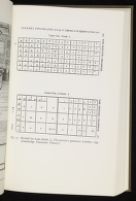
Next comes Joseph Moxon's less artistic but even more informative plate of 1683[10] (Fig. 12), the first illustration to show the divided lay in detail. Moxon's lay, although certainly intended for roman type, is unusual in that it lacks small capitals (Moxon has accented letters and zodiacal signs instead), and it will be convenient to consider it in connection with the next English illustration of the divided lay, which was included in Smith's manual of 1755,[11] and which is probably more typical of English practice (Fig. 13).
The two cases of the divided English lay each measured about 33 in. by 16½ in. (0.838 m. by 0.419 m.), and each was divided into halves by a vertical structural bar. Each half of the upper case was divided into seven rows of seven boxes (making 98). The lower case was not arranged in halves but as a unit, with about 56 boxes of various sizes. The total number of boxes was thus about 154, much the same as in the single-lay roman cases. The upper case contained capitals on the left and small capitals on the right, all in alphabetical order (with the exception of J and U, the alternatives in Latin of I and V), together with figures, various odd sorts and symbols, and the small letter k. The lower case had the rest of the small letters, the punctuation marks and the spaces, arranged so that the commonest letters come in the middle.
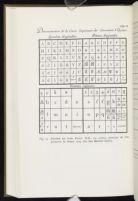
The next illustration of the divided lay after Moxon was the French version of Fertel, published in 1723[12] (Fig. 14). This lay is very like the English divided lay, except that W is omitted from the upper-case alphabets; the figures are in the lower case; h is put out beyond g; short s is down beside long f; and i is in Moxon's h-box. This French lay is shown again, with minor variants, in the Encylopédie;[13] and it seems likely that a version of the divided lay similar to the French pattern — that is with i, not h, in the middle of the lower case — was also used in Spain, although it was not illustrated until 1811.[14]
We have already seen that a divided lay was used in a Dutch printing house in 1628; and the fact that Moxon (who trained as a printer in Holland from 1637 to 1643 and who was an admirer of Dutch printing technology) did not mention the single lay also argues for the general use of the divided lay in seventeenth-century Holland. There were no early Dutch printers' manuals, however, and the earliest evidence we have of the details of a Low Countries lay is in the old type cases preserved at the Plantin-Moretus Museum at Antwerp. All of them are divided lays, with a general similarity to the French version, but they fall into two groups which differ from each
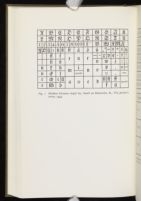
Virtually nothing is known about the lay of the case in Italy during the hand-press period, which is particularly regrettable in view of the importance of the Italian contribution to early printing technology. A divided lay is shown in a manual of 1873; it is of course poor evidence of early Italian practice, but it is worth considering because it differs from the other divided lays[16] (Fig. 16). The upper case, which is smaller than the lower, has only four rows of eight boxes in each half (some of them subdivided); but it is the lower case which has the most remarkable variants, with r and s in the middle row, and o in what elsewhere is the e box, e being moved to the right; h and i are in the 'French' positions, while a and the space box are interchanged.
Just as a general alphabetical pattern was found in the single lays of the seventeenth and eighteenth centuries, so the early divided lays show analogous patterns. The capitals and small capitals in the upper case are straightforwardly alphabetical, but for J and U and (except in England) W. The lower case is less obviously organized, but once again the pattern is in fact based on alphabetical order. Considering first the French lower case (Fig. 14), which is virtually the same as the Plantinian lower case, we find in the next to top row b c d e f g h, with intrusive s and long f; then in the next row the series i l m n o p q, altered only by the placing of the i in the middle. The order in the bottom row, surprisingly, runs from right to left, not from left to right, completing the alphabet with r t u v x y z, the space box and
The English version of the divided lay (which also makes special arrangements for j, k and w) differs in two major respects from the French pattern: h, a commoner letter in English than in French and most other European languages, is kept in the centre of the lower case, the i being in what is otherwise the s box, and s going into the top row; and y, also common in English, is moved to the middle.
The fact that the English version of the lower case departs further from alphabetical order than the French may suggest that it is the later of the two. By a similar process of reasoning, the position of r and s in the middle row of the nineteenth-century Italian lay, which brings it nearer to alphabetical order, might be an indication of early origin.
But we should not be tempted to postulate a primitive form of the divided lower case. A single origin it may have had, but hardly one that was strictly alphabetical. If, as the evidence suggests, the divided lay was developed after the single lay, then it may well have been deliberately designed for its purpose by a practical man who put the letters of the lower case in the most convenient places, taking alphabetical order as his starting point but altering it wherever necessary.
What then can have been the purpose of developing a divided lay? Here we can only speculate, but it has been mentioned that the single lay case was very large; Gessner's was 4 ft wide, and it would have weighed about 75 lb (34 kilos) when it was full of type. To divide it into two would be an obvious device, and indeed there survive in Sweden some old cases of the single-lay pattern which are divided vertically up the middle.[17] But this could be inconvenient — each half of such a pair contains only half the capitals and half the small letters, and would be useless by itself — and a horizontal division of all the capitals into one case and all the small letters into another would commend itself as being more practical. The result, at any rate, is a pair of cases which are each of a convenient size and which weigh, when they are full, no more than 30 lb (13 kilos) apiece.










Notes
There is no recent collection of reproductions of pictures of early printing houses; the most convenient source is still J. W. Enschedé, 'Houten handpersen in de zestiende eeuw', Tijdschrift voor boek- en biblioteekwesen, iv (1906), pp. 196-215.
J. W. Enschedé, loc. cit., p. 213; R. B. McKerrow, An Introduction to Bibliography (1927), p. 41.
G. A. Crüwell (Gutenberg Jahrbuch, 1931, p. 252) refers to two earlier German format-books by T. L. Vietor; one, dated 1653, does not show a lay, and it is unlikely that the other (1664, not located) does either.
C. F. Gessner, Die so nöthig als nützliche Buchdruckerkunst und Schriftgiesserey, i (Leipzig, 1740). Gessner also shows a Bohemian case, which is a variant of the gothic single lay, and a roman single lay similar to Wolffger's.
Gessner gives the dimensions of the case as 1 Elle 18 Zolle by 1 Elle 2¼ Zolle. The Leipzig Elle equalled 2.26 English feet (Encyclopédie, x [Paris, 1765], s.v. 'Mésure'), and contained 24 Zolle; thus 24 Zolle = 27 inches.
J. Moxon, Mechanick Exercises . . . (1683-4), ed. Davis and Carter, 2 ed. (1962), p. 27-8n; S. Ampzing, Beschryvinge ende lof der stad Haarlem (Haarlem 1628).
J. Smith, The Printer's Grammar (London, 1755), pp. 186-7. This is the first of three lays shown by Smith; they differ only in minor detail, and the first (to judge by its relationship to Moxon's lay and to the lays shown in the French manuals) is probably the earliest.
J. J. Sigüenza, Mecanismo del arte de la imprenta (Madrid 1811), pp. 4-5. Siggüenza's upper case has six rows of eight boxes, and the lower case lacks the row of small boxes along the top; long f has already been discarded.
My information about the Plantinian cases comes, through the kindness of Dr Vervliet, from Mr Jeffrey Wortman, who has been working at the Plantin-Moretus Museum, and who wrote me a valuable and interesting report about them. I am most grateful for Mr Wortman's help.
| | ||
