| | ||
FORM AND FUNCTION IN THE ENGLISH EIGHTEENTH-CENTURY LITERARY EDITION: THE CASE OF EDWARD CAPELL
by
Marcus Walsh
[*]
The forms of eighteenth-century editions of English literary texts were at least as diverse as the forms taken by literary editions in our own time, varying as they did not only with the different markets at which particular editions were aimed, but also with the naturally more fluid state of a scholarly genre in a relatively early phase of its historical development. Small-format editions for instance, aimed at general use, or theatre texts meant to be pocketed by a playhouse audience, included minimal scholarly paratexts. Early editions of Shakespeare, prepared by poets—Nicholas Rowe (1709) and Alexander Pope (1723-25)—for a general and genteel readership similarly provided sparse textual and explanatory matter. As vernacular literary editing became more and more a domain of historical scholarship, or `philology', the poetic text was increasingly accompanied by a far more elaborated apparatus, as in Zachary Grey's edition of Hudibras (1744), Thomas Newton's variorum Paradise Lost (1749), or Thomas Tyrwhitt's Chaucer (1775). The disposition and relations of that apparatus, as now, were variable. In Tyrwhitt's Chaucer, or in John Upton's 1758 Spenser, elaborated scholarly annotation was printed separately from the `clean' text. In Grey's Hudibras or Newton's Milton the text was accompanied by substantial bodies of footnotes. In Richard Bentley's 1732 edition of Paradise Lost the text page becomes a complex and interrelating pattern of various components, the text attended by substantial and typographically insistent footnotes and a battery of marginal alternative readings, and itself broken up by italics and square brackets— `hooks'—drawing attention to what Bentley thought dubious readings.
In the editing of the plays of William Shakespeare, however, an essentially `standard' format for the scholarly edition was adopted and evolved over the course of the century. Lewis Theobald, arguably the first `critical'— to use his own word, `intelligent'—editor of Shakespeare, also led the way in providing a formal model, deliberately choosing (as he told his then friend William Warburton) `to follow the form of Bentley's Amsterdam
In this paper I shall be discussing the highly individual editorial work of Edward Capell, which formally is strikingly distinct from this recognizable main stream. Capell is now best remembered for his edition of Shakespeare, ten octavo volumes of the text of the plays, published in 1768, followed by a First Part of Notes and Various Readings in 1774, and the complete threevolume Notes and Various Readings of 1779 through 1783. I shall refer also to Capell's only other piece of published editing, the Prolusions . . . of Antient Poetry (1760); to Capell's holograph copy for the Shakespeare edition; and to Capell's unpublished holograph Milton, which survives with the Shakespeare holograph in the Wren Library of Trinity College, Cambridge.
Both the text and the subsequent apparatus of Capell's Shakespeare edition are innovative and distinctive. As we shall see, the Shakespearean text was published, in 1768, in a strikingly, even provocatively, `clean' form. Capell's textual practice, abandoning the textus receptus and returning to the `original copies', displayed what is arguably a radical text-critical modernity. Capell's explanatory notes, published many years after the text, and very different in book form and mise en page, are based on a daunting range and depth of contextualizing knowledge of Elizabethan and Jacobean culture and literature rivalled, amongst previous editors of Shakespeare, only by Theobald and Johnson.
Capell's hermeneutic procedures and text-editorial methodologies have been both discussed and appreciated by such scholars as Alice Walker and Brian Vickers.[2] Here I shall examine rather the `bibliographical codes' of Capell's works of English editorial scholarship: matters of volume format and makeup, the relations among texts and paratexts, styling and mise en page. In particular I shall argue that Capell's editorial publications are deliberately designed and carefully produced, reflecting not only the expertise and craftsmanship of their printer, but also the intentions of Capell himself. Both the Shakespeare and the Prolusions display Capell's thorough and thoughtful attention to form and to the effect of form on function. Both books show the clearest evidence of Capell's highly distinctive view of the editor's role, of typographic layout, of the reader's use of the text, and of the relation of the editor both to his author and to his reader.
Illustrations
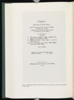
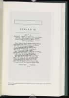
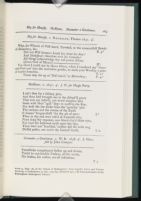
In 1760 Capell published his Prolusions. Perhaps no other English literary edition of the eighteenth century—certainly none before George Steevens's Twenty of the Plays of Shakespeare (1766)—is so determinedly a manifesto of editorial purpose. The full title of the work (plate 1) makes explicit Capell's claimed design: Prolusions; or, select Pieces of antient Poetry,— compil'd with great Care from their several Originals, and offer'd to the Publick as Specimens of the Integrity that should be found in the Editions of worthy Authors. The Virgilian epigraph reinforces the point:
impius haec tam culta novalia miles habebit? barbarus has segetes?
Eclogues 1.70-71.Here Meliboeus fears that his cherished lands are in danger of passing to a godless soldiery; by analogy, Capell invites us to think of English literature as (in Dryden's translating phrase) `happy fields', which must be preserved from the hands of the barbarous, and cultivated with care and honesty.[3] The book is made up of editions of The Nutbrown Maid; Thomas Sackville's Induction; Sir Thomas Overbury's A Wife, now a Widowe; the pseudo-Shakespearean Edward the Third; and Sir John Davies's Nosce Teipsum. The Dedication reiterates Capell's intention to offer `an Example of Care and Fidelity to Persons who take upon them the Publication of our best Authors'. That `Care and Fidelity' is certainly instanced in Capell's text-editorial procedure as he explains it in his Preface: the selection, on the basis of collation, of one original authoritative text as base text or `ground-work'; its emendation either by collation with other copies or by rational conjecture; and the faithful reporting of all variant readings.[4] But the care and fidelity appropriate to the reprinting of the texts of the English literary tradition is instanced too in the make-up, format, and printing of the Prolusions. The volume was printed `for J. and R. Tonson in the Strand', by Dryden Leach, `who may be styled', as John Nichols was to put it in his Literary Anecdotes (2.453), `the Father of Fine Printing in this Country'; the colophon reads, with a proper pride and unusual specificity, `From the Press of Dryden Leach, in Crane-court, Fleetstreet. Oct. 6th. 1759'. The book is a small, carefully-printed octavo. The page measures 6.875 x 4.5 inches (175 x 114 mm.).[5] The type is a distinctive small Caslon, light-faced and beautifully cut, cleanly inked and impressed on a wove paper (to the significance of which I shall return). The text page is neat and elegant, with relatively generous margins, particularly at the foot, and minimum decoration; the opening page of
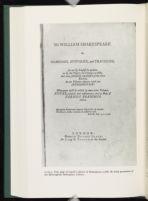
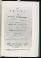
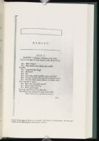
The 1768 Shakespeare is similar in format and style. It is made up of ten small octavo volumes whose pages measure 7 x 4.5 inches (178 x 114 mm.).[6] The most immediately striking feature of the title page (plate 3) of the printed work is the title itself: `Mr WILLIAM SHAKESPEARE / his / COMEDIES, HISTORIES, and TRAGEDIES.' Other eighteenth-century editions of Shakespeare named themselves in a familiar and standardised way: `The Works of Mr. William Shakespeare' (Rowe), `The Works of Shakespear' (Pope, Hanmer, Warburton), `The Works of Shakespeare' (Theobald), `The Plays of William Shakespeare' (Johnson), `The Plays of William Shakspeare' (Johnson and Steevens, Reed), `The Plays and Poems of William Shakspeare' (Malone). (The most consequential disagreement in these forms of title, notoriously, is in the spelling of Shakespeare's name.) Capell's form of title is highly unusual in its own time, but it is of course a version of the title of the first folio: `Mr. WILLIAM / SHAKESPEARES / COMEDIES, / HISTORIES, & / TRAGEDIES.' To revert to the 1623 folio title is at once to make a claim of genuineness and originality, to assert the authenticity of the text presented in these volumes. Unlike the conventional eighteenthcentury title—`The Works of Shakespeare'—Capell's chosen title gives the author primacy, putting Shakespeare's name at the head of the page. Indeed, Capell's form of words, `Mr WILLIAM SHAKESPEARE / his / COMEDIES, . . .', uses an older form of the possessive than Heminge and Condell had done a century and a half before, allowing Capell to present Shakespeare's name untrammelled by inflection. The name of Capell as editor appears nowhere on the title page, an act of self-effacement which aligns him with such another gentleman-editor as Charles Jennens. These are strategies which give Shakespeare an uncontested authority. In other eighteenth-century editions the word `Works' or `Plays' is almost always given the largest type, and the name of the editor or editors almost always appears, with lesser or greater prominence. One might contrast with Capell's, for instance, the title pages of Johnson's 1765 Shakespeare (plate 4), or the 1778 Johnson and Steevens Shakespeare. In both of these the most prominence is given to the word PLAYS, set on its own line in capitals 6 mm high. In both these title pages, Shakespeare's name is allowed rather smaller capitals, 3.5 mm high. In Johnson's 1765 Shakespeare the editor's name appears but is permitted only decently small capitals, a little over 2 mm high. In 1778, less modestly, and more closely approaching the typographical status allowed to Shakespeare
Capell's title page is not on the face of it less cluttered than those of other Shakespearean editions. Following the title itself, Capell provides a description of his book, which insists once more on its textual authenticity—`faithfully republish'd' from the original quartos and folios—and sets out what the reader may expect to find, including the Notes and Various Readings, promised for `some other Volumes'. (Such a description was of course necessary in Capell's time, when the title page doubled as a blurb, set up as advertisement in the bookseller's shop or in the street.) There is, as so often in the eighteenth-century vernacular literary edition, a classical motto, asserting in rather familiar fashion the superhuman genius of Shakespeare (`Qui genus humanum ingenio superavit' [`Who surpassed the race of man in understanding'], Lucretius, De rerum natura, 3. 1056). And there is a simple imprint. Nevertheless, this is an unpretentious and well-proportioned page. There are neither rules nor (unlike the pompous page of Sir Thomas Hanmer's Oxford Shakespeare) ornaments. If Capell's does not have the simplicity of early Foulis title pages—the 1743-45 edition of Shaftesbury's Characteristicks, for instance, or the 1756 Horace Opera—or the monumental severity of Baskerville's 1757 Virgil Opera, it nonetheless appears strikingly light and well-balanced. The balance is aided by the clear separation and spacing of the elements of the title—author's name, the different genres of the works, the account of the editorial enterprise in this volume and in the promised Notes and Various Readings, the motto, the imprint. The lightness is substantially effected by the very extensive use of italics, in contrast with the predominant roman upper case of Johnson's 1765 edition, or the 1778 Johnson / Steevens edition, or, more starkly, with the lapidary mass and precision of Baskerville's large rounded roman capitals.
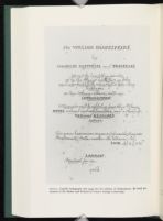
The effect achieved in this title page—within the space and conventions available clean, elegant, classicising—is substantially as intended by Edward Capell as editor of these volumes, as we can see from comparing it with the title page as it appears in Capell's holograph manuscript, now in the Wren Library at Trinity College (plate 5). Dryden Leach as printer of course must have had a substantial input, in terms of choice of fount and other matters, and Capell and Leach presumably had opportunities to consult before and after their previous work together on the Prolusions. Nevertheless, the typography and layout of the printed page, its line-breaks, punctuation, spacing, capitalisation, and italicisation, are exactly as set out in the fair copy provided by Capell. The only detail that differs is the imprint, where the absence of the name of printer or publisher—the manuscript supplies a mere `&c.'—might suggest that Capell had deliberately designed the page before he knew for certain who his printer and publisher would be. At least as probably, however, those choices were already made, and Capell was simply leaving Leach and Tonson free to specify their preferred exact wording.
So close a match between the author's manuscript and the printed title page is remarkable. It was not of course unusual for authors to set out their
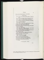
Capell's prescription of the codicography and typography of his book, however, goes far beyond the title page. The text-page of the printed Shakespeare is distinctive, and in many respects similar in styling to that of the Prolusions (plate 6). Again, the format is a small octavo. There are particularly generous margins, almost an inch at the top and right, and almost an inch at the foot; the page has the proportions, and aspires to the elegance, of a larger format work. The typeface is a small Caslon, slightly more heavily cut than that used in the Prolusions (there is, incidentally, a Leach/Caslon connection; Dryden Leach printed, in 1764, A specimen of printing types by W. Caslon and Son). There are no catch-words, no line numbers, and no ornaments apart from straight rules, and the plain rectangular rule frame used in the headings of poems in the Prolusions recurs, as on this first page of Hamlet. As in the Prolusions there is a single line of textual notes at the foot of the page (plate 7), but no explanatory notes on the page, and as in the Prolusions this is announced as deliberate policy. In the Introduction to the 1768 Shakespeare Capell excuses himself, with a politely contemptuous irony, for not including the `accustom'd and laudable garniture of Notes, Glossaries,' etc. He explains this decision partly on the grounds of the difficulty of distributing notes amongst the volumes; partly on the grounds of his intention to provide notes quite separately; and partly, and significantly, because `a very great part of the world, amongst whom is the editor himself, profess much dislike to this paginary intermixture of text and comment' (p. 30).
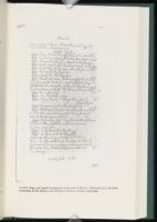
There is striking further evidence of the extent to which Capell's textpage, like the title page, embodies his intentions. Most editors at this time gave their printers a more-or-less heavily marked up and interlineated copy of a previous text (Theobald, for instance, sent to the printer a heavilymarked copy of the 1728 second edition of Pope's Shakespeare).[9] Capell however provided a remarkably neat holograph fair copy, embodying his own rather than a traditionary text, with virtually every detail of layout and
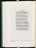
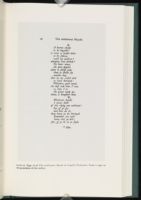
Two further characteristics of the Capellian page style contribute to the production of a clean and uncluttered, a classically simple, textual effect. Firstly, capitalisation is light; Capell's manuscripts and published work are in the vanguard of the process by which capitalisation was purged from the literary text. In the manuscript and printed texts of Capell's Shakespeare only proper names, and the first word of each line of poetry, have initial capitals. In the Trinity College manuscript of Capell's edition of Paradise Lost there is no initial capital for the first word of each line, except for the first word of each verse paragraph. The same policy is followed in all of the texts (except Edward III) printed in Capell's Prolusions (plate 9); it seems reasonable to assume that this was a feature of the manuscript for the Prolusions (which is not known to be extant). Capell's use of italicisation is more problematic. Decades before Capell's Prolusions or Shakespeare, such authors as Alexander Pope (David Foxon has argued)[12] were already dropping the use of italics for proper names, partly in the search for a more classical textual simplicity, partly because they felt such typographic emphases assumed an unsophisticated audience. Capell's texts, however, both printed and manuscript, regularly
A final and it seems to me significant feature of the Capellian text is the paper on which it is printed. Both the 1760 Prolusions and the 1768 text of Shakespeare were printed on wove paper—papier vélin. Unlike laid paper, with its characteristic chain and laid lines produced by the mould, wove is a smooth-surfaced paper made on fine mesh screens woven from high-quality brass wire; a process originated by James Whatman the Elder in the 1750s. Wove paper was probably first used in Baskerville's 1757 Virgil, whose volumes are made up of a mixture of sheets of laid and wove paper, all subjected to Baskerville's glazing process. Wove paper production was new and experimental in 1757, and according to John Balston, in the major study of James Whatman, it was not until 1759, and in particular for the quarto Paradise Regained of that year, that Whatman developed the process to a level which satisfied his own criteria.[13] Wove paper did not enter general use for another three decades. Though the Foulises in Glasgow used unusually fine papers, and indeed used Whatman papers from 1747, they did not turn to wove papers until this became the industry norm in the 1790s.[14] Wove paper was used only in a very small minority of the publications of Baskerville, or of Dryden Leach. Leach for instance resorts to wove paper for such aristocratic special printing as An Elegy on the Death of Lady Boynton, a 5page quarto pamphlet published in 1768, but not for more common books.
The stipulation of wove paper for both the Prolusions and the Shakespeare therefore seems entirely remarkable in 1760 and 1768, and seems in all likelihood to have been proposed by Capell. No doubt Capell, and Leach, valued the quality of Whatman's new wove paper itself, and hoped by its use to enhance the perceived quality of their printed text. Perhaps also, for the same more technical reason that Baskerville had Whatman develop new papers, including a wove paper, to use with his new lighter type, Leach and Capell thought it would help in the even impression of the relatively fine-cut Caslon type used for the Prolusions and Shakespeare. If so, the choice of wove paper may be thought of as a condition of the typography of these volumes.
I have attempted to argue that these two major editorial enterprises by Edward Capell are distinctive in many aspects of their form, and that their distinctiveness can be shown in important ways to stem from Capell himself. It seems highly unlikely that the publishing house of Tonson had any part in the page or volume design of Capell's 1768 Shakespeare (equally, the Tonsons could scarcely have contemplated publishing an edition of Shakespeare which competed directly, in form or market, with the edition by Samuel Johnson in whose publication they had shared fewer than three years earlier). It is certainly true that the printer Dryden Leach was a willing and expert co-adjutor, responsible of course for the practical execution, and the choices involved in the execution, of Capell's wishes. No doubt many aspects of the two physical books I have been considering are the result of consultation and cooperation between Capell and Leach. More than that, it has been convincingly argued that Leach was in the forefront of the move towards a simpler, neater typography in the 1750s and 1760s. In his extraordinarily suggestive article on the `Revolution in the Layout of Books in the Eighteenth Century', Nicolas Barker contrasts a page of the 1754 Act establishing the British Museum, with its large and blocky type, heavy capitalisation and cluttered marginal notes, with the Statutes and Rules Relating to the Inspection and Use of the British Museum, in a small neat type, without obtrusive capitals or marginalia, printed by Dryden Leach in 1768—the same year as he printed Capell's Shakespeare.[15] Leach had both the aesthetic sympathies and the craft skills to print the books Capell required. Nonetheless, the typographical features of Capell's two books, while they conform very exactly to Capell's holograph, do not coincide with a regular Leachian house style. For example, Christopher Smart's subscription-published volume of 1765, containing his Song to David, Hymns and Spiritual Songs, and Translation of the Psalms, was printed by Leach. It is not especially `modern' in style, with its heavily roman title page, and double-quotation marks used throughout at the beginning of every quoted line within the verse.
Whatever the nature of the collaboration of Leach and Capell, and whatever their relative input, it seems clear that the style of the Prolusions and Shakespeare are part of that revolution of typographical layout in the mideighteenth century which is usually taken to originate with the work of Andrew and Robert Foulis in Glasgow from 1742 onwards. As Nicolas Barker has described it, the main characteristic of the new style led by the brothers Foulis was neatness, and its main vehicle the printing of the classics. The Foulis style certainly influenced Baskerville and Leach, and seems also to have influenced Capell. It is easy to rehearse a list of features that Capell's printed editions have in common with at least the smaller format reprints of the classics that emerged from the Foulis press in the 1740s and 1750s: a
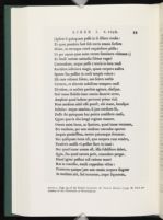
The difference between the page of Foulis and Capell, on the one hand, and the larger, busier and closer-printed variorum pages of Samuel Johnson's 1765 Shakespeare or the Johnson-Steevens editions of 1773 and 1778, is obvious. Why was Edward Capell at so much pains to produce, in 1768, an edition in page format and physical properties so much at odds with what had by then become a significant norm in Shakespearean editing? Why was he so concerned to separate from his critical text of Shakespeare the detailed and copious textual, explanatory and illustrative materials he was already preparing, and in which indeed he had an enormous intellectual and personal investment? Capell's `clean', unmixed, unannotated text displays many of the characteristics, and some of the impulses, of humanist printing. Early printed editions of classical authors, of Horace for example, mimicked the densely populated page of the medieval manuscript, in which accreting commentaries surrounded the text. As many scholars have pointed out, this structure was challenged by the humanist scholar printers—Aldus Manutius, notably— who sought to strip away the accumulations of diverse commentary, and restore the intended authorial text, as they thought it, to its central and privileged place, uncluttered and uncontested by rival voices. This humanist tendency in printing was revived by Foulis and by Baskerville as a vehicle for (predominantly) the poetic works of classical antiquity (plate 11). E. J. Kenney suggests, of the Baskerville editions of classical authors, that they
were intended to be read . . . by gentlemen who were also amateurs of literature and who liked their literature well printed. To such readers line-numbers, variant readings, diacritical marks, sigla, and the like clutter would merely disfigure the page.[17]
Capell's `clean', unmixed text, courteously refraining from imposing explicatory annotation upon the reader, insisting on the primacy of the author and the authenticity of the text, belongs to a similar humanist tradition. Fine in physical quality, beautifully printed, clear on the page, it was no doubt aimed at least in part at a broadly similar market. It is designed not for the shelf or the library desk, but for the pocket—the moderately moneyed pocket —and familiar reading. It is the only text-critical edition of Shakespeare which, in its first-published format, might have been carried conveniently to, and used by a spectator at, the playhouse. Capell was a scholar, and substantial parts of his Shakespearean scholarship, in the form of his Notes and Various Readings, would follow years later in, significantly, a much larger format, and with an altogether different page style. In 1768, however, his priority was to produce a text of Shakespeare's plays which would visibly and functionally represent the dramatist as a classic of vernacular literature, a classic which might be read in the same way, and in recognisably the same
However different the form of Capell's 1768 and Samuel Johnson's 1765 Shakespeares, it is nonetheless possible to compare Capell's principle here with Samuel Johnson's stated belief that `Notes are often necessary, but they are necessary evils'. In his Preface Johnson famously urges the newcomer to Shakespeare to read straight forward, to
read every play from the first scene to the last, with utter negligence of all his commentators. . . . When his attention is strongly engaged, let it disdain alike to turn aside to the name of Theobald and of Pope. Let him read on through brightness and obscurity . . . ; let him preserve his comprehension of the dialogue and his interest in the fable.[18]
Only after this initial, unmediated and uninterrupted experience is the reader advised to `attempt exactness, and read the commentators'. Johnson here recommends an initial aesthetic response to the work in its entirety, very much comparable not only with Pope's generally anti-philological position, but also, and more specifically, with Pope's humanist distinction, in the Aristarchus passage of the Fourth Book of the Dunciad, between fragments and the glorious whole; or with his insistence that `men of a right Understanding generally see at once all that an Author can reasonably mean'.[19] Johnson allows the necessity of notes, and even the value of the formidable apparatus of variorum commentary. And clearly the annotations in his own 1765 edition are one of the major contributions to the philological side of the argument, the scholarly investigation of Shakespearean readings and meanings. Yet notes are still in his view an intrusion, explaining the crux but failing to interpret the whole work: `particular passages are cleared by notes, but the general effect of the work is weakened'. From the hermeneutic point of view, Johnson's emphasis on the local and limited interpretative possibilities of the note might put us in mind of some post-modern attacks on annotation as traditionally conceived: for instance, Anne Middleton's characterization of explanatory notes as `scattered raids upon local meaning', which cannot finally explain their whole text, and which are `insistently anti-narrative (or counter-narrative)', `tending to occlude the horizontal coherence of the text for the vertical plenitude of superimposed or parallel forms of information'.[20] Certainly the radical simplicity of Capell's text, far more than Johnson's proto-variorum format, is hospitable to `general effect', to narrative, to horizontal coherence.
Nevertheless the extreme original purity of Capell's 1768 edition was at odds with a rather widespread contemporary presumption amongst textual
Other writers found more value in the principle of linear and unhindered reading that the form of Capell's edition so strongly favoured. A writer in the English Review in 1784, with not only the 1768 bare text but also Capell's subsequent extensive apparatus in front of him, congratulated Capell on having printed the notes `by themselves, not forcing them upon the student of Shakespeare, but leaving the perusal to his choice'. The question of where to place the notes is represented as one of `the great questions that divide the learned world', and is settled in favour of a mode of linear reading of poetry which foregrounds passion, inspiration and sensibility:
. . . in poetry, and where the notes are merely those of an emendator or commentator, . . . we do not hesitate a moment to give the palm to Mr. Capell's method. . . . The soul of true poetry is enthusiasm; the most indispensible quality of dramatic poetry in particular is to touch and captivate the passions. But to be interrupted at every turn with a laborious commentary, and that, as it may happen, at the most interesting and masterly situation in the whole play, is perfect sacrilege to the divinity of the Muses.[22]
Eighteenth-century editors and reviewers had, clearly, their own often sophisticated theoretics of editorial function and presentation, and conducted their own debates. It is also possible however to understand the intentions of Capell, and the response of his contemporaries to his work, in the light of a much more recent theoretics of the book. Jerome McGann (with others, and especially Donald McKenzie) has taught us to think of the text `as a laced
Jerome McGann's discussion of bibliographical codes has been mainly concerned with primary writings, but bibliographical codes have consequences, as McGann is aware, not only for the original published documentary form of literary writings, but also for the edited forms in which they are subsequently mediated. Observing that `the very physique of a book will embody a code of meaning which the reader will decipher, more or less deeply, more or less self-consciously', McGann argues that
to read . . . a translation of Homer's Iliad in the Signet paperback, in the edition published by the University of Chicago Press, in the Norton Critical Edition, or in the limited edition put out by the Folio Society (with Illustrations) is to read Homer's Iliad in four very different ways. Each of these texts is visually and materially coded for different audiences and different purposes.[24]
Especially pertinent in McGann's discussion of the form of the critical edition, and its effect upon reading, is his distinction between linear reading and radial or spatial reading. Linear reading—what Tristram Shandy would call `reading straight forwards, in search of the adventures' (1.20.65)—is what the unexamining reader does in the case of more or less straightforwardly non-self-reflexive texts. By contrast, literary scholarship provides numerous examples of texts which encourage radial reading, in search rather (to borrow Tristram's words once more) of `the deep erudition and knowledge which a book of this cast, if read over as it should be, would infallibly impart'. Of such books amongst the most striking are critical editions, the Cornell Wordsworth, for example, or the Oxford English Texts editions:
One does not simply move through works like these in a linear way, starting at the beginning and then proceeding page by sequential page. Rather, one moves around the edition, jumping from the reading text to the apparatus, perhaps from one of these to the notes or to an appendix, perhaps then back to some part of the front matter which may be relevant, and so forth.
(The Textual Condition, p. 120)McGann has provided some of the most valuable conceptual yardsticks for assessing the forms of the scholarly edition, but in recent years he has been only one, if one of the most prominent, of a number of theorists and scholars addressing issues arising out of the forms in which literary texts are presented and annotated. That discussion has tended to focus on the ideological, on issues in particular of power, ownership, appropriation, and authority. Such
our reading, especially as it interprets the codes of type size, text and page placement, and other visual and spatial phenomena, responds to the ideological and procedural `instructions' supplied by the textual editor.[25]
Greetham identifies just such a set of ideological and procedural `instructions' in `traditional' clear-text eclectic editing, which, he alleges, `deliberately tries to prevent radial reading by concentrating the reader's eye on the "text itself" of the text page proper'. Greetham suggests, with other textual theorists, that the New Bibliography and the Greg/Bowers school of eclectic editing was naturally linked with the New Criticism, whose `critical concentration' on `the text itself'
needed a textual equivalent in which the critic and reader was offered an apparently seamless and perfected text, with the tension produced by variance banished to the back of the book, or even a separate volume.
(P. 12)Such texts conceal, according to the arguments employed by Greetham, their own motives, functions, and contradictions. They disguise the inevitable contingency of the text. They implement hierarchical structures in which the authorial text is privileged and apparatus occupies an inferior place. Indeed, Greetham remarks that some editions in his own field of Middle English
prevent radial reading by publishing the textual notes and full apparatus in a separate volume, sometimes years after the text proper has been available.
(P. 12).Greetham's strictures apply no doubt with a particular precision to Capell's Shakespeare: to its offering of `an apparently seamless and perfected text', its privileging of the author and the author's writing, its ejection from the text page of most (though not all) evidences of textual variance and transmissional indirection, its fragmented and drawn-out serial publication.
The adoption of a clear-text format however, despite the crimes of disguise and coercion which have been imputed to it by Greetham and others, does not by itself rule out an awareness and pursuit of textual variance, a recognition of the complexities of meaning and of the need to explicate meaning, or an understanding of the connection between the text-critical and the text-hermeneutic enterprise. Concerned as he is with textual appearances, Capell is nevertheless deeply involved in the reasoned and supported text choices and exegetical acts of interpretative editing. Though Capell's text itself is humanist in its regard for the beauty of the page and integrity of the text, his project taken as a whole is humanist in another, philological sense: in its detailed historical literary scholarship, its text-critical responsibility, and its emphasis throughout on knowledge and interpretation. The text of
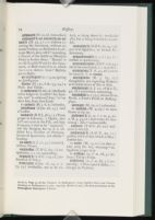
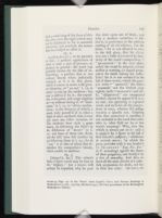
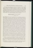
These disparate editorial materials presented in the three volumes of the Notes and Various Readings were designed to work together in justifying textual choices and in explicating the text. Capell makes this combined purpose explicit in his Advertisement to the 1774 Notes and Various Readings: `the sole intent of the "Notes," is—to establish the Author's text, and to explain it'.[26] I provide reproductions of pages from Capell's Glossary, Notes, and School which all relate to a celebrated Hamlet interpretative crux (plates 12, 13, 14), the line which reads, in Folio and Quarto, `Unhouseled, disappointed, unaneled', and which reads, in the text of Capell's 1768 edition, `Unhousel'd, unanointed, unanneal'd'. Capell's Note on this passage refers to his Glossary definition, which reads:
unhousel'd, un-anointed, un-anneal'd . . . i.e., without receiving the Sacrament, without extream Unction, or Absolution in Articulo Mortis, here call'd—annealing, a Process of the Artists on Metals in order to harden them. `Housel' is an old English Word for the Sacrament, or Host receiv'd in it, which Skinner derives from— Hostiola, parva Hostia.
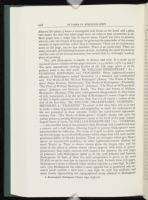
(Notes, 1.74).In the Notes Capell explains that he prefers to the reading of all the old editions the `modern correction' unanointed (the `correction' is to be found in Pope, Warburton, and Theobald—in his 1733 edition, though not in Shakespeare Restored). The modern reading, Capell argues, provides the un- prefix for all three terms, and in the three original terms extreme unction is lacking. He rejects `disappointed' and `unappointed' on the grounds that `appointing is a general word, . . . whereas the passage requires a specific one'. Capell here provides an emendation which modern editors consider quite unnecessary; but the editorial materials of the Notes and Various Readings provide what amounts to a carefully reasoned explanation, though the emendation in the `clean text' of 1768 taken alone would appear tacit, arbitrary, unjustified. The other two terms of the triplet are explained by passages in the School, which can be hunted down by the curious reader who is prepared to make careful use of the School's Verbal Index. Aneyled is exemplified, and hence explained, by three passages from Thomas More's Works (1557). `Houseled' is exemplified and explained by two passages from the second
In fact, if readers are to gather together Capell's account of this line in Hamlet in its entirety, they must consult no fewer than six differentiated and separated components: the `clean' text of 1768; the Variant Readings for Hamlet; the Notes; the Glossary; the Verbal Index to the School of Shakespeare; and the School itself. It is true that readers are offered a good many direction signs: each note is referred to a page and line number of the text; the Notes frequently refer to the Glossary; the Index to the School enables the location of passages appropriate to the particular crux; within the passage, the word which Capell is concerned to illustrate is flagged by quotation marks; and, very occasionally, a passage in the School is there referred to a particular passage in the text of one of the plays. But these directions re-affirm what a complex maze of pathways Capell has created.
The radial reading of Shakespeare in Capell's edition is made an especially disorientating experience by the difference in size between Capell's small volumes of Shakespearean text and his vastly larger volumes of apparatus, presented in a normal format of eighteenth-century prestige scholarship. The Monthly Review of 1776, addressing itself to the single volume of Notes which had been published in 1774, complained both of the tardiness and of the bulk of these first fruits of Capell's commentary, of `the awkwardness of huge quarto volumes to a text given in small octavo, . . . coming like heavy Falstaff so long after the battle.'[28] Normally the volumes of an edition— Pope's or Theobald's Shakespeare, Thomas Newton's Milton— `range with' one another in bibliographical format. Such volumes are designed to be bound consistently and to stand together on a gentleman's or gentlewoman's library shelf. Capell's 1768 Shakespeare `ranges' only with his earlier Prolusions; it is a volume not for the shelf or the library desk, but for the pocket and familiar reading, like the Aldine Horace, and unlike Bentley's quarto Milton, or even Johnson's relatively bulky octavo Shakespeare. In format Capell's 1768 text is abstractable, suited to the purposes of linear reading, of reading as poetry. It is mis-sized in its function as a component in Capell's completed edition, which may be thought of as a complex machine for a particularly elaborated and ergonomically problematic version of the kind of radial reading that McGann describes, in which: `one moves around the edition, jumping from the reading text to the apparatus, . . . from one of these to the notes or to an appendix, . . . and so forth.' In Capell's separation of the text from notes and apparatus in time as well as in space, however, there are resemblances with
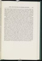
The paginary forms of Capell's edition articulate a mode of scholarly communication very different from that of Bentley's Milton or Johnson's Shakespeare. Capell and Bentley offer a radical formal contrast: on the one hand, Bentley's almost medieval or post-modern page, in which the editorial workings are not only exposed, but infiltrate and destabilise the Miltonic text; on the other, Capell's complex editorial structure in which Shakespeare's text is at the same time determined and liberated, and the reader effectively allowed the choice of linear or radial reading. There is an almost equally dramatic contrast between the clean unmarked text of Capell, followed at so great a temporal and formal distance by the numerous components of an apparatus generated by one solitary scholar, and the Johnson or Johnson/ Steevens Shakespeares, which lead the reader towards what Johnson calls `exactness' of interpretation through their cooler on-page conversations of plural expert commentators, the variorum edition being above all the place where the disparate kinds of explanatory knowledge possessed by many different scholars may be brought together, and where obscurities left by one may be resolved by the `happier industry, or future information' of another. These differences between editors, these contests on the page, are one measure of the tension in the eighteenth-century world of letters between the different varieties of philological and gentleman humanisms. I have suggested that in Johnson's statement on the necessary evil of annotation we see an evidence of that stress. No doubt Capell's edition might be seen as an attempt to address this cultural and literary problem; to invent an editorial form which allows for rapprochement between the demands of these two very different, but in Johnson's wish and perhaps in Capell's deed, consonant positions.
Notes
This paper has benefited from kind suggestions made in response to earlier and partial versions presented at seminars at Oxford University, Cambridge University, and the British Society for Eighteenth-Century Studies. I would particularly like to thank Roger Lonsdale, Paulina Kewes, Jim McLaverty, Simon Jarvis, William St Clair, Howard Erskine Hill, and Michael Suarez, S. J.
Letter to William Warburton, November 18, 1731. Quoted by Peter Seary, Lewis Theobald and the Editing of Shakespeare (Oxford: Oxford Univ. Press, 1990), p. 127.
Alice Walker, `Edward Capell and his Edition of Shakespeare', Proceedings of the British Academy, 46 (1960), 131-145; Brian Vickers, ed., Shakespeare. The Critical Heritage, 6 vols (London: Routledge and Kegan Paul, 1974-81), vols. 5 and 6 passim. See also my own Shakespeare, Milton and Eighteenth-Century Literary Editing (Cambridge: Cambridge Univ. Press, 1997), pp. 175-198.
There is a comparably polemic application of a different Virgilian metaphor in the choice, by Alexander Pope for his 1725 Shakespear, and by Lewis Theobald for his Shakespeare Restored (1726), of Virgil's lines on the mangled condition of Deiphobus: `—Laniatum corpore toto / Deiphobum vidi' [`I saw Deiphobus, his whole frame mangled'] (Aeneid, 6.494 ff.).
Prolusions; or, Select Pieces of Antient Poetry (London, 1760), fol. A4r; p. i; Mr William Shakespeare his Comedies, Histories, and Tragedies, 10 vols. (London, 1768), 1.20.
In The Margins of the Text, ed. D. C. Greetham (Ann Arbor: Univ. of Michigan Press, 1997), pp. 173-198. I refer particularly to pp. 178-181.
David Foxon, rev. and ed. James McLaverty, Pope and the Early Eighteenth-Century Book Trade (Oxford: Oxford Univ. Press, 1991), p. 166.
I argue the point more fully in Shakespeare, Milton and Eighteenth-Century Literary Editing, p. 183.
John N. Balston, The Whatmans and Wove [Vélin] Paper (West Farleigh: John Balston, 1998). See also Balston, The Elder James Whatman: England's Greatest Paper Maker (1702-1759), 2 vols. (West Farleigh: J. N. Balston, 1992), 1.254-255.
Barker, `Typography and the Meaning of Words: the Revolution in the Layout of Books in the Eighteenth Century', in Buch und Buchhandel in Europa im achtzehten Jahrhundert: The Book and the Book Trade in Eighteenth-Century Europe. Proceedings of the Fifth Wolfenbütteler Symposium, November 1-3, 1977, ed. Giles Barber and Bernhard Fabian (Hamburg: Dr Ernst Hauswedell & Co., 1981), pp. 127-166 (pp. 133-134, 150-151).
The Classical Text: Aspects of Editing in the Age of the Printed Book (Los Angeles and London: Univ. of California Press, 1974), p. 154.
The Yale Edition of the Works of Samuel Johnson, vols. 7-8: Johnson on Shakespeare, ed. Arthur Sherbo (New Haven and London: Yale Univ. Press, 1968), 7.111.
The Twickenham Edition of the Poems of Alexander Pope, vol. 7: The Iliad of Homer, Bks I-IX, ed. Maynard Mack et al. (London: Methuen and New Haven: Yale Univ. Press, 1967), p. 82.
Anne Middleton, `Life in the Margins, or, What's an Annotator to Do?' in New Directions in Textual Studies, ed. Dave Oliphant and Robin Bradford (Austin: Harry Ransom Humanities Research Center, 1990) pp. 167-183 (pp. 169, 170).
Monthly Review, 39 (1768), 274; Critical Review, 26 (1768), 327; Lear, ed. Jennens (London, 1770), p. viii.
`Editorial and Critical Theory: from Modernism to Postmodernism', in Palimpsest: Editorial Theory in the Humanities, ed. George Bornstein and Ralph G. Williams (Ann Arbor: Univ. of Michigan Press, 1993), pp. 9-24 (p. 12).
| | ||


