| | ||
II
The most significant changes that appeared in either book occurred in the second printing of Introduction. The “few corrections and small addi-
The largest and most important group of modifications consists of adjustments to make the information more accurate or precise, either by correcting errors or by providing new facts. In order to focus on this category, it is helpful to deal first with the smaller groups of changes, beginning with those that were not for the better. Several of them occur already in the second impression, which overall is printed from the same setting as the first. A comma vanishes at the end of the first line of note 3 on page 224, and two page numbers undergo alteration: “xi” drops from the preliminaries, and “113” is reset. For “113” the compositor happens to replace the second digit with the letter “r”, a character that remains in all subsequent printings. Throughout those later lithographic reprints, in turn, various changes result from degeneration of the type images. The barely detectable period that concludes the caption on page 149 in the second impression becomes invisible in the third; starting with the third printing, the closing period is absent after the final note on page 310; the letters “os” of “imposition” at 263.7 are missing in the sixth through twelfth printings and in the fourteenth; and beginning with the eighth printing the full stop that is presented as an example at the start of the fourth paragraph on page 316 is gone. The book also provides a rare example of type damage that seems intended. On page 145, the job number “3349” in the new direction line of the third printing is corrected to “3249” in the fourth (continuing through the twelfth), apparently by removing the lower portion of the second digit.
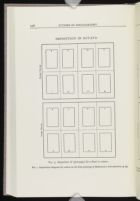
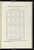
One other instance of the later reading being the inferior one—an example that incidentally serves as a reminder that graphic images are subject to the same vicissitudes as words and punctuation—occurs in Figure 9, on page 35. Two separate but related changes occur in the octavo imposition diagrams here: the inner forme is moved from the bottom to the top of the page, and it is rotated 180°. Whether both modifications were intended or whether one happened accidentally in the course of the other is unclear; either way, they may illustrate varieties of what McKerrow sees as a common problem, the “transformation of sense by the attempt to correct mistakes” (p. 198). The switching of the formes is puzzling, for in his other illustrations McKerrow consistently presents the outer forme first (he depicts the folio on pages 30 and 33, the quarto on 16-17, and the duodecimo on 170-171). Perhaps the exchange is an unintended consequence of revision, though it is not an alteration that obscures sense. The rotation, however, presents difficulties, and there are grounds for thinking that McKerrow himself is responsible.
Both the Introduction and the earlier “Notes” provide some suggestion that McKerrow does not have a firm grasp of the intricacies of imposition and that although his understanding develops it is not yet complete by the time of the book's publication. He increases the difficulty of comprehending these matters, moreover, by rendering the imposition patterns as pages of type lying on the bed of the press rather than as their images printed on a sheet. He recognizes the problem, for amid his repeated injunctions to read-
 [Description: SB 52, Page 226]
 [Description: SB 52, Page 227]
Problems with imposition are first evident in the 1914 article. The folio (pp. 245-246) is portrayed properly, but the layout of the quarto (pp. 228-229) works only if the sheet is turned incorrectly—that is, pivoted on its long edge for the printing of the second forme. The octavo (p. 247) is again all right, with the sheet being turned on its short edge for the iteration. All three of these patterns—two correct, one incorrect—are repeated in the first printing of Introduction (with the diagram for the quarto matching the incorrect verbal description on page 18). The treatment of the duodecimo, however, undergoes changes from the article to the book and reflects development in McKerrow's understanding. In the “Notes” he points out that because “there are several ways in which the pages can be imposed” for small “sizes” such as duodecimo, and because these “sizes are seldom of any practical importance to those who are likely to read these pages,” therefore “It must... suffice here to give a single scheme for 12mo imposition, and to leave readers to work out others for themselves, if they wish to do so” (pp. 248-249). The imposition scheme he chooses to illustrate, duodecimo without cutting, was, to say the least, uncommon; according to Gaskell, “There seems to be no clear evidence” that it “was ever used in the hand-press period” (New Introduction, p. 107). By the time of the Introduction McKerrow's understanding and experience have progressed: though he again presents a diagram for folding without cutting (p. 171), he also includes one showing the more familiar pattern of “twelve-mo by cutting,” saying that “So far as my observation extends, this was the normal, and practically the only, method of producing a 12mo used by English printers of the late sixteenth and seventeenth centuries” (p. 170). McKerrow himself documents what happened between 1914 and 1927. In discussion after a Bibliographical Society talk by R. W. Chapman on 15 October 1923 that was itself a response to some points made in McKerrow's article, McKerrow acknowledges that “In these notes, being conscious that I did not know much about duodecimos but feeling it necessary to say something about them, I worked out the possible ways of folding a sheet in twelve and left it at that.” The “examination of a fair number of duodecimos since I compiled those notes,” he continues, “has led me to the belief that, round about the year 1600 at any rate, the method of cutting off the lower third of the sheet which Mr. Chapman has found practised in the eighteenth century was, if not the only method, at least the usual one.”[25] In the 1927 revamping of the material on duodecimos McKerrow
McKerrow's uneasiness with some questions of bibliographical format was noted by at least one reviewer of the book. According to the TLS writer, “Dr. McKerrow illustrates these mysteries of imposition by diagrams, and, though with a momentary lack of courage he remarks `into the question of 24mo. I cannot enter,' he returns to the charge in an appendix.” McKerrow likewise falters on a related matter, the role of the pins or points that hold the sheet on the tympan during printing. His description on pages 22-23 is largely unchanged from the account on page 266 of the “Notes.” In it he fails to acknowledge a crucial feature of their positioning—that, to help the pressmen pivot the sheet in the right direction, they were placed asymmetrically, so that the holes they created would match only for a certain turning of the sheet. A passage he adds in the second printing of the book (p. 37) speaks to the turning of the sheet and does at least indicate his struggle with the complexities involved:
Note IV.
If this point be overlooked, strange errors will result. In working out imposition schemes by means of folded paper it is essential to remember always that the arrangement of pages in the printed sheet is a `looking-glass image' of the arrangement of the type-pages in the forme itself (i.e. reversed from left to right or from top to bottom).
The uncertainty that characterizes McKerrow's dealing with format culminates in the change of the diagram for the inner forme in Figure 9. What was correct in the “Notes” and in the first printing of Introduction goes awry as the pattern is rearranged to show the sheet being turned across its long side instead of its short one. In various ways McKerrow warns his readers of the “strange muddle” caused when “sheets, after being printed on one side,” are “turned the wrong way round when being perfected” (p. 260; this wording also appears in “Notes,” p. 250). Though through his efforts McKerrow may save others from misunderstanding, on this point he does not save himself.
But most of the alterations in the second printing are appropriate. These involve first of all making consistent a number of typographical details, ones whose variability offers support to McKerrow's observation that “The human body is not a perfect machine” (p. 225). On the final page of the table of contents (xi, line 11), the concluding points are removed from “12mo.” and “24mo.” in order to match the text itself.[26] (This is the page on which the pagination also disappears—perhaps accidentally in the course of deleting
This attention to typographical nuance finds its most surprising manifestation in two instances where passages have been reset simply for visual effect. In the first printing, the first line of the second full paragraph on page 57 has large gaps between words. To balance its appearance with the following line, a syllable from that one is moved up: “been| described” becomes “been de-|scribed”. In the second full paragraph on 94, lines 3 through 6 all start with a three-letter word, creating a river of white space to their right (three lines in a row begin with the word “the”), and line 3 also is set unusually loose. The revision moves a word from line 4 to line 3: the lineation changes from “below| the title” to “below the| title”, thereby addressing both problems. In a slightly different instance, where space instead is added, the structure of a page's content is clarified when the list of Latin abbreviations on page 324 is lowered to set it off typographically from the preceding prose.
The nature of some of the details needing correction makes it hard to tell whether they originated from the compositor's slips or from the faithful reproduction of the author's errors (which in turn might have resulted from momentary inattention or faulty understanding). Reviewers of the first printing pointed out how “proving” at 14.16 should be “proofing” (Byles, Modern Language Review) and, at 341.12-13, “Facsimilies” ought to be “Facsimiles” (Sisson, Library); both are corrected in 1928. At 161.9, the name “Moretius” becomes “Morelius”. To mark the beginning of a parenthetical statement, a comma is added after the first word of the note on 70, and a colon replaces a period at the close of the introduction to the inset quotation on 122.
McKerrow also uses the occasion of a second printing to make a number of stylistic changes. He converts the preposition in the phrase “puffing titles found on many Elizabethan books” to “in” (93.11), and to reduce repetition of forms of the word cause that appear three times in four lines he alters “which cause his work to fall below” to “which result in his work falling below” (240.8). Some verbal changes that might be considered stylistic are in fact necessary for the sense. In his Library review Charles Sisson pointed out that the phrase “may prevent the reproduction from falling short of our reasonable expectation” at the end of the opening paragraph on 239 made no sense; McKerrow changes the core of it to “from coming up to our”. Elsewhere a revision is necessary because the original syntax is incoherent. The opening of the note on 33 first reads:
It is important to observe that the repetition of borders or ornaments outside the text-page proves nothing, for these would, I think, normally be added at the time of imposition, or to illustrations which in certain cases (e.g. necessary diagrams in astronomical books, &c.) might possibly be so added,
It is important to observe that the repetition of borders... imposition; or of certain kinds of illustrations (e.g.... &c.), which might....
By far the largest category of textual changes for the second printing, however, comprises corrections and additions in the name of accuracy, bibliographical and otherwise. The reasons for certain kinds of modifications in the reprintings are obvious: the date on the title page must change, the information on the copyright page needs to be updated, or the colophon at the end of the book must report a new printer. Those alterations and ones in direction lines are not reported in the list that follows, which unless otherwise indicated cites changes between the first and second printings and assumes that all subsequent impressions follow the second. The adjustments in the preliminaries that were caused by introduction of the McKitterick essay in the St Paul's/Oak Knoll printing likewise are not included here. But all the other changes I have identified but have not yet mentioned are present. Each account begins with the page number on which the variation occurs, and it generally includes some explanation of why the text was altered.
viii. At the end of the Preface, the 1928 printing adds a note retained in all subsequent impressions:
NOTE TO THE SECOND IMPRESSION| A reprint being required, I have taken the opportunity to make a few corrections and small additions.| R. B. McK.| June, 1928.
xv. To the list of useful books McKerrow adds an entry after line 26 for one by his friend A. W. Pollard in order to account for a new reference in the note on 265: “— Fine Books. London, 1912.”
1. The opening word of chapter one is altered from “THIRTEEN” to “FOURTEEN”. Because McKerrow is speaking of the number of years since “I put together the `Notes on Bibliographical Evidence'” (“In the autumn of 1913,” according to a parallel sentence that begins the Preface) rather than the years since the article was actually published (in 1914), this change may be the correction of a misstatement rather than a recalculation based on the date of the revision, a year after the 1927 first printing.
34. The addition of “Note IV.” (quoted above) at the foot of 37 requires on 34 the insertion of a cross-referential footnote and the incorporation of a corresponding superscript “2” in the text seven lines from the bottom. The new note, six lines long, emphasizes that the arrangement of pages on the printed sheet is “a `looking-glass image' of the arrangement of type-pages in the forme itself.” The new footnote, inserted at the end of a short existing line of type, reads simply: “2See Note IV on page 37.”
38. Lines 2 through 5 of the second paragraph are reset for greater precision in dating (and better congruence with the date “1530” in the caption on the following page): the phrase “Badius's later block in 1520 (figure 10)” changes to “his later blocks in 1520 and c. 1529 (figure 10)”. In the next sentence, the dependent pronoun switches from “this” to “these”.
39. The following two-line footnote is appended to the caption of Figure 10:
1The press is wrongly drawn with a left-handed screw, which would cause the platen to rise when the bar was pulled.
72. In lines 18 and 19, McKerrow corrects information about the history of stereotyping, working the alteration into the existing space. In a change perhaps encouraged by someone's attentiveness to a local slight, “reinvented at Edinburgh in 1781, only to| be again abandoned” becomes “reinvented by A. Tilloch of Glasgow in 1781,| but again abandoned”.
74. The fourth and third lines from the bottom soften an earlier speculation, again adjusting the new wording to fit the available space: “was difficult, if not| impossible, for them” becomes “was naturally very| troublesome for them”.
80. McKerrow adjusts note 2 (which concludes on the following page) about the nineteenth-century American practice of signing plates for multiple imposition patterns. Though he does not fully understand the phenomenon, which lies outside the period of his greatest attention, he nonetheless provides useful evidence—and, in the revision, adds to it. The relevant part of the last three lines of the note on 80 and top five lines on 81 originally reads:
most curiously signed books in the Furness Variorum edition of Hamlet, the first volume of which (at least in the `Fifth Edition') has two sets of [p. 81] signatures throughout, being signed by numbers in sixes, and by letters in eights! It is sewn in
most curious systems of signature in the Furness Variorum Shakespeare, some volumes of which, e.g. Romeo and Juliet, 1871, and vol. i of Hamlet, 1877 (and [p. 81] later eds.), have two sets... in eights! They are sewn... make-up of the volumes after the casting of plates, the signatures
93. Charles Sisson's identification in his Library review of earlier instances of advertisements citing authors as the writers of previous works prompts McKerrow to come up with examples still a century earlier. The revised footnote in which he incorporates them is two lines longer than the original one, requiring condensed setting of other passages on the page. The new information also entails slight revision of the text, albeit in situations that require the rewording to occupy the same amount of space as the first version. The initial change, a recasting of the opening two lines of the second full paragraph on the page, proceeds as follows:
Towards the end of the eighteenth century, however,| a new form of advertisement appears on the title-page,
In the later eighteenth century, however, a new form| of advertisement becomes frequent on the title-page,
the earliest instance of this known| to him is in 1791 when the School for Widows is
the earliest instance of this in the| collection is in the School for Widows, 1791, which is
It need hardly be said that the practice, once intro-| duced, has continued.
The practice has, of course, continued.
may be surrounded by a border of| ornamental pieces.
may have a border of ornaments.
1It may be supposed that the practice originated with anonymous works which were described simply as `By the Author of' so and so (an earlier work equally anonymous).
1Scattered examples of this practice are found much earlier, e.g. in Bunyan's Holy War, 1682, R. Head's Nugae Venales, 1686, Wither's Divine Poems, 1688, and cf.
99. The addition of the two-line note 6 citing a 1906 article on the paper-maker John Spilman requires condensation of other passages in order to gain sufficient space on the page. The note reads: “6For a detailed account of Spilman, see G. H. Overend in Proc. of Huguenot Soc. of London, viii.180-96.” The new information also results in two corrections: of the spelling of Spilman's name (from “Spillman”) two lines from the bottom of the text (a superscript for the new note is also added here), and, two lines above that, of the date he was granted a license (from “1588” to “1588/9”). Verbal alterations and tighter word spacing twice effect the saving of a line of type: in note 3, “by an evident slip” is reduced to “by a slip”, and in note 5 “large quantities| of English rags” is cut down to “English rags”.
102. A newly available article, dated the same month as McKerrow's prefatory note to his second impression, prompts McKerrow to revise his estimate of the futility of studying the location of watermarks on the sheet. His duties as co-secretary (with A. W. Pollard) of the Bibliographical Society, which included “supervision of publications,” presumably would have acquainted him with the article before it was published.[28] The original and revised passages, which appear at the end of the first full paragraph on the page and involve four lines, read as follows:
has never been investigated, and unfortunately, though it would be useful to have the results, they would hardly be worth the great amount of research which would be necessary in order to arrive at them.
has not yet been fully investigated, though an excellent beginning has been made by Mr. Edward Heawood in a paper on `The Position on the Sheet of Early Watermarks' printed in The Library, 4th Series, ix. 38-47 (June, 1928).
131. The TLS review called attention to a 1909 article that McKerrow should have been aware of. He introduces the reference in the second printing by altering lines 2 through 4 of the first new paragraph on this page; the change results in the resetting of the subsequent twelve lines as well. The two forms of the passage are as follows:
editions, and indeed so far as I have been able to ascertain there is no evidence as to the number of copies of any book printed in England until after 1550.
editions, but of certain books printed by Pynson in 1493-4 the edition consisted of 600 copies, and of one, apparently, of 1,000 (cf. H. R. Plomer in The Library, 2nd Ser., x. 115-30).
206. The addition of a footnote on 218 citing a recent article by Percy Simpson requires shifting of the text on that page as well as inclusion of a three-line cross-reference at the end of the note on 206 (which begins on 205) and the subsequent adjustment of text in that area. This new material on 206 reads: “Cf. also the important article by Mr. Percy Simpson on `Proofreading by English Authors of the 16th and 17th Centuries' referred to on p. 218 note 1.” To gain the needed space, first the text of note 3 on 205 is squeezed from three lines into two by reducing the opening indentation of each of the three footnotes on 205 from 3.2 to 2.4 mm. (The single-line note 1 and the first line of note 3 are consequently reset, though they read the same.) One line of note 3 is then moved from 206 to 205, and the spacing above and below the quotation immediately above the footnote on 206 is reduced.
218. Information promised in the added note on 206 is provided as a new three-line note 1 on 218 (with a footnote superscript for it inserted at the end of the second full paragraph). That results first of all in the renumbering and repositioning of the single existing note on 218, which now becomes note 2 (with the superscript in the text changing accordingly). To provide the space required for the addition, the four lines at the end of the first paragraph on 217 are reset as three; the top line of 218 is moved to 217; the bottom line of 218 is moved to 219; and the final two lines of the paragraph concluding at the top of 219 are compacted into one. Perhaps to dilute the typographical impact of the insertion over several pages, the title of the article is given only in the new note on 206 and information about the journal in which it appeared only here: “1But see the article by Mr. Percy Simpson in Oxford Bibl. Soc. Proceedings, II. i (1928), pp. 5-14, for some important additions to this list.”
265. In the footnote which begins on 264, McKerrow reduces what amounts to a blurb for a British Museum exhibition catalog in order to mention a source he overlooked earlier, A. W. Pollard's Fine Books (1912). (This is the title McKerrow also added to the list on p. xv.) The original passage (from the end of line 8 through line 12 on 265) and the portions that are new are as follows:
indicated. As, moreover, the book is illustrated by facsimiles from the more important works, it can be strongly recommended as giving a good general introduction to the subject at an extremely low price. There is, I think, no recent general history of printing, but the aesthetic side is dealt with in Mr. Stanley Morison's
indicated. There are facsimiles from the more important works. There is... dealt with in Prof. A. W. Pollard's Fine Books, 1912, which contains an excellent general account of the early development of printing and many facsimiles, and in Mr. Stanley Morison's
297. Six lines from the bottom of the text, “black letter” is hyphenated in the second, third, and fourth printings. The hyphen may be obscured by accident in the fifth and subsequent printings, but the intentional intervention revealed by the word “black” simultaneously moving slightly left in this lithographic printing suggests that the hyphen was removed by design. On this and the following page, the phrase “black letter” (with and without a hyphen) appears nine times. All four occasions in which the words function as adjective and noun respectively appropriately lack the hyphen; of the four instances other than the current one where they function as a single adjective modifying another noun, three have a hyphen and one (the closest, seven lines later) does not. The present example therefore is inconsistent whether or not it includes the requisite hyphen.
319. McKerrow adds a footnote (and, after “practice” in line 2 of the second paragraph, a superscript “3”) that provides references to the use of contractions in manuscripts, the objects that lie behind the early printed books that are his chief concern:
3 For the principles governing the MS. practice cf. Madan, Books in Manuscript, 1920, pp. 33-9 and Mediaeval England, ed. H. W. C. Davis, 1924, pp. 466- 8.
though he must not| expect to find the usage in printed books, which is| indeed far from uniform, correspond exactly with that| of the MSS.
though the usage| in printed books, which is indeed far from uniform,| does not correspond exactly with that of the MSS.
324. The list of Latin abbreviations and contractions adds one entry and modifies three others, all in the first of the two columns. To accommodate the change, the final item in the longer first column is moved to the top of the second, thereby also equalizing their length. As noted earlier, the entire list is lowered slightly on the page to differentiate it more clearly from the introductory text. The new entry in this alphabetical roster occurs at the beginning of “g”: “g [with an overring] = ergo”. (Unlike in the other entries, “ergo” is not followed by a stop.) McKerrow also revises the abbreviations used for “apostolice,” “apostolorum,” and “igitur.”
353. In the second column of this index page McKerrow adds an entry recommended by Sisson in his Library review: “forel (a kind of parchment), 123”. He does not, however, incorporate the one for “measure” that Sisson also wanted. To accommodate “forel” the printer has reduced the white space between the entries beginning with “e” and “f”.
355. In the entry for “kern” in the first column of this index page, McKerrow corrects the page reference “318.” to “313.”, as Sisson advised in the
| | ||