| | ||
Venetian 'Woodcut' Capitals
by
A. J. Dunston
Many by-ways branch off from the path followed by a classical scholar interested in the Italian Renaissance: if he succumbs to temptation and wanders down any of them, he soon finds himself hopelessly lost in alien fields. For this reason, and because I have now returned to Australia where further research on the subject is virtually impossible because of the paucity of material available,[1] I make no apology for presenting an incomplete piece of research based on a study of only some 170 incunabula, but rather express the hope that someone who has the appropriate facilities available will pursue the problem further and try to answer with more precision the questions which arise.
Towards the end of my sabbatical leave in 1974, I had occasion to examine some of the incunabula printed in Florence by Bartolommeo di Libri. The British Library has 116 copies (excluding duplicates). Decorated capitals are first found in a book dated 5 September 1495 (IA 27311, BMC VI 650: C3—S262[2]): they are B and L, 15 x 15 mm., white on black ground. The 18 books which precede IA 27311, dating from 1482 onwards, have capital spaces with guide letters and/or Lombards. Of the 28 dated and 69 undated books which follow, 48 have capital spaces and/or Lombards, 7 have decorated capitals from sets measuring 20 x 22 mm. and 24 x 29 mm., and 42 have one or more decorated capitals from the 15 x 15 mm. set from which the B and L of IA 27311 came. IB 27385 (BMC VI 654, C3—B324), dated 20 July 1499, uses all the letters of the alphabet in this set except B.[3] No other Florentine printer appears to use this set save that the T makes a singular appearance on f.G.1.r. of IB 27636 (BMC VI 651 and 675, C3— S243). This is a 'composite' volume dated 8 February 1496/7[4] : di Libri
Again, all the letters of the alphabet except B E F O R T are used in C 107 g 16, Incomincia il libro delle omelie di sancto Gregorio papa. This volume bears no indication of date or place of printing. Brunet, Manuel du Libraire, 11 (1861), col. 1725, says "les éditions de cette traduction (Pachel and Scinzenzler Milan 1479, BMC VI 746 [IB 26432] C3—C423) sont cette de Florence 1502 pet. in-fol. de 92 ff. à 2 col. sans nom d'imprimeur mais qu'on attribue aux Junte. . . ." But perhaps the volume is Venetian (see further n.7).
BMC VI 647 says of the decorated capitals used by B. di Libri, "some closely following Venetian models".[5] This prompted a perusal of incunabula produced by printers who either worked in Venice or had Venetian associations, and led to the discovery that no less than 16 of these consistently use what appears to be the same[6] 15 x 15 mm. set used in Florence by B. di Libri.
The earliest dateable usages, in chronological order, are:
| Date | Printer | Capitals used | Incunabulum & references |
| (Printed in Venice) | |||
| 30 March 1492 | Joannes Rubeus Vercellensis[7] | A only | IA 23149, BMC V 417, not in C3 |
| 6 November 1493 | Matteo Capcasa | ACDEFILMT | IA 22751, BMC V 484, not in C3 |
| 20 January 1493/4 | Matteo Capcasa | All except G and T | IA 22745, BMC V 485, C3--C103 |
| 14 March 1494 | Simon Bevilaqua | All except O | IB 23934, BMC V 518, C3--D437 |
| 13 May 1494 | Matteo Capcasa | All | IB 22758, BMC V 485, C3--J180 |
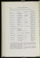
Other dated usages, to show the extent of the use of the set:
| Date | Printer | Capitals used | Incunabulum & references |
| 29 April 1494 | Joannes Rubeus Vercellensis | E only | IA 23164, BMC V 418, C3--T224 |
| 21 May 1496 | Joannes Rubeus Vercellensis | AEGLMNP QSTV | IA 23180, BMC V 419, C3--J393 |
| 10 April 1497 | Joannes Rubeus Vercellensis | All | IB 23185, BMC V 419, C3--O185 |
| 25 June 1494 | Christophorus de Pensis | E only | IA 23469, BMC V 469, C3--C335 |
| 15 June 1496 | Christophorus de Pensis | All except BCFO | IB 23485, BMC V 470, C3--V66 |
| 27 March 1499 | Christophorus de Pensis | All | IA 23509, BMC V 472, C3--A578 |
| 22 September 1494 | Bonetus Locatellus[8] | All except FV | IB 22910, BMC V 443, C3--C531 |
| 10-20 November 1494 | Jacobus and Hieronymus Paganinus | All | IB 23272, BMC V 457, C3--L315 |
| 25 May 1494 | Johannes Emericus[9] | FC only | IA 24207, BMC V 539, C3--N118 |
| 13 April 1495 | Petrus de Quarengis | ACHNOPRSV | IB 24161, BMC V 512, C3--P357 |
| 15 October 1495 | Joannes et Gregorius de Gregoriis | C only | IB 21101, BMC V347, C3--K14 |
| 22 April 1496 | Joannes et Gregorius de Gregoriis | ENPQ | IB 21097, BMC V 348, C3--A965 |
| 10 April 1497 | Joannes et Gregorius de Gregoriis | All | IA 21131, BMC V 350, C3--J429 |
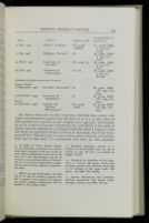
| Date | Printer | Capitals used | Incunabulum & references |
| 6 June 1495 | Joannes Tacuinus | All except BDGR | IA 24048, BMC V 529, C3--C703 |
| 17 May 1496 | Philippus Pincius[10] | All | IB 23666, BMC V 497, C3--N272 |
| 25 March 1497 | Manfredus de Bonellis[11] | All except Q | IB 23825, BMC V 504, C3--B754 |
| 28 June 1497 | Theodorus de Ragazonibus | AP only | IB 23568, BMC V 479, C3--B1233A |
| (Printed in places other than Venice) | |||
| Reggio Emilia | |||
| 18 September 1496 | Dionysius Bertochus[12] | All | IB 34061, BMC VII 1090, C3--S349 |
| 20 November 1499 | Franciscus de Mazalibus[13] | All | IB 34043, BMC VII 1089, C3--S350 |
| Brescia | |||
| 20 November 1498 | Angelus and Jacobus Britannicus[14] | All except BHL | IB 31189, BMC VII 982, C3--S623 |
We observe from this list that 16 printers who had some contact with Venice used decorated capitals from the same set of 15 x 15 mm. white on black ground over a period of time ranging from 1493-1500. And beyond: for on my return to Australia I found that the 1508 edition of the works of Statius, with the commentary of Domizio Calderini, which I happen to own and which was printed in Venice by Petrus de Quarengis, has all the letters except B M V. The set is not, of course, always used exclusively and printers from time to time used it in conjunction with other sets they possessed.
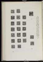

Plate 1A illustrates the nineteen letters of the set from IB 23272 (BMC V 457-8, C3—L315), Lucas de Burgo somma di aritmetica, printed in November 1494 by Jacobus and Hieronymus Paganinus. The C and A may be compared with those in Plate 1B: IA 22745 (BMC V 485, C3—C103), Cantalicus Epigrammata, printed on 20 January 1493/4 by Matteo Capcasa. Plate 1C shows the O used by Bartolommeo di Libri, IA 27595 (BMC VI 665, C3—S273), Savonarola, Triumphus Crucis, undated. Further comparisons may be made with the set as reproduced (except for O) by F. Ongania in L'arte della stampa nel rinascimento italiano, Venice, n.d., p. 81, and with the S and V reproduced in BMC V Plate XXXIII and BMC VII Plate C respectively.[15]
We must now try to define a little more clearly exactly what we are dealing with here. Though borrowings of type and woodcut capitals and borders is well attested,[16] it is quite impossible that we have here a single set of capitals. Quite apart from the intrinsic improbability of such a large number of printers sharing a common set, no wood or metal set could have lasted so long. In any case close examination reveals, as we shall see, differences, minute maybe but still differences, between some printings of the same capital letter and others. A more pertinent question is perhaps, "Of what material were the blocks made anyway? Metal or wood?" BMC I, intro. p. xvii, refers to "relief-blocks, whether wood or metal used for pictorial illustrations and ornaments" and goes on to discuss how both wood and metal blocks can develop faults which will allow a whole series of books to be put into chronological order. BMC V in the sections which preface the descriptions of books produced by each printer consistently uses the term 'Woodcut Capitals': BMC VI uses the term 'Printed Capitals', and BMC VII simply 'Capitals'.
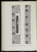
Plate 2 shows the left-hand side of f. 109 v. and the right-hand side of f. 110 r. of IB 23272. This makes it clear that Paganinus had at least 7 blocks for decorated capital S. One, on f. 110 r. marked X, is clearly different from the rest.[17] The rest resemble each other in decoration very closely indeed, though one can discern very minute differences here and there. The frame-lines, however, are so chipped or distorted as to allow those on f. 109 v. to be 'paired' with those on f. 110 r. The clearest examples are the last S on f. 109 v. and the top on f. 110 r., where the top of the frameline has a quite distinctive distortion. The rest can be 'paired' as I have indicated in the margins.[18]
We have here one printer with 6 near-identical copies of the same block. Taking into consideration the similar duplications that doubtless could be evidenced in the work of this and of other printers, and the whole extent (in time and by so many different printers) of the use of this set, it is clear, I think, that we cannot be dealing with the work of Italian wood-engravers, skilled as they were, but rather with type which has been cast.
In reply to a letter written to him making this suggestion, Mr. H. G. Carter of the Oxford University Press very kindly drew my attention to the noun and verb 'dab' in the Oxford English Dictionary: "9. . . . 1889 T. B. Reed (in letter), The common process of producing cast ornaments for printing before the introduction of electrotyping was known in English type-foundries as 'dabbing'.[19] The original woodblock is dropped sharply into a bed of molten lead on the point of cooling. A mould or matrix of the design is thus produced. To produce replicas of the design the operator strikes this matrix into lead. The result is a 'cast' or 'dab' in relief, which when mounted can be used to print along with type."
Although further research—the examination of more incunabula, and perhaps the enlistment of the aid of optical equipment—is necessary before one can speak with precision about details, it is perhaps already clear that the Venetian typefounders in the last decade of the fifteenth century must have discovered the process of 'dabbing'. This would explain not only the general similarity of the capitals but also the minute differences. It would also explain occurrences such as the following. The normal E of the set has a whorl of leaf and branchwork circling the lower, middle and upper
It has been already noted that the set was not always used exclusively, but often in conjunction with other sets of similar or greater dimensions. Some printers, like Paganinus, had 'duplicates' of individual letters, others had a few alternative blocks which they used co-extensively with those of the set. For example, Joannes Rubeus, in IB 23201 (BMC V 421, C3—J487) 23 October 1499, uses an M which is of the same basic design but slightly different, and in IA 23207 (BMC V 422, C3—O 79), 10 March 1500, has a second Q. Compare that on f. d 3 r, with that (normal) on f. g 2 r. But the set of initials as illustrated in Plate 1A is the one consistently used. Its predominance among Venetian printers seems to point to a Venetian origin, and there is nothing intrinsically improbable in the suggestion that Bartolommeo di Libri obtained his set (less the O) from that source. Joannes Rubeus and Matteo Capcasa appear to have been the first to use letters from the set: both (see n. 7) seem to have been regularly employed by Luca-Antonio Giunta. Did Luca-Antonio lend a set of capitals to his brother Filippo in Firenze? Was this in fact the 'Florentine connection'? Further research might perhaps examine this possibility.
Notes
In 1966, H. G. Kaplan compiled A First Census of Incunabula in Australia and New Zealand (Library of New South Wales, Sydney), containing 503 entries. There have obviously been accessions since that date, but holdings of incunabula are still microscopic compared with those of libraries in Europe and America.
I have followed BMC V and VI and Haebler (in his Typenrepertorium in C. Dziatzko, Sammlung bibliothekswissen-schaftliche Arbeiten 19-40, Halle, 1905-24) in talking of a '15 x 15 mm.' set. In point of fact the width or height of some of the letters is a little smaller: e.g., the A is 14.5 x 14 mm., the B 15 x 14.5 mm., etc. The O used by B. di Libri is 17 x 17 mm. See further note 6.
This method of indicating the date is used to indicate that there is doubt whether the normal or the Florentine or Venetian mode of dating (in which the year commences with the Annunciation, March 25) is used.
BMC V uses a variety of terms to describe what I hope to establish as a set based on a common origin: these include "white Renaissance ornamentation" (415); "ordinary Venetian design" (453); "the usual style" (479). Haebler (op. cit.) uses a similarly varied nomenclature.
The O used by the Venetian printers is 15 x 15 mm. and not the 17 x 17 mm. one used by di Libri.
BMC V, intro. p. xxxviii, says of J. Rubeus, "the editions which he turned out on his own account are remarkable for not containing a single one of the many woodcut capitals found in his commissioned work and the close affinity of much of his material with that of Capcasa [my italics] suggests that Giunta was the regular employer of both."
It was only possible for me to examine about a quarter of the books printed before 1500 by Locatellus, but the sampling was spread evenly over the whole of this period of production. IB 22910 (Cicero, Epistulae ad familiares) appears to be the only book in which Locatellus uses the 15 x 15 mm. set—if indeed he was the printer: BMC V, intro. p. xi, notes that IB 22910 is one of a group of six books produced for Scotus but not containing the name of Locatellus: this group has other peculiarities too.
I was only able to examine one incunabulum printed by Emericus: later ones may well use more of the letters in the set.
IB 23666, C3—N272 (Nonius Marcellus, de proprietate sermonum) is a particularly good example of the use of the set (and, indeed, justification of the use of the term 'set'); for some sections, e.g. II, de honestis et noue ueterum dictis de dictionibus ab A etc. littera incipientibus, necessitate the use of all the capitals in alphabetical order.
BMC V 505 says of IB 23825, "As both type 81 R and the woodcut capitals used with it appear to be material of Capcasa, this printer perhaps collaborated with de Bonellis in the present book."
Dionysius Bertochus printed in a number of North Italian cities: he was in Venice in 1494. IB 34061 was printed in Reggio Emilia.
Franciscus de Mazalibus in his Scriptores rei rusticae (IB 34043) clearly uses printing material that Bertochus had used in his edition of the same work (IB 34061). See BMC VII 1088-89.
Jacobus Britannicus had numerous printing associations with Venice before moving to Brescia. See BMC VII 972.
The page which contains this plate is not, for some reason, to be found in the English-language edition of 1895 (Early Venetian Printing Illustrated), but examples of P and H can be found on pages 132 and 142 respectively. I am grateful to the British Library for the provision of the photographs from which the plates were made.
A good example is provided by two woodcuts. One measures 56 x 50 mm., is "a peculiar, simply drawn P with the figure of a monk writing and lettered FRA IACOMO DE VORAGINE" (BMC V 338), the other is an E with the figure of a monk writing, measures 32 x 32 mm. and is lettered DV[N] NICOLO MANERBI. (reproduced in O. Jennings, Early Woodcut Initials [1908], pp. 183 and 182 respectively). They can be found in IB 22758 (BMC V 485, C3—J180) Matteo Capcasa 3 May 1494; IB 22910 (BMC V 433, C3— C531) Bonetus Locatellus 22 September 1494; IB 21111 (BMC V 349, C3—A966); and IB 21135 (BMC V 350, C3—H160) published by Johannes and Gregorius de Gregoriis on 13 July 1496 and 25 August 1498 respectively.
It may prove to have some affinity with a 15 x 15 mm. set used by Locatellus: I noted in IB 22898 (BMC V 442, C3—I186) capital A M Q P E V very similar indeed to the 'Venetian' set; also that this same set was used in IB 22900 (BMC V 442, C3—P1089), IA 22883 (BMC V 442, C3—S802), IB 22906 (BMC V 443, C3—H456) and IB 22907 (BMC V 443, C3—C609). Unfortunately, though, I recorded an S on f. Z 3 r. in IB 22906. I have no further details of it.
| | ||
