| | ||
II
In 1931 the Inter-Society Color Council was formed as an organization of national societies whose work involved color; it was not only to be a clearinghouse for color problems and research but more specifically was to assist in revising the color names used in the U. S. Pharmacopoeia.[24] E. N. Gathercoal, the ISCC's first chairman, was a member of the Pharmacopoeial Revision Committee, and he had arranged a symposium on color names at the 1930 Pharmacopoeial Convention in Washington. His goal was a color nomenclature "sufficiently standardized as to be acceptable to science, sufficiently broad to be appreciated
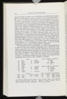
In the history of color nomenclature, the work is epoch-making in at least two ways. First, instead of assigning names to particular color chips, it proceeds in the other direction, setting up a system of easily understood names and then mapping out the entire color solid for the first time into segments which define the precise limits of each name. The system of names — which takes into account the three attributes of color — is a simple one based on ten hue names, three neutrals, their modifying forms, and ten other modifiers, as follows:
- B blue
- Br brown
- G green
- O orange
- Ol olive
- P purple
- Pk pink
- R red
- V violet
- Y yellow
- b bluish
- br brownish
- g greenish
- p purplish
- pk pinkish
- r reddish
- y yellowish
Hues
- Black black
- Gy gray
- White white
- blackish blackish
- gy. grayish
Neutrals
- d. dark
- l. light
- med. medium
- v. very
Value Modifiers (Lightness)
- gy. grayish
- m. moderate
- s. strong
- v. vivid
Chroma Modifiers (Saturation)
- brill. brilliant [light, strong]
- deep deep [dark, strong]
- p. pale [light, grayish]
Value and Chroma Combinations
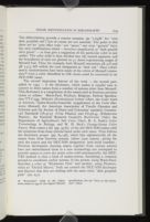
The second important feature of the work — the second part, added in 1955 — is the dictionary, which makes it equally easy to convert to these names from a number of systems other than Munsell. This dictionary is a compilation of the names used in fourteen previous charts or atlases: Maerz-Paul, Plochere, Ridgway, Federal Specification TT-C-595, Wilson's Horticultural Colour Chart, the Color Card of America, Taylor-Knoche-Granville (supplement to the Color Harmony Manual), the American Association of Textile Chemists and Colorists and the Society of Dyers and Colourists' standard, Commercial Standards CS147-47 (Urea Plastics) and CS156-49 (Polystyrene Plastics), the National Research Council's Rock-Color Chart, the Department of Agriculture's Soil Color Chart, H. A. Dade's Color Terminology in Biology, and W. H. Beck's Postage-Stamp Color Names. First comes a list (pp. 35-82) of the 267 ISCC-NBS names with the synonyms from these systems listed under each name. Then follows the dictionary proper (pp. 83-158), which lists alphabetically all the names from these fourteen systems (about 7500 names), giving for each the source and the ISCC-NBS designation (and serial number). Previous dictionaries drawing names together from various sources have not subordinated them to a new terminology nor attempted to provide names to cover the entire color solid systematically; the ISCC-NBS method is thus a kind of master-system, furnishing a common ground to coordinate earlier systems. If one person, using Maerz-Paul, describes a color as "Rhodonite Pink" and another, using Plochere, refers to "Orchid Mauve," both can consult the ISCC-NBS dictionary and discover that they are dealing with the same color, "dark purplish pink" (no. 251).
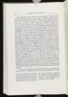
The advantages of this system for bibliographers (or for anyone else) are immediately apparent. It provides a consistent, standard, easily understood nomenclature for color, regardless of the particular set of color chips employed for matching. If one bibliographer prefers for some reason to use the Plochere system but hesitates to describe the color of a certain binding cloth as "Best Effort" (or as 1224 YYg 3-h), he can look that name up in the ISCC-NBS dictionary and find that it corresponds to ISCC-NBS 121, "pale yellow green." Then if another bibliographer, who wishes to check this color himself, has only a copy of Ridgway at hand, he may make the comparison, find that Ridgway's "Glaucous" is the one that matches, and check the dictionary to see that "Glaucous" is also within the area defined by "pale yellow green." The same would be true of a third bibliographer or collector who had identified the binding as "Rhone" (Maerz-Paul 18 B 3). In this way uniformity results in the final bibliographical description, despite the multiplicity of systems which may have been used by individual bibliographers. Even if a bibliographer buys for himself a copy of the Munsell Book of Color, for example, he may not always have it with him; if he finds himself in a library which has only a copy of Maerz-Paul, he may proceed with his description of the binding and later convert the Maerz-Paul term by using the ISCC-NBS dictionary. For accuracy and for general scholarly indication of sources, the ISCC-NBS name should be accompanied by a reference in parentheses to the actual color sample used — as "dark red (Maerz-Paul 6 L 11)," or "dark red (Plochere 353 R 3-a)," or "dark red (TCCA 65020)," or "dark red (Munsell 2.5R 3/7)." The Nickerson Color Fan is particularly convenient (aside from its price, size, and arrangement) because it designates on each sample both the Munsell notation and the ISCC-NBS name (thus obviating any reference to the dictionary itself after the process of matching). In any case, two points are essential: that bibliographers agree to compare binding colors with some collection of color samples and that they convert the identifications into ISCC-NBS names.[27]
The only real limitation of the ISCC-NBS system as published in 1955 was that it contained no actual color chips to illustrate the names.
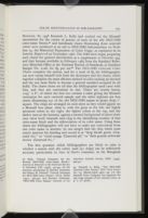
The first question which bibliographers are likely to raise is whether a system with 267 colors (and 251 chips) can be sufficiently accurate, particularly in view of Stott's comment, in his Maugham
Second, since the ISCC-NBS dictionary encompasses fourteen other systems (plus the Munsell name charts), it is always possible, when finer discriminations are required, to utilize a system with more chips and yet remain within the framework of the ISCC-NBS method. Indeed, Kelly has explained six levels of accuracy in color description attainable within this method.[30] In the first the color solid is divided into only 13 sections, corresponding to the ten hue names and the three neutrals; for some purposes it is enough to distinguish "pink" from "red," or "yellow" from "orange." The second level works with 29 name-blocks, consisting of all the hue terms — such as "olive brown," "greenish yellow," "yellowish brown," or "olive green." The 267 names produced by adding the modifiers descriptive of value and chroma, as in the ISCC-NBS dictionary and centroid charts, constitute the third level of refinement, the one on which bibliographers may normally find themselves. But many distinguishable colors naturally fall within each of these name-blocks, and it may be that certain binding variants are not distinguishable in terms of the centroid colors alone. One may then move to the fourth level, which involves consulting an appropriate color-order system — Munsell if possible, but, if not, perhaps Plochere, with 1248 colors, or Maerz-Paul, with 7056.[31] If an exact
Another problem arises from the fact that the centroid color chips are glossy and book cloth is not. Since the ideal system for bibliography is undoubtedly one with cloth samples, there is no answer to this objection, except to say that the system offers so many other advantages that it is still the best one to choose. Besides, the importance of the surface texture of the sample in any given case is a function of the accuracy required. In some instances, then, the bibliographer may wish to turn to the textile Color Card — so long as he realizes that its sampling of the color solid is not systematic — or to the British Colour Council's Dictionary. The difference in appearance between a glossy chip and a cloth swatch of the same color is also to some degree a function of the viewing conditions. It is normally recommended, in most systems of color identification, that the matching be done in natural light, preferably northern light and certainly not direct sunlight; the light should strike the surfaces to be matched at an angle of 45°, and the surfaces should be viewed from 90°. Some sets of chips include masks which can be used to block out the colors on the chart surrounding the chip being matched. Although the ISCC-NBS charts do not contain masks, it is a good idea to prepare a few of them by making a hole 1" square in a stiff piece of gray paper or cardboard.
Still another of the bibliographer's questions will concern notation — what form the color information is to take in a bibliographical description. The ISCC-NBS abbreviations — as "d.gy.G" — should
or bold-ribbed (T) cloth, dark grayish green (Centroid 151)
dark grayish green (Nickerson 10 GY 3/2) [indicates precise match]
dark grayish green (cf. Nickerson 10 GY 3/2) [indicates approximate match]
However, it should be emphasized here that, despite an occasional example of this kind, the bibliographer generally need feel no urge to go beyond the centroid charts. Given the nature of book cloth and of material standards, the majority of matches are going to be only approximate; and in any case the purposes of most bibliographical descriptions would not be further served by a more precise match. For these reasons the centroid colors, which are simply the representative colors of particular color-blocks, constitute an ideal frame of reference. If a bibliographer goes outside this system, one must assume either (1) that another system was the only one at hand when the comparison was made (with the result later converted to the corresponding centroid name) or (2) that greater accuracy was required — and obtained — by specification in terms of another system. It would be a mistake to overuse the "cf." designation, for, if the match is only approximate anyway, nothing is gained in precision over the simple reference to the centroid color.
Because of the advantages of the Munsell notation, it may be that some bibliographers, if they have had to turn to another set of chips for an exact match, will want to indicate the equivalent Munsell notation or renotation as a convenience to their readers. The Munsell equivalents of the most commonly used systems have been tabulated, and it may prove helpful to bring together the principal references to these conversion tables:
- Color Harmony Manual Walter C. Granville, "Munsell Renotations of Color Harmony Manual Chips (Third Edition) from Spectrophotometric Measurements," available from Container Corporation of America, Color Standards Department, 38 South Dearborn Street, Chicago 60603.[33]
- DIN-Farbenkarte W. Budde, H. E. Kundt, and Günter Wyszecki, "Überführung der Farbmasszahlen nach dem Farbsystem DIN 6164 in Munsell-Masszahlen und umgekehrt," Farbe, IV (1955), 83-88.
- Horticultural Colour Chart Dorothy Nickerson, "Horticultural Colour Chart Names with Munsell Key," JOSA, XLVII (1957), 619-621.
- Maerz-Paul Dorothy Nickerson, "Interrelation of Color Specifications," Paper Trade Journal, CXXV (1947), TS219-237.
- Plochere W. E. Knowles Middleton, "The Plochere Color System: A Descriptive Analysis," Canadian Journal of Research, XXVII (1949), F1-21.
- Ridgway D. H. Hamly, "Ridgway Color Standards with a Munsell Notation Key," JOSA, XXXIX (1949) 592-599.
- Standard Color Card Genevieve Reimann, Deane B. Judd, and Harry J. Keegan, "Spectrophotometric and Colorimetric Determination of the Colors of the TCCA Standard Color Cards," JOSA, XXXVI (1946), 128-159; or Journal of Research of the National Bureau of Standards, XXXVI (1946), 209-247.
grayish purplish red (cf. Standard Color Card 70189 = Munsell 6RP 5.1/5.7)
grayish purplish red (Standard Color Card 70189 ≈ Centroid 262)
grayish purplish red (cf. Standard Color Card 70189 ≈ Centroid 262)
Another question — and one of the most troublesome — is the problem of fading, both of the color samples and of the bindings. As far as the samples are concerned, one should not expose them to light except when they are being used; and after extended use one should perhaps compare them with a new copy to see whether they have yet
moderate red (Munsell renotation [3.8R 3.9/8.75], faded from 3.8R 4.4/9.1 = Centroid 15)
moderate red (Munsell renotation 3.8R 4.4/9.1 = Centroid 15, faded from [3.8R 4.4/9.75])
A final consideration has to do with the fact that colors in books are not limited to bindings. There are colored sheets, inks, dust jackets, and endpapers; and the ISCC-NBS names are appropriate for describing them all. In fact, Deane Judd has specifically commented on the applicability of these names for the paper industry and has shown some of the equivalents between the ISCC-NBS names and those in the Grading Committee of the Groundwood Paper Manufacturers' Association's
In 1953 Fredson Bowers remarked, "As a matter of fact, when the technicians really get to work on the problems of machine-printing, I rather suspect that the general reader and the bibliographer who has catered to him are due to suffer a shock."[38] Whether or not the method of color description outlined here will offer a shock to those bibliographers who fondly remember the good old days when it was possible to speak of "puce" or "Eureka" or "Victoria Lake," depending on one's mood, the fact remains that a move in this direction is inevitable. The ISCC-NBS system can be as simple or as complex as is required under different circumstances, and its use is no more difficult, and only slightly more time-consuming, than the measurement of leaves
A Note on the Literature
The bibliographer who wishes to pursue further the problems of color specification and nomenclature and is generally unacquainted with the technical literature of the field discovers few places to turn for help except several alphabetical checklists in the basic books on color and I.H.Godlove's Bibliography on Color (Inter-Society Color Council, 1957). The present list groups the significant literature by topic or system, with the interests of the bibliographer in mind, and is intended also to record the material which served as the basis for the somewhat perfunctory dismissal of a large number of color systems in the text.
The principal general surveys of color systems, which vary in the number of systems covered and in the thoroughness of their comment, are as follows: Ralph M. Evans, An Introduction to Color (1948), pp. 205-234; Optical Society of America Committee on Colorimetry, The Science of Color (1953), pp. 317-340; Robert W. Burnham, Randall M. Hanes, and C. James Bartleson, Color: A Guide to Basic Facts and Concepts (1963), pp. 163-172; Deane B. Judd and Günter Wyszecki, Color in Business, Science, and Industry (2nd ed., 1963), pp. 202-264; W.D.Wright, The Measurement of Colour (3rd ed., 1964), pp. 161-192; Symposium on Color — Its Specification and Use in Evaluating the Appearance of Materials (American Society for Testing Materials, 1941), pp. 37-44; Arthur G. Abbott, The Color of Life (1947), pp. 141-163; Sterling B. McDonald, Color Harmony (1949), pp. 111-118; Color Charts: A Descriptive List (Letter Circular 986, National Bureau of Standards, 1950); H. D. Murray (ed.), Colour in Theory and Practice (1939; rev. ed., 1952), pp. 143-158; Frederick M. Crewdson, Color in Decoration and Design (1953), pp. 90-108; A. Ames, Jr., "Systems of Color Standards," JOSA, V (1921), 160-170; K. S. Gibson, "The Analysis and Specification of Color," Journal of the Society of Motion Picture Engineers, XXVIII (1937), 388-410; Morton C. Bradley, "Systems of Color Classification," Technical Studies
CIE SYSTEM. A helpful elementary discussion is G. J. Chamberlin, The C.I.E. International Colour System Explained (1951), a pamphlet published by The Tintometer, Ltd. Any basic book on color, of course, contains a detailed explanation; see, for example, Evans, pp. 205ff.; The Science of Color (1953), pp. 254-334; Burnham, Hanes, and Bartleson, pp. 123-150; Wright pp. 96-160. Also see such articles as Deane B. Judd, "1931 I.C.I. Standard Observer and Coordinate System for Colorimetry," Journal of the Optical Society of America [JOSA], XXIII (1933), 359-374. The American Standards Association Methods of Measuring and Specifying Colors (in CIE terms), Standard Z58.7 (1951), is reprinted in JOSA, XLI (1951), 431-439. For information on the equipment, see Arthur C. Hardy, "A Recording Photoelectric Color Analyser," JOSA, XVIII (1929), 96-117, "A New Recording Spectrophotometer," JOSA, XXV (1935), 305-311, and Handbook of Colorimetry (1936); E. J. King and D. S. Robdell, "An Experimental Color Comparator," JOSA, XLI (1951), 830-835; Richard S. Hunter, "Color Difference Meters for Precision and Accuracy," Farbe, X (1961), 173-192; J. M. Adams and S. Bergling, "A Comparison of Colorimeters," Printing Technology, VIII (1964), 16-27. For modifications in the system, see David L. MacAdam, "Projective Transformations of I.C.I. Color Specifications," JOSA, XXVII (1937), 294-299; and Günter Wyszecki, "Proposal for a New Color Difference Formula," JOSA, LIII (1963), 1318-1319 (cf. LIII, 1012).
MUNSELL. Dorothy Nickerson, "History of the Munsell Color System and Its Scientific Application," JOSA, XXX (1940), 575-586; John E. Tyler and Arthur C. Hardy, "An Analysis of the Original Munsell Color System," JOSA, XXX (1940), 587-590; Dorothy Nickerson, "The Munsell Color System," Illuminating Engineering, XLI (1946), 549-560 ("the most widely known and useful of color order systems"); Maitland Graves, Color Fundamentals (1952), pp. 134-151; Method of Specifying Color by the Munsell System (American Society for Testing and Materials, Method D1535-58T, 1958). In 1921 the Strathmore Paper Company issued a handsome book, A Grammar of Color, in which the colors of the paper samples were specified in Munsell terms; in the same volume T. M. Cleland published "A Practical Description of the Munsell Color System" (pp. 13-26). Another early discussion is Irwin G. Priest, K. S. Gibson, and H. J. McNichols, An Examination of the Munsell Color System (Technologic Papers of the Bureau of Standards, No. 167, 30 September 1920). Norman Macbeth, in "Munsell Value Scales for Judging Reflectance," Illuminating Engineering, XLIV (1949), 106-108, discusses one of the special Munsell charts. Measurements in CIE terms are reported in J. J. Glenn and J. T. Killian, "Trichromatic Analysis of the Munsell Book of Color," JOSA, XXX (1940), 609-616; Kenneth L. Kelly, Kasson S. Gibson, and Dorothy Nickerson, "Tristimulus Specification of the Munsell Book of Color from Spectrophotometric Measurements," JOSA, XXXIII (1943), 355-376, or Journal of Research of the National Bureau of Standards, XXXI (1943), 55-76; Walter C. Granville, Dorothy Nickerson, and Carl E. Foss, "Trichromatic Specifications for Intermediate and Special Colors of the Munsell System," JOSA, XXXIII (1943), 376-385; Josephine G. Brennan and Sidney M. Newhall, "ICI Specifications of Difference Limens for Munsell Hue, Value, and Chroma," JOSA, XXXVIII (1948), 696-702; Dorothy Nickerson and Davis H. Wilson, "Munsell Reference Colors Now Specified for Nine Illuminants," Illuminating Engineering, XLV (1950), 507-517 (cf. XL, 159-171).
On the problem of color spacing and equal psychological steps, expressed generally in Munsell terms, see Dorothy Nickerson, "Color Measurements in Psychological Terms," JOSA, XXI (1931), 643-650; Sidney M. Newhall, "The Ratio Method in the Review of the Munsell Colors," American Journal of Psychology, LII (1939), 394-405; Domina Eberle Spencer, "A Metric for Color Space," JOSA, XXXII (1942), 744 (summary); Parry Moon and D. E. Spencer, "Geometric Formulation of Classical Color Harmony," JOSA, XXXIV (1944), 46-59; Arthur Pope, "Notes on the Problem of Color Harmony and the Geometry of Color Space," JOSA, XXXIV (1944), 759-765. In 1943 some of the original specifications in the Munsell Book of Color were modified in terms of the CIE coordinate system and standard observer, and the results are referred to as the "Munsell renotation system" (as opposed to "book notation"): see Sidney M. Newhall, Dorothy Nickerson, and Deane B. Judd, "Final Report of the OSA Subcommittee on the Spacing of the Munsell Colors," JOSA, XXXIII (1943), 385-418 (cf. XXX, 617-645); Dorothy Nickerson and Sidney M. Newhall, "A Psychological Color Solid," JOSA, XXXIII (1943), 419-422; Dorothy Nickerson, "Spacing of the Munsell Colors," Illuminating Engineering, XL (1945), 373-386; Dorothy Nickerson, Josephine T. Tomaszewski, and Thomas F. Boyd, "Colorimetric Specifications of Munsell Repaints," JOSA, XLIII (1953), 163-171; Deane B. Judd and Günter Wyszecki, "Extension of the Munsell Renotation System to Very Dark Colors," JOSA, XLVI (1956), 281-284; Werner C. Rheinboldt and John P. Menard, "Mechanized Conversion of Colorimetric Data to Munsell Renotations," JOSA, L (1960), 802-807. A limited edition of a Munsell Renotation Color Book is announced in JOSA, LIV (1964), 851. The basis for a set of chips, systematically sampling the color solid and truly representing equal perceptual differences, is set forth by Günter Wyszecki, "A Regular Rhombohedral Lattice Sampling of Munsell Renotation Space," JOSA, XLIV (1954), 725-734; the Committee on Uniform Color Scales of the Optical Society of America is working on the preparation of such a system.
OSTWALD. J. Scott Taylor, A Simple Explanation of the Ostwald Colour System (1935); Herman Zeishold, "Philosophy of the Ostwald Color System," JOSA, XXXIV (1944), 355-360; Carl E. Foss, Dorothy Nickerson, and Walter C. Granville, "Analysis of the Ostwald Color System," JOSA, XXXIV (1944), 361-381; Egbert Jacobson, Basic Color: An Interpretation of the Ostwald Color System (1948). For a comparison of the merits of the two systems, see Milton E. Bond and Dorothy Nickerson, "Color-Order Systems, Munsell and Ostwald," JOSA, XXXII (1942), 709-719. The Ostwald system has had a number of enthusiastic supporters who have developed their own applications of it, notably Faber Birren in his many books. In Color Dimensions (1934), after praising Ostwald as the "greatest scientist ever to devote a large portion of time and energy to color harmony" (p. 35) and after pointing out that "the vast majority of systems so far invented are utterly spurious and impractical" (p. 4), Birren presents his own version of Ostwald, the Color Equation (based on the spinning of Maxwell disks — cf. footnote 15 above), and declares that with it "the problem of color standardization — so long a complex affair — has been adequately solved" (p. 57). Hilaire Hiler, in Color Harmony and Pigments (1942), expresses his admiration of Ostwald before explaining his own Color Circle, Color Piano, and cylindrical Color Solid; J. A. V. Judson bases his textbook, A Handbook of Colour (1935; rev. ed., 1938), on Ostwald; The Color Helm (1932, 1940), designed by J. P. Gangler for Fiatelle, Inc., uses the Ostwald system; and The New Color Culler (1951, 1960) of the Desarco Corporation contains eleven Ostwald triangles.
BRITISH COLOUR COUNCIL. See Robert F. Wilson, "Colour and Colour Nomenclature," Journal of the Royal Society of Arts, LXXXIII (1934-35), 307-323, for a sketch of the Council's history, activities, and Dictionary.
OTHER SYSTEMS. (1) Color Card Association. Margaret Hayden Rorke, "The Work of the Textile Color Card Association," JOSA, XXI (1931), 651-653. (2) DIN-Farbenkarte. Manfred Richter, "Das System der DIN-Farbenkarte," Farbe, I (1952-53), 85-98; Hellmut Goeroldt, "Die Herstellung des Entwurfs der DIN-Farbenkarte," Farbe, I (1952-53), 128-134; "Normblatt-Entwurf DIN 6164: DIN-Farbenkarte," Farbe, I (1952-53), 147-158; Richter, "The Official German Standard Color Chart," JOSA, XLV (1955), 223-226; H. E. Kundt and Günter Wyszecki, "Zusammenhang zwischen Munsell und DIN-System," Farbe, IV (1955), 289-293; Richter, "Die Beziehung zwischen den Farbmasszahlen nach DIN 6164 und den Ostwald-Masszahlen," Farbe, VI (1957), 49-62. (3) Villalobos Colour Atlas. Cf. Carl E. Foss's review in the Inter-Society Color Council News Letter, No. 82 (May 1949), p. 8. (4) Maerz-Paul. M. Rea Paul describes the work in "Dictionary of Color," JOSA, XXI (1931), 358-360. (5) Plochere. Before their Plochere Color System, Gladys and Gustave Plochere had produced the Plochere Color Guide (1940) and Color and Color Names (1946). (6) Federal Standards. See "New Federal Standard on Colors," JOSA, XLVII (1957), 330-334; examples of other governmental standards are the National Bureau of Standards chart of colors for kitchen and bathroom accessories, the Army's color card for sewing threads, the Bureau of Federal Supply's samples of colors for upholstery leather, the Maritime Commission's standard colors for flags and for paint, the Bureau of Ships' standards for electrical insulation, and so forth. Cf. British Standard 2660, Colours for Building and Decorative Paints (British Standards Institution, 1955); RAL-Farbtonregister 840R (Muster-Schmidt KG, Göttingen). Standards and specifications are also published by the American Standards Association (10 East 40th Street, New York City 10016) and the American Society for Testing and Materials (1916 Race Street, Philadelphia 19103). The former, in its Standard Z44-1942, Specification and Description of Color, recommended the Munsell system. The latter, in its catalogue of publications, lists some sixty pamphlets on color tests and measurement, dealing with dyes, acids, plastics, varnishes, petroleum products, etc. It has also published an extension of the three-attribute system of color description to take into account the total appearance of engineering materials: Visual Appearance: A Five-Attribute System of Describing (STP 297; 1961). (7) Ridgway. Before his famous 1912 work, Ridgway had published A Nomenclature of Colors for Naturalists (1886), with 186 samples. See D.H.Hamly, "Robert Ridgway's Color Standards," Science, CIX (1949), 605-608. (8) Other Special Charts. A bibliographer wishing to survey even more widely among the alternative systems might glance at the following: the National Philatelical Society's Color Chart of 1884 or B.W.Warhurst's Color Dictionary of 1899 (now Stanley Gibbons' Colour Guide for Stamp Collectors, with 75 colors); René Oberthü and Henri Dauthenay's Répertoire de couleurs pour aider à la determination des couleurs des fleurs, des feuillages et des fruits for the Société française des chrysanthémistes in 1905, with 1356 colors, or the Fischer Color Chart of the New England Gladiolus Society, revised in 1944, with 108 colors on a circular board (recommended also for geneticists in 1933 by Edgar Anderson, in Science, LXXVIII, 150-151); The Colorizer (1947) showing paint proportions for 1298 colors, or Pratt & Lambert's DeLuxe Color Book (1954?); C.J.Jorgensen's The Mastery of Color (1906) or Sterling B. McDonald's Color Harmony with the McDonald Calibrator (1949); E.A.Séguy's Code universel des couleurs (1936), with 720 colors on 55 printed plates, or the Cheskin Color System (Color Research Institute of America, 1949), with 4800 colors on 48 printed hue charts;Hesselgren's Color Atlas (1955); the Colour Index of the Society of Dyers and Colourists (2nd ed., 4 vols., 1956); Ralph S. Palmer and E.M.Reilly's Concise Color Standard for the American Ornithologists' Union (1956); Faber Birren's The American Colorist (1939); Edward Friel's The Friel System: A Language of Color (1961); and even musical systems of color
NOMENCLATURE. There is a historical account of the development of color nomenclature at the beginning of the Maerz-Paul Dictionary. Further discussions of nomenclature include Milton Bradley's pamphlet Some Criticisms of Popular Color Definitions and Suggestions for a Better Color Nomenclature (n.d.); M. Luckiesh, The Language of Color (1918); "Report of the Committee on Colorimetry for 1920-21," JOSA, VI (1922), 527-596 (section II on nomenclature); "Report of the Committee on Color Terminology Questionnaire," JOSA, XIII (1926), 43-57; Loyd A. Jones, "Colorimetry: Preliminary Draft of a Report on Nomenclature and Definitions," JOSA, XXVII (1937), 207-213; Colour Group of the Physical Society, Report on Colour Terminology (1948); Arthur Pope, The Language of Drawing and Painting (1929; rev. ed., 1949), esp. pp. 3-34. The question of color terminology in relation to theater gelatins has been taken up in "Names for Colors," Theatre Arts Monthly, XVI (July 1932), 604, 604a, 604b; and by Deane B. Judd in A System for Specifying Theater Gelatins (Report to ISCC, February 1938). Kenneth L. Kelly, in "Color Designations for Lights," Journal of Research of the National Bureau of Standards, XXXI (1943), 271-278, shows the applicability of the ISCC-NBS system to self-luminous sources and gives a good historical checklist. A later effort to define the boundaries of colors is the dictionary part of Kornerup and Wanscher's Reinhold Color Atlas (1962).
TOLERANCES. The Nickerson formula for the Index of Fading is as follows: (average chroma / 5) x (difference in hue / 3) + (difference in chroma / 2) + difference in value. For an explanation of the basis for the formula, see Dorothy Nickerson, "The Specification of Color Tolerances," Textile Research, VI (1936), 505-514; and "How Can Results of Fading Tests Be Expressed?", in ASTM Standards on Textile Materials (October 1936), pp. 238-241. Cf. "The Inter-Society Color Council Symposium on Color Tolerance," American Journal of Psychology, LII (1939), 383-448; F. Scofield, "A Method of Representing Color," ASTM Bulletin, No. 102 (January 1940), pp. 11-12; Dorothy Nickerson and Keith F. Stultz, "Color Tolerance Specification," JOSA, XXXIV (1944), 550-570; and "Interim Method of Measuring and Specifying Color Rendering of Light Sources," Illuminating Engineering, LVII (1962), 471-495.
COLORS OF PAPERS AND INKS. Federal Specification 9310, Paper Specification Standards (No. 4, 1 May 1965), includes (as Part 3) samples of eight colored papers for government use and describes briefly (in Part 2) the methods of color measurement by visual comparison (ASTM D1729-60T) and by spectral reflectivity. The annual Bibliography of Papermaking and U.S. Patents, published by TAPPI (Technical Association of the Pulp and Paper Industry), contains a section on color. Cf. W. B. Van Arsdel, "Color Specification in the Pulp and Paper Industry," JOSA, XXI (1931), 347-357; F. A. Steele, "The Optical Characteristics of Paper," Paper Trade Journal, C (21 March 1935), TS151-156; CI (24 October 1935), TS245-249; CIV (25 February 1937), TS129-130; Institute of Paper Chemistry, "Color and Color Measurements," Paper Trade Journal, CV (1937), TS285-306; and the Strathmore Paper Company's A Grammar of Color (see under Munsell above). On "whiteness": D. L. MacAdam, "The Specification of Whiteness," JOSA, XXIV (1934), 188-191; Deane B. Judd, "A Method for Determining Whiteness of Paper," Paper Trade Journal, C (23 May 1935), TS266-268; CIII (20 August 1936), TS154-160; V. G. W. Harrison, The Measurement of "Shades" of "White" Papers (PATRA Reports Nos. 2-3, 1938-39). Some of the atlases issued by the paper and the ink trades are Charles J. Schott's Modifications of Pigment
| | ||