| | ||
Type Sizes in the Eighteenth Century
by
Philip Gaskell
A 'point' system is used by English-speaking type-founders and printers of the present day to measure the 'body-size' of a fount of type, in which the point is a unit measuring approximately one seventy-second of an inch. Points are not used to measure that part of a 'sort' of type, raised in relief upon the rectangular body which actually makes an impression on the paper, called the 'face';[1] and for this purpose it is perhaps most convenient to use millimetres.
The face can be placed upon a particular size of body in two different ways. One way, which is used to produce what may be called 'text types', is to cast a fount which includes both upper and lower-case sorts; this means that, in designing the face of such a fount for a particular body-size, allowance must be made for lower-case ascenders[2] and descenders, which will project beyond the vertical dimensions of the capital letters. The other sort of fount, usually called 'titling types', has no lower case, so that there need be no provision for lower-case ascenders and descenders; which means that the face of a capital letter can be almost as tall as the body on which it is cast.[3] To take an example of how this works out in practice, the face of the 72 point capital 'A' of 'Gill Sans' text type in the current Monotype specimen book (Monotype series 262) is 18 mm. high; the 72 point capital 'A' of 'Gill Sans Titling' (Monotype series 231) has a face that is 24¼ mm. high; and the body-size in both cases is 72 points, which is about 25¼ mm., or ·9962 in.
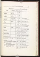
Before the point system was adopted in the English-speaking countries during the last quarter of the nineteenth century, a series of names was used to distinguish the various body-sizes most commonly employed. A list of these names, together with the body-size and face-size of the founts to which they refer, will be found at the end of this note. Although this list, and what follows, are based on an examination of eighteenth-century typefounders' specimens, they will be found to apply, with only occasional alteration, to typographical usage in Britain during the sixteenth, seventeenth, and nineteenth centuries.
The practice of the eighteenth-century founders with regard to the casting of text and titling faces on to the same size of body was, with one serious exception, exactly similar to the modern practice described above; it need only be remembered that they did not usually differentiate between the two varieties in their specimens. To take an example, Alexander Wilson and Sons' specimen book of 1772[4] begins with a 'Five Lines Pica' which turns out to be a titling type; in other words, the face-size of these capital letters takes up nearly the whole of the five lines of Pica named as the body-size. This fount is followed by other titling sizes from Four Line Pica to Two Line Small Pica, and they in turn by text sizes from Canon (which has a Four Line Pica body) to Pearl. But now comes the exception. Wilson's next specimen, the broadside of 1783,[5] appears to make nonsense of the nomenclature hitherto employed by him. The Six Line Pica of this sheet has capitals of titling size, the face being nearly six picas high; but it also has a lower case. In the same specimen, Five and Four Line Pica are displayed only by their lower case; but measurement discloses that the distance from ascender line to base line virtually fills the body named, leaving no room for descenders.
I have taken Wilson as an example, but the same apparently inconsistent nomenclature is to be found in the specimens of a number of other eighteenth-century founders. Caslon's specimen book of 1764[6] shows capitals of Five and Four Line Pica which have capitals of titling size together with a lower case; and Fry's book of 1788[7] does exactly the same. Nor was this practice confined to the eighteenth century; the latest examples I have come across are in Specimens of Wood Letter (H. W. Caslon and
There are two possible explanations of this anomaly. Since the occurence of titling types with lower case was confined to the larger sizes, it may be that they were not intended to be set solid. If so, then the lower case could have been cast on the body-size named, with projecting 'kerns' to accommodate the descenders of g, j, p, q, and y. Against this it may be said that kerns are a nuisance, both because they are easily broken and because descender kerns necessitate leading;[8] and that they are difficult to cast.[9] On the other hand, if kerns are rejected, then we must suppose that the real body-size of a titling fount with lower case called Six Line Pica was in fact about eight picas, not six; that the body-size of such a Five Line Pica was really six and three-quarter picas, and so on. Against this may be set the facts that the capitals of these queer founts can sometimes be found set solid (when there are no lower-case sorts about), showing a true titling body-size; and that this method would be more extravagant of type metal than would casting with kerns. It is hard to decide which method is the more likely.
Some confusion would be avoided if bibliographers, when they speak of type-sizes by name, would agree to state plainly and repeatedly whether they are referring to text or titling types. It is, at any rate, quite essential to do so when there is any chance of confusion arising from the occurence of the ambiguously named types we have been discussing.
Notes on the Table
This table is based on measurements taken from ten eighteenth-century specimens by Caslon, Wilson and Fry. The average of these measurements is given, so that the table is unlikely to be completely accurate with regard to the products of any one foundry.[10] It will be noticed that a few of the body-sizes are not quite the same as those given by Mr J. C. Tarr in a letter to The Library; [11] however, I am convinced that the sizes I give are more accurate than his as far as eighteenth century
It will be seen that one or two text types have the same sized capitals as some of the titling types (e.g., Two Line Great Primer text and Two Line Pica titling), and these correspondences are found even more frequently in the work of each individual founder. Probably both sets of capitals were cast in matrices made from the same punches. A similar technique seems to have been used to supply founts with Small Capitals; the small caps of a given fount often appear to originate from the punches of the capitals of the fount two or three sizes smaller.

Notes
They are sometimes used to give an approximate idea of the face-size, as, for instance, in '10 on 12 point Perpetua'; in this case the depth of the body would be exactly 12 points, but the '10 point' face-size is peculiar to the design. The face of '10 point Perpetua' is appreciably smaller than that of '10 point Times'.
The ascenders of most modern founts are slightly taller than the capital letters of the same fount; the ascenders of most eighteenth-century founts were not.
The body-size is usually slightly greater than the maximum face-size of a fount. The projection, at the bottom, is measured from the edge of the face to the edge of the 'shoulder' of the sort (which includes the 'bevel'), and is called the 'beard'. There is usually a similar projection at the top, large enough at least to accommodate the bevel.
W. Turner Berry and A. F. Johnson, Catalogue of Specimens of Printing Types . . . 1665-1830 (1935), pp. 52-53.
To take an example that is reproduced by Berry and Johnson (op. cit., plate 6); similar examples may be found in several other Caslon specimens.
Berry and Johnson, op. cit., plate 7. There is another good example in Fry's broadside of 1785, in which the largest fount is Four Line Pica titling with lower case; this immediately followed by Canon, which is the text version of Four Line Pica.
Some eighteenth-century printers, like their modern descendants, preferred to buy type cast on a large body, rather than to use leads. From the middle of the century most specimen books offered 'Pica on an English body', etc.
Not that the eighteenth-century founders lacked skill in casting. Nowadays founts are seldom cast in metal in sizes above 72 point (about Six Line Pica); but Caslon in 1764 was offering a fount, in metal, of Thirteen Line Pica.
| | ||