| | ||
II. The Order of Variants in the First Issue
Whatever his doubts and reservations concerning the hypothesis just presented, the reader will readily agree that for the issue now identified as the first the present alphabetical arrangement of the imprints may not necessarily correspond to their chronological order through the press. That is determined, we suspect, by the convenience of the compositor. Normally, as his interest, like that of us all, is in doing as much as possible with the least amount of effort, he may be expected to plan his work so that it requires a minimum of labor to effect the alterations he must perform. Both within and between the several states of the title-page we should therefore look, not for drastic changes back and forth in aimless manner, but for the slight and deliberate adjustments which link all variants in a certain progression.
As illustrated in the accompanying plate, the letterpress for the title is disposed in three groups: (1) the heading, consisting of the seven lines of type above the area later to be filled by the portrait; and, below this area,
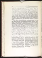
It will now be perceived that in any determination of the order we must contend with two kinds of alterations, hereafter arbitrarily distinguished as states and variants. The term state is used to denote a deliberate alteration in type, whether performed, supposedly, on press (b, f) or off press (c—e, g); the term variant to denote shifts within states in the position of the type, whether these appear as intentional adjustments on press (a2-3) or as accidental results off press (c2). The minimum deviation, laterally or vertically, which distinguishes a press variant has been fixed at two millimeters. Any discrepancy less than this is dismissed as a distortion caused by shrinkage in the paper.[31]
Since two settings of the imprint are employed within the same impression it is obvious that the relation between them can be decided only by reference to type elsewhere in the forme which both have in common. This other type is unchanged except for a few copies of a and all copies of g. In the exemplars of what I believe to be the first variant, a state, the interval between the heading and the place[32] measures 206 mm., an interval
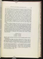
Further scrutiny of copies in the earliest state of the first setting—and of the entire sequence—discloses certain other refinements, all intended, I believe, to improve the appearance of the page. Shortly after the imprint was adjusted to 204 mm. it was noticed that SHAKESPEARES, the longest and most prominent word in the heading, though extending beyond the portrait (191x160 mm.), was several millimeters short of the margin established by the plate mark (200x169 mm.).[33] To remedy this the forme was again unlocked and the word spaced out from 166 to 169 millimeters. The combination of adjustments thus produces three distinct variants within the state:[34]
| 1. 166 mm. | 206 mm. |
| 2. 166 mm. | 204 mm. |
| 3. 169 mm. | 204 mm. |
Preceding these slight and delicate adjustments is another which is grossly botched. Instead of replacing the foul case "f" in "ſold" either at the striking of proofs, or when the imprint was moved, or later, in state b, the pressman attempted to gouge out the offending projection, but succeeded
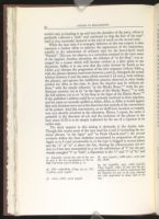
While the later state b is strangely defective in this one respect, it does represent a further effort to enhance the appearance of the impression, notably in the substitution of ordinary type for the heavy-faced word "Printed". This too, we observe, is a correction retained in the later states of the imprint. Another alteration, the deletion of "at his ſhop", was arranged for a reason which will become evident at a later point in our discussion. Suffice it to say now that the order devised by Smith as b-a (Allot 4-5) disrupts the progression of his own sequence (where Allot 4, with the phrase omitted, intervenes between 3 and 5), disregards the actual relation between b and the states which succeed it (d and g, both without the phrase), and ignores the indifferent practice observed in other books printed for Allot at this time. In these the imprint may be without address,[36] with the simple reference "at the Blacke Beare,"[37] with the preliminary notation (as in b) "at the ſigne of the Blacke Beare,"[38] or with the full address (as in a) "at his ſhop at the ſigne of the Blacke Beare."[39] If the publisher's address could be so variously rendered in these imprints, and his name so variously spelled as Allott, Allot, or Allet, it would appear that such decisions were not at his discretion but entirely at the convenience of the printer. And this convenience, as we shall have occasion to remark, was very directly involved in the alteration. Hence, I repeat, the order is probably in the direction of a-b, and the inclusion of the phrase in the later issues II-III is to be simply explained by the use of a copytext in its earlier state.
The third imprint in this setting is obviously d, the Aspley state. Though this retains most of the type used for a and b (including the terminal phrases "at the ſigne" and "in Pauls Church-yard") the several revisions within the lines doubtless necessitated its preparation off press. Again as in b (and occasionally in a) the type is clogged in several places and the "n" of "in" is above the line. Among the idiosyncrasies not evident in b but later transmitted to g are the substitution of "ſ" for the previously mangled "f" in "ſold", a depression in the "e" and "t" of "be" and
In Meighen g, the final imprint in this setting—and in the sequence—the modifications are more extensive. Besides the usual substitution in the name, these include the two Ns previously mentioned, on the next line, the use of "middle" for "ſigne", the word employed in all preceding variants, and in the last line an entirely new reading. Other than these the Meighen state has only one distinction, a broken comma after Cotes, doubtless caused by the constant shifting of the type below it in the preparation of the earlier states.
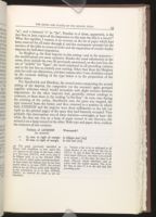
For Smethwick and Hawkins, the several states comprising the second setting of the imprint, the compositor (or the overseer) again grouped together addresses which would necessitate only slight revision between impressions. As the other imprints had, generally, certain readings in common, so these share in the reading "at his ſhop". At some time during the printing of the earlier, Smethwick state the press was stopped, the type removed from the forme, and then returned to a position in which both LONDON and the imprint were three millimeters to the left (or right on the printed page) of the space they had formerly occupied. Very probably this interruption was of some duration—overnight, at least—for while the first run was on a heap of paper turned in one direction, the second is on a heap turned in the other. Both type and paper, then, confirm the existence of two variants:
| Position of LONDON (as printed) | Watermark[41] | |
| c1 | 63 mm. to right of margin | In Effigies leaf [A5] |
| 2 | 66 mm. to right of margin | In title leaf [A2] |
Next and last is the Hawkins imprint, with LONDON disposed as in c2, but with the beginning of the final line reading first (e) "Chancery Lane", and then, as usual in Hawkins' address[42] (f), "in Chancery Lane". For the other instance of a correction at press (b) the deletion of three words required a readjustment of the imprint. For this insignificant addition, however, the compositor was content to leave the line slightly off-center.
At this juncture I must confess that while I have, to the best of my ability, defined and ordered all the points that appear on the title-page of the first issue, I have established a sequence which pertains only to the order of composition within each setting, and not to the order of variants through the press. Were the imprint of a single setting the order for both would be, of course, the same. But since there are two, a question arises concerning the necessity for the second. If eleven words are, as we see, applicable for all states, why does the compositor go to the trouble of preparing another setting?
The only plausible explanation is that the provision of this other setting enables two men to work efficiently and simultaneously at their separate tasks. While the compositor is revising and adjusting the imprint in one slug the pressman can work off copies on the other. Thereafter, as each finishes his assignment, the slugs may be transposed, and both can then continue to revise and print as before. The obvious advantage of the system must have immediately recommended it to the overseer, who doubtless classified the imprints in the two groups just described, ordered a separate setting for each, and arranged a schedule for their regular alternation through the press.
To reconstruct this schedule we may now recall that if a and g have certain distinctions not common to the other states, then these two are at the extremes and the others alternately disposed between them.
As ordered, this sequence is justified not only by the peculiarities in the terminal states, or by the progression within each setting, but also by certain links between the settings. In some copies of b [43] and all copies of c1, for example, LONDON is displaced three millimeters to the right (or left
| | ||
