| | ||
Watermarks Are Twins
by
Allan H.
Stevenson
In the first place, there is no such thing as a duplicate. Of course not. Can you print two copies on the same paper? Then, so far as the paper itself and the watermarks are subjects of enquiry, "duplicates" may be astoundingly different.—Falconer Madan before the Bibliographical Society (1911).[1]
MOST EARLY BOOKS ARE PRINTED ON A VARIETY of papers. They contain a number of different watermarks. Though now and then a small volume has "one mark throughout," and a tall folio shows a single stock of fine paper, the majority of books are not so consistent. Often a well-printed folio, starting out with a run of grape paper (say), shifts to crown or fleur-de-lis paper by the time it reaches its second alphabet. In other folios, no less proud ones, the preliminaries alone disclose several marks, and the text a dozen or sixteen more, with alternation of marks through successive sheets. And, as for quartos, the next play one leafs through may offer an assortment of seven watermarks within eleven sheets. Those who have examined the papermarks in early books know these things are so.[2]
Indeed, mixed watermarks began with the Gutenberg Bible;[3] and they persisted through the Renaissance into the eighteenth century, as a normal feature of books printed on handmade paper. A volume printed by Wynkyn de Worde, the Vitas Patrum of 1495, is said to contain nearly fifty different marks.[4]
There have been explanations. Sometimes (it has been said) printers bought cheap job lots of paper.[5] Such an explanation neatly fits the bibliographically famous Shakespearian quartos of 1619. Sir Walter Greg showed, in 1908, that these nine quartos contain at least twenty-seven watermarks, so distributed as to prove all were printed in one year, though their imprints read variously "1600," "1608," and "1619."[6] All printed by Jaggard for Pavier. In examining four sets of these quartos, Greg found, to be sure, just one pot watermark throughout the two Contention plays (dated 1619), yet no less than fifteen marks—pots, croziers, fleurs-de-lis—in the four copies of King Lear (falsely dated 1608); and in a single copy—the Garrick-British Museum copy—of The Merchant of Venice (misdated 1600) eight or nine different marks within its ten sheets.[7] Dr. Greg then doubted that similar wild mixtures were likely to occur elsewhere; and they are indeed rare; but I have
The moderate mixture of papers generally found in books allows a sui generis explanation. It lies in the manner in which paper was manufactured, packed in quires and reams, gathered by factors into bales, transported by waggon or boat, and shelved in warehouses. As a generalized procedure is hard to visualize, let us think in terms of books printed in England in the seventeenth century—though the implications extend beyond these limits of time and place. For in the seventeenth century the ordinary papers used in English books came mainly from just across the Channel, from Normandy and Brittany.[9]
The rushing streams near such towns as Vire, Sourdeval, Fougères, Morlaix turned the wheels of a host of papermills, small family usines, mostly, with just one vat to dip paper-moulds in, and a small output daily.[10] Though little is known of his operations, a marchand papetier or factor seems to have bought up (weekly, say) the paper from various mills in a district.[11] As sometimes many mills were clustered along one stream[12] and may have been
Yet this is not all. Within the reams themselves the paper was in a sense consistent. But a subtle variation occurred, due to the number of moulds, and occasionally the number of vats, used in its making.
Students of the history of paper know that pairs of moulds were used in its manufacture. Regularly, if not inevitably, two similar moulds were employed together, in all mills, in the making of all sizes and qualities of paper. It is so today for homemade paper.[16] The vatman, after placing the deckle,[17] plunges a mould
Documentary and material evidence shows that moulds were made and used in pairs from at least the early seventeenth century. Louis Le Clert, citing records of the region of Troyes in Champagne, tells us that "Dans l'inventaire après décès de dame Jeanne Delalne, . . . dressé en juin 1614, il est fait mention de 'deux paires de formes servant á faire papier. . . .'"[23] Alexandre Nicolaï, in discussing the inspectors who visited papeteries to secure conformance with the Tariff of 1739, publishes several reports that mention pairs of moulds. For instance, at Creysse (near Bergerac) in Périgord, Inspector Marouze found "dans un moulin exploité par le Sieur Jardel . . . trois paires de formes avec leurs couvertes
The double moulds (Doppelformen) or divided moulds mentioned above were a development of the eighteenth century, in which two moulds usually of small format (such as foolscap) were placed side by side, so that a skilled vatman might dip two sheets at a time. Schulte has discussed their use in Germany,[27] Povey and Foster their probable use in England from 1709 or earlier,[28] and Labarre, with excellent illustrations, a well-preserved double mould of Honig & Zoon, famous Dutch papermakers.[29] Naturally, the companion sheets of such a mould exhibit similar watermarks, as Schulte's and Labarre's illustrations show. But double moulds themselves were made and used in pairs, as we can see from the Willcox purchase of 1783.
Although some early accounts of papermaking make no mention of pairs of moulds, the standard accounts, of course, do. Thus,
Le Plongeur, en ôtant la couverture de dessus cette première forme, la place tout de suite sur la seconde forme, qu'on lui donne pour la plonger à son tour.
. . . le Coucheur releve sa forme, en commencement par la bonne rive; il la rend au Plongeur aussi nette qu'avant qu'elle eût été plongée, & il trouve sur le trapan de cuve une seconde feuille à coucher qui a été formée pendant qu'il couchoit la première, & qu'il releve en passant, avant que d'étendre le feutre. Ainsi l'on voit, qu'au moyen de deux formes qui sont toujours en mouvement, il n'y a point de temps perdu: pendant qu'une forme se plonge, l'autre se couche; quand le Plongeur passe une forme au Coucheur, il en reçoit une autre qui est vuide, sur laquelle il pose la couverture qu'il retire de dessus la première, & il plonge de nouveau.[30]
La Lande offers a series of valuable plates, among which no. XI pictures a vatman dipping one forme while his coucher is releasing a sheet from the other; and another pair of moulds is seen in the foreground. This plate has been reproduced by Renker.[31] Hunter has brought together several instructive pictures of papermaking in which the two moulds in use can plainly be seen.[32]
Though historians of paper have thus stressed the fact of companion moulds, not much attention has been paid to the companion watermarks produced by such moulds. (Are they identical? Are they different?) Relatively few collectors have taken note of them; and bibliographers, at least in the English-speaking world, have seemed oblivious of them. A reason perhaps is that McKerrow, in the bibliographer's bible, makes no mention of pairs of moulds, though he gives a short description of papermaking.[33] Inasmuch as bibliographers in their innocence commonly assume that the papermarks
Watermarks result from designs made of wire and attached to the moulds. Le Clert points out that "La confection des formes était une industrie spéciale exercée par les formiers ou formaires."[34] That is, skilled artisans set up as makers of moulds and supplied the needs of a papermaking region. Less often they were papermakers themselves.[35] An examination of old moulds, such as those at the Dard Hunter Paper Museum, leaves little doubt that European mould-makers came to be exceedingly clever workmen, seasoning the wood and securing the laid wires and buttressing the chain wires as they did.[36] They fashioned the watermark patterns out of brass wire and sewed them to the moulds with finer wire.[37] Though the ordinary wireform was not a work of art, particularly after a period of use, it was sufficient and not unattractive; and it was often so neatly duplicated as to deceive students into supposing that companion marks are the same marks. Thus cataloguers of incunabula or Renaissance books who state categorically "This copy has the same watermark throughout" are usually, if not invariably, wrong.
The maker of moulds can hardly have intended to deceive anyone. It was enough if a pair of moulds resembled each other so closely that the vatman would always know them for mates. What was important was that the formier should cut the mould frames precisely alike, so that the single deckle would fit them both neatly. But the twin watermarks might vary somewhat in height or position or details of design without affecting the certitude of their belonging together. Indeed, as we shall see, the mould-maker must sometimes have intended a distinction, as when he put the handle of a pot once on the left, once on the right. Some more patent
Though some have not pondered his words, Briquet spoke clearly on these matters, out of years of experience:
It is convenient to refer to Briquet's several categories of degree as twin watermarks, a term suggesting either identical or ordinary pairs of twins. The term companion watermarks also has useful connotations. But for purposes of efficient analysis and description, I have found it necessary to observe certain points of difference which recur in twin watermarks. Among useful points of difference are these:
- 1) Difference of mould-end. Often the pairs
of marks appear in different halves of their
respective moulds and the sheets of paper made on
them: variant a centered in
the left halfsheet,
66b in the right halfsheet. Actually, this is mainly an inference from the fact that some marks read in and some read out. Frequently the inference may be checked by the indentations made by the watermark or chain wires. Where these are clear, it appears that commonly, if not normally, the lettering on the mould itself was reversed, as in typography; that is, a watermark in a left halfsheet with left-to-right lettering usually was impressed by a wireform with right-to-left lettering in the right half of the mould; for the indented side or "smooth" side is obviously the mould side of the paper. Of course, there are exceptions, as when a label was turned and resewn non-reversed, In ambiguous or uncertain cases the Difference may be called one of in and out.
- 2) Difference of chain-position. Sometimes a mark fits neatly between the chains while its twin does not. Or a small mark is centered in one instance but touches a chain in the other. Some pairs are centered on a chain, with the line cutting through at slightly different points. A few are sewn to a chain or between chains that do not correspond to those of the companion mould, the count being different from the end-chain or deckle, so that they appear higher or lower in a quarto fold. We may call a chain that splits a watermark its center chain, and those that it falls between or that cut its edges its attendant chains or outer and inner chains.
- 3) Difference of chain-space or chain-pattern. When the attendant chains vary as much as 2 mm. in their distance from each other, this often is the easiest means of telling the twins apart. A smaller variation, though usable, may prove elusive, because of paper shrinkage or vagaries in the parallelism of the line. Differences of as much as 4 mm. occur. Actually, the chain-structure of two handmade moulds will never be precisely alike; thus remote chains are sometimes as useful as near ones, if they differ markedly in relative position or form. Occasionally an end-chain or other margin-chain has a wobble or a break that may be seen at a glance.
- 4) Difference of slant. At least one of the
marks has not been sewn to the mould in an upright
position and leans to right or left. Or an
important part has been bent. In doubtful cases it
is wise to measure upper and lower distances from
the nearest chains;
67particularly in quartos, where one sees but part of the watermark at a time and may be uncertain which side of the paper one is looking at.
- 5) Difference of reversed pattern. The mould-maker has made one mark the reverse or mirror-image of the other, except for names and initials. In the Arms of France and Navarre, for instance, Navarre may be first on the left, then on the right, with respect to the lettering below. This makes a pretty distinction, which seems to have been intentional on the part of some mould-makers.
- 6) Difference of label. One mark carries a "full name", the other mere initials or a name-abbreviation: as DVAVLEGARD and DVG. Or one may have initials, the other none. Or a name may appear in two spellings. The labels themselves may have different shapes. And occasionally one of the labels gets inverted or attached to the wrong end of a grape or shield watermark.
- 7) Difference of countermark. Countermarks are of course the smaller marks that appear opposite the main marks in the other half of the mould or sheet; they are common after 1650 or so. When they contain lettering, they vary much as labels do. Sometimes one of the countermarks has fallen out of its mould. Frequently, though the mould-maker has made the main marks "identical," he has taken less trouble with the countermark letters and has spaced them differently. And one set of countermark letters may be reversed or even inverted in respect to the main mark. Those countermarks that are letterless differ in detail or position as other marks do.
- 8) Difference of distinctive detail. One mark has an element of design not found in the other. A pot may have a fleur-de-lis within its base, its companion none. One bunch of grapes may have a curved stem, the other a comparatively straight one. Such differences may have been original or consequent to use. It was easy for separately attached bits of the design to break off or drop out during the process of papermaking or the brushing or cleaning of moulds after use.
- 9) Difference of sewing. Particularly in
early watermarks, where heavy sewing-wire was
used, the sewing marks can be seen.
68These are what Sotheby calls dots.[39] Their differences of position may serve to distinguish nearly identical marks. When the wire-forms came loose, then arose Differences of resewing. In such cases the dots often are plainer, especially if linen thread has been used in temporary replacement; and the sewings may appear in new places. At this same time the watermark itself may have been moved, so that it reappears between wider chains (say) or even in the other half of the mould.

- 10) Difference of distortion. Parts of the design have been bent out of position. This ugliness is less often due to malformation than to deterioration. The wireforms commonly went to pieces before the moulds to which they were attached.[40] They came partly unsewn, at one or more points. The result was sprung wires, bent wires, shifts in position—and increased differentiation from the twin mark. The wires might be further bent in resewing. Certain of these distortions in the life-history of watermarks will be illustrated. The awkward thing is that the shape of a mark may change in some difficult-to-describe particular while the detective pursues it from gathering to gathering of a pompous folio. Naturally, such changes limit the certainty of recognition when he meets the mark in another book.
These ten points of difference, closely observed, serve to train the bibliographical eye. Those points having to do with chains are perhaps the most helpful (despite the vagaries of resewing), and the student soon learns the advantage of measuring the chainspaces as part of the routine of examination. Distances of key points from the attendant chains often repay measurement, though much measuring wastes time. Slight differences in the overall size of a watermark prove less useful than differences of two or five millimeters in a part, for these the eye can judge. The filigranist will learn not to assume while looking at one twin what the main point of difference is likely to be: both twins may be disfigured by a harelip and yet differ markedly in some unexpected detail. In note-taking it is important to follow a neat, consistent practice, to avoid
The student may observe examples or possible examples of twin watermarks in various published collections, though the collector himself may not have recognized their nature. Briquet, as we have seen, points out examples of filigranes similarires and filigranes divergentes.[42] Curiously, one of the earliest writers on the subject of watermarks understood their basic nature better than some later men. Though Samuel Leigh Sotheby may not have
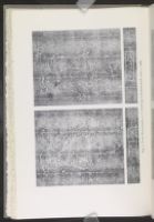
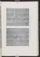
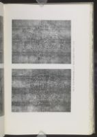
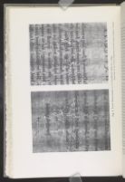
The plates accompanying the present article offer simple examples of twin watermarks, with a few that lead to complications. Among those photographed, one pair are taken from a mid-sixteenth-century manuscript, three from endpapers removed from seventeenth-century bindings, two from a mid-seventeenth-century folio with plates, and two from a royal writing-book resplendent with the watermarked arms of King William and Queen Anne.[51] The marks as reproduced may vary slightly from their natural size.
During the discussion the reader needs to keep in mind pictures of the old moulds, such as those illustrated by Clapperton, Hunter, and Degaast.[52] The chains ran the short way of the mould, so as not to impede surplus pulp from falling over the edge away from the
SHIELD: STARS DIVIDED PER BEND. MS Volume of Property Records, Langenzerdorf, Austria, 1556-1738. 4°. Jirgal. Fig. 1.
The manuscript, written in various German hands, deals with property-holdings at a village near Vienna. The first entries are dated 1556. Sixty-nine leaves of script (some crossed out) are followed by eighty or so blank leaves, and a few apparently have been lost. The paper is coarse, rough, slightly sized, with leaves measuring 7¾ x 6 inches (198 x 154 mm.). The watermark, as the illustration shows, is a small shield of about 18 x 16 mm. centered between chainlines 26-27 mm. apart. There are two varieties, and they may be distinguished at a glance. Variant a slants to the right, and variant b to the left, at angles of about 80°; and further particularization is unnecessary. As there are no other marks in the volume, it is instructive to note how many instances of each variant there are. Expectations are neatly satisfied: a occurs 17 times and b 16 times. The arms, two six-pointed stars separated per bend, appear to be those of Kaufbeuren (see Heawood, 490, 509), a city fifty or so miles southwest of Munich. Luckily the mark occurs just above the middle of the sheet (higher in variant a) and is not caught in the quarto fold. Judging by the position of the end-wires or tranchefiles,[55] along with the indentations, the two variants were situated in the opposite halves of their respective moulds, non-reversed.
POT P LEGRAND. Endpapers, c. ?1660. 4°. AHS (my copy). Fig. 2.
The pot watermark, so common in the sixteenth and seventeenth centuries, underwent a thousand permutations. Here is a style not illustrated in Heawood, nor elsewhere, apparently. Many a Norman pot is topped by a
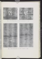
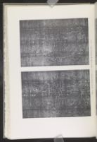
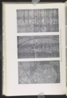
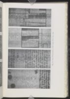
FOOLSCAP & COUNTERMARK MPX. Endpapers, c. 1688. 2°. AHS. Fig. 3.
This pair of foolscap watermarks is such as to delight a small boy, if not a bibliographer. For watermarks are not lacking in humor. In variant a the Fool has thrust his long nose up to a chainline; in b he has pushed it quite 4 mm. over. Though this may be difference enough for all parties concerned, the pair illustrate several other points of difference. Fool a (92 x 58) has the five (Norman) points of his coat well separated, though the back one is squeezed and others are bent; while Fool b (94 x 58) has two of his points hanging together so that a bell touches the reversed 4 below. Where Fool a is a roundhead, b is a flathead with a larger cephalic index. The main chain-spaces of a measure 22:25 in, those of b 24:23.5; and the mid-chain of a splits one of the three balls, while that of b merely touches it. Each of these Fools is accompanied by a countermark, a label reading MPX, and these labels are also readily distinguishable. Countermark a (11 x 33) is cut by a chain 16:17 out, along the back of the P; and b (10 x 34) is cut 16:18 between the M and P. In both endpaper sheets the watermark appears in the left leaf and the countermark in the right, and the leaves measure 11⅞ x 8⅛" (301 x 208 mm.), with some deckle remaining at the fore-edges. According to Heawood, the initials MPX stand for M. Pallix, apparently a Norman papermaker of the latter part of the century.[57] Though
SHIELD FM & THREE LIONS. Endpapers, c. 1610. 2°. AHS. Fig. 4.
The crowned shield with quarterly a fess and three lions is one of the more intriguing of French marks. Though the design may have come out of the Rhine country,[60] the style here is certainly French. The date 1610 sometimes found in the base of the shield may denote the first regnal year of Louis XIII. Other shields of the time have Norman name-abbreviations within the fess, but the initials FM have not been identified. The oddest thing about the present pair is—what the reader will have seen at once—the reversed date of variant b. Though the initials appear in a customary position in the first quarter, and the lions ramp regularly to the left, the year has got in backwards, except for the numeral 6.[61] The marks are not among the prettiest examples of the mould-maker's art, for they have suffered some deterioration, but they well illustrate common features of ècu watermarks, such as the crown with fleur-de-lis, "horns," and band of annulets, the spear-rests on either side, and the conventionalized toison d'or below. Such complex designs invite differences. Shield a (83 x 48) is elongated and well centered on a line between spaces 19:20. Shield b (81 x 54) has its fleur-de-lis spread between chains 20 mm. apart. Shield a has a deeper fess and taller letters, and has lost the outer wire from its second quarter. Shield b has extended horns, a tailless lion in its second quarter, and a smaller sheepskin below. And so on. The differences provide practice in observation. As these endpapers have been cut down, it is uncertain whether the shields are from left or right halves of their moulds.[62] We shall have more lions anon.
ARMS OF KING WILLIAM III. Blank Writing-book, c. 1715. 2°. ICU. Fig. 5. Style of Heawood 442.
A recent acquisition of the University of Chicago Libraries is a thin folio volume neatly bound in morocco, stamped with pots and the initials
King William's arms consist of a crowned oval and shield quartered with the arms of England, Scotland, Ireland, England, with an inescutcheon of the Lion of Nassau, the motto "Honi Soit Qui Mal Y Pense" in the surround and "Semper Eadem" below. The whole measures 5 inches tall, or 126 x 81 mm. Both shields of the pair are carefully centered on a chain that splits crown and shield; and the shields fit precisely between attendant chains spaced 24-25 mm. (nearly an inch) apart. Differences are not readily distinguishable within the shields; but in a there is a space below the harp, and the Scotch lion is higher within its tressure flory. The lettering betrays a discongruity. In a the O of HONI is opposite the S of SEMPER; in b nearly opposite the E. In b the I of SOIT slants. In a the Q of QVI is low. In a the R of SEMPER almost touches the center chain; in b it lacks 2 mm. or so. This last is perhaps the point most easy to note in turning the pages; for some variations transpire only when the photographs are placed side by side. The countermarks (not illustrated) are even more difficult to distinguish; but one has a longish foreleg on its R, the other a slightly curved foot. So much for King William.
ARMS OF QUEEN ANNE. Same blank volume. Fig 6. Style of Heawood 441.
This is the feminine counterpart, on slightly thicker paper. The designs measure nearly 3¾ inches tall, or 94 x 64 mm., on chain-spaces as before. Again the crowns and shields are carefully centered, with the inner oval this time fitting within the attendant chains. The quartered arms consist of the three leopards of England impaled with the lion of Scotland (with tressure on three sides) in the first and fourth, the lilies of France in the second, and the harp of Ireland in the third, with merely the HONI SOIT motto in the band. Again differences within the shield are hard to see; but in variant a the right side of the shield is noticeably wider, and the harp is
POT C/AB. Inigo Jones, The Most Notable Antiquity of Great Britain, Vulgarly Called Stone-heng (J. Flesher, 1655). 2°. AHS, ICU. Fig. 7.
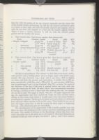
The prevailing watermark in Jones's Stonehenge is a tall, baroque pot, surmounted by a circular crescent and a large fleuron (or quatrefoil), with five lobes and sets of trefoils emerging from an embroidered pot-cover, with a fleur-de-lis on its throat, a crescent C on its bowl, and another fleuron within its derby-shaped base. It, of course, is twins. But that is not all. Each twin lives and grows old. Fig. 7a1 shows one of these glorious pots (109 x 47) as it emerged proudly from the atelier of the formaire, perfect in every detail, except for the leftist position of its base fleuron. Its top crescent is centered, its handle is a symmetrical S, its bowl and its base are polished and unscratched. But pots lead a hard life, whether in the tavern or the papermill, and pictured next (a2) is the same pot after its handle has been banged, its bowl dented, and its derby base woefully crushed; and then (a3) this pot in a further state of degradation. Actually, I have distinguished as many as six states! Where at first its crescent is placed neatly between chains reading 4[15]4 in, in later states deformed it appears with the crescent sewn beside a chain, or cut by it, or recentered, sometimes reading out, sometimes in. In one the handle is distorted, but the base looks still good. In others the base is wrenched first one way, then the other. Strangest is the state (a3) in which the top crescent is once again centered, reading in, and the crescent C on the bowl has been resewn so it looks reversed! Still reasonably sound of body though infirm of limb, this pot might yet live through further accidents into age and ugliness.
All the while this pot has a twin that also experiences some of life's hard knocks. Of almost identical size (111 x 47), it is distinguished by a thickish crescent above, a flattened left petal, a thinner crescent C on an eggshaped bowl, a higher bar on the A and a fleuron nicely centered within the base. Its letters consistently read out. The plate shows four states: b1 with the handle prettily curled and tacked to the chain; b2 in the same position
| Form | Crescent Letters | Detail | AHS | ICU | ||
| 1 | Handle S-shaped | 4[15]4 | IN | S sewn to chain | M4 * | M4 |
| " " | 3:12 | OUT | Chain along B | N2 | N3 | |
| " deformed | 7[15]0 | IN | Pot tipped left | N4 | ||
| 2 | " & base deformed | 6[15]1 | OUT | Chain along B | pl 1 * | F4 |
| " " " " | 7:8 | OUT | Trefoils o[23:22]1 | I3 | pl 5 | |
| 3 | " " " " | 4[15]4 | IN | Crescent C | pl 5 * | pl 7 |
| reversed |
| Form | Crescent Letters | Detail | AHS | ICU | ||
| 1 | Handle curled | 13:3 | OUT | Crescent joined | M2 * | |
| " " | 13:3 | OUT | " parted | K4 | ||
| 2 | " wire sprung | 13:3 | OUT | " " | I3 * | |
| 3 | " sagging | 6[16]0 | OUT | Handle mended | pl 3 * | C4 |
| 4 | " " low | 7:9 | OUT | Pot bent left | pl 4 * | E4 |
All this is extraordinary. The volume is a thin folio of 60 leaves (A-P4), with portrait and 5 folding plates (two on larger paper with shield watermarks). My copy measures 11⅛ x 7½'' (282 x 190 mm.); ICU is slightly cut down and lacks the portrait and some plates. A smaller Pot C/AB appears sporadically (AHS M3, clear), Pillars CG (?) turn up once (AHS O3), and in gatherings P and A a fine Cardinal's Hat IVL, as twins. Yet much of the life-story of the big C/AB pots is enacted before our eyes, with late states the commoner for both. In other folios I have encountered variations in sewing, a second or even a third state—but nothing like this. Yet reasons are not far to seek. The paper is clearly "fine pot." As paper improved with age, the papermaker may have stacked his reams for some months before selling; so that reams made weeks or months apart came into James Flesher's printing-house together. Flesher printed plates and early sheets on deformed pots, and later sheets mainly on the earlier states. Then finally he ran out of pots and began using hats; or else he wanted his finest paper at beginning and end. (The illustrated pots are asterisked.)
The identification of the papermaker CAB is hardly possible now; but there are clues. His fondness for the crescent may have something to do with his name. The smaller C/AB pot in the Stonehenge volume has three crescents: one aloft, one in the neck, one in the initial C. Heawood illustrates an undated C/AB pot with an open, two-lined C (3601); and I have noted a
CARDINAL'S HAT IVL. Jones, Stone-heng (1655), as above. Fig. 8.
This watermark well illustrates the normal use of printed folios in the study of twin watermarks. Though the mark occurs only in the final and preliminary gatherings (P and A, in fours) —thus neatly showing the preliminaries were printed last—and the letterpress of the dedications mars the photographs, the variants can be compared in detail. The Cardinal's Hat is from ecclesiastical heraldry, and thus often appears as a crest above shields in watermarks—as in Heawood 681-683, 691, 792-800. As a separate watermark the Hat was used for two decades or so: Heawood lists or illustrates a dozen varieties from 1649 on;[66] but it is not the "Cardinalls Armes" of the Oxford Pricelist, 1674.[67] Both Nicolaï and Heawood picture examples of Cardinal's Hats over handsome floriated pots;[68] and this combination of ideas, along with the appearance of hats in the Stonehenge, suggests that the Cardinal paper was for a time regarded as a fine pot paper.
In the illustrations the hats can be distinguished both by their shapes and by their positions relevant to the chains. Hat a (59 x 65), is spread over several chain-spaces and measures 1[54]14 in along its brim, with its crown cut by the center chain. Hat b (57 x 61) measures 8[53]7 out along its brim and has its crown jammed between lines 24 mm. apart. The tassels differ too. The letters IVL probably stand for I. Vaulegeard,[69] of a papermaking family with a mill or mills near Sourdeval in Basse-Normandie.[70] As the letters on Hat a read in and those on Hat b read out, reversed on the indented side, the matching moulds had their marks in contrary halves. (The illustrations are from the AHS copy, A2, A3.)
We now turn to a few examples of twin watermarks in Shakespearian quartos and other important books, and begin to note bibliographical uses and applications.
POT P. Shakespeare, King Lear ([N. Okes], 1608). 4°. CSmH, NN.
In recent years the Pide Bull quarto has received much attention
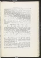
| Trefoil | Pot Top | Neck | Bowl | Base | |
| a | 5:3 | 4:2 | 3:2.5 | 9:10 | 11:13 |
| b | 4:4 | 6:6 | 2.5:3.5 | 9:10 | 12:12 |
Where only one pair of marks appear it is obvious they offer little bibliographical help, though they do suggest a continuous printing operation. If the same pair of pots turn up in other Okes books of 1608, they might serve to identify the printing-month.[74] And it is yet possible to find mixed marks or an instrusive mark in the ten other extant copies of King Lear.
POT PA. Shakespeare, The Whole Contention betweene . . . Lancaster and Yorke (W. Jaggard, 1619). 4°. CSmH. Greg 23.
It is pleasant to reëxamine the watermarks that Sir Walter Greg discovered in the Shakespearian quartos of 1619, some of them falsely dated.[75] Among twenty-seven watermarks he found just one which persisted through a play; and this one did through both parts of the Contention, which have continuous signatures. The other marks were riotously distributed through eight quartos. The Contention watermark is a pot, no doubt a Norman pot, though it is topped by a heart within a circle. Its handle is on the right, with the initials PA reading toward it. Greg gives a freehand portrait of this pot,[76] pointing out that "in the 'Contention' the paper is all of one make" and has "one mark (23) throughout."[77] On the plate he notes: "The bends [in the wires] are considerable in some cases." In the light of new experience this remark now suggests the presence of filigranes similaires—two varieties differing only in minor points—and such proves to be the case. Actually, when one knows the trick, the two are quite easy to distinguish, for in Pot a the letters consistently read up, and in b as consistently down. Unlike the Pide Bull Lear, which had both pots in the same end of their moulds, the Contention probably had its pots in contrary ends. These further points also serve to distinguish the Contention pots (reading with the letters):
| Chains | Circle | Left ball | Middle lobe | Bowl | P | Base | |
| a | 21 | 7[8]5 | Bent left | Slanted rt. | 0[18]2 | Open | 2[15]3 |
| b | 20 | 6[8]4 | On point | Straight | [1:19].5 | Closed | 4[15]1 |
In a similar manner most of the other Shakespearian watermarks of 1619 turn out to be pairs. Pot R/LM (Greg 2) and Pot BP (Greg 5) are particularly worthy of study. The RG Shields (Greg 15 & 16) are themselves twins; but the RG/D Shield (Greg 18) may be quadruplets. These matters are somewhat complicated and deserve separate treatment.[78]
SHIELD RGD & THREE LIONS. William Camden, Britannia, tr. Holland (G. Bishop & J. Norton, 1610). 2°. ICU. Style of Heawood 576.
Lions again. Camden's great book is a crown folio (ICU 12¾ x 8½'' or 321 x 214 mm.) regularly watermarked with small crowns, but with crowned shields in its maps. Most of these are emblazoned with initialed fess and three lions. The designs (87 x 55 mm.) are neat, symmetrical, fresh— unlike the abused FM shields of Fig. 4. But the pattern is the same, the date 1610 again occupies the base with an annulet below, and the toison d'or now looks more like a sore tooth than a sheep. The third lion resembles a lion passant. The initials are G over R D; but the lower letters are so spaced, with the G above the space, that they suggest the reading RGD and the Norman papermaker Richard Guesdon.[79] Heawood nowhere lists quite so early a specimen of the lions of 1610, though he found one in John Smith's Map of Virginia, an Oxford book of 1612.[80]
The Camden twins are much alike. We find them first neatly centered on chainlines, Shield a on two 20 mm. spaces, Shield b on two 21.5 mm. spaces. In a the G is above the front of the R (as in Heawood 576); in b it is spaced between the R and D. In a the line above the date is straight; in b it is curved up below the feet of the left lion. In a the numerals are normal, with the center chain slightly right of the 6; but in b the 6 is broad or sprung and almost touches the chain. And, notably, a reads in, while b reads out. In ICU Shield a turns up in the maps of Middlesex, Leicester, Nottingham, Devon, and Scotland; and b in those of Oxford, Essex, Worcester, and Ireland.
So far, good. Now we examine further maps—and make twin discoveries. Both shields have a second state. Finding a in Huntington and Stafford (ICU), we note that this shield, though again centered on a chain, has different attendant chains and looks as if shifted 2 mm. to the right. The letters and date still read in. Meanwhile b turns up in Buckingham and Cheshire, no longer centered, but 2 mm. to the left with respect to the fleur-de-lis bud at top and the vent in the sheepskin below. And now this shield reads in, like its mate. As with the C/AB pots there has been a piece of resewing, though it is hard to say which state came first. Perhaps the centering was done by the mouldmaker and the resewing by a workman in the mill. Photographic comparison might reveal some slight deterioration, but to the roving eye all the lions look as fresh as a May morning.
Certain other maps in the volume contain three-lion shields with the initials IG (for I. Ganne?) in the base point, but these are distorted beyond
CORONET (?) / GRAPES. Ovid, Metamorphosis, tr. Sandys (J. Lichfield [and W. Stansby], 1632.) 2°. CSmH (2), ICN, ICU, TxU.
The common mark in this crown-size folio[82] is a paltry thing, yet it nicely illustrates an important point of difference. It presumably is intended for a small crown with fleur-de-lis over fifteen grapes in a triangle, being a degenerate form of Heawood 2343 ff. If the double stems, though, are meant for a W, it makes no sense in a French mark. Turn the thing around and it looks like grapes inverted over the letter M and a pendant. What it is hardly matters, but a small crown over SM and grapes (ICN 3M4, 2X1) and another over NG and grapes (ICU 3S1, TxU 3M4) perhaps show its archetype. The prevailing marks measure about 34 x 18 mm. Though each varies slightly in position (from resewing), the pair are distinguishable throughout the volume by the fact that one bestrides a line and the other wobbles about in a space. In mark a the tip of the grapes is on the line between 20 mm. spaces, and the lily bud (or pendant) shifts slightly within the line. Mark b commonly measures 1.5[17]1.5 across the grapes, but sometimes it measures 3[17]0 in. The W or M varies in its bends. These vagaries are instructive to study but tedious to describe. They do persuade the bibliographer to expect small variations in watermark position within a long run of one paper.
The other watermarks in this Ovid deserve careful study. In some copies at least (ICN, ICU), Shields with Bends and Shields with Lions turn up in Book X. Usually the plates contain the ordinary crown/grape watermark (one CSmH, ICN, TxU), but the Chicago copy offers a procession of lions in its plates.[83] Yet this hardly answers the question raised by Bowers and Davis as to what has happened to the fifty copies known to have been printed on fine paper.[84]
LABEL G HVET. Milton, Paradise Lost (S. Simmons, 1667). 4°. CSmH (2), ICN. Fletcher 1.
The commonest watermark in the first edition of Paradise Lost, as Professor Fletcher has shown, is a small label or cartouche containing the name G HVET.[85] It appears at right angles to the quarto fold, with the name divided between conjugate leaves. Variant a, the one Fletcher notices and illustrates photographically, is distinguished by a T shaped like a 7 with a long top, and a label with a relatively broad right end. The G is straight and upright. The label is so placed between chains that it measures 6[10]7.5 up through the H (though it may vary slightly with resewing or shrinkage). Variant b has a T with no apparent top, and tapered label-end. The G is broader, and there are other differences in the lettering. This label measures 6.5[11]6 up through the H. The difference of the label ends is easy to see, but sometimes obscured by type.
The greatest poem in English is printed on "Morlaix paper," the cheapest sort imported from France.[86] Such paper contains watermarks mainly simple and dull, often mere initials, dilapidated ones, with occasional pillars and shields (Fletcher 4 and 6); here are no ornate pots or arms from Normandy, no fine foolscap from Angoumois. The papermakers themselves were Norman, coming to the Morlaix region of Brittany, where labor was cheap, in 1629 and after.[87] The Huets came among them, and flourished. Jean Huet, Pierre Huet, other Huets were maîtres papetiers at Ploudiry, Plourin, Briec.[88] Apparently G. Huet also made paper in this region south of Morlaix. The GH of other marks (Fletcher 2) are probably his initials, and the PH (Fletcher 12) probably those of a Pierre Huet, who also worked at this time. For I have noted labels with P. HVET in books of 1657 and after;[89] and Bourde de la Rogerie mentions "Pierre Huet, papetier à Morlaix en 1678" and again in 1701,[90] perhaps a different Pierre. Just possibly the Huets made more out of Paradise Lost than did Milton. This astute family of papermakers outlasted virtually all their seventeenth-century
The photographic illustrations in Harris Fletcher's facsimile edition provide excellent aid toward the study of watermarks in Milton and in Milton's time. A pair of pots are reproduced as No. A [II,134].
POT R/GD and POT G/PR. John Scheffer, The History of Lapland, tr. Cremer (Oxford: At the Theater, 1674). 2°. AHS, ICU. Style of Heawood 3693.
Scheffer's Lapland is a pot folio—a true folio in twos[92]—from the last decade of pots in English printing. Except for its engraved title and its map, the book is (according to one way of looking at it) a gallery of tall and fancy pots, of which one catches glimpses beside delightful engravings of Lapps.
There are three pairs of pots and one unmated pot (in the copies examined). The thing they all have in common is a handle on the deckle or outer side, though some inscriptions read in and some out. The commonest is a POT P/DB, which always reads in. Its variants may be distinguished by (a) a top crescent violently wrenched to the right, and (b) letters slanting down. This last is Heawood 3637, except that the upper D should be P: the point can be checked in the companion mark. The letters suggest the Debon family, with a mill (later) at St. Bathélemy, between Sourdeval and Mortain (Manche).[93]
More attractive are the POTS R/GD, G/PR, and G/CH, all ornamented with fleurs-de-lis top and base, in a late Norman style. R/GD and G/PR prettily illustrate the fashion of making the matching moulds so that one mark is on the left side, one on the right; one reads in and one out; one handle on the left side of its pot, one on the other. I can hardly imagine a formaire planning all this and then affixing one of the wireforms to its mould with letters reading the wrong way—though that might happen later in the mill. Pot G/CH occurs once in each copy, reading in (AHS A2, ICU P2). As, judging by its good looks and supple curves, it may have been shaped by the same artisan, its companion when found may be expected to read out—towards its handle and the deckle.
Reversal of pot handles occurs as early as 1640. A modest Pot G/RO (for G. Rouxel?) appears among the mixed watermarks in plays of Fletcher, Shirley, Habington (a pot folio) printed by Thomas Cotes in that year. In this case one mark reads up away from the handle, and the other also up towards the handle; so that both appear in the left halfsheet. I have noted examples in The Humorous Courtier (sheets B F H I K), The Opportunitie
The name-abbreviation R/GD in Scheffer may be attributed to the Guesdons, who had a mill or mills at Brouains, just west of Sourdeval in Normandy, though some of the family had migrated to Brittany by 1629.[95] Heawood 3591 may be a Guesdon pot. The meaning of G/PR is uncertain; but G/CH suggests the Chastel family, which figures in a pillar mark, H 3516. The G/CH pot is perhaps H 3685.
ARMS OF FRANCE & NAVARRE. Jonson, The Works (T. Hodgkin, 1692). 2°. ICN, ICU. Style of Heawood 663 or 670.
This is not the best edition of Jonson: only the one with the best watermarks. It offers a pretty example of the reversal of a coat of arms. The commonest marks in it show the three fleurs-de-lis of France with the long label of D. VAVLEGARD (style of H 635-636, 654), a maker of Sourdeval or thereabouts.[96] But some sheets show the combined escutcheons of France and Navarre in a conventionalized form—the first with the three fleurs-de-lis reduced to two fishlike bearings, the other with the chains of Navarre in wheel-form. These appear in the preliminaries and in the fourth alphabet carrying the label of I. CONARD, whose mill may have been near Vaulegard's. The striking difference among these marks is that some have France on the left and Navarre on the right (ICN & ICU A3) while others have the contrary arrangement (ICN A6, ICU A3). All the labels read out, but they differ in size and chain-position. The common pair measure 8[58]12 and 12[65]1; but mixed with them seems to be another pair measuring 22[62]13 and 12[65]23; which I take to be evidence that two pairs of moulds were in use on the same day at a pair of vats.
The book is a demy folio. The ICN copy is 14⅛ x 9'' (359 x 230 mm.), and the ICU (the poet Thomas Campbell's copy) slightly smaller. The Oxford Pricelist of 1674 lists "Durand Demy" with "on one side. 2 Scutcheons crowned & bordered vnder it A DVRAND"; and the size given for the folded quire is 15 x 9¾''.[97] Study of the watermarks in such volumes should improve our understanding of paper sizes in the seventeenth century.
WHEEL or FLOWER WITHIN CIRCLES. Bartholomæus Anglicus, De Proprietatibus Rerum, tr. Trevisa (Westminster: Wynkyn de Worde, [1496]). 2°. ICN. Briquet 6608, Heawood S36.
This article has found its argument mainly in seventeenth-century
Ames, Jenkins, Briquet, Plomer have told the tale of John Tate and his mill at Hertford.[98] How Henry VII visited the mill; how Wynkyn de Worde referred to the mill in verses at the end of De Proprietatibus Rerum; how the miller became Mayor of London or at least was the son of a Mayor. Enter ye unromantick bibliographer & taketh a looke at ye paper.
Briquet did not look at it: he lifts his illustration from Jenkins, and calls it "Fleur à 8 pétales," which may be right. Ames and Jenkins offer engine-turned sophistications, Heawood a reduced tracing, all without benefit of chains.[99] The mark is hard to see, behind two columns of textura. Though two spokes of the Wheel of Tate show between, centered neatly on a chain, the breadth of the mark is hard to measure, and the attendant chains are ambiguous. After much peering and turning of leaves, the bibliographer decides he can distinguish two variants: one with a bump on (the lower side of) its rim; the other with circles unevenly spaced. Yet in most of the pages these points are obscured, uncertain.
All the while he has missed a difference that can be seen at a glance. Regardez les pontuseaux! In one particular the two chain-patterns are remarkably different. The normal chain-space, as in the unwatermarked leaves (or halfsheets), is about 35 mm. but the spaces on which the wheel is centered are 24-27 mm. (about an inch) each. (No doubt these closer chains gave better support to the watermark.) Now, the notable difference between the moulds lies in the chain-space on the deckle side of the attendant chains. In the sheets with the bumped rim this outer space is the usual 35-36 mm. wide; but in the sheets with the spread rim it is only 28-29 mm. wide. Thus, whereas Wheel a measures 36:10[17:16]8:35 in, Wheel b measures 28:8[16:17]8:36 in. These measurements are merely approximate, of course, for the chains are not strictly parallel. But the indicated difference of 7-8 mm. is something anyone can see.
As I examined the handsome Britwell-Newberry copy,[100] my wonder grew. Here is a folio in sixes and fours running through nearly three alphabets of signatures—478 leaves, as Duff notes[101]—the paper of which was manufactured on just one pair of moulds and imprinted by Wynkyn de Worde
The Newberry Library also has a fragment of the Legenda Aurea of Jacobus de Varagine, which book Wynkyn de Worde dated 8 January 1497. It is the only other book known to have been printed on paper with the wheel (or star or flower) watermark of John Tate. It is amusing to note that this fragment, consisting of nine random leaves has five without marks and four with wheels; and these four are divided two and two between the two chain variants. There seems to be no deterioration in the marks. Now looking back at the Bartholomæus I count 51 instances of variant a and 48 of b (with one remargined and uncertain) within the first alphabet and the first eleven books. This is known as normal distribution.
This study has now been carried far enough to place in the hands of bibliographers who work among books of particular times and places. Some of its observations may thus grow into generalizations; while others may suggest useful analogies.
The student of early printed books may take heart from the Bartholomæus: a case of filigranes identiques which proves simple to analyze. He may wish to begin with that incunabulum incunabulorum the 42-line Bible, whose three watermarks, as can be inferred from the plates of Sotheby and Dziatzko,[102] are each from a pair of moulds. The Bull's Heads differ in the spacing of the eyes, the Grapes in size and stem (one looped and one cut), and the Bullocks in the form of eye and tail. Though only three or four copies seem to have been studied, it is at once evident that pairs of moulds were in use at the inception of printing by movable type.
Whether pairs of moulds were used from the beginning of European papermaking is a question for those who live with manuscripts. The oriental papermaker has always used a single unwatermarked mould. Nor does twelfth-century Spanish paper have watermarks; yet recurrent impressions of wire defects may show whether two moulds were used together at Xátiva. One of the earliest paper books I have examined, a quarto manuscript of the Four Gospels in Greek, "The Isaac Gospels," of the first half of the fourteenth century, and owned by the University of Chicago [BS 3552 1350], has thick, yellowish paper with two very crude
For the student of sixteenth and eighteenth-century books the illustrations and analyses in these pages will suggest parallel lines of study, though the primitive pots of 1525 have little in common with the ornate and spreading eagles of 1775—except that the moulds were made in pairs. Possibly the ten points of difference will dissolve some mysteries of both centuries, or lead to techniques that will. Such study should throw further light on the original positions of wireforms, the nature and speed of their deterioration, the manner of their resewing, the use of two or more vats, and all consequent variations in a stock of paper. In the long run we may know a good deal about the life-story of watermarks.
It will be asked—it should and will!—what use it is to know that watermarks like wrens go in pairs. This is no time and place for a chapter on the bibliographical significance of twin watermarks: that may come hereafter. Yet it is evident at once that even the
On the positive side several uses or advantages have been mentioned in these pages, and others can be found. It is worth knowing that the Bartholomæus and the Pide Bull Lear were machined (apparently) in continuous printing operations—though each has two watermarks. The historian of paper will relish the inference that John Tate's vatman and coucher applied themselves diligently at a single vat for six weeks or so to provide sufficient paper for a volume of nearly 500 leaves in an edition of perhaps 500 copies. But admittedly the homogeneity of the watermarks throws no light on the size of that edition, except to suggest it was not large. The Shakespearian quartos of 1619 have been touched on sufficiently to suggest that a realization of the binary nature of their watermarks in 1908 would have improved Greg's demonstration that plays dated 1600 and 1619 were printed in the same year. For no one would have argued that a pair of moulds might remain the same (without distortion or resewing) over a score of years, or that a mould-maker might have imitated the subtle differences of
Such facts, such realizations serve also to sharpen conventional uses of watermarks. If papermarks can be used in dating (and their possibilities have been overestimated), it may be important to watch for the reappearance not of a watermark but of a pair of watermarks. In cases of cancels or standing type, if the authenticity of a leaf or sheet has been questioned because of a mark "different" from marks in contiguous sheets or other copies, the questioned mark may prove to be the unappreciated mate of one of these. In the analysis of quartos, where questions of conjunction arise, it is hardly sufficient to point out that two related leaves "show a watermark": they must show corresponding halves of the same member of a pair. One suspects that T. J. Wise and other purveyors of madeup play-quartos, while complacently matching pot tops with pot bottoms, have seldom distinguished between the marks that result from a pair of moulds.[106]
Recognition of the true state of its watermarks brings the dignity of individuality to each book printed on handmade paper.
Notes
Various writers have noted the mixture of watermarks in books. Dard Hunter says: "In examining old books a great profusion of watermarks may be noted in the paper of an individual volume, some fifteenth-century works containing a dozen or more different papermarks in a single book." [Papermaking: the History and Technique of an Ancient Craft, 2d ed. (1947), p. 261.] Thus William Blades speaks of "the astonishing variety of water-marks frequently found in one volume" of Caxton; and adds: ". . . there was a great intermixture of qualities [of paper], including the make of several mills. We have never yet seen one of Caxton's books in which the same watermark runs through the whole volume, and in many cases the variety is astonishing. Thus, in a copy of the first edition of the 'Canterbury Tales,' now in the library of Mr. Huth, there appear no less than fifteen distinct water-marks." [The Biography and Typography of William Caxton, 2d ed. (1882), pp. 97-98.] Recently the collector Edward Heawood has cited as examples of the "large number of different marks, often seen in a single book," Camden's Britannia (1637), Ogilby's Atlas Chinensis (1671), Fryer's New Account of East India and Persia (1698), and certain volumes printed in Italy, Holland, and Germany. [Watermarks Mainly of the Seventeenth and Eighteenth Centuries (Hilversum, 1950), p. 33.]
The 42-line Bible (c. 1456) contains three quite different watermarks: Bull's Head, Grapes, and Bullock, each with two variants. See Samuel Leigh Sotheby, The Typography of the Fifteenth Century, Being Specimens together with Their Watermarks (1845), pl. Z, no. 92; and Karl Dziatzko, Gutenbergs Früheste Druckerpraxis, Sammlung Bibliothekswissenschaftlichen Arbeiten, Heft IV (1890), pp. 41-50 and pl. III.
Samuel Leigh Sotheby, Principia Typographica to Which Is Added an Attempt to Elucidate the Character of the Paper Marks of the Period (1858), III, 102. Sotheby treats Caxton's watermarks at pp. 83-88 and pls. Qa-Qc.
On a suggestion of A. W. Pollard, Greg offered this hypothesis: "The middleman bought large stocks of paper from the manufacturer and sold comparatively small parcels of various sizes to printers. The inevitable result was that he was left with a number of oddments, remainders of various sizes, on his hands. These he simply stacked together and sold off cheap." [W. W. Greg, "On Certain False Dates in Shakespearian Quartos," Library, 2d ser., IX (1908), 395-396.] McKerrow concluded: ". . . it seems quite clear that many printers bought their paper in job-lots, and it is common to find a number of different watermarks in a book about the printing of which there appears to have been nothing abnormal." [Ronald B. McKerrow, An Introduction to Bibliography (1927), p. 101 n.] And in examining paper prices Marjorie Plant remarked: "It seems . . . as if the dealer was willing to sell off odd quires cheaply, and it may be for this reason that so many sixteenth-century books contain a number of different watermarks." [The English Book Trade (1939), p. 204.] But there was no reason to suppose that the varying prices applied to the same paper.
"New Uses of Watermarks as Bibliographical Evidence," [Studies in Bibliography], I (1948), esp. 152-163.
That a considerable part of the paper is Norman was shown by Edward Heawood in "Papers Used in England after 1600," Library, 4th ser., XI (1930-31), 263-299, 466-498, and "Further Notes on Paper Used in England after 1600," ibid., 5th ser., II (1947-48), 119-149. That the greater part of it was Norman and Norman-Breton I shall attempt to show in some "Notes on Norman Papermakers" now in preparation.
H. Bourde de la Rogerie cites evidence from official surveys that in the eighteenth century practically all mills in Brittany had just one vat each. See Les papeteries de la région de Morlaix, Contribution à l'histoire de la papeterie en France, VIII (Grenoble, 1941), esp. 57-61.
Published archives of the eighteenth century mention Julien Sagory "marchand-papetier à Morlaix," Yves Plassard "marchand papetier" apparently of the same place, and "Biard, marchand de papier et d'images à Brest." See Inventaire-sommaire des archives dèpartementales . . . finistere, B 4549, 4551, 4581. Nothing is known of such merchants in Normandy. In the seventeenth century there must have been English factors at Caen, Morlaix, and elsewhere. Nicolaï names some paper dealers and Dutch factors of the Angoumois. See Alexandre Nicolaï, Moulins à papier du sudouest de la France (Bordeaux, 1935), I, 49-50, 164, 170, 183.
Bourde de la Rogerie gives an account of many mills near Pleyber-Christ and Plourin, along the Jarlot and Queffleut just south of Morlaix [pp. 23 ff]. As late as the nineteenth century a writer in describing the valley of the Haute-Sée near Brouains and Sourdeval in Normandy speaks of "l'industrie qui a jeté mille usines à papier sur ses bords." [La Normandie illustrée (Nantes, 1852), II, pt. 6, 39.] Nicolaï lists clusters of mills along the Charreau, Boëme, and other streams below Angoulême [I, 154], and points out that the clusters had been larger before the Revocation of the Edict of Nantes, 1685.
As in Raleigh's History of the World (1677) and Blome's Cosmography and Geography (1680-93). See Heawood, "Papers Used in England after 1600," p. 267; Watermarks, nos. 662, 663, 665a, 672, 678; and further examples can be cited.
The Oxford Pricelist of 1674 (among other evidence) shows that paper was imported from these three ports, of Normandy, Brittany, and the Angoumois respectively. See R. W. Chapman, "An Inventory of Paper, 1674," Library, 4th ser., VII (1926-27), 405-408.
Hunter, pp. 435-440. This is part of a very informative chapter on "Present-day Papermaking by Hand in Europe."
The deckle is the frame that fits the two moulds of a pair and limits the edges of the sheet. See Hunter, figs. 297, 301. By metonymy the word also means the rough edges of the sheet itself. For definitions of terms see E. J. Labarre, Dictionary and Encyclop&c.nt;dia of Paper and Paper-making, 2d ed. (Amsterdam, 1951).
The stay is the board to the left of the vatman on which he places the moulds for the coucher. Hunter, figs. 294, 305.
The bridge is the platform at the back of the vat along which the coucher returns the moulds to the vatman. Ibid., figs. 294, 298, 299, 305.
La Lande wrote: "Les operations . . . sont si promptes, qu'il se forme sept à huit feuilles par minute dans les grandeurs moyennes de papier, telle que la Couronne; en sorte qu'un Ouvrier peut faire huit rames dans la journée . . ." [Joseph Jérome Le Français de La Lande, Art de faire le papier, Institut de France, Académie des Sciences, Descriptions des arts et métiers. IV (Paris, 1761), 55.] Cf. Le Clert: "On estimait qu'un ouvrier, dans sa journée, pouvait faire de 7 à 8 rames de papier de 500 feuilles chacune, soit de 3500 à 4000 feuilles." [Louis Le Clert, Le Papier (Paris, 1926), I, 13.] Yet vatmen sometimes made even more. Schulte reckons that "Etwa 2500-3000 mal wird der Vorgang mit jeder Form täglich wiederholt . . ." [Alfred Schulte, "Papiermühlen- und Wasserzeichenforschung," Gutenberg Jahrbuch 1934 (Mainz, 1934), p. 22.]
Ibid, pp. 20-21. Hunter prefers the term divided mould, thus avoiding a confusion with double-size moulds but not distinguishing those furnished with tearingwires. [Hunter, pp. 229-231, figs. 199-200.]
E. J. Labarre, "De eerste schepzeef," Télé, III (1948), 233-236; translated as "An Interesting Find: An Historic Paper Maker's Mould," World's Paper Trade Review, CXXX (1948), 215-216, 218, 220, 256. I am grateful to Mr. Labarre for Dutch and English copies of this article.
Hunter, figs. 147, 148, 150, 179, 294, 304. The woodcut of 1568 by Jost Amman, fig. 146, shows but one mould, but also only part of the post.
Le Clert, I, 16. La Lande says [p. 49]: "Les formes & les couvertes se font dans toutes les Provinces où il y a des papeteries; en Auvergne c'est le métier propre d'un grand nombre de gens qu'on appelle Formaires; il y en a sur-tout beaucoup à Ambert. . . ." For an instructive modern photograph see Georges Degaast, "Les vieux moulins à papier d'Auvergne," Gutenberg Jahrbuch 1936 (Mainz, 1936), p. 11, fig. 3, "Le dernier 'formaire' d'Auvergne au travail."
Nicolaï mentions two such of the eighteeneth century, both of La Couronne, below Angoulême: Pierre Laroche, "Marchand papetier et faiseur de formes à papier," at Moulin de l'Abbaye 1734, and Michel Gaillard, "fabricant de papier et de formes à papier," at Moulin de Beauvais 1747-49. [I, 166, 176, 183-184.]
Sotheby, Principia Typographica, III, 15. "These dots are found frequently multiplied to a considerable extent in marks otherwise, to all appearance, of the same mould."
In measuring large watermarks, internal chains may be ignored, for chain-spaces (after 1500) tend to average 20 mm. Thus 7[73]4 measures a design spread over nearly four chain-spaces, and o[79]o one that just fits within four.
See e.g. Heawood 297-298, 633, 655 & 662, 943-944, 1494-95, 1518-19, 1541 & 1705, 1645, 1648-48a, 1868 & 1869a, 1878-79, 1972-73, 2079-79a, 2081-82, 2086-86a, 2234-35, 2236-36a, 2284-85, 2289-90, 2301, 2649, 3297 (bis), 3387, 3389, 3681-82. Most of these may represent pairs of moulds.
In this mark the letters C & P are spread over three chain-spaces of 65-66 mm. In variant a the back of the C and the front of the P touch or nearly touch the bounding lines; whereas in variant b the letters are fallen together so that they measure but 48 mm. across. In b the C is thinner and the P has a thicker stem. This mark Briquet would call a filigrane divergente.
Pp. 134, 164-166, 169. The book is printed on handmade paper made by Dard Hunter and in type cut and cast by Dard Hunter Jr. The prospectus states: "The many specimens of old line watermarks appearing as illustrations in each book have been made in the actual paper with the exact number of laid- and chain-lines, duplicating faithfully the original American watermarks in private and public collections."
For the German manuscript leaves I thank my student-friend Rudolph Jirgal of Chicago; for the endpapers Mr. D. F. Bogardus of the Huntington Library, who kindly gave me duplicates from his small collection of watermarked paper; for the watermarks of royal arms Mrs. Merle Boub of the University of Chicago Libraries, who called my attention to the blank volume on its arrival from England. The photographs are the work of Mr. Cabot T. Stein of the University of Chicago Department of Photographic Reproduction; and the halftones that of the Pontiac Engraving and Electrotype Co. of Chicago. There is an art in photographing and photoengraving fools and pots.
Robert H. Clapperton & William Henderson, Modern Paper Making (1929), figs. 122, 123; Hunter, Papermaking, figs. 94-97, 199-200, 220; Degaast, figs. 3, 4, 6.
That is, in the sixteenth to eighteenth centuries: in incunabula the distance is often 30-40 mm. See Labarre, Dictionary, "Chain lines."
Fig. 4b shows a shield watermark with the date reversed. Among reversed shields note Heawood 583, 585, 587, 591, 596, &c.
Tranchefiles are extra wires at the ends of the moulds between the last rib and the frame. The term is from La Lande. For a bibliographical use of tranchefiles see Povey and Foster, "Turned Chain-lines," where they help to identify sheets with longitudinal chainlines made on double moulds.
Perhaps the initials PLG in Heawood 2929 are his; and several triplets in LG may denote the Legrand family.
Heawood, "Papers Used in England after 1600," pp. 266, 267, 279; "Further Notes," p. 125; Watermarks, no. 440[?]. The name Pallix occurs at Beauchêne, a town between Tinchebray and Domfront (Orne), where the papermill of Michel Le Jeune appears to have been situated. See Bourde de la Rogerie, p. 22; and Inventaire-sommaire des archives dèpartementales . . . manche, A 1930.
Robert Sanderson, A Discourse concerning the Church (T. B. for R. Taylor, 1688), 4°. In my copy the fool appears three times—in sheets B C D—without his twin turning up.
That they are mates, however, is made apparent by their being from one of two sets of endpapers removed by the binder from similar volumes. Mr. Bogardus kindly parted with the duplicates.
Perhaps this paper was the manufacture of the White Paper Company, formed in England in 1686 by Nicholas Dupin with French and English associates for the making of "all sorts of writeing and printing paper, and to imprint our arms upon such paper." The Company benefited from the art of Huguenot workmen exiled to England by the Revocation of the Edict of Nantes in 1685; and its charter ran to 1704 or after. See Rhys Jenkins, "Paper-making in England, 1682-1714," Library Association Journal, III (1901), 240-246.
It may have been prepared for someone at Court. The initials IP stamped on the binding may stand for John Palmer of Torrington, Devonshire, if, as Seymour de Ricci suggests, he formed the Bibliotheca Palmeriana. [English Collectors of Books & Manuscripts (1530-1930) (1930), pp. 48-49.]
Heawood, "Papers Used in England after 1600," p. 270; "Further Notes," p. 125; Watermarks, nos. 592, 2254 (full name), 3596, 2616.
Published archives mention "Énchantillons des papiers de la généralité de Caen . . . le 3 septembre 1765: . . . grand royal à la grappe, fabriqué par . . . Michel Vaulegeard, à Sourdeval". [Inventaire-sommaire des archives départementales . . . calvados, C 2903.]
W. W. Greg, The Variants in the First Quarto of 'King Lear' (1940); Fredson Bowers, "An Examination of the Method of Proof Correction in Lear," Library, 5th ser., II (1947-48), 20-44; Philip Williams, "The Compositor of the 'Pied Bull' Lear," [Studies in Bibliography], I (1948), 61-68; and several reviews and discussions of these.
In 1908 Greg noted that the Pied Bull Lear does not "contain any of the same marks as the Pavier volume" of 1619. ["On Certain False Dates," p. 123 n.]
Incidence of the variants in the Huntington and New York copies: a: CSmH: C2.3 D2.3 F1.4 H3.2; NN: C4.1 F1.4 G1.4 K1.4. b: CSmH: B4.1 E2.3, G2.3, I1.4, K4.1, L4.1, A-.2 (tp); NN: B2.3 D1.4 E2.3 H4.1 I1.4 L2.3. In each instance the leaf with the pot top is given first. The handle is consistently out (on the deckle side).
As Lear was entered on 26 November 1607, presumably it was printed within the first half of 1608. The only other play printed by Nicholas Okes in 1607-8 is Markham and Machin's Dumbe Knight (1608), which was not entered until 6 October 1608 and has no pots in common with Lear (CSmH copies).
The R/LM pots are those whose slight variations were discussed by Greg and Huth. [Alfred H. Huth, "Shakespeare's Quartos," Academy, LXXIV (1908), 864-865; W. W. Greg, ibid., pp. 889-890; "On Certain False Dates," pp. 386-390; Huth, "The Shakespeare Quartos," Athenœum, No. 4239 (1909), 101; Greg, ibid., No. 4240 (1909), 132.] Actually, the most apparent distinction between the R/LM twins is not a minute difference in the size of their bases but a difference of four millimeters (19, 23) in the width of their chain-spaces. This is an excellent illustration of the third point of difference. The pot with wide chains also has a plainly bent center lobe. Besides the six 1619 quartos named by Greg ["On Certain False Dates," Table I], this Pot R/LM occurs in Henry V (ICN).
The Guesdons had a mill at Brouains, near Sourdeval (Manche). See Bourde de la Rogerie, p. 21; cited (with errors) by Edward Heawood, "Paper Used in England after 1600," Library, 5th ser., III (1948-49), 142. The Richard Guesdon mentioned by Bourde de la Rogerie went to Morlaix around 1630; but a Julien Guesdon still had a mill at Brouains in 1765. [Inventaire-sommaire des archives départementales . . . calvados, C 2903.] But another possibility is the Rondel family; cf. Heawood 1973.
Printed by J. Barnes. The Huntington copy has a different three-lion shield in its map, with P [tower] D in place of the date.
Some of these are dated 1610 and have interesting variants. See my "Shakespearian Dated Watermarks," later in this volume.
The largest page measurements recorded by Bowers and Davis are 341 and 222 mm.—or 13.4 and 8.7"—which agrees with the Oxford Pricelist mean of 13¾ x 9¼" for a folded quire of crown paper. See Fredson Bowers and Richard Beale Davis, George Sandys: A Bibliographical Catalogue of Printed Editions in England to 1700 (1950), pp. 31-32; and Chapman, pp. 405-407.
ICU has three lions on large shields in thick paper for the plates to Books 3, 4, 15; three lions on smaller shields in thin paper for the plates to Books 5, 6, 7, 14; with the remaining plates unwatermarked (that for Book 9 wanting). It also has three-lion shields in the text at 2T1, 2V3, 2V4, 2X2, 3V2. Cf. certain Virginia, Clark, and Huntington copies described in Richard Beale Davis, "George Sandys v. William Stansby: The 1632 Edition of Ovid's Metamorphosis," Library, 5th ser., III (1948-49), 208-209.
Bowers and Davis, p. 31. One or more of the fine-paper copies listed by Stansby [Davis, pp. 198-199] may yet come to light. They will not necessarily be taller copies, for the crowned shield with fess and three lions clearly was a way of marking fine crown paper. Cf. the discussion of the plates in Camden's Britannia (1910), above.
Harris F. Fletcher, ed., John Milton's Complete Poetical Works Reproduced in Photographic Facsimile, II (1945), 120.
Where the mills of Normandy used pots, fools, and crowns rather systematically to mark pot, foolscap, and crown paper, the mills of Brittany appear to have used a variety of marks in these sizes. This my experience is borne out by the Oxford Pricelist of 1674 [Chapman, pp. 407-408], which gives marks and sizes and prices for both Caen and Morlaix papers of these sorts. The Morlaix prices are regularly lower, though for reams of 24-sheet quires.
Francis Bacon, Resuscitatio (S. Griffin, 1657), 2C1 (ICU); John Ogilby, The Relation of His Majestie's Entertainment (T. Roycroft, 1661), D2 (variant a), G1 (variant b) (CSmH). This thin Ogilby folio, like the Paradise Lost, also has the initials PH, in a pair.
J. Lemoine & H. Bourde de la Rogerie, eds., Inventaire-sommaire des archives départementales . . . finistere, Série B, III (Quimper, 1902), cxciv; Bourde de la Rogerie, Les papeteries de la région de Morlaix, p. 28.
Cf. "New Uses of Watermarks as Bibliographical Evidence," pp. 155-158, 161-163. So diverse are the watermarks in the Cotes plays of 1640 that it was (luckily) not necessary to distinguish pairs of watermarks for the purposes of that article. See n. 15, p. 156: the Jesus and bird watermarks have now resolved themselves into pairs, and their association would seem to be that of companion vats.
Joseph Ames, Typographical Antiquities, augmented by William Herbert, I (1785), 200-201, or ed. Thomas Frognall Dibden, II (1812), 320-321; Rhys Jenkins, "Early Attempts at Paper-making in England, 1495-1586," Library Association Record, II (1900), 481-484; Briquet, II, 373; Henry R. Plomer, Wynkyn de Worde & His Contemporaries (1925), pp. 55-56.
Ames, ed. Herbert, I, 200; ed. Dibden, II, 321; Jenkins, II, 481; Heawood, "Sources of Early English Paper-supply," Library, 4th ser., X (1929-30), no. 36. The latter notes the mark in a Paston letter of 1495 [p. 292].
It measures 11⅞ x 8'' or 303 x 205 mm. It is in excellent condition, except that certain preliminary leaves are in facsimile or carefully remargined.
Sotheby, Typography of the Fifteenth Century, III, pl. Z, no. 92; Dziatzko, Guten-bergs Früheste Druckerpraxis, pl. III. Briquet distinguishes the two grape watermarks as 13,040 and 13,009.
Le Clert notes [I, 16]: "Les formes étaient fabriquées non seulement pour les fabricants de papier, mais aussi pour des marchands qui y faisaient apposer leurs marques ou filigranes et les remettaient ensuite aux papetiers chargés d'exécuter leur commandes." James Wardrap notes an instance of "sheets watermarked alternately W BALSTON and J WHATMAN," in 1810. See "Mr. Whatman, Papermaker," Signature, No. 9 (July 1938), 18 n.
Sir Walter Greg examined an early nineteenth-century mould and neatly disposed of Huth's contention that the watermarks themselves may have been moulded, rather than formed separately of wires. See W. W. Greg, "The Shakespeare Quartos," Athenœum, No. 4239 (1909), 100-101. As we have seen, various writers testify to the impossibility of making two wireforms exactly alike.
For Wise's industry in making books "perfect" see Letters of Thomas J. Wise to John Henry Wrenn, ed. Fannie E. Ratchford (1944), pp. 77, 301, 396, 454, 458.
Collation: A2 B-K4. Sir Walter Greg found in twelve copies seven formes variant, each in a different sheet. [the Variants in the First Quarto of 'King Lear', ch. II.] Not counting second corrections in inner C or an altered catchword in inner K, and assuming equal numbers of uncorrected and corrected sheets (the totals being 42 and 46 among extant copies), that means 27 or 128 possible combinations within an edition of perhaps 1000 copies. But consider the watermarks. One paper with twin watermarks in 9 1/2 sheets means 210 or 1024 possible combinations, enough to allow a different watermark sequence for each copy. And now it may be pointed out that a pot can have its top or base in any one of the four leaves of a quarto gathering—and the pots so vary in position in examined copies of Lear. And even in an unwatermarked halfsheet the chain-pattern varies. Thus, in this simplest of cases, with only a third of the formes known to be variant and with only one pair of "identical" watermarks so far found, the possible combinations work out roughly as 27 x 210 x 410 = 237 = 137,438,954,000. What chance is there for a duplicate Pide Bull among so many? What chance? If such is the case with single-paper books, then what of books printed on a variety of papers, books with mixed watermarks! Clearly the possible combinations are astronomical, even if we assume only one or two pairs of marks within each edition-sheet. Let the reader perpend (if it does not terrify him) the case of the St. Jerome Vitas Patrum of Wynkyn de Worde with its fifty watermarks—whether this number includes pairs or not. He will need a ream of white paper for his problem, and a jar of paste.
| | ||